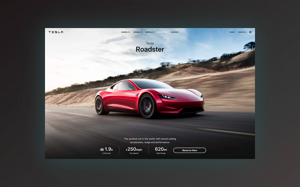
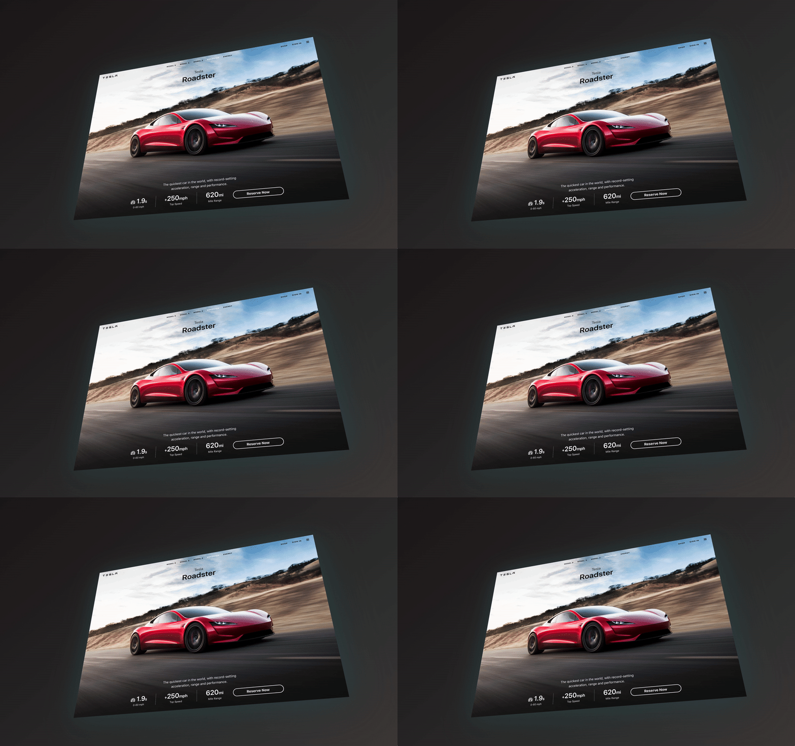
0-60 in 1.9s ?
To accelerate the advent of sustainable web design
Hello internet! (Hi Elon!)
I’m here to disabuse you from the belief that building websites has to be hard. Furthermore, in mere minutes we mere mortals will learn how to build a beautiful and(!) responsive Tesla launch page using Bulma.
Bulma?! Bulma is a CSS framework and brainchild of @jgthms. ?

I also taught a free, full-length Bulma CSS course on Scrimba.com, where we build these ? designs. Click here to enroll for free! ?
Scrimba.com is a next-generation platform for front-end developers to record and share their websites as interactive screencasts! ?
Bulma? ¯\_(ツ)_/¯
Bulma solves a lot of problems — a lot. Whether you need a visual component, or you want to understand how a component might be codified, with best practices and best-in-class documentation, Bulma’s here to help! ??
Bulma’s not even version 1.0, and has major adoption with 150K+ downloadsa month and 26K+ stars on GitHub. Think of Bulma as a competitor to Bootstrap, despite the fact that it’s *just* CSS. ? Look ma, no YavaScript!
How does Bulma work?
Bulma uses several techniques to create a cohesive interface for developers. We need just be concerned with describing our website’s design using semantic classes — not elements — or in other words, idiomatic templates.
These semantic templates can be thought of as interconnecting building-blocks we use to build websites fast! ⚡ These components are also responsive out-of-the-box, meaning we can focus more on our content than the code.
Confused? Start ? here to first learn the fundamentals of Bulma.
What about that ? design?

This design can be better understood as three parts:
☝Responsive background
✌ Bulma components + modifiers
? CSS Grid
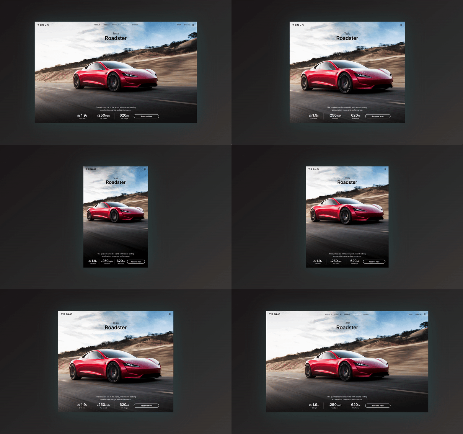
Look a littttle closer…see something? The background isn’t continuous! ? This isn’t a mistake; the Tesla team optimized for desktop, tablet, and mobile. With that as our base, we’ll add Bulma components and modifiers, then use CSS Grid to achieve the intricate responsive design for the specs.
☝ Responsive background
These are the actual background images I ??????? from tesla.com! ?☠️ Sooo…how do we build a responsive background? Using media queries, obvs! Media queries allow us to, given certain circumstances, override CSS.

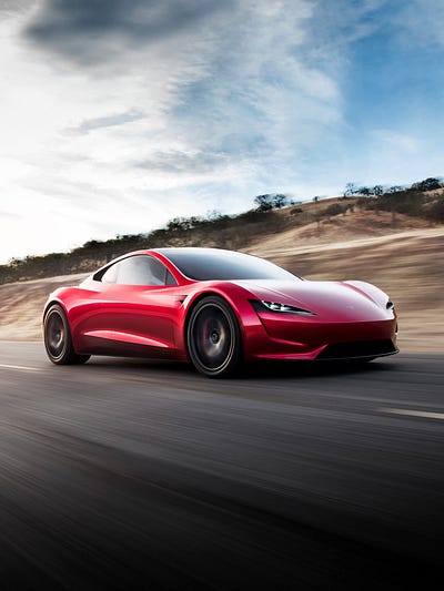

And media queries are powerful; we can override CSS depending on the website’s rendered aspect ratio, the device’s aspect ratio, or simple-and-plain: the website’s rendered width. Yeah — let’s go with that.
First, we start with one of Bulma’s components, .hero, and use one of its modifiers, is-fullheight, to create a fullscreen section. Then, we assign various backgrounds for common widths using media queries:

Great — so now our website swaps backgrounds at 1024px and 768px. Sometimes when this happens, there’s a flash of white, so black conceals it. And center and cover just help align and focus the image.
Believe it or not, background is shorthand for 8 CSS properties: ?
1.️ background-clip2.
background-color3.
background-image4.
background-origin5.
background-position6.
background-repeat7.
background-size
8. background-attachment
We made use of -color, -image, -position, and -size!
✌ Bulma components + modifiers
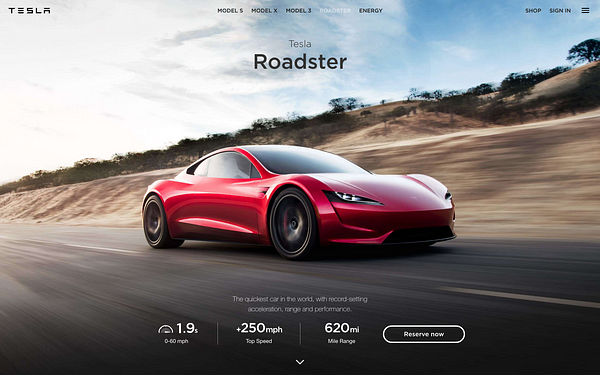
This is where Bulma gets interesting. Which one is the real launch page?!

…
…
…
The left one is authentic! ٩(;ʘ¿ʘ;)۶ Wait…how can Bulma be so versatile? Well — remember modifiers? Yeah so, with enough modifiers at our disposal, we can create a varied aesthetic, even without editing Bulma’s source.
Now, without further ado, I present the launch page as ASCII art! ??

You can ignore the IDs wrapped with parentheses for now. Other than that, these are a few of the available Bulma components. And imagine this, ? Bulma’s components are responsive, too! Whoa.
Bear in mind, this is far less terse than the actual implementation, see here. I’m obfuscating modifiers and extraneous HTML to show how Bulma works; we link components together, just like LEGO, but to design a webpage!
And modifiers are how we can achieve a Tesla-like aesthetic, despite that Bulma has nothing to do with Tesla. Throughout the code, notice the *extensive* use of has-* and is-*; this is what gives us a varied aesthetic.
You can click ? here to learn more about Bulma’s components.
? CSS Grid
Do we need CSS Grid? I’m not sure, (>﹏<) but I found programming the responsive design for the specs much easier than I anticipated using grid than some other technique. So, here’s where those IDs come into focus:
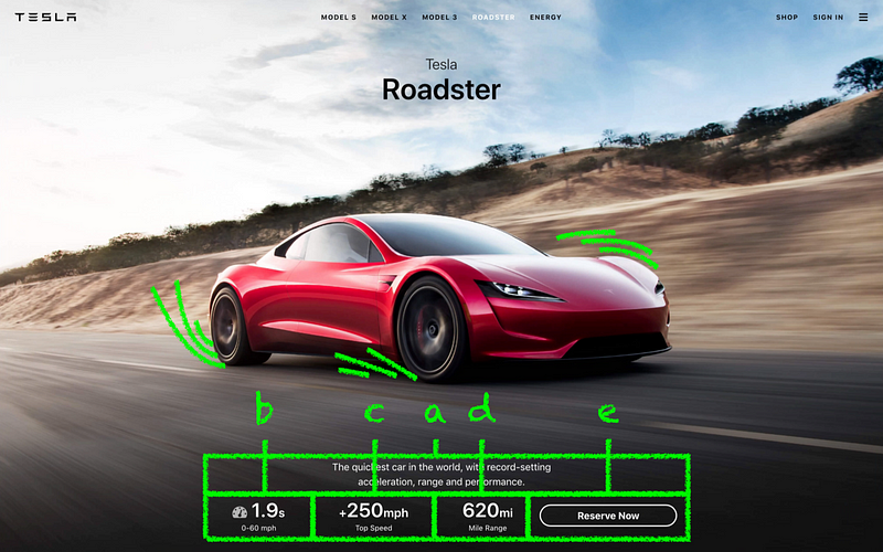
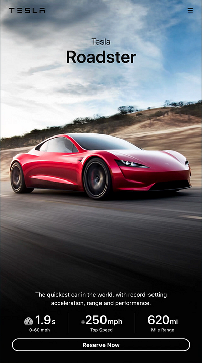
Hehehe…so we have IDs #a through #e, with #a being some marketing, and #e being the “Reserve Now” button. The desired effect is that on mobile we sneak the “Reserve Now” button under #b, #c, and #d.
3…
2…
1… ?

In the first slide, we assign identifiers to each of the IDs using grid-area. Then, we communicate to #grid the *shape* of our grid using ASCII art! ? This is the default grid; for desktop and tablet.
Last — remember media queries? YAS! All we need to do is to communicate the shape of our grid for mobile. Imagine this…we write a single media query to override the shape of our grid for mobile. ?⚡
The full interactive code is available in the Bulma course ? here.
Or…HOW ABOUT PORSCHE?!!? ?
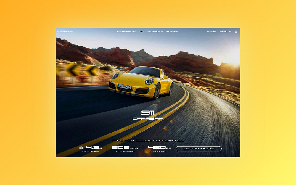
Nikita Rudenko @rdnkta, who is new to #100DaysOfCode(!), created this after finishing the course, and shared it with me! Cheers! ?
Congratz! Thanks for reading! 6(^ω^)9
Now is a phenomenal time like no other to get into front-end development. With the introduction of CSS specs like Flexbox and CSS Grid, and frameworks like Bulma, building for the web has never been more accessible!
ZAYDEK ????
Tweet or DM me for questions and feedback! @username_ZAYDEK ?