
Understanding the Flexbox Powered Bootstrap 4 Grid
This is the 2018 follow-up to my original “How the Bootstrap Grid Really Works” article that was based on Bootstrap 3.x, and Part 4 of my complete “How to… Bootstrap” article.
___________________________________________________________________
What is the Bootstrap “Grid”?
The Bootstrap Grid System is used for layout, specifically Responsive Layouts. Understanding how it works is vital to understanding Bootstrap. The Grid is made up of groupings of Rows & Columns inside 1 or more Containers.
The Bootstrap Grid can be used alone, without the Bootstrap JavaScript and other CSS Components. You just need to download and reference the “bootstrap-grid.css” which contains the Grid and Flexbox classes. More info on only using the Bootstrap Grid CSS is here in the docs.
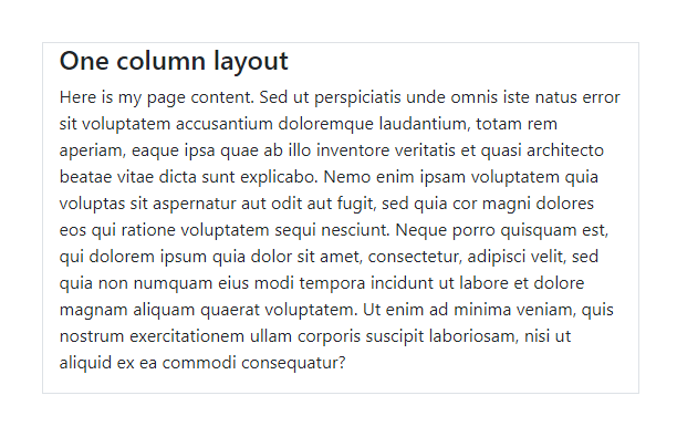
Here’s the most basic example of using the Grid:
<div class="container">
   <div class="row">
      <div class="col">I'm your content inside the grid!</div>
   </div>
</div>
Which gives us one big “column” horizontally across the viewport…
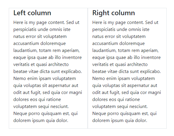
2 Columns…
<div class="container">
   <div class="row">
      <div class="col">Left column</div>
      <div class="col">Right column</div>
   </div>
</div>
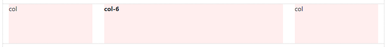
3 Columns…
<div class="container">
   <div class="row">
      <div class="col">Left column</div>
      <div class="col">Center column</div>
      <div class="col">Right column</div>
   </div>
</div>
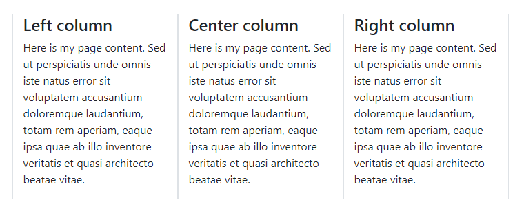
Note: The light gray border lines around the columns in the examples above were added so that you can visualize the outline of each column. See the working layouts on Codeply.
Basic Grid concepts are quickly understood, but you may be wondering why all of this HTML markup is necessary. You might have some questions like…
__Why do I need a Container?
__Can I make one Column wider than the others?
I will address Grid questions like these in a little while. But, first I want to take a step back to explain something very important about using the Grid.
Trust me. Understanding the “Rules of the Grid” will save you a lot of time and frustration. Read them carefully…
___________________________________________________________________
The Rules of the Grid:
- Columns must be the immediate child of a Row.
- Rows are only used to contain Columns, nothing else.
- Rows should be placed inside a Container.
Those rules are very IMPORTANT. The Rows & Columns always work together, and you should never have one without the other.
Bad stuff will happen if you don’t follow those 3 simple Grid rules, exactly. I’ve answered countless Bootstrap questions on Stack Overflow by simply applying those rules. At first this might sound complicated, but it’s really easy once you understand how the Grid works.
___________________________________________________________________
How to Use the Bootstrap Grid __The Right Way.
Container
In the basic example before you may have noticed that I used the .containerto wrap the .row. The Container is the root (a.k.a: top-level, outermost) element of the Bootstrap Grid.
<div class="container">
   <div class="row">
      <div class="col">I'm content inside the grid!</div>
   </div>
</div>
The Container can be used to hold any elements and content. It’s not only used for the Grid Rows & Columns. For example, this is perfectly valid Bootstrap markup:
<div class="container">
   <h2>My Heading</h2>
   <div class="row">
      <div class="col">I'm content inside the grid!</div>
   </div>
</div>
Don’t Ignore the Container.
At first, the Container may seem trivial or unnecessary, but it’s very important to control width of the layout. The Container is also used to evenly align the left and right edges of the layout within the browser’s viewport. The Container is used to counteract the negative margins of the Row which I will explain a little further down.
FYI: Viewport — The visible area inside the browser window.
Bootstrap 4 has 2 types of Containers. In my examples I used .container, but there is also the full-width .container-fluid. You can use either one:
1 — Fixed-width container to center your layout in the middle:
<div class="container"></div>
2 — Full-width container for a layout the spans the entire width:
<div class="container-fluid"></div>
The .container scales down in width responsively (as the screen width narrows) so that eventually it becomes full-width like the .container-fluidon smaller devices.
Reminder: A Container can be used to contain any content, not just the Grid Rows & Columns. But, if you do utilize the Grid Rows & Columns, the Rows should be placed inside a Container. Try the Container demo on Codeply
When utilizing the Grid, one more Rows will be placed inside the Container. You can have multiple Rows in a Container, and you can have multiple Containers on one page. It all depends on what layout you’re trying to accomplish, but don’t get too concerned with that yet.
It’s important that a Container is used to contain grid Rows (.row).
Rows have a negative left/right margin of -15px. The Container padding of 15px is used to counteract the negative margins of the Row. This is to keep content evenly aligned on the edges of the layout. If you don’t put a Row in a Container, the Row will overflow it’s container, causing an undesirablehorizontal scroll.
Rows & Columns
For a while now I’ve wished that the Bootstrap .row wasn’t actually named “row”. The name “row” is often misleading, and obscures the actual purpose of the .row.
When you think “row”, you probably think horizontal line, which is okay, BUT, it’s better to think of the .row simply as a parent of columns.
Think of the Row as a group of Columns
This is because columns inside the .row aren’t always laid-out horizontally across the viewport. Some times we want the column layout to be horizontal, while other times we want the columns to layout vertically down the viewport. The concept of horizontal vs. vertical layout is the essence of Responsive Design. The sole purpose of the “row” is to contain 1 or more “columns”.
DON’T PUT CONTENT DIRECTLY INSIDE THE ROW!
⛔ <div class="row"> This is very bad, wrong way, no bueno!! </div><div class="row"> <p>This is also very bad, the wrong way!!</p> </div>
<div class="row">
   <h2>No headings either! This is the wrong way!!</h2>
</div>
Columns, and only columns, are placed inside the Row.
Content is placed inside the Columns.
✅ <div class="row"> <div class="col">Happy :-) This is the right way.</div> </div>It’s also important to mention that the .row is display:flex. As Flexbox children, the Columns in each row are the same height. Because of Flexbox, horizontal and vertical alignment (align right, center, bottom, etc..) is easily accomplished using Bootstrap 4’s Flex and Auto-margin Utilityclasses.
Now it’s time to look deeper at Rows & Columns, and exactly how they work together. There are different “types” of Columns, and different ways to use them in your layout. They are like magic.

Happiness is, Columns…
- Create horizontal divisions across the viewport.
- Can have different defined widths.
- Can change in width at different screen widths.
- Layout horizontally left-to-right, then vertically up-and-down.
- Can change position (re-order) relative to siblings in the same row.
- Are the same height as other siblings in the same row.
- Can “grow” or “shrink” in width.
- Can automatically “wrap” or “stack” vertically as needed, or at different screen widths.
- Can contain more Rows & Columns__ nesting.
All you need to know about Bootstrap Columns.
Just don’t forget that Columns must be the direct child of a Row.
Columns create horizontal divisions across the viewport. The space between the columns is called the “gutter”.
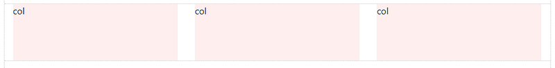
The classic Bootstrap grid has 12 column units:

Note for Dummies: Columns aren’t actually light pink. That is only used for you to see the left/right boundaries of the Columns. In most cases you’re not going to use all 12 individual columns as illustrated above. Instead you’ll be using some combination of the 12 to contain page content…
So, the columns can be evenly divided up into factors of 12. For example, 6 columns (12/6 = 2):
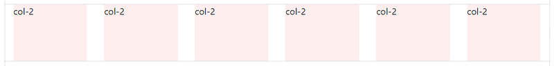
And, you can do the math…
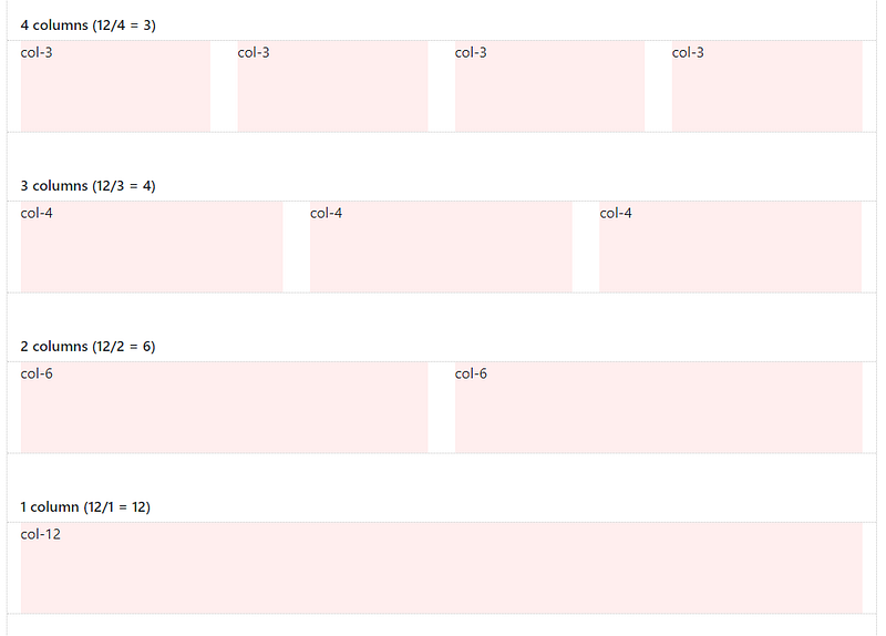
The columns can be split-up using any part of the 12 units. And, it’s okay to use less than 12. It’s also okay to use more than 12 which I’ll show you later.
With all of this flexibility, the layout possibilities are seemingly endless…
But, the Grid is not always about 12. Thanks to Flexbox, Bootstrap 4 has new “Auto-layout” Columns. These unit-less columns give you even more flexibility when it comes to designing layouts.
Now you know how to use Columns to create a horizontal layout. But wait, there’s more! Let’s talk about some fancier things Columns can do.
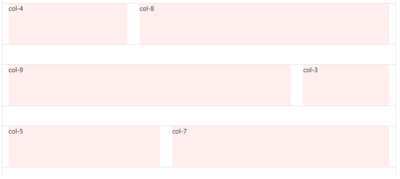
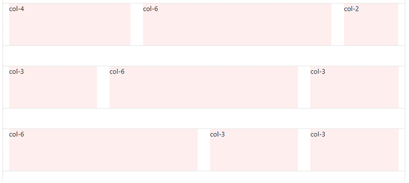
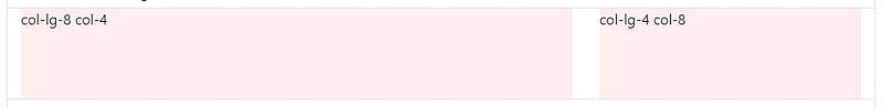
As you just saw above, Columns can be different widths:
Did you know that, Column width can change depending on screen width?
This is called Responsive Design, and I will tell you exactly how it works.
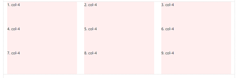
But, first things first, I need to finish telling you about Columns. Remember before when I said “It’s okay to use more than 12 Columns in a Row”?
Columns in the same Row layout horizontally across, and then stack vertically down. This vertical “stacking” or “wrapping” occurs when the Column units in a single Row exceed 12. This is known as “Column Wrapping”…
Columns in the same Row wrap to the next line every 12 units:
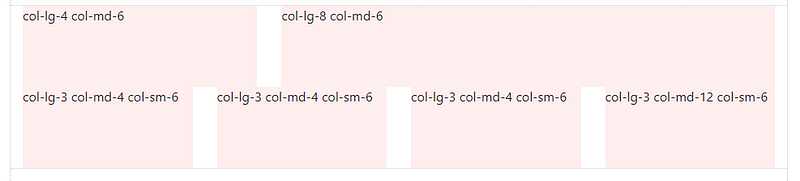
Column width and “wrapping” can be controlled using different Responsive Grid Tiers (a.k.a “Grid Breakpoints”):
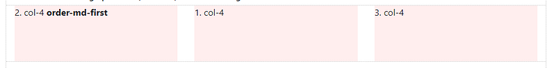
Columns can change position (re-order) relative to siblings in the same Row:
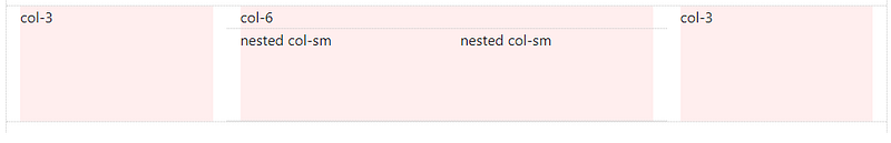
Columns can contain baby Rows & Columns. This is called “Nesting”:
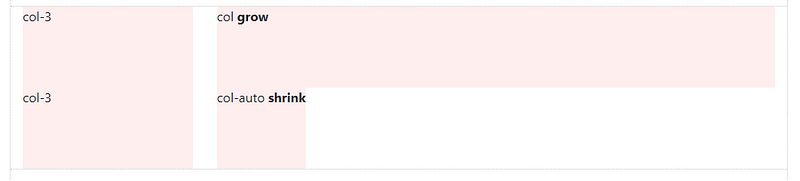
Columns can “grow” or “shrink” in width. These are Auto-layout Columns:
___________________________________________________________________
How to Responsive Design with Bootstrap.
Grid Tiers, Media Queries and Breakpoints, Oh My!
I’m not done talking about Rows & Columns yet, because they’re the star of the show when it comes to Responsive Design.
It’s all about width.
Bootstrap 4 has 5 Responsive Tiers (a.k.a. “Breakpoints”) that you may have noticed in some of the previous Column examples (ie; col-lg-4, col-md).
Responsive Breakpoints, based on screen width:
- (xs) — screen width < 576px (This is the “default” tier)
- sm — screen width ≥ 576px
- md — screen width ≥ 768px
- lg — screen width ≥ 992px
- xl — screen width ≥ 1200px
Aside: Why did I put (xs) in parenthesis, and not the other breakpoints? Since xs (extra-small) is the default breakpoint, the
-xsinfix that was used for Bootstrap 3.x is longer used in Bootstrap 4.x. So instead of usingcol-xs-6, it’s simplycol-6.
Bootstrap uses CSS media queries to establish these Responsive Breakpoints. They enable you to control Column behavior at different screen widths.
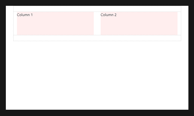
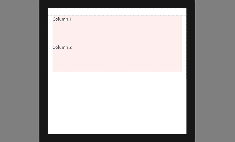
For example: here are 2 columns, each 50% width:
<div class="container">
   <div class="row">
      <div class="col-sm-6">Column 1</div>
      <div class="col-sm-6">Column 2</div>
   </div>
</div>
The col-sm-6 means use 6 of 12 columns wide (50%), on a typical smalldevice width (greater than or equal to 768 px):
On less than 768px, the 2 columns become 100% width and stack vertically:
This is because (xs) is the default or implied breakpoint. Since I didn’t specify a default Column width, the 50% width was only applied on 768px and wider for the sm breakpoint.
Mobile-first!
Since (xs) is the default breakpoint, the col-12 is implied. So, this:
<div class="col-12 col-sm-6">Column</div>
Works the same way as this:
<div class="col-sm-6">Column</div>
Larger breakpoints, override Smaller breakpoints.
xs(default) >
overridden by sm >
overridden by md >
overridden by lg >
overridden by xl
Or, in reverse…
xl > overrides lg > overrides md > overrides sm > overrides (xs)
Therefore, col-sm-6 really means 50% width on small-and-up. For the samecolumn width on all tiers, just set the width for the smallest tier that’s desired. For example:
<div class="col-lg-3 col-md-3 col-sm-3">..</div> is the same as,
<div class="col-sm-3">..</div>
For a different column width on a larger tier, use the appropriate larger breakpoint to override the smaller breakpoint. For example, 3 columns wide on sm, and 4 columns wide on md-and-up:
<div class="col-sm-3 col-md-4">..</div>The Bootstrap 4 auto-layout columns also work responsively. Because of their simplicity, I now prefer them over the classic 12-unit columns. The auto-layout columns are perfect for any layout scenarios where equal-width columns are required. But, don’t forget, the 12-unit columns can be mixed-in as needed.
Take a look at a few auto-layout Grid examples…
3 equal-width columns. The `cols` remain horizontal at all widths, and don’t stack vertically because the xs breakpoint is the default:
<div class="container">
   <div class="row">
      <div class="col">1</div>
      <div class="col">2</div>
      <div class="col">3</div>
   </div>
</div>
3 equal-width columns (responsive). In this example, the `cols` remain horizontal until the sm breakpoint of 576px, and then stack vertically. Remember, you can switch out sm for whatever breakpoint (md,lg,xl) is needed:
<div class="container">
   <div class="row">
      <div class="col-sm">1</div>
      <div class="col-sm">2</div>
      <div class="col-sm">3</div>
   </div>
</div>
2 columns, left sidebar. Here’s an example of combining the classic defined-width columns, with the auto-layout columns. The right column will automatically grow to fill the width because we’re using an auto-layout .col. The sidebar will be 16.6% of screen width on larger screens,and then stack on top at the sm breakpoint of 576px:
<div class="container">
   <div class="row">
      <div class="col-sm-2">sidebar</div>
      <div class="col">main content</div>
   </div>
</div>
3 columns, right sidebar (shrink-to-fit): In this example, there’s a left sidebar, center content area, and a right sidebar that shrinks in width to adjust to its content.
<div class="container">
   <div class="row">
      <div class="col-sm-2">left</div>
      <div class="col">main content</div>
      <div class="col-auto">right</div>
   </div>
</div>
___________________________________________________________________
Key points on Responsive Design using the Bootstrap 4 Grid:
- Columns will stack vertically (and become full-width) at the smaller screen widths unless you use a specific
col-*class in your HTML markup. Use a specificcol-*to prevent that vertical stacking. - The smaller grid classes also apply to larger screens unless overridden specifically for larger screen width. So,
<div class=”col-md-6"></div>is effectively the same as<div class=”col-md-6 col-lg-6"></div>. Therefore, you only need to use the class for the smallest width you want to support. - Rows are
display:flex,and therefore Columns are equal height in the same row. Use auto-margins or Flexbox align-items and justify-contentforhorizontal or vertical alignment (centering, bottom, right, etc..).
__________________________________________________________________
Thanks for reading the whole story! You can also find this article on bootstrap.themes.guide. If you want to keep learning more about Bootstrap 4, check out the complete “How to… Bootstrap” guide.
__Carol