Let’s get things moving! ?
Hey! ? So you’re interested in making things move on your websites and in your apps? This guide should help you out ?
This post assumes you’ve never created a CSS animation before. But even if you have, there may be things you were not aware of. It does assume you have some familiarity with HTML and CSS. We’ll explore creating your first animation through to things like chaining animations.

CSS animation can be a quick concept to grasp but a big topic to cover once we really dig in. Therefore, this post is split over parts.
- Part 1: Introduces CSS animation looking at things like performance and how to inspect animations. We will also create a basic animation and look at
@keyframescomposition. - Part 2: With the basics grasped, we dig into the different things we can do with the
animationproperties. This includes tips on things like usingfill-modeand chaining animations. - Part 3: We wrap things up with some bonus topics like using CSS variables and hooking in from JavaScript. We also discuss whether you should even use CSS animation at all. That’s right, it’s not always the best option. But there’s benefit to understanding the foundations and alternatives.
Before we get started
All the code is available in this CodePen collection ?
This enables you to edit and fork live examples ?
You can also grab the code on Github
For all animations we are using a single div element unless stated otherwise. The basic markup comprises of something like the following
The goal of this guide is to make you comfortable with creating your own CSS animations from scratch! ?
So, why animate?
To improve usability and general user experience. But that does not mean animation should be everywhere in your sites. There’s a time and a place.
With animation, we can do things such as draw a users attention to something or direct them through a flow. Consider loading animations or page transition effects for example.
What can we animate?
Before we start creating animations, we need to know which properties we can animate. We can’t animate every property. The following MDN article lists properties that we can animate.
Lea Verou also has a great demo page for animatable properties.
Property performance
Of the properties we can animate we may choose to animate some over others due to performance.
For example, animating element position will be better handled using transform. This is because the GPU can handle the heavy lifting when animating that property. Animating some properties will trigger layouts to take place ?
The following article is great for understanding animation performance ?
With all that out of the way, let’s get started ?
Our first animation
Let’s dig right in and create our first animation ⛏
For this animation we will make an element spin 360 degrees. Riveting stuff I know ? But we need to start somewhere!
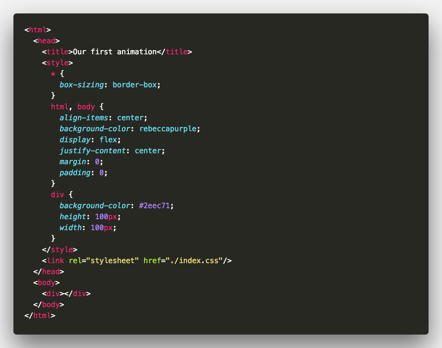
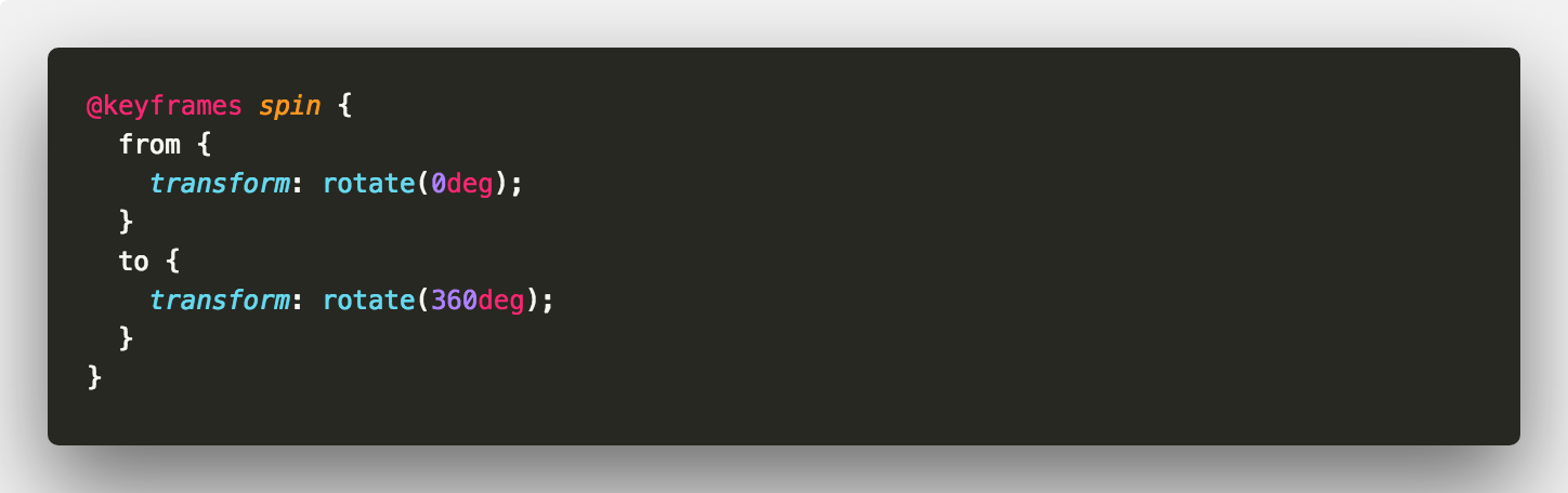
First, we create our animation using the @keyframes rule. The @keyframesrule takes the following structure.
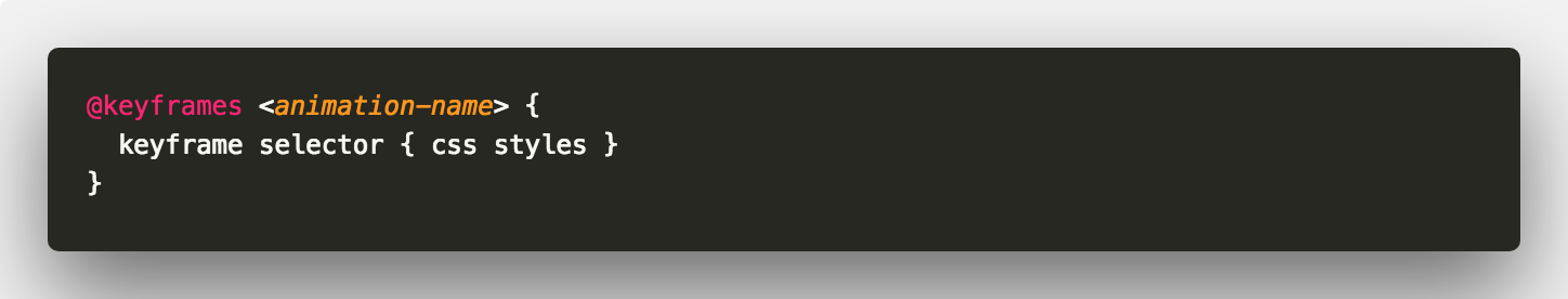
animation-name is the name we give to our animation. You can have one or many keyframe selectors ?
We will name our animation spin. To spin our element we can use the transform property and rotate from 0deg to 360deg. We use two keyframe selectors. One to define the start of our animation(from) and one for the end of our animation(to). from and to keywords are equivalent to 0% and 100%.
We can take this a little further. The styles under the from keyframe selector don’t make any difference to our element. So, the from keyframe selector is redundant. We can remove it.

Now, we need to apply that animation to our element. We use the animation-name and animation-duration properties ?
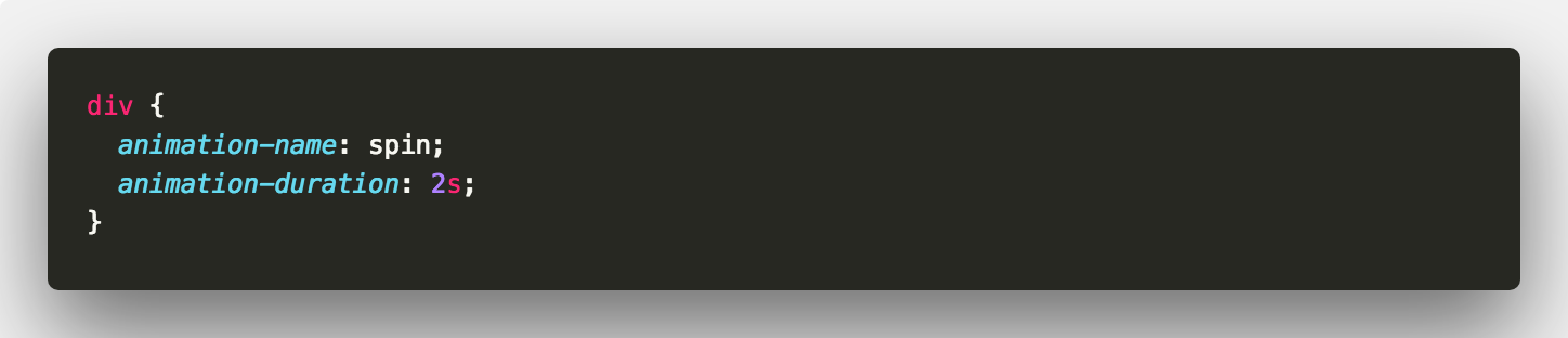
Here we are telling our element to use the animation spin with a duration of 2 seconds. Duration can be set in either milliseconds(ms) or seconds(s).
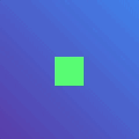
Loading that up in a browser should give us something like
Our first animation ?
From that first animation, you have enough to go off and start creating cool animations ? But stick around and we will get a full grasp of what we can achieve.
Animations inspector
We have created our first animation. Now seems like a great time to introduce the Animations inspector in Google Chrome.
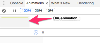
Open up your animation in Google Chrome and open up the Developer Tools. Open up the Animations panel by going into More Tools. If the Animationspanel says “Listening for animations…”, refresh the page.
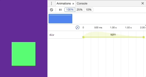
After refreshing, you should see something in the Animations panel, that’s our animation!
Click the animation and we are able to inspect it. Now as our animation isn’t particularly complex, there isn’t much to inspect. But with the Animationsinspector we can do various things. We can experiment with durations and delays as well as altering playback speed. Most importantly, we can replay our animations without having to refresh the entire page ?
This becomes particularly useful when we have many animations. Whether it be for different elements or on one element.
You can read more about the Animations inspector in the following article.
Throughout this guide I recommend using the inspector when checking out the demos. This will allow you to replay animations and tweak them without having the reload the page ?
@keyframes
We put together our first @keyframes rule in our spin animation.
There isn’t much to @keyframes. After specifying an animation name, we specify animation within keyframe selectors. The keyframe selector specifies a percentage of the animation duration. Or, as mentioned before, we can use the from and to keywords that are the equal to 0% and 100%.
Each selector defines styles that should apply at that point of the animation. If we have selectors that specify the same CSS styles, we can group them together.
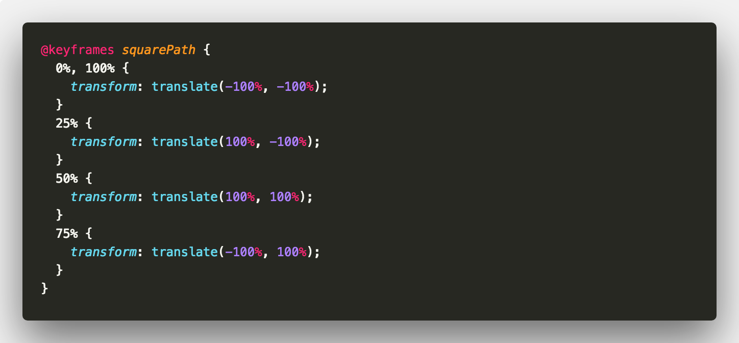
Let’s start with a simple example. Consider the effect of an element moving around the path of a square.
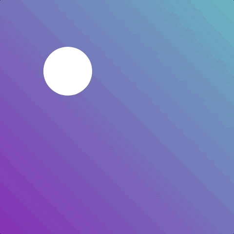
We will call our animation squarePath, very creative I know ?
For this example, there will be four positions for our element. For every side of the square, we use a quarter of the animation. Because our start and finish position will be the same, we can group those keyframe selectors ?
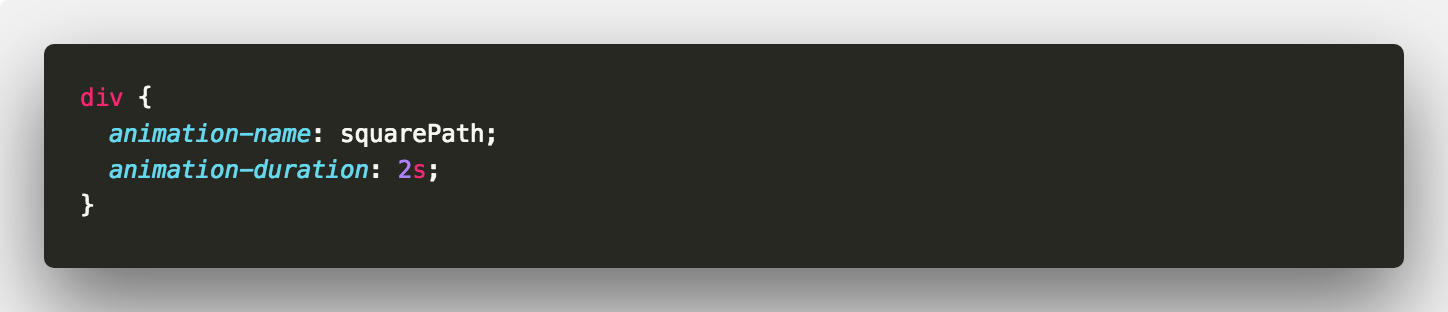
Apply the animation and a duration to our element ?
And that’s it! We have an element moving along the path of a square ?
That’s it for Part 1 ?
We’ve taken a look at the basics of creating and applying animations to our elements. Also we can inspect our animations and tweak them in the browser ?
Although that will be enough to get you up and running with CSS animation, there’s a lot more to it! I hope you’ll join me in Part 2 where we dig deeper into applying animations and the associated tips and tricks.