Pointers to keep in mind before delving deep in micro-interactions and pixel level details.
My first few years as a designer involved a lot of learning that was mostly through trial and error. It usually followed the format of — understand the problem, try a few ideas out, guess what process works best, and go ahead and do it. This way of designing definitely did teach me quite a bit and I learned about dead-ends as and when I approached them. In my naive years, there was not too much thought put into an organized way of doings things. As I grow as a designer, I have noticed myself building frameworks and process guidelines for myself. This has been necessary because of the impact the designs achieve, the stakes involved, and the scale of the projects.
With increasing stakes of the designs, it is important to iron-out details and get as much right in the MVE (minimal viable experience; I don’t believe in MVPs, and that’s for a different discussion) that I am designing for.
Over the years, I found myself going back to the drawing board because I missed out some key elements of the design flow. On retrospective, I realized this was because I was not really following a format to iron out the designs before the hand-off.
Engineers really love having complete designs that are well thought-through and are logically thorough.
Enter the Framework
To aid with thorough designs, I came up with a framework that tries to cover all bases of the flow that I am designing. Some instances, it has proven to be helpful in thinking about cases that were not thought through earlier in the process.
The framework that I use is nothing that we designers already don’t do, but it is a conglomeration of the important pointers that we sometimes tend to forget while designing.
The framework consists of four sections that I like to divide my designs into –
- Happy Path
- Edge Cases
- Transitions & Animations
- Content/Messaging
Happy Path
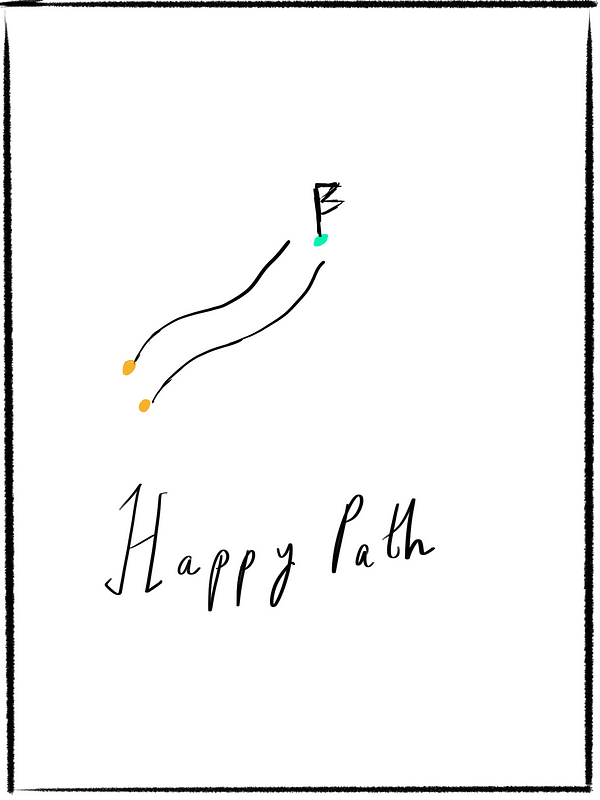
This is something that almost all designers do with certainty. If we are designing a way for a person to book a flight ticket, what is the ideal journey going to look like? Starting from choosing dates of travel, to selecting a flight, and the checkout process. This ideal path is something that I lay out first without thinking about the what-ifs. I iron out the specific details of the ideal path without paying attention to any edge-cases. I call this the user journey without any quirks.
This is a no-brainer but allowing yourself to think only about the ideal journey and not be bothered by the edge-cases helps in focusing on the flow and not get carried away. This conscious session helps me jot down questions that come to my mind about the what-ifs but not pay attention to the design of the what-ifs.
The Scenarios of the Happy Path
The next step to this phase is accounting for the different scenarios. Many would argue that accounting for different scenarios does not mean you are designing the ideal journey. In my view, scenarios are different from edge-cases.
For example, in Enterprise design, you usually have multiple scenarios of a particular flow. How does a particular flow seem when a setting is enabled or disabled. What does a tertiary state look like — that is neither disabled nor enabled but a dormant state.
Accounting for scenarios does not apply to all design flows but definitely helps in being mindful.
Another example of different scenarios — say on Google Maps, what does the new experience you are designing look like when voice is disabled, or when the map theme is in night mode? Listing out the different possible scenarios early in your design process will allow you to identify sub-journeys that could have been easily missed.
This is ideally just branching out the different possibilities of the ideal journey by creating sub-journeys if necessary of just the happy path.
Edge Cases
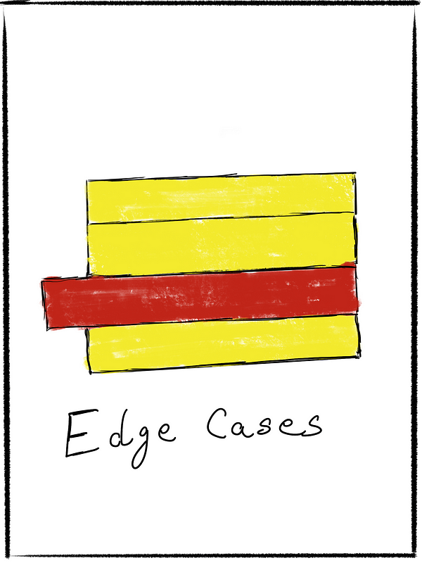
You are in the good books of the engineers you work with the minute you start accounting for all the possible edge-cases. In my working experience, there are two types of edge-cases that occur on a regular basis —
- User initiated edge cases
- System generated
User Initiated edge cases
There are cases when a user erroneously performs an action that is not expected of them in an ideal flow.
Let’s take some examples here –
- A user is going through a wizard of 4 steps, and is on the third step. The user accidentally hits the close or cancel button. Should the wizard just close? Or should there be room for error and provide the user with a way to recover from the error?
- Another similar example, a user is filling up a tedious form and hits cmd+q and the browser just closes. Should there be a way for the user to recover from the loss or should they be filling the form again from the start?
- Another simple example is when users forget to enter into mandatory fields which throws a validation error. What do these screens look like? Thinking about them and having them handed over to engineering is important for a complete round design.
Sometimes, for security reasons, the answer is the latter experience where they have to restart. Thinking about these scenarios helps in drafting all possible experiences for the actual flow of a user is not always just the ideal one.
System Generated
There are cases when the technology fails. The internet stops working, or there is an error because of the system status, or the API endpoints are overloaded with requests.
Should the user be notified of the error? Or should the system just rectify itself upon being active again? What if the auto-correction is not technologically feasible?
How does the interface handle such situations?
The edge-case pitfall
Sometimes, I have found myself redesigning the ideal experience to account for edge-cases. This is a pitfall I am being wary of recently. Changing the ideal happy path experience just to accommodate edge-cases means some serious thinking needs to go behind system design — this to me, highlights problems in how the system is engineered to work and handle the one-offs. This is where designers have the opportunity to challenge the status-quo of the system’s architecture.
Screen Transitions
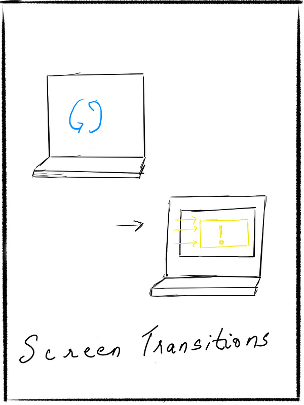
When we design screens and the flow from one screen to another, sometimes we forget to account for the changes between the screens. The real built systems don’t work the way it is designed on InVision prototypes.
There are multiple scenarios where we need to think about how the transitions between screens look like. A few examples –
There are delays between screens, fetching of data needs to happen, back-end validations to occur as users progress through screens, loading times due to slow connectivity are a few simple examples.
Ignoring these transitional states leaves gaps and hence results in unpolished flows developed with no real feedback given to users on what the status of screens are.
Content & Messaging
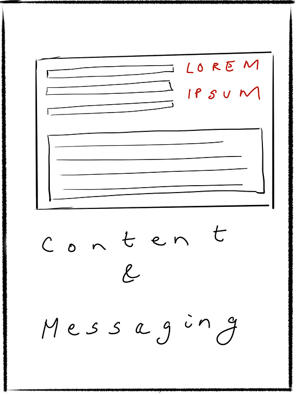
Content
We oftentimes end up designing with placeholder text that is an intermittent temporary replacement to the actual copy. All designers do this to get ahead with designing the flows as they don’t have access to the actual copy yet. While this is normal and necessary to progress, it can be quite a task to make changes to the layout if the copy does not really fit with the intended design.
A technique that has been helping me in such situations is not just placing placeholder Lorem Ipsum, but typing in a version of the possible copy. This will give you an idea of how much space is required, and the content strategist a head-start on how they should be progressing.
Links to docs
It is also important to collect all the links to the docs wherever required and have it tied to the mocks in some manner. I do this by leaving comments on InVision with the links to docs wherever necessary.
Messaging and alerts
When designing flows, there are occasions where there needs to be messages sent to the user. An email needs to be sent upon completion of an action, or data needs to be logged on a completely different part of the flow, or the user needs to be alerted after a point not exactly in the current flow. It is important to create necessary screens for these parts of the experience. How does the email look with the content needs to be a part of the email etc.
Final Thoughts
This is, by no stretch, all the steps involved in day to day interaction design challenges, but a good strategy to develop by keeping these pointers in mind before delving deep in micro-interactions and pixel level details.
SOURCE: https://uxdesign.cc/a-interaction-design-framework-to-cover-all-your-bases-1e616a954827