How to create a logo that responds to its own aspect ratio
There are quite a few articles on the web that deal with responsive logos. The most popular example might be the Responsive Logos website that shows some very well known logos in different variations for different screen sizes. When I first saw this example, I thought it wasn’t much more than a little gimmick. In the end, it is just <div> with a big image sprite as background. It wasn’t until I heard a talk at Smashing Conference by @MikeRiethmullertitled: Beyond Media Queries, that I got more interested in this topic. In addition to the talk, I highly recommend reading his article “SVG has more potential”.
There are two things I learned that really got me excited.
- When using SVG, you can drop the
viewBoxattribute and establish a new coordinate system on nested SVG-symbol elements by applying a newviewBox. (Yeah I know. Sounds confusing. Below, I’ll explain in more detail.) - When you use media queries inside SVG files and then insert the image via img-tag or as a CSS background-image, the media queries are bound to the width of the image. Pretty much the same behavior as if you usedContainer Queries.
The idea was born
After I read about all this, I got the idea to build a logo file for our company, that not only reacts to the browser width but instead adapts while respecting its aspect ratio. So you can use it anywhere, and the file itself chooses which version to show depending on the size it’s given.
The final result
If you’re already excited, download the final DEMO FILE or see it in action in this CodePen.
Step by step (…uuh Baby ♬ )
In the following, I’m going to walk you through every step you have to perform to build your own responsive Logo. You should at least have some basic knowledge about SVG and also CSS. But the good news is: there will be no JavaScript at all. For the most part, we just have to copy code from one file to another.
1. Designing the logo
Let’s start by designing four versions of our logo. My tool of choice for that is Sketch.
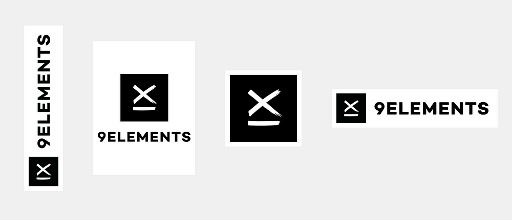
Whenever there are elements, that can be found on multiple versions, I recommend to use symbols in Sketch. This is going to make it easier for you in the future, and the SVG that we’re going to build is going to use the same symbols. (If you’re not familiar with symbols in Sketch I highly recommend this Medium Story by Jon Moore.)
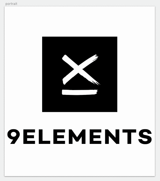
As you can see, the logo consists of a visual element and the company name. Only in the square version, I chose not to display the name. The reason for this is, that I wanted it to be recognizable, even when used as a tiny thumbnail by maybe only about 32px x 32px.
2. Setting up the SVG file
Before we export any images, we have to create a new SVG file. Maybe it’s a little frightening to start your SVG with writing code, but in the end, it is not too complicated. Pinky promise. All we need is an opening and a closing tag like this:
<svg width=”100%” height=”100%” xmlns=”http://www.w3.org/2000/svg" xmlns:xlink=”http://www.w3.org/1999/xlink">
</svg>
If you look at the attributes, you’ll notice, that there is no viewBox attribute. We only set width and height to 100%.
(Note: There are also two xmlns attributes present. To be honest, I don’t exactly know why they have to be there, I should probably google it… anyway if you delete them, you will not be able to use any symbols within the SVG and get some ugly error messages instead.)
3. Exporting SVG-symbols
Because we will be using both elements as symbols in the final SVG, we have to put each of them on a single artboard and export them as SVG.
It is crucial that you do not export the objects but always create a new artboard. If you export elements from a bigger artboard, you will end up with strange looking transform attributes attached to your groups. It also helps to detach all symbols and delete all unused groups. Finally, do some proper naming and see if there is any mask applied, that is not used.
Now let’s see, what the exported code looks like:
I’d recommend to use something like SVGOMG to reduce file size and delete all the unnecessary stuff. But do not clean IDs. If you named your layers in Sketch you can identify them easier by ID in the final file. This is how your optimized file is going to look like:
If everything is correct, you will see a group that has the name of your artboard as ID. Inside of this group is the content, that is of interest. In this case it’s a rectangle serving as background and a complex path that builds the IX (roman 9 rotated counter-clockwise by 90 degrees … just in case you were asking).
4. Building the symbols
All our files are ready and can be put together. Start by writing some symbol tags in your final file and give each a unique ID as well as a viewBox attribute that matches the viewBox of the exported files.
<svg width=”100%” height=”100%” xmlns=”http://www.w3.org/2000/svg" xmlns:xlink=”http://www.w3.org/1999/xlink">
  <symbol id=”ix” viewBox=”0 0 160 160">
    <!-- Insert Symbol Content here -->
  </symbol>
  <symbol id=”typography” viewBox=”0 0 144 16">
    <!-- Insert Symbol Content here -->
  </symbol>
</svg>
Finally, paste the content of your exported files (everything inside the group that is named like your artboard) inside the symbol tags. Once you’re done with that your file should look like this:
5. Using our symbols
So far so good. Sadly, if you open the file in a browser, you won’t see anything. For now, we defined our symbols, but never placed them anywhere. To insert a symbol you need a use-tag in your file:
<use xlink:href=”#ix” x=”0" y=”0" width=”100" height=”100”/>
Now let’s see what exactly is happening here.
First the xlink:href points to a symbol with a unique ID and will render its contents… well, it’s not really rendered, but cloned and suddenly there is a weird thing coming up called the Shadow DOM. It may sound like something from Stranger Things, but you don’t need to be afraid. As long as you don’t want to change anything inside the symbol instance via CSS, there is nothing to worry about.
Next we have the x, y, width and height attributes. You may already have guessed, that these attributes define the position and dimensions of the rendered symbol. But there is no unit given, so how big will our symbol be? Inside an SVG the units are defined by the viewBox attribute set in the SVG tag. Since we did not set a viewBox and only defined width and height (100%), one unit matches one pixel and our symbol will have a width of 100px. And it doesn’t matter if you change the width of the SVG. It will always stay at at 100px width.
Try changing the width and height attributes inside this CodePen. You will notice that the symbol will always keep its aspect ratio. Luckily this is exactly what we need for our logo. If you wanted to change the resizing behavior, you needed an attribute called preserveAspectRatio. Check out @SaraSoueidan’s Article on Understanding SVG Coordinate Systems and Transformation if you want to learn more about it.
Apart from the unitless values, you can also use percentages to define position and dimensions through the attributes. So to make this symbol look like the square version, simply use a width of 90% and position its upper left corner 5% from the bounding box of the image:
<use xlink:href=”#ix” x=”5%" y=”5%" width=”90%" height=”90%”/>
(Maybe you think that setting width or height to ‘auto’ is a good idea… well, it’s not. Safari and Firefox simply ignore it while Chrome won’t render anything.)
6. Combining symbols inside a new symbol
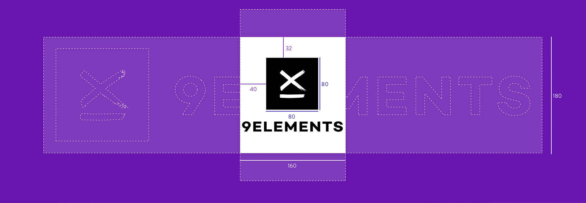
For the portrait version, we’ll need both symbols. In order to make sure they scale proportional and always have the same distance to the border and to each other, we simply create yet another symbol. This symbol again has its own viewBox attribute which allows us to place our symbols within the new coordinate system. To see where exactly everything has to be placed, you can simply go back to your sketch file and inspect the sizes and distances.
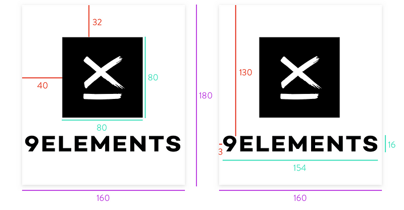
Now, we only have to translate all the numbers to our new SVG symbol, which will then look like this:
<symbol id=”portrait” viewBox=”0 0 160 180">
  <use xlink:href=”#ix” x=”40" y=”32" width=”80" height=”80"/>
  <use xlink:href=”#typo” x=”3" y=”130" width=”154" height=”16"/></symbol>
When we use this symbol, we wouldn’t want it at 100% width, so let’s just scale it down like our square symbol.
<use xlink:href=”#portrait” x=”5%" y=”5%" width=”90%" height=”90%”/>
7. Hide and show
Up to this point we created three symbols and have two use tags in our SVG.
Finally, the fun part begins, and we can make it responsive. Right now both symbols are rendered on top of each other. To hide the parts we don’t want to display, we need to add some classes to the use tags.
<use class="square" xlink:href=”#ix” x=”5%” y=”5%” width=”90%” height=”90%”/>
<use class="portrait" xlink:href=”#portrait” x=”5%” y=”5%” width=”90%” height=”90%”/>
Now, the only thing missing is some CSS to show only one logo version at a time. You can add a <style> tag to your SVG and use some media queries just like you would in a regular CSS file.
In CSS you most likely use something like @media (min-width: 768px) { ... }, but then you are only looking at the width of the image. We are interested in aspect ratio and not width, so our media queries will have to look like this: @media (min-aspect-ratio: 1/2) { ... }.
For our first two versions, let’s make the portrait-version the default and show the single-IX-version only when the image width is at least the same as the image height. In other words: at the point where the image changes from portrait mode to landscape, we will not show the typography anyomore, only the graphical logo.
<style>
  .square { visibility: hidden; }
  .portrait { visibility: visible; }
  @media (min-aspect-ratio: 1/1) {
    .square { visibility: visible; }
    .portrait { visibility: hidden; }
  }
</style>
If you create another symbol for the landscape version, you would probably want to show it when the width of the image is at least two times it’s height. Let’s see how the style changes:
<style>
  .square,
  .landscape { visibility: hidden; }
  .portrait { visibility: visible; }
  @media (min-aspect-ratio: 1/1) {
    .portrait,
    .landscape { visibility: hidden; }
    .square { visibility: visible; }
  }
  @media (min-aspect-ratio: 2/1) {
    .portrait,
    .square { visibility: hidden; }
    .landscape { visibility: visible; }
  }
</style>
And that’s it. We’re done building our own responsive svg logo. Here, you can see the full code with three versions going from portrait mode to landscape:
8. A little bit of transformation
OK, OK… I know the skyscraper-version is missing in the example above. The reason here is, that you need to perform some transformation to create the needed symbol. I will not explain it in detail, but you can find the code you’ll need below:
<symbol id=”skyscraper” viewBox=”0 0 64 328">
  <use xlink:href=”#ix” x=”0" y=”264" width=”64" height=”64"/>
  <use xlink:href=”#typography” x=”-90" y=”109" width=”246" height=”27" transform=”rotate(-90 32 123)”/>
</symbol>
Over to you: I hope this tutorial has been useful and I’d certainly love to see some of your results.
If you’ve enjoyed this piece and would like to see more, you might want to check out our Website, follow us on Twitteror subscribe to our Newsletter.