Language and typography dictates the user experiences we deliver to users.
Living in Silicon Valley exposes you to a very diverse population from all around the world. One of the side effects of this is being introduced to different ways of thinking in design.
I’ve been fortunate enough to have the chance to work on products or websites that are multilingual, advised startups at incubators like K-Startup which is for South Korean startups, as well as design user flows and experience strategies for apps targeted to China.
Language Barriers
It’s no secret that grids are an important aspect to design. Grids are the foundation for how your design will respond and organize itself on different devices and screen sizes.
One area of design I have always admired is typography in various languages. Asia especially has a unique form factor as the major languages have block formatted writing. Block design enables designers to fit everything perfectly within the grid without any gaps. Let’s look at these two sentences each with the same meaning:
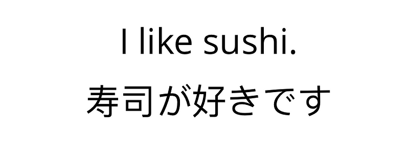
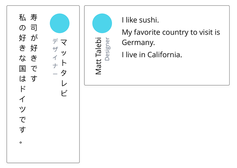
We can see immediately that the Japanese sentence forms a perfect block. Each character within the sentence has seemingly the same heights and widths. The English sentence has completely different sizes causing high variability. But before we continue on about the layout, let’s build onto this and create a simple profile card:
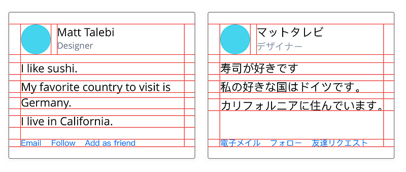
These cards translate to the same meaning and I’ve outlined the grid I used for each card. With the grid outlined it’s clear that the English card doesn’t fill out the grid as nicely, whereas on the Japanese card the words fill out the grid almost perfectly as far as the letter height is concerned.
In this sense grid design can be more favorable for languages with block characters such as Japanese, Chinese, and Korean. Of course, in English we could write in all capitalized letters— but it’s not very readable or favorable in long form articles. Many websites from Asia especially game sites do adopt all capitalized words for headlines and navigation to keep the same look and feel as their native counterpart.
Vertical text
With vertical text comes vertical layouts. Many of the languages from Asia are capable of being read vertically just the same as horizontally. Because their languages can be read vertically, designs can be horizontally compact, allowing for a more natural mobile adaptation in some instances.
For languages such as Japanese in the above image, rotation is not required when doing a vertical format, making it read naturally. In English rotation is required to give some legibility. With English we can do vertical design for some unimportant areas of applications. For example I’ve seen applications who put the user profile vertically (similar to above) to save space in a collapsed side menu. Beyond these cases vertical text in English may create a barrier between legibility and design (even if the design “looks good”).
Visual overload
One perception of the untrained eye to these languages is that their designs are highly overloaded with visuals while English design has much more breathing room and is “easier to read.”
The optically cluttered idea may be true to some extent, but there is also something to be said about the written styles of each language. Let’s take a look again at our sentence I like sushi.
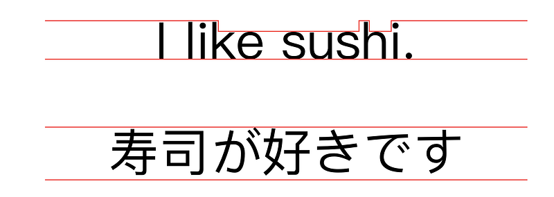
With an added grid outlining the general forms we can see how the Japanese sentence is uniform with block shapes unlike the English sentence. Let’s take a look at one more sentence.
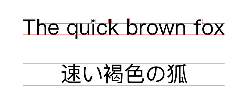
English sentences not only have variable heights and widths, we have ascenders and descenders which also break through the grid. It’s no wonder we put extra leading between our lines, otherwise our letters would clash with each other and it wouldn’t be very readable.
To fully understand why we have more spacing in English over languages like Japanese or written Chinese we need to look at it from their perspective in a way that is understandable to us. Below is an English nursery rhyme that has extra letter spacing and line height that simulates how their characters would read if spacing was added.

This example gives you an idea of how native speakers would feel (or worse) if designers were to decompress block character based languages. Nevertheless—cluttered visuals are still popular in Asian print design, and perhaps seep a bit into the digital interface design world, too. But this visual information overload style is not to the extent people may think it is on digital formats. It may feel overloaded because their characters are readable in tighter spaces. If you look at the same website in English and Japanese, I’m pretty sure you will think the Japanese site is visually overloaded, but actually it’s showing the same information.
There is definitely something about our culture in Western countries wanting to have breathing space. Could these differences be a derivative of what we just talked about with block and variable letters that naturally evolved into this divergence? Or is there something more to the way different cultures think about design that has caused one to prefer more or less information over the other? I will let you decide for yourself on this. ?
Design Samples
We’ve covered some basic typography of English (or Latin based languages) against block character languages (Chinese, Japanese, Korean), but where do they really differ?
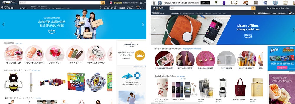
Depending on the language, words and phrases can also be much more compact in the context of menu systems. Let’s take a look at the Amazon application against a shopping application in China called Pinduoduo (拼多多).
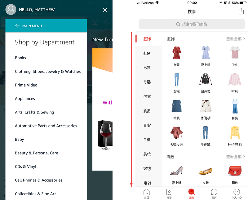
Each category shown in the Amazon application takes a lot of horizontal space. This forces us to have a full screen menu on our mobile devices to select categories or menu items in English. With written Chinese, one word could be just a single symbol which allows for high optimization on screen real estate especially for mobile devices.
Looking at Pinduoduo on the right in the example above, you will see a tabbing system on the left of the screen. This tabbing system displays every category for their shopping, from electronics and food to furniture and clothing — each consisting of just two characters! The images on the right represent sub-categories of the selected tab. This design paradigm would only be dreamed of in our language.
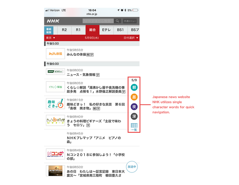
Another quick example is the mobile Japanese news website NHK. They have a floating side navigation utilizing single symbol words to bring in quick navigation for the time frames of each show. In this case each character translates to: Morning (朝), Day (昼), Night (夜), Late (深).
Using the above examples and given the compactness of the languages, can you imagine the amount of information that could be shown on a tablet or a larger screen? Is it visual overload, or rather is it just design optimization of the language?
Functional, minimal and compact (but readable) design is something we strive for in Western countries. Looking at the examples above and their innate ability to be minimal it appears as if our inability as designers to create such interfaces is not to question, but the limitations of our very own language. Some would say resorting to icon based navigation for English is one solution—but icons are not only inefficient to “read,” the meanings are often controversial.
Responsive Design with language
In design we’ve always talked about responsiveness in regards to screen sizes — building our grid from mobile to desktop for perfect readability and experiences. But how does this process differ for multilingual websites and applications?
It’s clear now that some languages enable different stylistic properties over others. With the advent of CSS grid in the past year or two, it should only encourage us more to format our layouts to adapt for different languages and devices we support.
Today responsive design has a very limited meaning—it’s time we expand the meaning to include the different languages and cultures around the world. No two devices and no two languages were made equally. Next time you get the chance to build an international or multilingual application (and I encourage everyone to do so!), do some research into the language. Learn how it’s written, read, the culture behind it, and perhaps you too will create an interactive experience that is unique to it!
I would love to hear your thoughts and examples of what you have done internationally, or just connect with me!
SOURCE: https://uxdesign.cc/interaction-designs-from-western-to-eastern-countries-74338b6fa7e2
Matthew Talebi
Product • Designer