You won’t believe how easy it is!

Recap
This article is the fifth and final part of our series on creating interactive infographics with plain Javascript.
Previously we built a feature-rich User Interface (UI) to browse inter-connected information. In this article, we’ll demonstrate why it is so easy to create UIs with a human touch.
Objective
We’ll highlight ten UI tweaks that’ll transform a casual visit into a superior user experience.
Concept
At its core, UI design is just two words: contextualise and communicate.
- If we can contextualise the story, we can identify the right problem to solve.
- If we can design a UI that communicates, we can guide users towards their goals.
To clarify, this story is not about design principals or axioms. It is about a focus on the needs and challenges of the user. As such, the “correct answers” will vary from project to project.
Also, while we used Javascript extensively in our examples, this story is not about Javascript technologies. It is about an attitude to figure out a UI design that can “make sense” to its users.
Let’s see how that comes into play with practical examples.
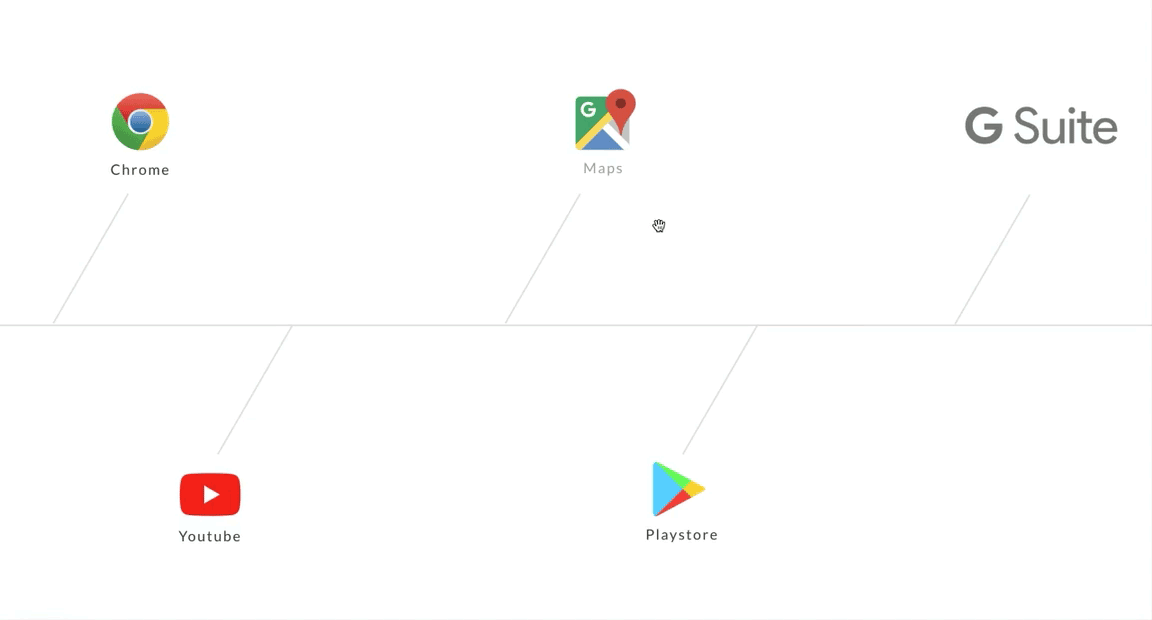
Tweak #1
Contextualise: How to present the information architecture without cluttering the display?
Communicate: Use transition effects to tell a story.
Before: The “usual” way of highlighting information.
<div id="myElement">
    <a href="myURL">Maps</a>
</div>
After: A CSS tweak will give new dimensions to the information architecture.
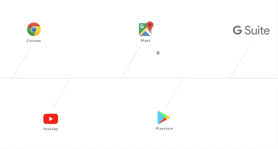
var myIcon = document.getElementById( "myElement" );
addEventListener("mouseover", mouseOver );
function mouseOver(event) {
    myicon.style.transform = "scale3d(1.20, 1.20, 1.20)"; // node;
    mylink.style.border = "solid 1px black"; // link
}
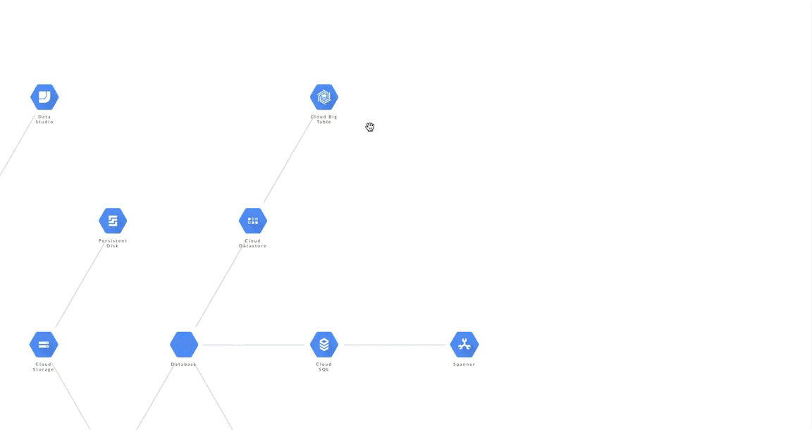
Tweak #2
Contextualise: How to reveal information hierarchy quickly?
Communicate: Stagger the entrance of containers progressively.
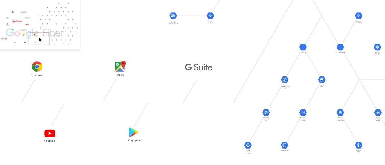
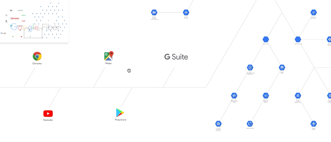
Before: A “typical” page load
After: A staggered entrance highlights the information hierarchy instantly.
Tier-one. The core content, comprising text and media, are wrapped within a larger container to the far-right so that its implied order is noticable. Observe the ultrafast creation of the Youtube embedded element even as its parent container is generated on-the-fly. No worries on any video content slowing down your website.
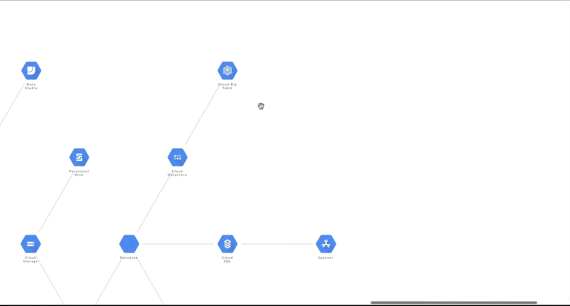
Tier-two. The middle container shows summary information and related topics for users who are interested to find out more.
Tier-three. If users are indeed engaged, they can trigger the far-left container to reveal more information (see the demo from part-four of our story).
Initiate the “start/hidden” position of all containers.
rightContainer.style.transform = "translate3d(50vw, 100vh, 0)";
middleContainer.style.transform = "translate3d(25vw, 100vh, 0)";
leftContainer.style.transform = "translate3d(0vw, 100vh, 0)";
Sequence the entrance towards the “end/show” position.
rightContainer.style.transform = "translate3d(50vw, 0vh, 0)";
setTimeout(() => {
    middleContainer.style.transform = "translate3d(25vw, 0vh, 0)";
}, 200);
setTimeout(() => {
    leftContainer.style.transform = "translate3d(0vw, 0vh, 0)";
}, 400);
setTimeoutdelays code execution to emulate the staggered animation effect.- The “start/hidden” position of each container is
100vh(from the top). The “end/show” position will be0vh. keyframesortransition-delaycan produce similar results.- Select an
easingtransition to create butter-smooth animations.
Tweak #3
Contextualise: How to maximise the view and navigation space.
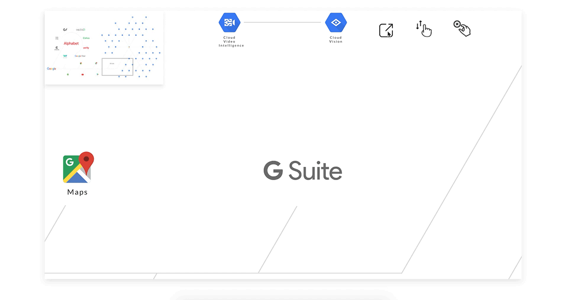
Communicate: Autohide unused UI elements during navigation events.
Before: Visible navigation space is halved. While users can view content on the “sticky” container, it is not needed in the midst of a navigation event itself.

After: Since users won’t need the sticky container while navigating, we can safely fadeout the container to maximise view and navigation space.
fadeOutSticky(){
    rightContainer.style.opacity = "0";
};
// reusing event listener (from part-one discussion)
canvas.addEventListener("mousedown", handlerGrab, false);
function handlerGrab(event) {
    if (event.which == 1) {
        ...
        fadeOutSticky();
    };
    ...
}
Tweak #4
Contextualise: How to “not-block” active elements
Communicate: Autohide blocking elements in response to interaction events.
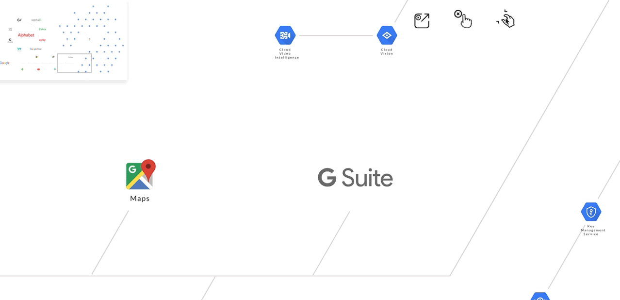
Fadeout the minimap so that it won’t “block” the mouse cursor when users are “panning” the canvas (a navigation feature discussed in part-two).
canvas.addEventListener("mousemove", handlerMouseMove, false);
function handlerMouseMove(event) {
    if (event.which == 3) {
        if ( boundingbox(event.clientX, event.clientY, minimap) != false) {
            minimap.style.visibility = "hidden";
        } else {
            minimap.style.visibility = "visible";
        }
    }
}
boundingbox is a custom function to determine if the mouse cursor is currently hovering over the minimap.
function boundingbox(ClientX = 0, ClientY = 0, element) {
    if (element.getBoundingClientRect) {
        var rect = element.getBoundingClientRect ();
        y = rect.top;
        xR = rect.right;
        yB = rect.bottom;
        xL = rect.left;
        boxHeight = yB - y;
        boxWidth = xR - xL;
    }
    if ( ClientX <= (xR) && ClientY <= (yB) ) {
        return true;
    } else return false;
 }
Tweak #5
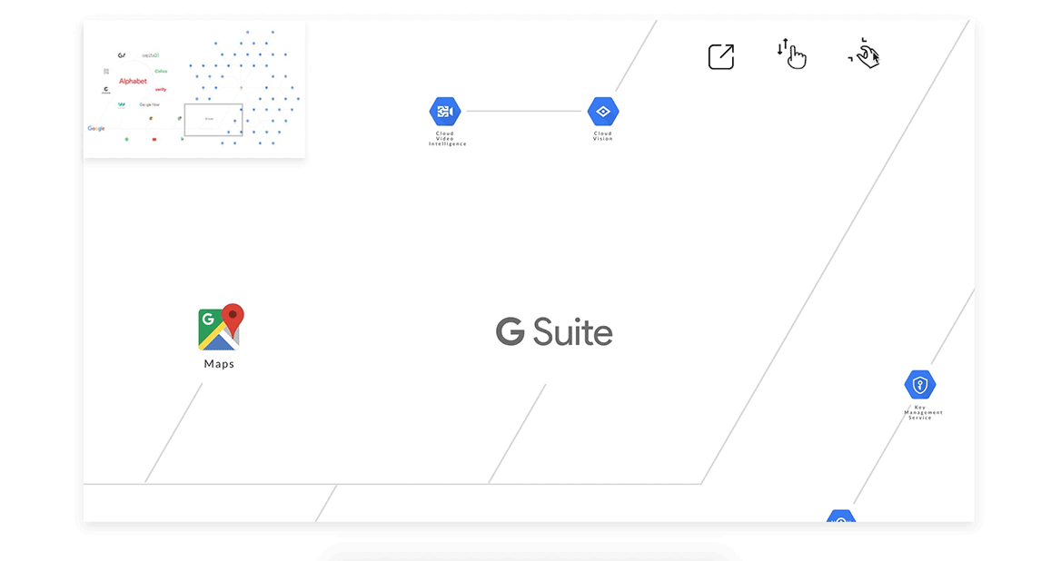
Contextualise: How to use the “hidden dimension” to reveal a deeper information architecture?
Communicate: Emulate a see-through effect by manipulating the opacity level of the “above” element. The content of both the above and underneathlayers are visible to help users visualise a more complete picture.
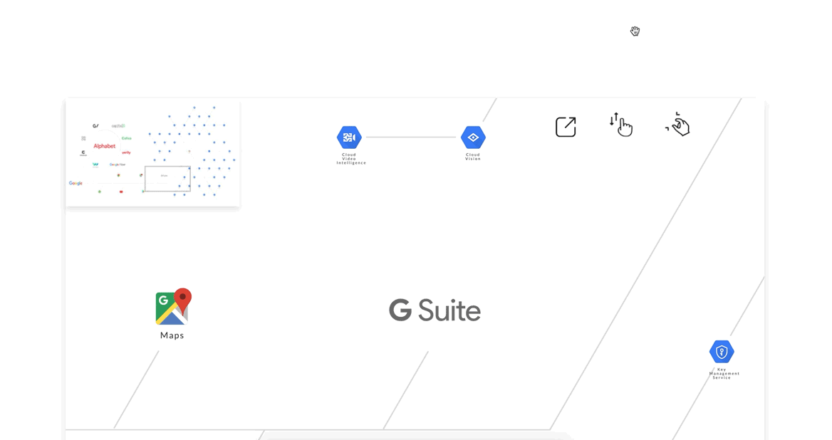
You can broaden the navigation view or create a sense of visual depth with just the opacity value. Notice the semi-visible layer underneath the minimap(top-left) and the sticky container (right-hand side)?
Tweak #6
Contextualise: How to show related information only when it’s relevant (without a page reload).
Communicate: Hide the information by default, but show on mouse focus.
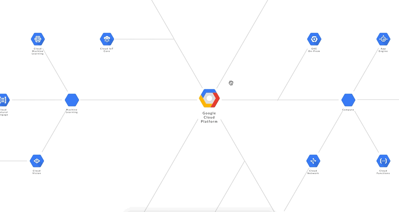
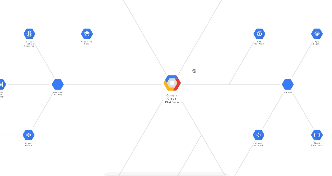
A little background on the Google Cloud Platform (GCP). In the GCP world, PubSub is tightly integrated with other GCP products. While PubSub may be categorised under Big Data, it is also a key integration point for many GCP products. How can we feature this contextual relationship without cluttering the view? It’s not so complicated once we do this.
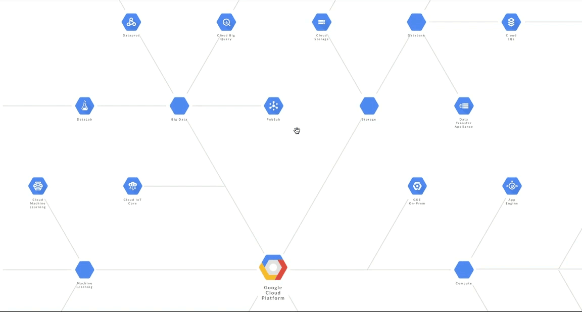
The technique is similar to how we would highlight the nodes (discussed in part-one of the story).
“Hide” the dotted line.
dottedLine.style.borderRight = "1px dashed #FFF";
// opacity or visibility works well too
When we mouse-over the PubSub node, the eventlistener for the previously hidden dotted lines become visible. Note that other non-essential links become hidden. With just one line of code, you can achieve a funnelling effect on the user’s attention and tell a story without narration.
dottedLine.style.borderRight = "1px dashed #ddd";
It’s almost mandatory to apply a fade-in fade-out transition.
dottedLine.style.borderRight = “300ms ease”;
Tweak #7
Contextualise: How to show the contextual usage of the mouse cursor?
Communicate: Update the mouse cursor icon to signify different usage or behaviour.
Interacting with the minimap. Users drag the rectangular bracket (top left) within the minimap to update the canvas (main view). The cursor change from a default pointer to a four-way arrow.
canvas.style.cursor = “inherit”; // default mouse pointer
canvas.style.cursor = “move”; // four-way arrow icon
Interacting with the main canvas. Users drag the main canvas. The location on the minimap updates concurrently. The cursor change from a “grab”(hand) icon to a “grabbing”(fist) icon.
canvas.style.cursor = “-webkit-grab”;  // hand icon
canvas.style.cursor = “-webkit-grabbing"; // fist icon
Tweak #8
Contextualise: How to add contextual usage to the same mouse click?
Communicate: Differentiate a mousedown from a mouse click.
We want a left-click to do this.
mousedown" and “mouseup” action in a rapid successionWe also want a prolonged left-click to do this.
As you can see, a left-click is not the same as a prolonged left-click. The later drags the canvas.
A mouse button can have dual usage and still feel intuitive. When a left-click is on mousedown, and not mouseup yet, it may mean either:
- click on something, or
- drag things.
It’s trivial to implement. The trick is knowing what happens after the mousedown event is detected. Is there an immediate mouseup event or a mousemove event? The former suggests a “standard” click and the later a custom drag action.
If a mouseup is not detected within, say 300ms, then let the user drag the canvas.
In the main while loop (from part-one), listen to the mousedown event.
while (item[i]) {
   itemElementName[i].addEventListener("mousedown", clickTimer );
   ...
}
Add a custom function named clickTimer to determine whether it’s a click or a drag.
var mouseClick = true; function clickTimer(event) { ... // measure the time interval between mousedown and mouseup ... }
Since we’re only interested in knowing if the time interval is more than 300ms (not the same as the interval value itself), we can use a simple hack to do the job.
// measurement hack
setTimeout(function(){
    mouseClick = false; }, 300);
On mousedown, set mouseClick to true. However, after 300ms, set it to false.
Tweak #9
Contextualise: How to transit from “in-browser” to full-screen mode.
Communicate: Provide a quick-toggle option.
Toggle-to-interact. Offer an option to go interactive. By default, the “in-browser” mode won’t block users from scrolling pass the canvas (also see scroll from part-two). A toggle will enable navigation from within the canvas.
canvas.style.overflow = "hidden"; // default with scroll disabled
canvas.style.overflow = "scroll"; // enable scroll
Toggle to fullscreen. Offer an option to go fullscreen from “inline” mode to maximise navigation space.
buttonFullScreen.addEventListener("click", handlerFullScreen, false);
function handlerFullScreen(event) {
    ...
    canvas.style.height = "100vh";
    canvas.style.width = "100vw";
    //  transform to new canvas full-width and full height
    //  handle new minimap placement position & adjust the new location position
    //  Calculate relative scroll position after canvas turns full-screen
    fullScreenSize = true; //  global var for other functions
}
buttonFullScreenreferences the HTML<button></button>.canvas.style.heightandcanvas.style.heighttoggles the canvas to full screen. Remember to account for changes in theminimapposition.- Finally, use a boolean flag to tell your down-stream functions to calculate based on full-screen dimensions (or not).
Tweak #10 (Zoom with SVG)
Contextualise: How to let users examine close-up details and still stay high-def?
Communicate: Use the mouse-scroll button to zoom. Use SVG to achieve unlimited scaling in high-definition.
Use the zoom API to increment or decrement size.
canvas.style.zoom = zoomLevel;
zoomLevel = zoomLevel + 0.01; //increment the zoom level
Tweak #10 (Zoom with easing)
Contextualise: How to make UIs respond in a fluid and human-like manner?Communicate: Incorporate an easing function to create an intuitive experience.
Animation and easing effects work hand in hand to provide useful visual cues for users. One example is the original iPhone end-of-page “rebound” effect.
Let’s try this on our zoom example.
function easeInOutQuad(t, b, c, d) {
    if ((t /= d / 2) < 1) return c / 2 * t * t + b;
    return -c / 2 * ((--t) * (t - 2) - 1) + b;
}
function spreadZoom(direction) {
    var time = 0;
    var diff = 1;
    var minTime = 5;
    var maxTime = 40;
for (var i = 0, len = diff; i <= len; i++) {
        (function(s) {
            setTimeout(function() {
                if (direction == 'zoomin') {
                    ...
                } else
                if (direction == 'zoomout') {
                    ...
                };
            }, time);
    })(i);
    time = easeInOutQuad(i, minTime, maxTime, diff);
    } // for loop
}
The result is a smoother start-stop curve that mimics a more natural response.
spreadZoombreaks a physical scroll action into a series of smaller virtual zooms “spread over” aeaseInOutQuadcurve.easeInOutQuadcreates the analogue effect. The formula is based on the Robert Penner’s easing equation.- The behaviour can be further configured via
time,diff,minTime, andmaxTimevariables.
Concept aside: Easing
Why is easing a first-class citizen in UI design?


Perhaps due to its mathematical nature, as illustrated in the previous easeInOutQuad example (Tweak #10), easing may be an overlooked and underused feature. However, it can be very straightforward too. One line of CSS usually gets the job done.
CSS usage
#myElement {transition: 1s ease;}
Customised usage
#myElement {transition: 1s cubic-bezier(0.25,0.1,0.25,1);}
Javascript equivalent
myElement.style.transition = "all 1s cubic-bezier(0.25,0.1,0.25,1)";
Easing is used extensively in our demo project. For example, the staggered entrance of the sticky containers are eased (Tweak #2). So are the scaling and highlighting effects of the SVG icons and connecting links (Tweak #1).
Let’s have some fun with easing.

Next Steps
Some of the most complex UIs are built on top of the simplest ideas. Once we apply those ideas to contextualise the problem, we can design a UI that communicates effectively to deliver the promise.
While we’ve devoted five stories and covered some of the most common Javascript techniques, we are saying only one thing. Anyone can create a compelling design with just simple tools. Anyone can transform a casual visit into a superior user experience.
SOURCE: https://hackernoon.com/10-ui-tweaks-for-web-developers-af2502b8f994
WRITE BY