The internet suffers from a lack of imagination, so I asked my students to redesign it
Web design today seems to be driven by technical and ideological constraints rather than creativity and ideas. Every page consists of containers in containers in containers; sometimes text, sometimes images. Nothing is truly designed, it’s simply assumed.
Ironically, today’s web technologies have enormous design capabilities. We have the capability to implement almost every conceivable idea and layout. We can create radical, surprising, and evocative websites. We can combine experimental typography with generative images and interactive experiences.
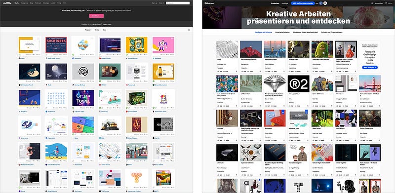
And yet, even websites for designers are based on containers in containers in containers. The most popular portals for creatives on the web — Dribbble and Behance — are so fundamentally boring they’re basically interchangeable. (See lead image.)
How did this happen?
There are a few reasons. Technological frameworks like Content Management Systems (CMS) and blogging platforms like WordPress are based on templates. Web pages on these frameworks are not individually crafted but generated on the fly by piecing together various media types like images, headlines, body text, and videos. Templates are not designs. Rather, they are rules for combining related data types. Beyond the template, these platforms typically offer users no way to influence a page’s visual appearance. What you see is what you poured into the template.
In other words, templates are content agnostic. And that is the problem.
One of the fundamental principles of design is a deep and meaningful connection between form and content; form should both reflect and shape content. Separating them breaks this principle and creates generic content containers. In a design sense, templates are meaningless; the form adds nothing to the content.
One of the fundamental principles of design is a deep and meaningful connection between form and content.
There are plenty of other reasons for web design’s lack of creativity. Most of them are economic and pragmatic. For example, it’s time-consuming to design individual pages. Considering the speed of online news and the frequency of new articles, large websites simply do not have the resources to design a page from the ground up. Furthermore, web design is still a matter of technical expertise: HTML, JavaScript, and CSS remain challenging tools for designers. There’s no web design equivalent to the direct and obliging workflows of desktop publishing applications.
I suspect designers’ creative and intellectual laziness is to blame, too. In the age of mobile-first, generic, framework-driven development, nobody seems to bother with the visual and contextual integrity of a web page.
How can we tackle this challenge? What can expressive and avant-garde websites look like today?
Sometimes, if you want to design the future, you have to rediscover the past.
Retro Web Design
I designed my first website about 23 years ago at the research and development group at the University of the Arts in Bremen, Germany. Creating web pages was hot at the time. The web was young. Pages sparked my imagination.
In the mid-nineties, we were struggling with the constraints of HTML. We could only use web-safe fonts like Arial, Times, or Verdana. We had to use table layouts, monospaced fonts, or GIFs if we wanted to do anything exciting. HTML was purely content-driven initially, and we had to work against the technology in order to design a page.
At the same time, experimental typography was exploding. From Jan Tschichold’s Die Neue Typographie in the twenties to the computer-driven layouts by April Greiman in the eighties, designers challenged the status quo and tried to find a visual language that represented the ideas and revolutions of their eras. By the mid-nineties, an unusual combination of technological and cultural advancements allowed for a very radical breed of graphic design. You could see it in the work of Irma Boom, David Carson, Paula Scher, Neville Brody, and many others.
Compared to the visual explosion of the graphic design world, however, early web pages were still fairly lame. (The Web Design Museum documents this very well.)
We wanted to do graphic design in the browser, but nobody knew how — or what mistakes could be made. There were no expectations of how a web page should look. There were no standards. No CMS (almost), no CSS, no JS, no video, no animation.
Now is as good a time as any to challenge the internet’s visual conformity.
Fast forward to 2018, and we can do everything in a browser. From massive-scale layouts to micro-typography, animation, and video. And what do we do with these incredible possibilities? Containers in containers in containers. Gigabytes of visually bland mobile-first pages contaminated with JavaScript. Generic templates that follow the same visual rules. If my younger self could have seen the state of web design 23 years later, he would have been very disappointed.
Web design’s problem is not the limits of technology but the limits of our imagination. We’ve become far too obedient to visual conformity, economic viability, and assumed expectations.
However, every crisis creates an opportunity. Now is as good a time as any to challenge the internet’s visual conformity. Alas, I am too old and too bourgeois to come up with a radical, experimental, and state-of-the-art approach to web design. But I can ask my students to do it.
In 2017, I gave a web design class at the Interface Design Programme in Potsdam, Germany. Each team was asked to come up with a redesign for an existing website. The assignment was very clear: Treat the browser as a blank canvas and create expressive, imaginative visual experiences. Use the technological potential of current web technologies as a channel for your creativity. Do not be constrained by questions of usability, legibility, and flexibility. Have an attitude. Disregard Erwartungskonformität.
I was very happy with the outcome of the class. (You can see all the results on this overview page.) Here are four projects that represent different approaches to the challenge.
1. ZKM by Frederic Haase and Jonas Köpfer
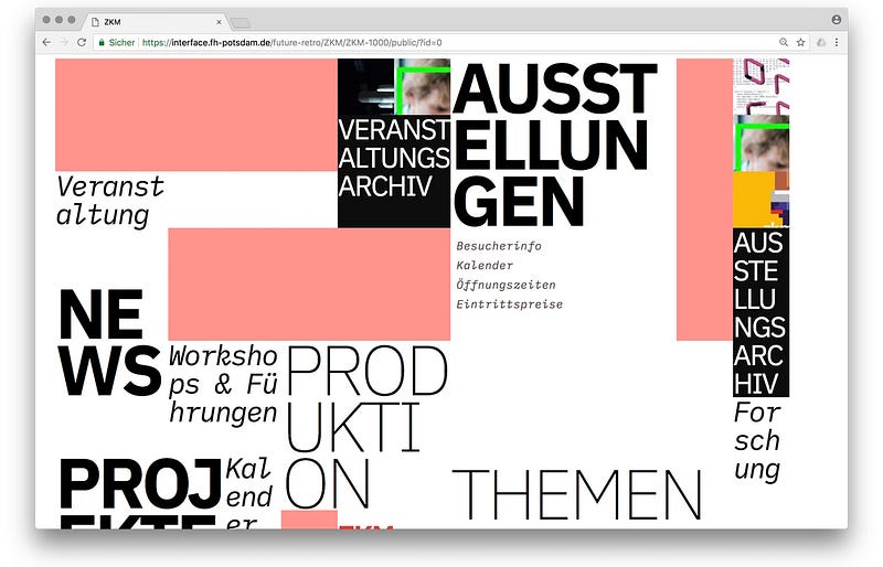
Frederic and Jonas chose the web site of the Zentrum für Kunst und Medien(ZKM) as a starting point for their experiments and explorations. A very fitting choice as the ZKM is one of the most prominent exhibition spaces for media art in Germany but ZKM’s website is fairly conventional. It’s functional but it lacks the avant-garde assertion that is conveyed by artwork in the exhibitions.
Frederic and Jonas’s aim was to design a concept, a visual language, and a technical setup for the ZKM site that represents the museum’s progressive approach. At the core of their concept is a generative design engine: Every time a page loads, a new layout is created.
2. Streem by Daria Thies, Bela Kurek, and Lucas Vogel
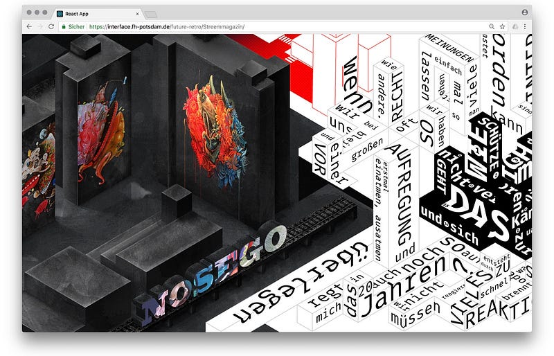
Streem is an art and street magazine. It is both a stage for upcoming artists and a platform for social issues. Streem includes work from illustration, painting, photography, design, writing, and journalism. Daria, Bela, and Lucas combined these different influences and based their designs on a conceptual city structure. For their prototype, they created four different neighborhoods that each represent a section of the magazine. Their approach combines strong illustrative styles with spatial typography in order to create a legible city.
3. Medium by Amelie Kirchmeyer and Fabian Schultz
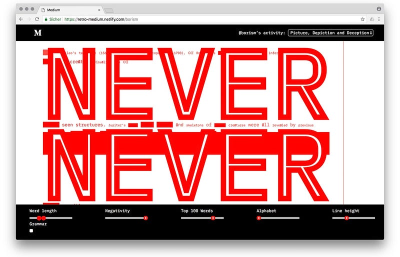
Amelie and Fabian took a very structural approach. Instead of finding an adequate form for a specific story, their aim was to dissolve a web page and break it down to semantic, syntactical, and statistical properties. Their idea was to demonstrate the fluidity and inherent malleability of HTML. They deconstructed Medium posts and created an environment that allows readers to break long blocks of text into experimental typographic space.
4. Hacker News by Fabian Dinklage and Florian Zia
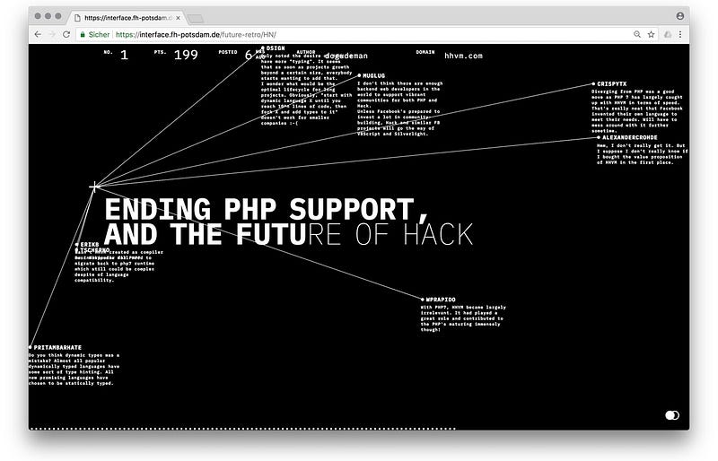
Fabian and Florian turned Hacker Newsinto an interactive visualization. The social media site is a news aggregator, focusing on computer science and information technology. Its design is bare-bones but it has complex functionality for voting and discussions. Fabian and Florian have taken the existing structure and turned it into a typographic space of timelines and networks. The visual presentation is based on the sequence and connections of news and comments. They also connected their design to the API of Hacker News, so you can actually use it to read the site. View the redesign of Hacker News.
David Carson once said, “don’t confuse communication with legibility.” We should apply this advice to the current state of web design. Legibility, usability, responsiveness, and especially accessibility are essential qualities of the modern web. But they should not define and limit its visual repertoire. If you equate stereotypes with usability, you have understood neither visual design nor human-centered design.
I, for one, would like to see more radical, generative, evocative, thoughtful, adequate, content-specific, and intelligent web design. I would like to rediscover the web as a space for design experiments. I would like to be surprised more often. I don’t know what the web will look in another 23 years, but I certainly hope it doesn’t look like the web today.
Source: https://medium.com/s/story/on-the-visual-weariness-of-the-web-8af1c969ce73
Written by
Boris Müller
Professor for Interaction Design at FH Potsdam, co-director of Urban Complexity Lab | http://uclab.fh-potsdam.de | http://esono.com