Tools for conquering the process from Idea -> Design -> Development -> Deployment

Like many people, I have no shortage of ideas for apps that don’t genuinely need to exist. I tend to hold onto those ideas waiting for some imaginary occasion where free time is abundant and I can build all of them with no thought of income or expense. For me, oftentimes the hurdle to completing a side project isn’t knowing how to do something, but finding the motivation and time to bring it to fruition.
That’s why I set a goal to launch a side project in 10 days.
This post isn’t about the advantages of building with a new technology I was unfamiliar with, or 7 things I learned while doing it. Rather, it’s about my process of building a web app quickly, keeping irrelevant ideas from muddying my focus, and my tool belt to make it happen. The end result was Card Surge.
Idea (1 day)
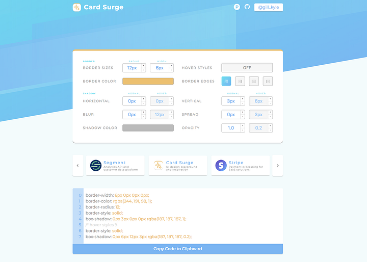
I spend a lot of time designing and building sites, which means I also spend a lot of time poring over well-designed sites from popular brands. I almost inevitably open up the Chrome inspector to examine how styles are applied or elements are laid out, because I want to see what can quantify those designs as good.
Then I find myself building my own site and referring back to those examples. I repeat the process of opening up the inspector, tweaking their styles, adding my own styles, not getting it right, positioning everything absolute which still doesn’t work, and eventually coming up with something reasonable.
Having found other design tools online like Coolors, or Hero Patterns that were valuable to me, I thought I could make something similar to fit my own interest. And so I set out to build a faster way to iterate over card UI.
I dug through existing tools and found that they looked kind of meh. They didn’t make it easy to create a decent shadow (because sliders were often used for inputs that rarely needed to be tweaked more than a number or two), and there was no reference to designs that actually worked. I felt like that was ample validation for my idea.
Design (2 days)
You see cards in layouts everywhere: pricing pages, product pages, lists, and so on. They are a great way of grouping relevant information and also can stand out on the page with a drop shadow or outline. You can refer to some of these examples of how they can vary:

They can have drop shadows, borders on some sides and not others, hover styles, can vary in color, and you can even apply multiple shadows to a single element to create a more exponential gradient in the drop shadow.
I wanted my tool to help designers and developers create cards that looked like those. I figured it should look aesthetically pleasing and use cards itself to help demonstrate what can be done to make them shine ?
I started shaping my ideas in Figma, kept myself from hyperfocusing on unimportant pieces that I could easily do later (like adding logos for brands, adding social icons, and so on) and ended up with this:
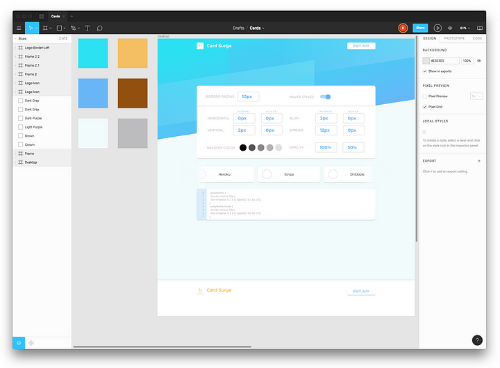
I knew that I wanted several things in my end product:
- An editor to tweak styles that would update the UI live
- A slider that could rotate through nice, fresh examples
- A place to export the code by copying to the clipboard
Those 3 essentials made the design, along with other things like the content below it and how exactly I’d format the footers and headers I’d left unfinished. It wasn’t entirely fleshed out, because I wanted to get started building before I got too carried away unnecessarily changing things that were probably fine as is.
Development (7 days)
I figured that the most time consuming piece would be actually writing the code for the app, and I wasn’t wrong. There always seem to be issues to worry about that don’t become a problem until you’re in the code. Things pop up like proper UX with the form elements, design decisions that weren’t thought out in initial designs, unsupported features by libraries you plan on using, or Twitter demanding your attention at the expense of your project. ?
I bootstrapped the development process with Gatsby because:
- I could build the interface using React
- Converting the site into a PWA would be as simple as adding a couple lines to a config file (see this tweet)
- Hosting would be a breeze with just static files to deploy
- I could skip a lot of the initial boilerplate and start building the fun pieces right way
- Gatsby is just freaking cool ?
I started from the gatsby-default-starter and built much of the functionality without problems. I implemented 3rd party libraries like react-color and react-slick to remove the need to build complicated slider and color components.
During this time, I decided how to lay out content on other parts of the page that my designs hadn’t included, and built those parts too. I took advantage of newer trends like CSS Grid that made responsive layouts much easier.
At one point, I realized that the diagonal divider I’d included in the layout of my app could be abstracted out and turned into an npm package other people could use. After building a simple component and publishing the package on npm, I realized that I was way off course from my original goals for finishing my project. It would take too much time, so I abandoned that venture (after appending it to my aforementioned list of unnecessary apps and projects to be completed at a later date, that is).
I used a GitHub project to keep track of some of the little things I wanted to get done that were lower priority, and eventually took some measures to add in Gatsby plugins for Google Analytics, some metadata, and included icons for browsers, mobile devices, and the PWA manifest configurations.
Deploy (~45 minutes)
…and launch!
Once I got to a point where my app worked and functioned as I’d designed and envisioned, I thought it still wasn’t good enough. I imagined a portal where users could authenticate, save, and share styles they’d made, and then use the app as a reference to return to. I came to the conclusion that that wasn’t my original intent, and decided to just wrap up what I had actually done. I could build on top of it if I had the motivation later or found that it was something people would actually use.
Getting past those inhibitions of uncertainty throughout were easy since I had a goal in my sights.
I finally realized that I could look at my hard work and appreciate a genuinely cool thing I’d made:
Being more or less complete, deploying it was next. Deployment was a really simple process. I didn’t really want to dump money into a domain on a side project I might not care for much in a year or two. So I took advantage of how Surge hosts your sites in the free tier and named it card surge, so all I needed to do was snag the card subdomain and I had a free branded domain at card.surge.sh ?. I ran gatsby build and then surge, and my code was online and distributed across a CDN with automatic SSL.
I also love Netlify too much to not use it, so I pointed my GitHub repo at a project on Netlify to automatically build any pull requests or commits to Master (which came in handy just a couple hours after launching when the first pull request came in).
Without a need for a backend, my site was up and I hadn’t spent a cent.
I took some screenshots and recordings using Kap, wrote up a description, and posted Card Surge on Product Hunt.
Looking back
Working fast and pushing towards a completion date (that I had looming on the calendar) was really rewarding. I had to simplify problems to what mattered and only address concerns that would actually interfere with finishing and launching by my end date.
If I find another project I realistically think I can complete in just a few weeks, I’ll definitely do another sprint like this.
Overcome whatever reservations you have to wrap up that side project you’ve been waiting to finish — you won’t regret it!
Thanks for Reading!
If you have questions about how I did something, why I did something, or what I did horribly wrong, I’m happy to hear from you here in the comments, on Twitter, or via email.
If you found what you read interesting or helpful, feel welcome to leave a clap or two, subscribe for future updates, or retweet/share this tweet: ?

Kyle Gill
Developer | Designer

freeCodeCamp.org
Stories worth reading about programming and technology from our open source community.
SOURCE: https://medium.freecodecamp.org/launching-a-side-project-in-10-days-615df3b0e808