When a user installs the Grammarly extension, they expect it to work seamlessly. It shouldn’t matter if they’re typing in Gmail, if they’re posting on Facebook, or if they’re composing a comment on a Reddit thread. Grammarly should feel like it’s built into whatever website it’s being used on.
But there’s a whole lot of websites. According to this statistic, there are about two billion websites online as of today. How do we know that Grammarly works great on every website unless we test all of them? And how do we know that, once we do get Grammarly working on a website, the website won’t suddenly change, undoing all our hard work?
Every website is different, so a one-size-fits-all solution is infeasible. Some sites use plain <textarea /> or <div contenteditable=”true” /> fields, some use one of the popular open-source rich text editors like Draft.js or Quill.js, some even build their own proprietary text editing engines. And every website has its own unique layout and style.
The Old Way
The biggest challenge in improving the compatibility of the Grammarly extension has always been rendering our signature underlines. Not only is it the hardest part to implement, but it’s also the core functionality. There’s no public API for native browser underlines, which are used by the built-in spell checker. So, we have to implement our own. Consider this simple contenteditable text field:

The source HTML is straightforward:
<div contenteditable=”true”>
  That its when I decided getting on the bike.
</div>
When you run Grammarly in that field, it will find a couple of mistakes in the text and underline them. Here’s the result:

Looks nice! But what’s happening in the DOM?
<div contenteditable=”true” data-gramm_id=”d1a428f0–40fd-1fca-a617-acf5aeeaa147" data-gramm=”true” spellcheck=”false” data-gramm_editor=”true”>That <g class=”gr_ gr_4 gr-alert gr_spell gr_inline_cards gr_run_anim ContextualSpelling ins-del” id=”4" data-gr-id=”4">its</g> when I decided <g class=”gr_ gr_3 gr-alert gr_gramm gr_inline_cards gr_run_anim Grammar multiReplace” id=”3" data-gr-id=”3">getting</g> on the bike.</div><grammarly-btn><div class=”_1BN1N-textarea_btn _Kzi1t-show _1v-Lt-errors _3MyEI-has_errors _MoE_1-anonymous _2DJZN-field_hovered” style=”z-index: 2; transform: translate(359px, 89px);”><div class=”_1HjH7-transform_wrap”><div title=”Found 2 errors in text” class=”_3qe6h-status”>2</div></div></div></grammarly-btn>
Not as nice anymore, even though it gets the job done.
The current Grammarly extension first figures out what part of the text it wants to underline, then wraps those text fragments in a node whose style is set to show the underline. If the text is changed or moved, the underlines will move. If the text is deleted, so are the underlines. If the text field, its container, or the entire window is scrolled, both the text and the underlines will move.
This seems to work well, and it does in many cases, but there are several issues with this approach. First, by mixing text and underlines, we pollute the text field content. The text field is supposed to only contain actual text, and most of the code running on the web expects that to be the case — and rightly so. If Grammarly doesn’t remove the extraneous underline nodes before the website’s code can notice them, it can corrupt the user’s text, crash the website’s code, or make an email include underlines when it gets sent. Yikes. And most of the time, there’s no way to know when precisely the underlines should be removed.
Another, perhaps even bigger issue with this approach is that websites don’t like it when somebody tries to change their DOM. The code running on the site expects that the DOM it created will not be changed by any other code. If that assumption is broken, bad things can happen. So both website and text editor developers started to look for ways to disable Grammarly, including such popular editors as ProseMirror, Quill.js, Draft.js, and many others.
A New Direction
If the Grammarly extension doesn’t work properly with rich text editors and UI frameworks, people are going to uninstall it. A lot of websites use rich text fields (formatting, images, mentions, etc.), and probably even more use a UI framework like Ember. If Grammarly doesn’t work in these cases, it will work on a smaller and smaller fraction of the web as time goes on.
It was time to change how the Grammarly extension worked. We needed to stop adding underline nodes inside of text fields and be very careful with any DOM modifications. If we were going to make any change to the DOM at all, we needed to make sure it wouldn’t be noticed by the code running on the page.
But we still needed a way to display underlines.
Prototype
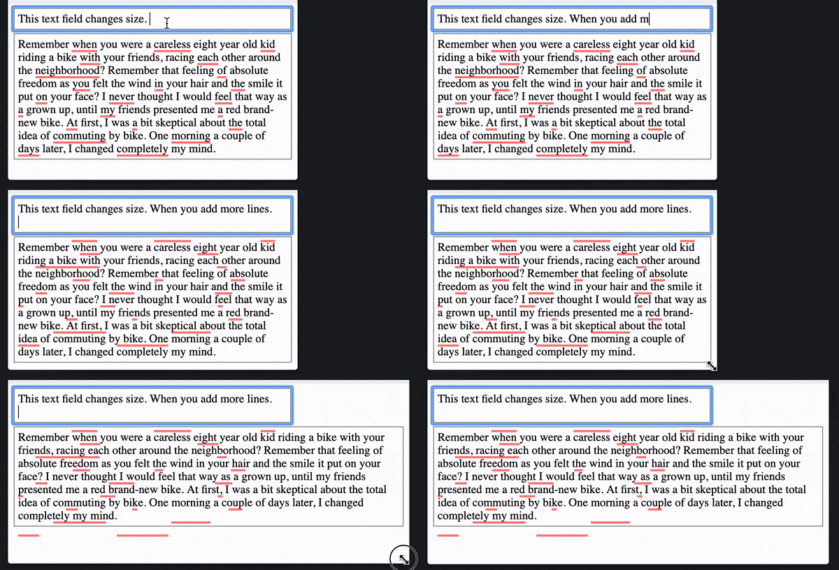
It turns out it’s not very hard to create a simple proof of concept. Suppose we want to render the underline elements outside of the text field and make no changes to the field itself. This means the underlines will have to go on top of it. For this to happen, we need to know the exact position where each underline should land. This can be achieved with the Range.getClientRects()API. This method allows you to get a list of rectangles that a certain range of text takes up on the screen.
Here’s an early prototype. It’s under 200 LoC, including all of the boilerplate. And it yields the following result:

In the DOM, the text field is clean:
<body>
  <div contenteditable=”true” spellcheck=”false”>
    That its when I decided getting on the bike.
  </div>
<!-- boilerplate html omitted -->
  <highlights>
    <div>
      <div style=”position: fixed; top: 31px; left: 47px; width: 15px; height: 3px; background: rgba(255, 0, 0, 0.5);” />
      <div style=”position: fixed; top: 31px; left: 168px; width: 45px; height: 3px; background: rgba(255, 0, 0, 0.5);” />
    </div>
  </highlights>
</body>
Note how the underline elements container is the very last element of the document body. Each underline is positioned to be exactly on top of a corresponding text fragment.
Tracking text field position
If we were to add such a functionality to one of our own web pages, not counting performance optimizations and positioning improvements, it’s a good start. But if we want to add underlines to somebody else’s text field, it’s a different story.
It is clear that underlines should be updated when the text is changed. But what if the text stays the same, but the layout of the text field (or elements around it) is changed?

Since we want to make the Grammarly experience look seamless and “native,” it is extremely important that our UI fits perfectly on top of what’s already on the page. There’s little room for error, especially with the underlines — they have to be pixel-perfect and look like they are one with the text.
To achieve that, we need to know, reliably and precisely, the text field’s size, position, and style — at all times. It’s easy enough to query for these values: the Element.getBoundingClientRect() and Window.getComputedStyle() APIs provide just that. The challenge here is that there is no API or event to know when these values change.
We can try to substitute for the absence of events with heuristics. Think about it: what has to happen on a page to change the position, size, or style of a text field? Here’s what we came up with:
-
- Text field content change: depending on what’s in the text field, it can have different size and even position in some cases.
-
- Window scroll: can change client position of an element
-
- Window resize: can change the layout of the entire page, including the target element
-
- Container scroll: if an element is inside of a scrollable container, its position can change when scrolling happens. Same thing for all scrollable ancestors of the element.
-
- Text field scroll (since we need to track the position of the text itself)
-
- Style and class attribute change
-
- Other element attributes (e.g.
cols,rows,wrapfor<textarea />)
- Other element attributes (e.g.
-
- All of the above, but for ancestors and all other elements on the page
-
- Addition and removal of elements elsewhere on the page (a change to some distant element can cascade into layout change for our text field)
- Global style sheet changes: insertion or removal of CSS rules and style sheets
For each of the above, except global style sheet changes, there’s an event you can subscribe to. The event for the DOM changes though, the MutationObserver API, is better used sparingly. If used improperly, it has the potential to degrade the performance of the entire page. So we cannot just blindly put a MutationObserver on the document element to get a notification for every change on the page.
What else can we do? There is this interesting IntersectionObserver API, which can notify you when a value of the visible area of an element changes. Even better, it will also give you the client rectangle of the element in the callback, which is exactly what we need. Although the IntersectionObserverisn’t really intended for such usage, with some hacking we can get it to do what we need in a lot of cases.
This gives us a good starting point into figuring out when a text field’s size, position, or style changes, but it still doesn’t cover all the cases. For example, an adjacent element changing its size might change the text field’s position. If we’re desperate, we can try to cover cases like this with another rather weak heuristic:
- Window key and mouse events: A lot of times, changes on the page happen as a reaction to some user input.
Subscribing to these events will improve our case coverage, but will still not give us 100% coverage. With that in mind, and also with the fact that Safari doesn’t support IntersectionObserver at all, this leaves us with one last option:
- Polling: Regardless of any other signals, we’re going to check up on the text field every second or so to see if anything has changed.
While this is not going to get us pixel-perfect alignment all the time, it will provide a necessary fallback option to ensure that underlines will get aligned eventually.
Performance
Ok, since we’re already polling, why don’t we just poll for text fields’ position and styles with the highest possible frequency? Surely if we poll at the browser’s rendering limit of 60 times per second we’ll always have up to date values for every possible frame? And it will be a lot easier to implement than a bunch of heuristics and hacks. Why didn’t we think of it in the first place? Well, I think you already know where I’m going with this.
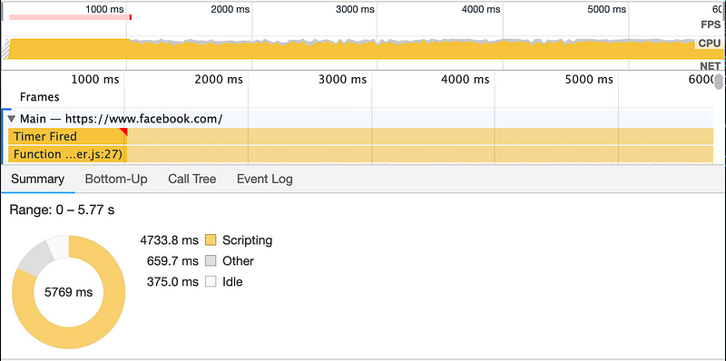
As mentioned above, getting an element’s position, size and style involves making calls to getBoundingClientRect() and getComputedStyle(). When you call these methods, the browser might have to force a synchronous layout/reflow. It used to be, and probably still is, a common source of performance issues on highly dynamic web pages. And we really can’t afford to create even more performance issues with our extension. If you try to call getBoundingClientRect of a text field element 60 times per second on a popular site like facebook.com, it can easily consume over 90% of CPU on average hardware.

getBoundingClinetRect() and getComputedStyles() on an element 60 times per second.That’s not all, though. We’ve used Range.getClientRects() to get coordinates for our underlines — it’s also on the list of calls that cause layout/reflow. And unfortunately, we have to use it a lot: once for each underline fragment of the text every time the text content, text field’s position, size, or style changes. So if there are a lot of underlined words, it can result in a significant performance drop. It is especially noticeable with scroll events: users expect scrolling to be smooth. But if we force layout with these calls in the scroll event handler, there’s no way it will be smooth.
One way we can reduce the number of getClientRects() calls is to position our underlines relative to the text field. We are already querying for the text field’s position to check whether it has changed since last time, so we can use that value to:
-
- translate client coordinates that we get from
Range.getClientRects()into offset coordinates relative to the text field element
- translate client coordinates that we get from
- position the underline elements’ container to be directly on top of the text field
A caveat here is that since we now need the text field’s client position in order to translate the underline client position, we have to query for both values at the same time. This means that for each batch of Range.getClientRects()calls we need to make at least one getBoundingClientRect() call on the text field element. This is because the position of the text field might have changed since we queried for it last time, and if we use an outdated value we are going to get incorrect coordinates for the underlines.
With this optimization, we will only need to recalculate underline coordinates either when the text content or text field size changes. Scrolling and position changes will only require us to update the underline container element.
Another optimization we could do is to be smart about which underlines even need to have their coordinates calculated. For example, if a part of the text is currently not in the viewport, there’s no reason to update underlines that land inside of it.
My last point on this topic is about profiling and keeping an eye on performance. If you typically work on a high-end computer (like many developers do), you might not even notice any performance issues with your software. The problems might surface only when your code is run by an average user who’s running average hardware. But if we’re only detecting performance issues when a user experiences them, then it’s too late. Luckily, modern browsers come with a lot of powerful performance profiling tools, including CPU throttling. I found it to be very helpful, especially during early development, when many architectural decisions are made.

Any more challenges?
There are always more challenges! So far, we’ve never really considered complex layouts in this article: pop-up dialogs, sticky headers, bottom-right-corner chat windows, etc. Our initial implementation assumed that the text field is always visible in its entirety, but that’s often not the case. It can be clipped if it’s overflowing in a container (which itself can also be overflowing, and so on, recursively). It can also be covered by an element with position: sticky style. The initial implementation didn’t consider any of that.

The good news here is that we can solve it, but in many cases it will require us to put the underlines container closer to the text field element in the DOM. That’s a risk though, as that way we’re more likely to affect the code running on the page.
In Conclusion
The Grammarly extension only works if it feels like it’s native. Grammarly should be compatible with every website, and every feature on that website. If such an extension begins to feel like more of a burden than a help, people will uninstall it.
Building an extension like this involves many challenges, some of which we hopefully can explore in future posts. We haven’t found a perfect solution so far, but with each improvement we make, we’re bringing better writing one step closer to millions of people — and that’s the ultimate goal.
Source: https://medium.com/engineering-at-grammarly/building-the-grammarly-extension-718497e3760d
Written by
Engineering at Grammarly
Grammarly’s AI-powered writing assistant helps 15 million people write better every day. Here’s what our team has learned about building complex AI-based products that scale.
