An early and essential lesson for designers is the value of constraints. I have come to believe that before any other creative decision, you must draw boundaries around the problem you are trying to solve. Then, we know our solution must lie somewhere within that space.
That’s the beauty of constraints — when correctly applied, they make creative work better.
Even if you’re a solo artist toiling away in your studio, with no one to answer to but yourself, self-imposed constraints will make your work better. Limit your palette, your subject matter, your mark-making, &c. and see how it brings your creativity into focus.
Unlike the solo artists, designers must work within constraints that are almost always set by others. We face technical limitations, brand limitations, limitations of tone and voice… The list goes on. We must arrange these external constraints, sometimes adding our own creative boundaries, and find the best solution hiding somewhere within.
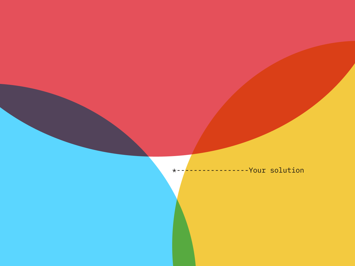
When this patchwork of overlapping limitations forms a coherent, logical boundary to the problem, we are working within constructiveconstraints. Our job then is simple (though not often easier).
The opposite is also true. Designers will face illogical, competing, overwhelming limitations that cloak the best solution. These destructiveconstraints force us to make poor compromises; they leave halfhearted designs and dissatisfied clients.
I’ve found that sorting out destructive constraints from constructive constraints can be a real design superpower. Here are three common forms of destructive constraints, and how to remove them.
Past assumptions and prior compromises
Eons ago, (roughly six months in software development) someone cut a corner. They didn’t do the research. Maybe they took a customer suggestion on faith. They probably had the best of intentions, and they couldn’t have possibly foreseen the consequences. Nonetheless, here we are — lying in the bed of their making. Oh, and that person left the team four months ago.
“This is the way we’ve always done it,” might be the most obvious refrain signaling this sort of destructive constraint. In this case, you’re arguing for a bit of culture change. Asking the “5 why’s” actually helps a lot in this case. A positive, productive tone is absolutely crucial. There’s a critical difference between a confrontational “why” and a genuinely curious “why.” Don’t try to challenge the constraint, so much as discover more about it and uncover the real objective.
Rarely, however, is the sign of this bad constraint so obvious.
More often you’ll hear that “customers are accustomed to” or even “prefer” this choice of color/layout/whatever. Solution? Offer to (re)validate with customers.
My personal favorite/most-infuriating version goes something like this: “We sold them this CMS framework because we’re invested in it. But, it doesn’t really support custom styling or JavaScript. I don’t think we can do a treemap. Maybe just a pie or bar chart?”
Arguing and bargaining when the business tail wags the design dog is pretty fraught. You’ll rarely win, I’m afraid. Be prepared to ask for a couple days to hack the problem. Then, implement it yourself and hand off the code snippets. (This is why I recommend digital designers pick up some coding skills.)
Equal and opposite constraints
Opposing constraints, when balanced and without overlap, can provide a constructive solution boundary. Opposing constraints that afford no middle ground are impossible to meet.
I recently was asked to help a feature team update the color palette for an interactive histogram. The graph was a large and complex component in an equally complex workflow resulting in an exhaustive list of constraints. Among these constraints, the team was relying on a red/green color palette to signify “passing” vs. “failing” in the chart, and data labels inside the histogram bars.
So, I needed to provide a segmented gradient of red (plus a green) that fit the following constraints:
- Proper WCAG text contrast for (currently white) labels
- Divides into several distinct degrees of failure (i.e. one shade clearly distinguished from the next, meaning a broad palette)
- Meet accessibility requirements for color-blindness
- Aesthetically pleasing
We laid out all the constraints together, and I then argued that something would have to give. To demonstrate, I provided a few red palettes that nearly met all of the requirements. In some way or another, each failed to meet one or more requirements. It was effectively impossible to find this palette.
The solution? Ask the team what’s most important. We stack ranked the priorities. We also examined each requirement to see if it could scale down (e.g. can we use fewer degrees of failure?).
Once I knew what the team valued most out of this design update (aesthetic improvement), what they were willing to compromise on (degrees of failure), and finally what they were willing to jettison completely (white data labels) we quickly arrived at a solution.
Outsize problem meets a downscoped solution
Creative work must always live within the pedestrian constraints of time and budget. There is never enough of either to create the ideal solution. Perfect is the enemy of good and all that. Instead of a site update, a single page or global component update is approved. Some piecemeal compromise is accepted. That’s business.
The danger is that the problems warranting a full order didn’t disappear and have a habit of sneaking in to the smaller iteration. There’s now an expectation, to varying degrees of subtlety, that major outcomes will follow a minor enhancement.
Designers working on a single feature face the same challenges of problem/solution fit as business owners in the market.
A favorite drawing teacher of mine would often ask, “What are you asking this mark to do? Is it describing shadow? Form? Color? Don’t ask it to do too much.”
We should ask the same question in any design challenge. “What are you asking this to do? Don’t expect too much.”
The damage to the work is often measured in lost opportunity. You trade what might be a small, tactical, meaningful change for vaporware (or at least an underwhelmed client).
Cases in point — More than once (a municipal government, a federal agency, and a direct sales company) I’ve tackled projects that began with promises of large-ranging organizational improvement that ended with… a primary research report and a one-day workshop. This was good work, but most likely it ended up on a shelf somewhere. Our recommendations weren’t tactical enough to begin implementation the next day. I can’t help wondering if we had scoped smaller, whether we might have seen more recommendations realized.
I can be difficult to escape the temptation of this destructive constraint. If you’re freelancing, set appropriate expectations early. Don’t promise the moon just to make a sale. If you’re in an agency, having seasoned designers informing the sales process is absolutely critical. If you’re working directly for a company, be involved in feature proposals. Consider the key metrics. Never be afraid to ask, “Who is this for, why do they need it, and how will we know it worked?” You should ask early, because soon enough you’ll be expected to give the answer.
Constraints are the foundation of any creative endeavor. You must understand and work with them. Learn to love your constructive constraints, and leave the rest behind.
Source: https://uxdesign.cc/constructive-vs-destructive-constraints-8f6a63d88791
Written by
Jeffrey Harris
Medium member since Feb 2019
Senior Designer at Microsoft. Thoughts are my own, especially the bad ones.