Comparing Airbnb, VRBO and Booking.com
A well designed site should be easy to use, with clear and simple cues to guide the eye towards whats possible. The basic usability principles, commonly reffered to as usability heuristics, help ensure a product’s behavior is predictable, expected, usable and therefore delightful to use. When comparing three of the most popular booking sites, Airbnb, VRBO and Booking.com, we’re going to see how good design creates meaningful experiences for users while bad design can cause pain and frustration, that as designers we should always aim to avoid.
Even though this article is by no means a way to bash on Booking.com, I am merely going to point out possible pain points users experience when using Booking.com, compared to Airbnb and VRBO.

AIRBNB
Simplicity meets functionality
Airbnb’s website exceeds expectations when it comes to meeting the demands of the users, without ever letting them know they need it. The easy to navigate structure of the site is primarily acheieved by the use of high resolution images, layout, clearly defined font size and weights, modularity, proximity and consistency.
Let’s go in to a few details and explore further why Airbnb works so well..
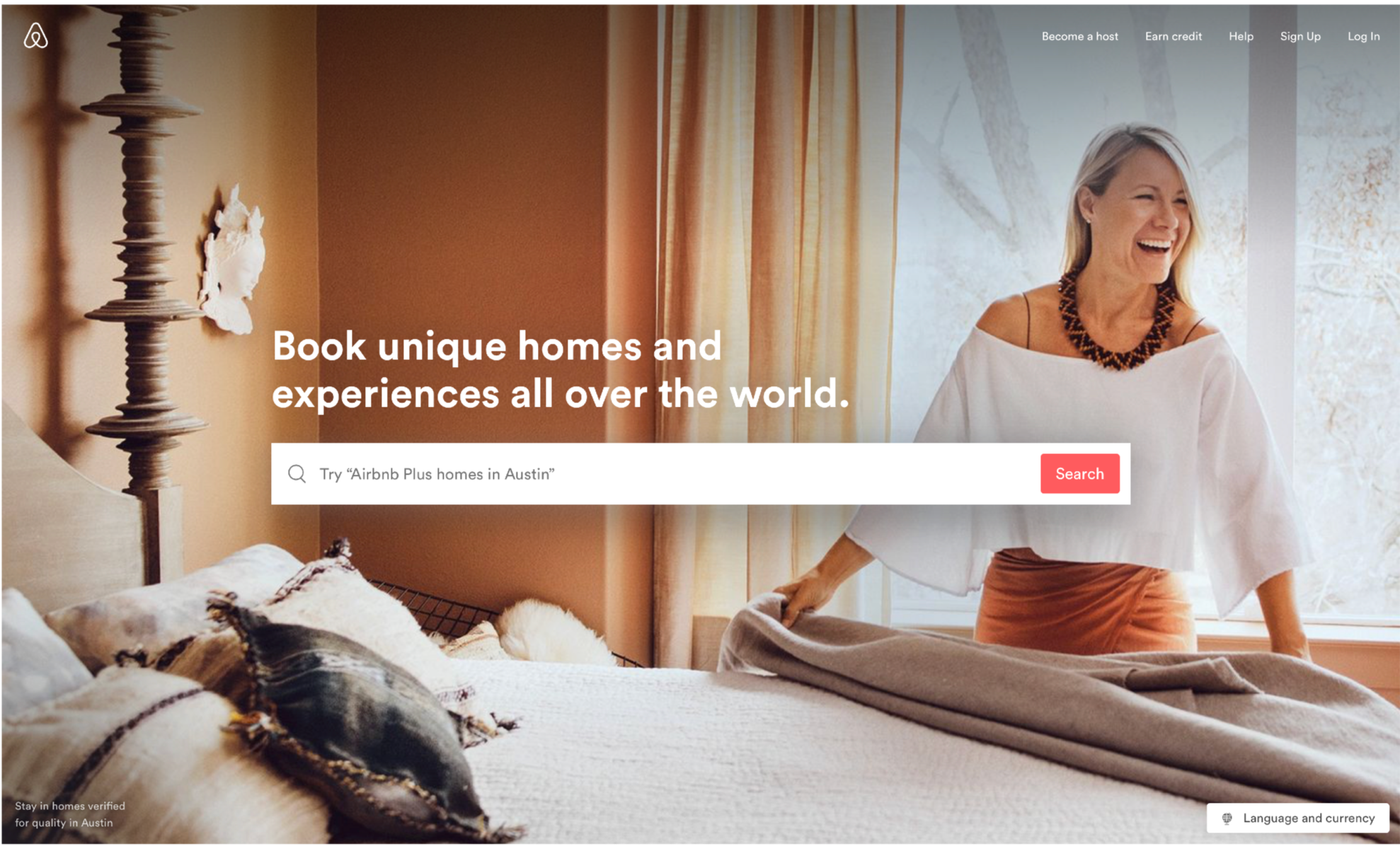
The overall feel of the site directly alings with Gestalt principals, in that, when looked as a whole, there is rhythm, harmony and balance, all presented in a structred way. While giving an aesthetically pleasing effect, this creates the sense of wonder and therefore keeps our attention to progress further. The call to action is clear without an overwhelming amount of information at first, to guide the user towards their first step in booking their next adventure. This clear and uncluttered layout keeps the user engaged without creating any distractions. It’s important to note there is nothing preventing us here from experiencing the site with ease.
Creates the sense of wonder and therefore keeps our attention to progress further.
The home screen has one main call to action, the search bar. -Inside the search bar is a search suggestion showing that linking two features is possible. (an “airbnb plus” at the destination “austin”) The uncluttered nature of the simple search bar helps remove pain points from the user by not needing them to input a lot of data to progress further and instead focus on finding a place they will love. On the upper right hand corner, the proximity between the clickable items are grouped closely together, creating a simple but effective toolbar into what other actions are possible. The prioritaztion is given to becoming a host by placing it as the first item on the toolbar, as perhaps this is second main function of the site, airbnb wants us to adopt: Allowing users to host their homes, and earn income by using airbnb.
If we choose to scroll down on the first page, we are greeted by vivid images and beautiful photos of homes and destinations we can expect to book. This creates a pleasing experience as the images are inviting, colorful and lively. Airbnb clearly puts a lot of emphasis on the quality of these images so that our desire to book an experience is heightened. They believe in this so much, airbnb will send a photographer to take pictures of your home for you so you can get increased traffic to your listing.
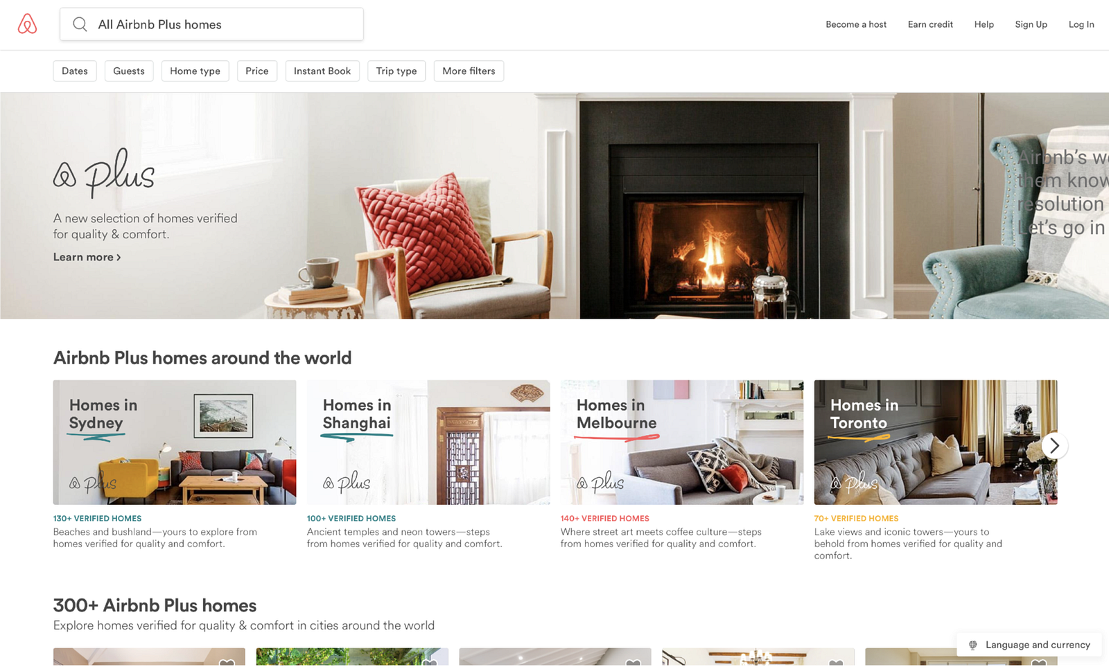
Even though there are quite a few elements on the page, the use of white space combined with the modular boxes give the layout clear visual hierarchy and alignmnent that guide the eye from one section to another section of the page while recognizing proximity and groupings of these elements. Within each box, the header paragraphs are aligned left, using the same font and weight grouping the boxes together into one consistent modular design that is easy to follow and understand. I especially like the touch of hand drawn like color adding splash and vibrance without cluttering the screen.

After we select a destination we are presented with only the relevant information at that given point. This is one of the main strengths where Airbnb excels over using a site like Booking.com. Only the information I would want to see at any given point is presented, and I feel at ease. Once our destination is entered, our search results are displayed in large, scrollable picturtes and they pack a lot of useful info at quick glance, organized in a consistent and modular UI language. To the right of the screen we see the location of the displayed search results on the map, allowing us to further search by zooming in to a specific area of the map.
Only the information I would want to see at any given point is presented, and I feel at ease.
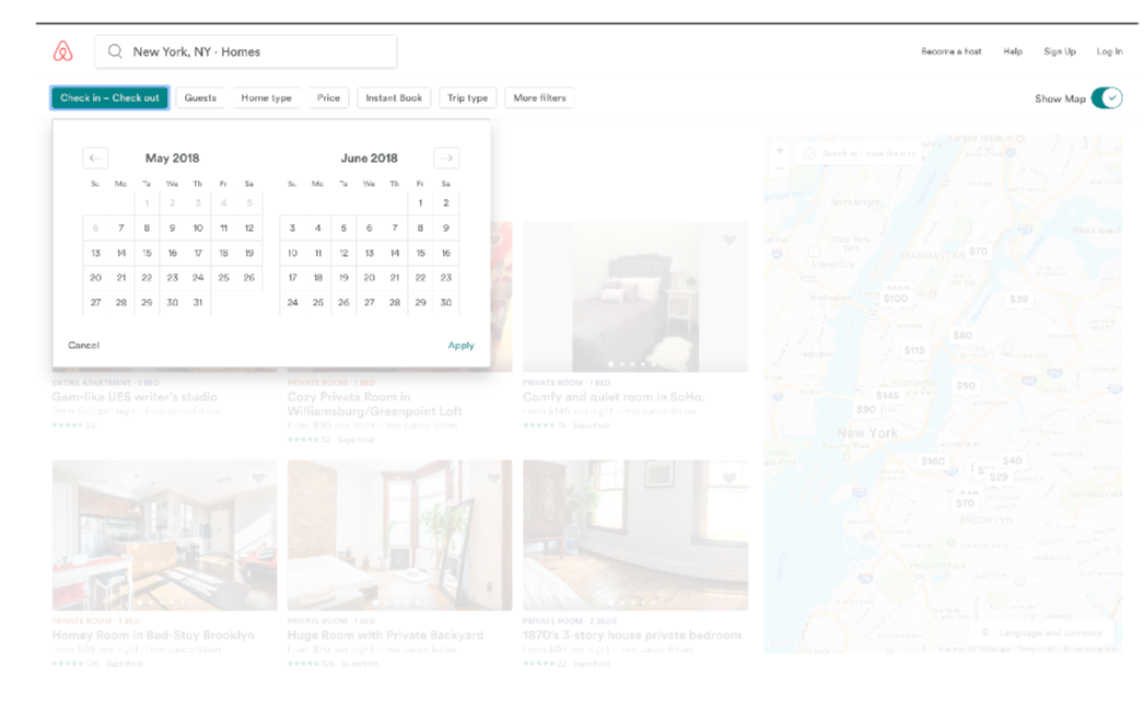
Customization and filtering of results is made possible by using elevated buttons in a toolbar setting closely grouped together. When clicked, the use of layers and transparancy achieves simplicity and an uncluttered clean look. The color selection of selected items are consistent, leading way to easier discovery.
When we get to the booking page, we can clearly see the call to action, the request to book button with the same color as the airbnb logo. Details about the selection are laid out using icons in close proximity with clear descriptions next to them, making them consistent, helpful and easy to notice. More information is presented to the user using dropdown links, and action items are clearly marked using selection colors on text. The user knows what to do and has a great sense of control, since they know what their possible actions are.
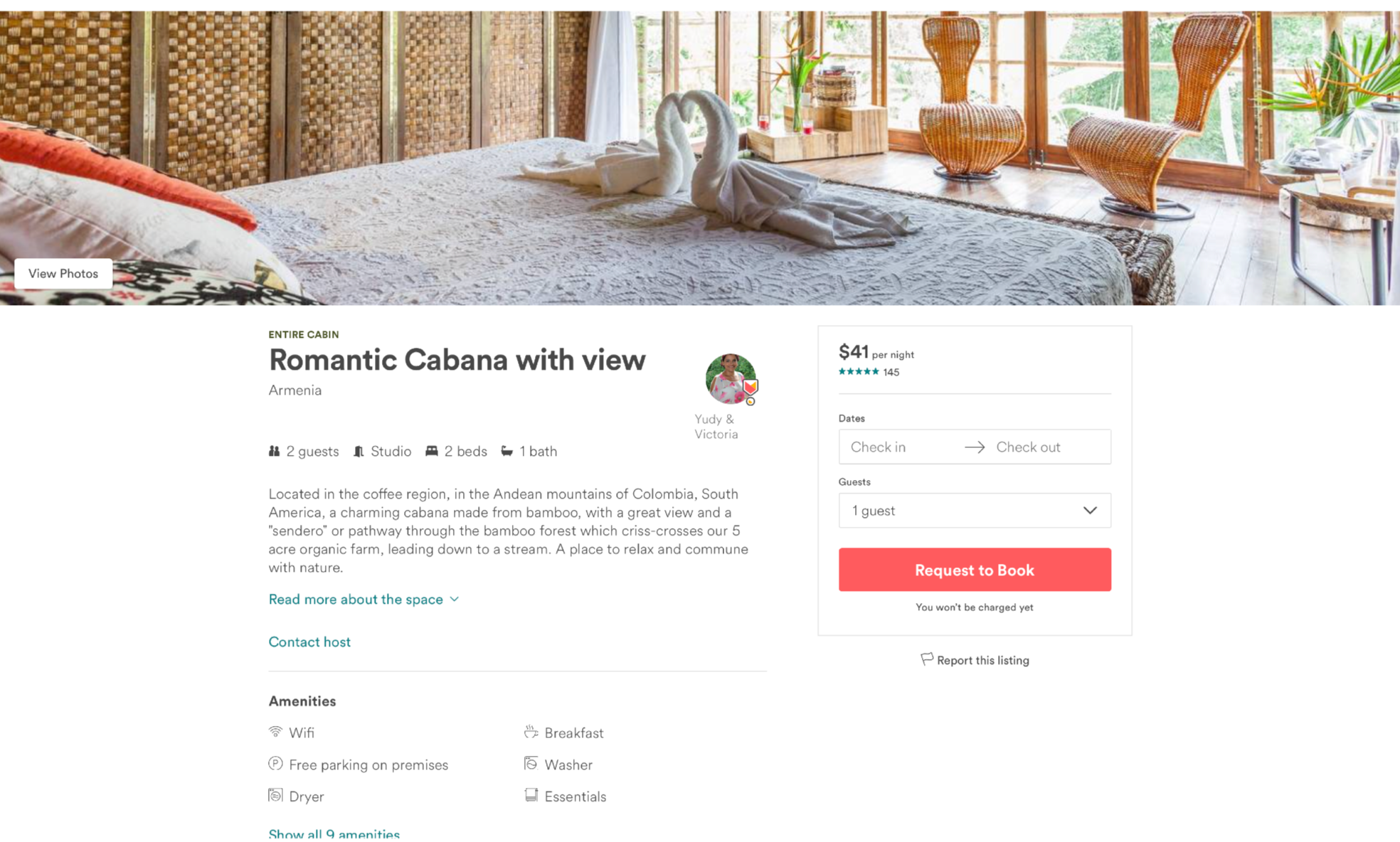
A complementary color palette is at play throughout the site and it works really well in how it establishes its action items on each page. The overall brand consistency is acheived and a sense of trust is established by grouping elements together in a conistent design language that is easy to understand and remember throughout each step.
Well done Airbnb!
Now let’s take a look at another well made site, VRBO.
VRBO
So fresh and so clean
VRBO.com is the second largest personal home booking website after Airbnb, and it uses a similar design language to its predecessor, allowing users to find what they want or what they don’t know they want, with ease and flexibility.
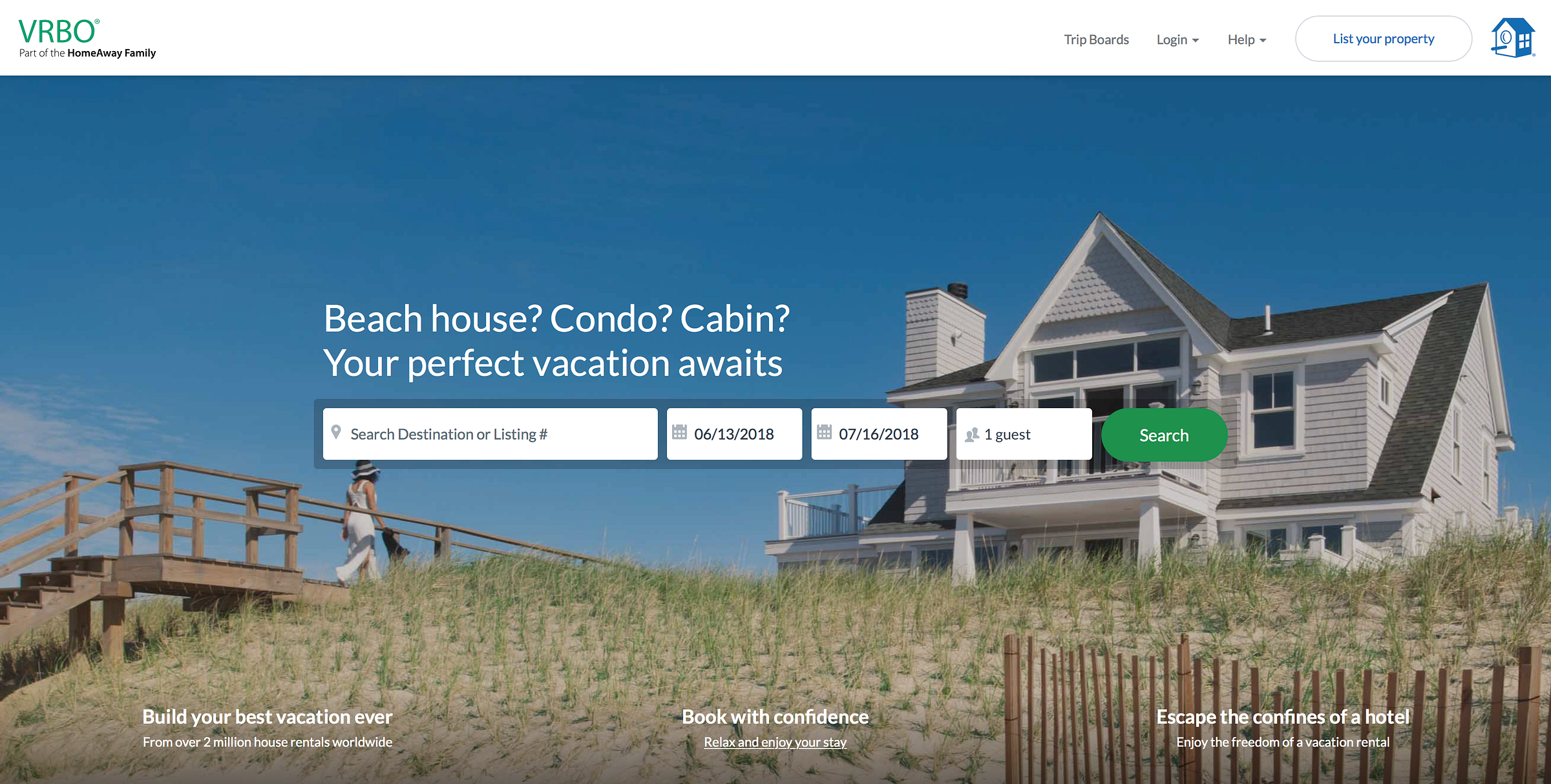
The landing page for VRBO, has a clear call to action, the search bar. The clean layout and visual hieraerchy allows the eye to be guided naturally to realize whats happening here at a quick glance. The search bar offers us to search by destination or a vague listing#. The vagueness looking at the listing# option sounds like a feature for advanced returning users, although I’m not sure that adds so much value to the interface. Instead, a search function that mimcks the headline would be useful and would clearly add more value to the site, like: “search destination or things like: beach house in Montauk, NY.”
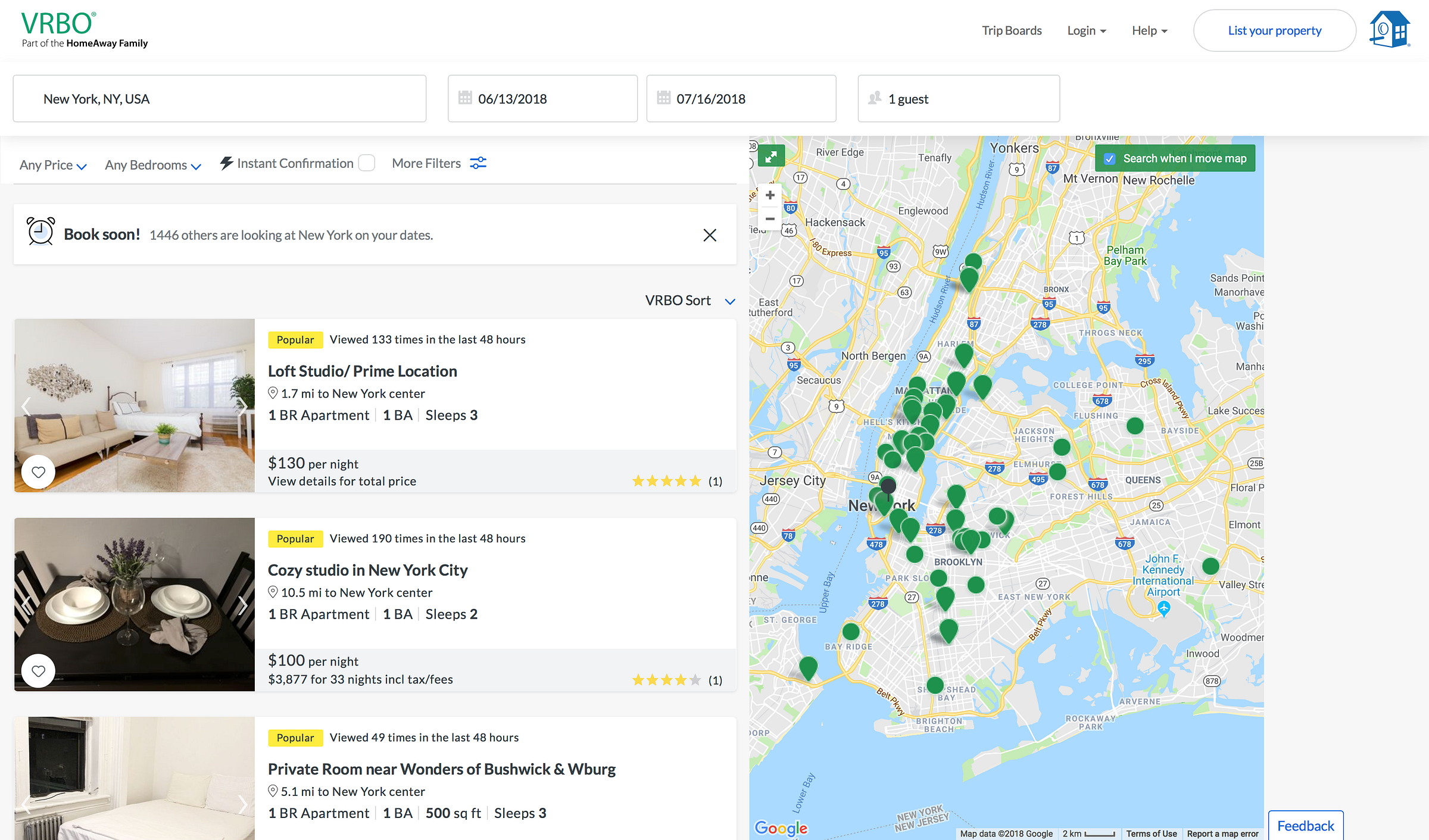
When we input a destination only the relevant results are displayed without any clutter to the page. We see listings organized in modular boxes aligned left, with large pictures and details surrounding the listing to find what we want, quickly.
To the right, a map shows where the listings are located and as we zoom or change the location on the map, the listings are updated, giving us furhter control and flexibility. The usability features of the site allows for easier discovery and frustration free navigation.
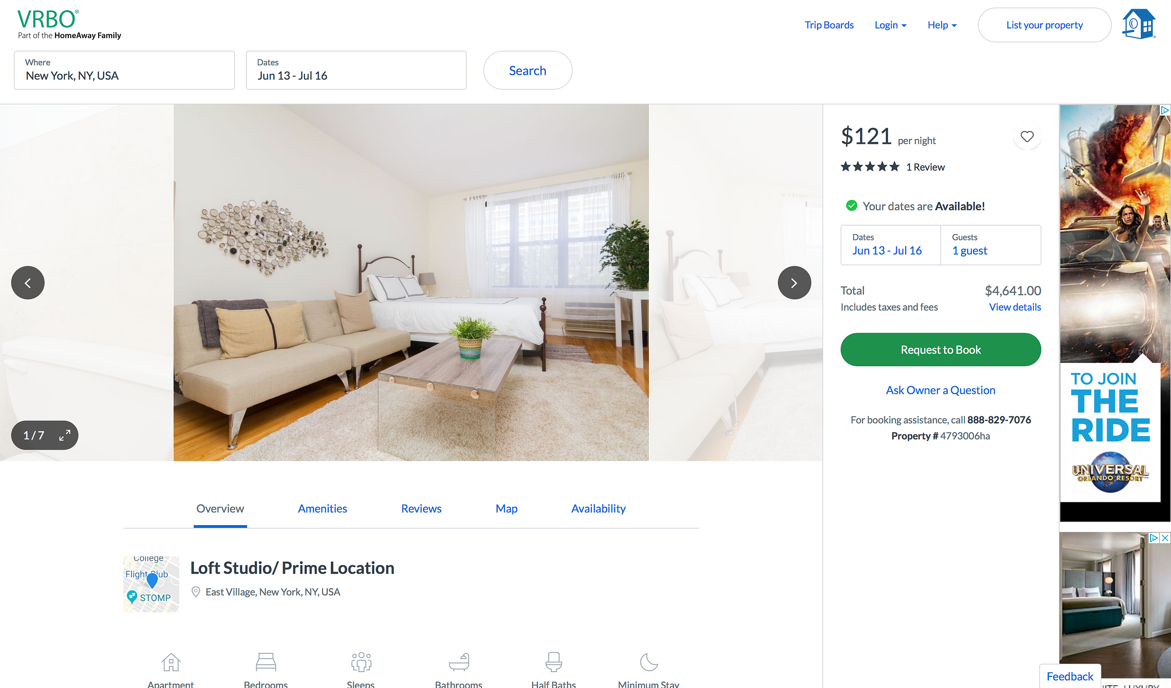
When we get to the booking page the clear call to action and details are displayed to the right. The large request to book button is clearly displayed, and unobtrusive as there are no other main action items visible at first glance. The use of white space gives the website an overall clean and minimal style all while being packed full of features and functionality within each page.
As we scroll down we see more details about our chosen listing. The use of icons are a nice addition here to guide the eye, and again quickly understand the items we’re looking at as well as giving a pleasing effect, and making the site less text heavy.
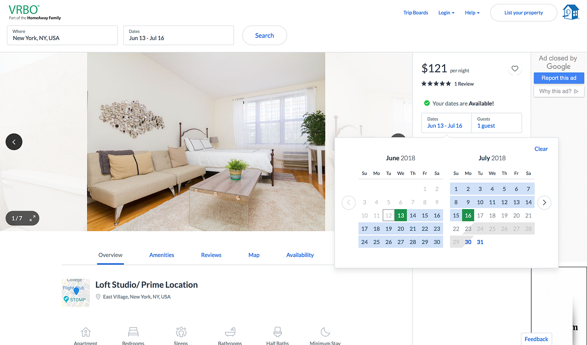
A lot of the functionality within the site is creatively hidden out of sight, allowing the pages to be less cluttered and awkward. If we want to change dates, we just click on the date and pop up tabs appear allowing us to do what we want easily and effectively. This makes the usability of the site almost second nature for first timers.
VRBO manages a comlex task of finding a home easy with its simple and guided layout. Within three clicks I was able to get to the booking page and find my way around without feeling lost.
Booking.com
Great selection of hotels, if you can find it.
Booking.com is one of the largest sites to primarily book hotels, and after that to book other travel services. The site uses similar design principles at play as Airbnb and VRBO, but when compared together we can see that the overall feel is more cluttered and doesn’t seem to increase the overall expertience for its users.
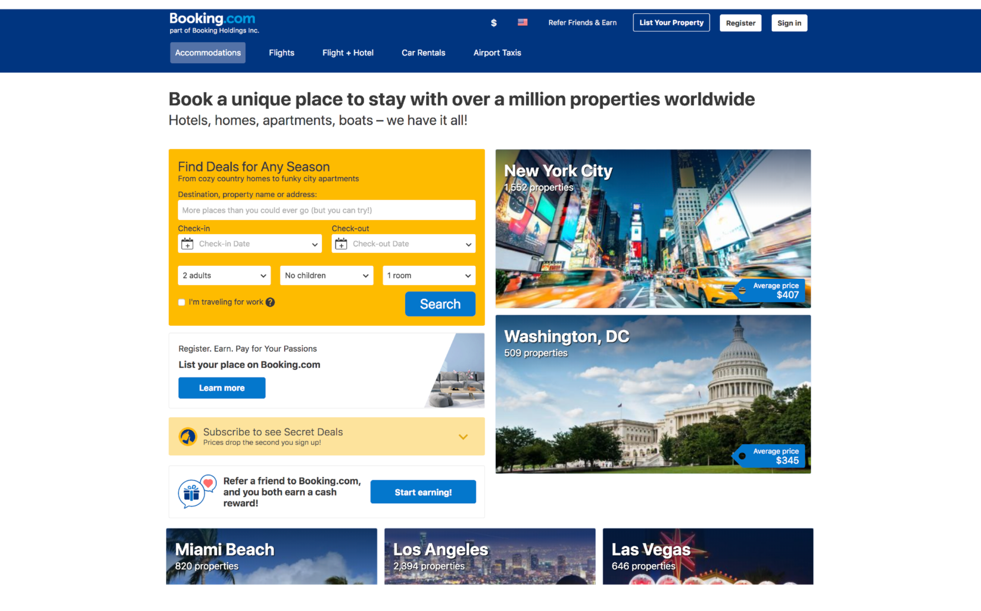
The home screen makes good use of white space, seperating elements. Proximity is used for tabs in top section of the site, but there are two tool bars, competing for space already giving way to a cluttered feel. The eye is left wandering from one section to the next, but the rhythm feels off, because there is so much to take in.
There is no clear call to action, and visual hierarchy is sacrified in favor of options. Perhaps it would be a better fit if there was less call to action items. Lets take a look at what happens when we input our destination.
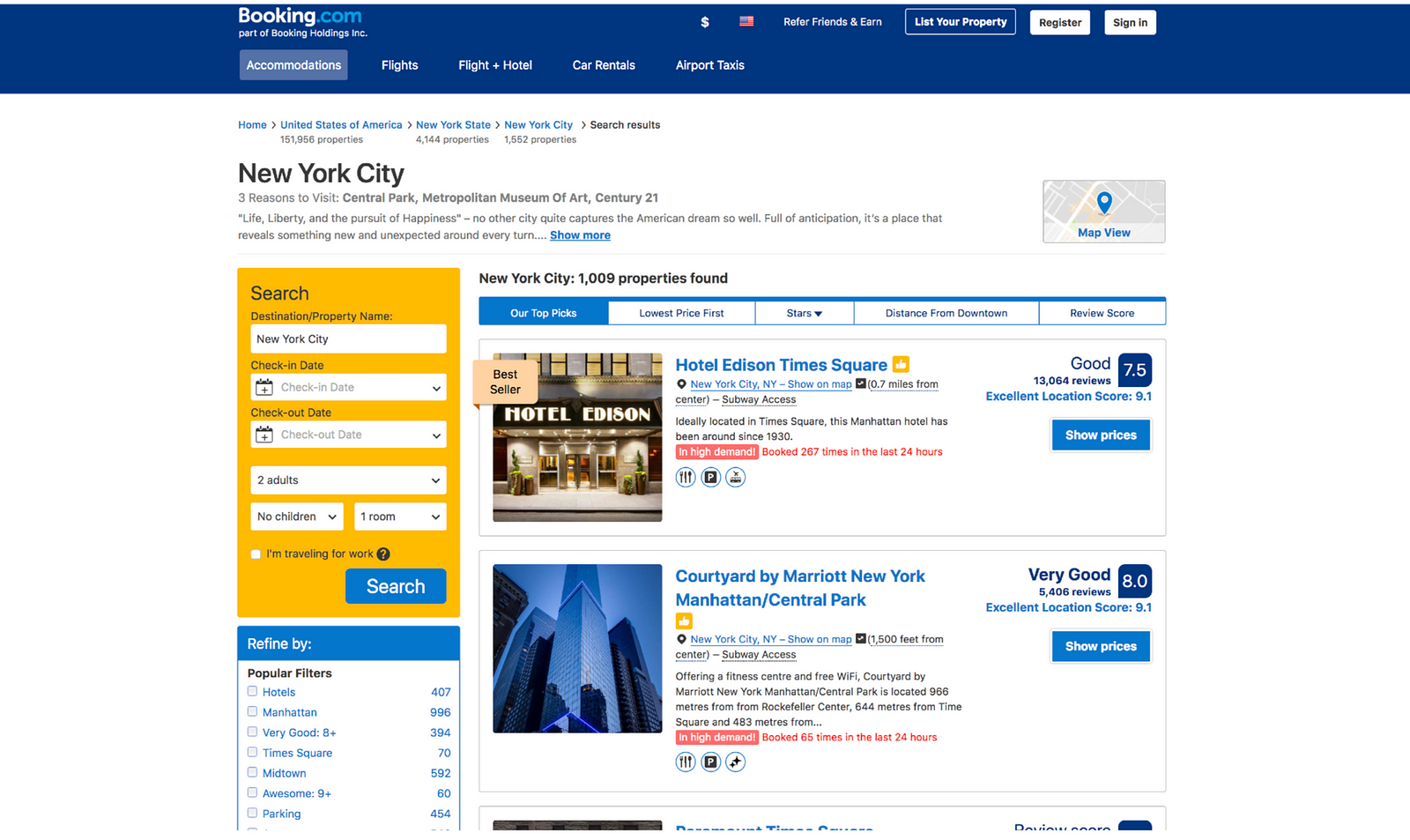
Once we have selected our destination, we are greeted with a new page with a list of selections. Proximity is used well to create sectioned off parts of the site, but again look cluttered.There are far too many grouped elements that are inconsistent in their design, that I think it would be more helpful to create a more consistent design UI language that users can get to recognize.
The results page looks too wordy, and not enough emphasis is given on the actual search results. Pictures are small, and there is no easy way to quickly get a feel for the location through scrollable pictures. -This might be a good addition to increase are chances on staying on the site. Also I’m surprised that Century 21, a department store, is listed in the three reasons to visit New York, what a shame..
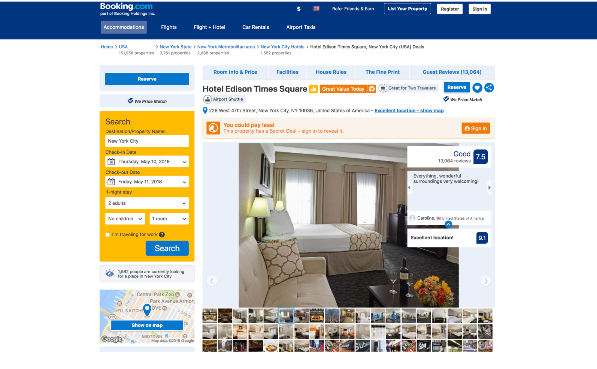
Once we are at the booking page, there is no clear call to action to book the room, unless we scroll to the bottom of the page. Which again looks cluttered and filled with too many details that make it hard to see what we’re actually looking for. There are menus, buttons, colors, boxes and clickable items everywhere on the page, resulting us spending an unnecessary amount of time clicking on things -which can lead to mistakes and frustration- without getting to the desired action. The yellow search bar is still prominent on the page, as if asking the user to start over again. A better option might be to minimize the search option into a single search bar, and put the emphasis on letting the users book the room directly.
Gestalt theories can be argued to be in play here. After all, Booking.com manages to arrange complex elements into simpler, organized boxes, however the consistency and visual hierarchy don’t indicate which action is important along each step of the process. In return, the space feels more cluttered, the use of colors feel random, the proximity of items feel too close, each element feels too dominant on their own without an overall clean aesthetic. By applying rhythm and balance, I think Booking.com can attract more visitors and make their experience more enjoyable and friendly.
All three sites are ultimtely able to convert first time users to returning users. Although in my humble opinion, both Airbnb and VRBO excel over Booking.com because of their better human centered design language and overall aesthetically pleasing choices in design and usability.
Don’t forget to ??? if you enjoyed reading this story. ?♂️
Source; https://uxdesign.cc/good-design-vs-bad-design-944dd36c9832
Written by
Mehmet Aydin
Product Designer. Musician. Vinyl junkie. Bicycle enthusiast. https://mehmet-aydin.com
UX Collective
We believe designers are thinkers as much as they are makers. So we curate UX stories we’ve always wanted to read. By @fabriciotand @caioab.