
Colors matter. Colors are one of the most important building blocks of any interface (along with typography and space). They have a tremendous effect on the overall perception of a digital product.
Colors are an essential part of visual design language you use to communicate with your users
It’s vital to structure colors. If you don’t structure colors, you can find overwhelmed by how many colors you use by the time you reach the end of the design project.
Building a consistent system of colors — reducing the number of used colors, and eliminating unnecessary duplicates seemed like the right thing to do. But how to achieve this goal?
Here are seven practical tips for structuring colors in a new design project:
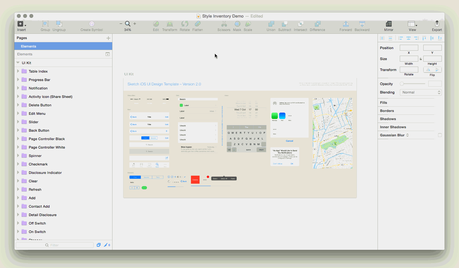
1. Conduct interface inventory
An interface inventory is a procedure of categorizing the components making up your app or website. Interface inventory will show how many colors you use in your product.
If you’re working on a website, use a tool like CSS Stats to see how many unique colors you have in your style sheets.
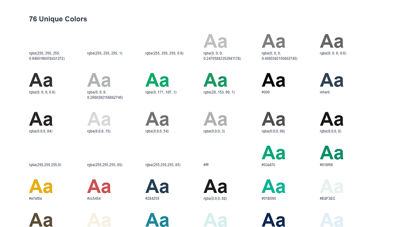
If you’re creating an inventory in Sketch, use the Sketch-Style-Inventory plugin to aggregate all colors. You will be able to merge similar styles.
For existing products, it’s also recommended to check the number of times each color is actually used in code. By doing that you’ll notice that some of the colors are used in many different places, while others are used only once. The insight you get will help you organize your palette.
2. Let brand colors form the basis
If you’re working for an established brand, most probably the brand has an established brand palette of colors.
Don’t modify the brand colors for UI Desing
You can’t go creative with brand colors because by doing that you’ll deviate from brand guidelines.
Try to use primary brand color for most of the “chrome” on the app
Try to use brand colors for UI elements that make the structure of your design — headers, footers, menus, etc.

If your brand color works both for light and dark background, you can use it as a layout color for your design.
3. Define foundational colors
Establish your whites and blacks
When it comes to selecting whites and blacks, it’s always better not to choose extreme versions of colors. White doesn’t have to be absolute white (#FFFFFF). Similar to that, black doesn’t have to absolute black.
Depending on how strict you want to be with your color palette, you may want to include a range of tints (a color mixed with white) and shades (a color mixed with black). But be careful! Having too many tints and shades can make the procedure of color selection harder for designers.
Find low contrast neutral color
Low contrast neutral colors are bad for elements that require reading but absolutely fine for elements like input fields. Input fields don’t need to stand out very much so low contrast neutral color can help you create a perfect UI container.

Limit the number of primary colors
Ideally, you should have a small number of approved primary colors (1–3 primaries that represent your brand) and a sufficient number of accent colors.
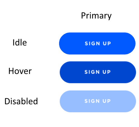
4. Define interactive colors
Interactive colors are colors that we use for interactive elements — buttons, links, and other UI controls that users can click or touch.
Limit the total number of interactive colors
If possible, try to use only one color as your primary interactive color. By doing that you’ll help your user memorize this color.
You can create lighter and darker versions of your interactive color. Color shades can help you convey different states for your UI elements — for example, a pressed state/hover state.
Strive for consistency
Color can be a helpful wayfinding tool for your users. It’s a good idea to use the same color for links and buttons. By doing that you help your users to recognize interactive elements.
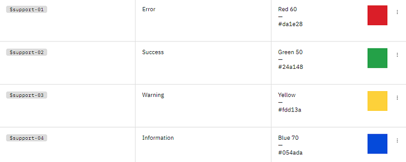
5. Define denotive colors
Denotive colors are colors that mean something. You’ll need to have colors for states such as error, warning, and success.
Error state color
Use a share of red to indicate the error state. If one of your brand colors happen to be red, it’s better to avoid using it for error messages. Why? Because by doing that you make users associate your brand color with problems.
Success state color
Use a shade of green to indicate success state. If one of your brand colors is green, it’s absolutely fine to use it for success state. Users will associate your brand color with a positive outcome.

Limit the number of denotive colors
Ideally, you should have only one color for error and another for success. But be sure that colors you choose for error and success work both for low and high- contrast backgrounds.

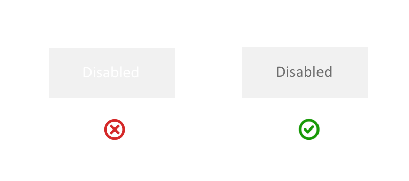
Disabled state color
Disabled state is traditionally grayed out. Usually, designers use low opacity color for that. One crucial moment that you should remember when selecting disabled state color — make sure the color has enough contrast, so it’s readable for your users.
6. Clear naming conventions
If you’re saving your colors in the design system, make sure to give clear names for each color you use. Color names should be both easily understood and memorable. Both designers and developers should be able to easily refer to particular colors defined in the system.
Try to avoid using gradation of adjectives (lightBlue, darkBlue); use functional names instead — names that describe the color by the place in the UI.
6. Accessibility
Create accessible color palettes so people who are color blind be able to use your products.
Checking color contrast
There are a variety of color contrast checkers you can use to ensure your color palette works for everyone who will use your products.
7. Test your palette
In some cases, modifying existing colors won’t create any problems, in others, you might break the entire UI. That’s why the color palette that you create and apply for UI must be carefully tested.
While it’s possible to use visual regression tools for that purpose, you can achieve much better results by conducting manual testing.
Bonus: Color pickers tools
If you’re in the process of finding the right colors for your project, here is a collection of tools that can help you with:
Source: https://uxplanet.org/7-tips-to-organize-colors-for-ui-design-97bbefed8a8a
Written by
Editor-in-chief of UX Planet (https://uxplanet.org). http://babich.biz
UX Planet
UX Planet is a one-stop resource for everything related to user experience.