
In this article we’ll see how this element can be improved in order to save the user time in going where they want.
Best practices
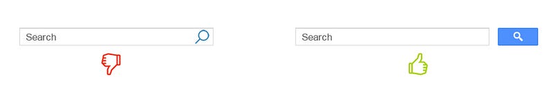
1. Use magnifying-glass icon
Always accompany search box with magnifying-glass icon. Icons are, by definition, a visual representation of an object, action, or idea.There are a few icons that have mostly universal recognition from users. Magnifying-glass icon is the one of such icons.

Tip: Use a schematic icon, the simplest version of the magnifying glass. Fewer graphic details speed up recognition.
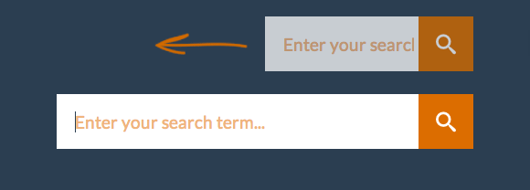
2. Display search field prominently
If search is important function for your app/site you should be displayed prominently, as it can be the fastest route to discovery for users.

It’s important to display full open-text field, because search hidden behind in icon makes search feature less noticeable and increases the cost of interaction:

3. Provide a search button for the search box
A button helps people recognize that there’s an additional step to trigger the search action — even if they decide to do this by pressing Enter.
Tips:
- Size the submit button appropriately, so that users don’t have to point the mouse very precisely. A larger clickable area makes it easier to spot and to click.
- Let users submit search using the Enter and by clicking the icon. Many users still have the habit of clicking an actual button to submit search.
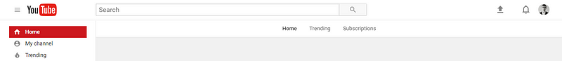
4. Put the search box on every page
You should always provide access to the search box on every page because if your users cannot find the content that they are looking for, they will try to use your search regardless of where they are in your website.
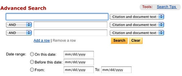
5. Make search box simple
If you design a search box, make sure it looks like one and is as simple to use as possible. According to usability studies, it is more user-friendly to have no advanced search options displayed by default. Advanced search options (such Boolean search query in example below) can confuse users who will try to use it.
6. Put the search box where users expect to find it
It’s not good when users have to search for search box because it doesn’t stand out and is not easy to spot.
The chart you see below was taken from a study by A. Dawn Shaikh and Keisi Lenz: it shows the expected position of the site search form in a survey with 142 participants. The study found that the most convenient spot for users would be the top left or top right of every page on your site, where users could easily find it using the common F-shaped scanning pattern.
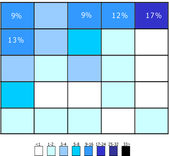
Thus, place a search box in the upper-right or upper-center area of your layout and you’ll be sure that your users will find it where they expect it to be.
Tips:
- Ideally, the search box should fit the website’s overall design perfectly yet manage to stand out slightly when users need it.
- The more content you have, the more prominently you want to display your search feature. If search is essential for your site, use plenty of contrast so that the field and icon stands out from the background and from the surrounding elements.
7. Proper Field Size
Making the input field too short is a common mistake among designers. Of course users can type long queries, but only a portion of the text will be visible at a time and this means bad usability, since users cannot review and edit easily their query. In fact, when search box has a limited number of visible characters users are forced to use short, imprecise queries, because longer queries would be hard and inconvenient to read. If input fields are sized according to their expected input they are both easier to read and to interpret for users.
A rule of thumb is to have a 27-characters text input (it would accomodate 90% of queries).
Tip: Consider using a growing search box, which expands the text input field on click. This saves screen space while still giving the user enough visual cues to quickly find and execute search.
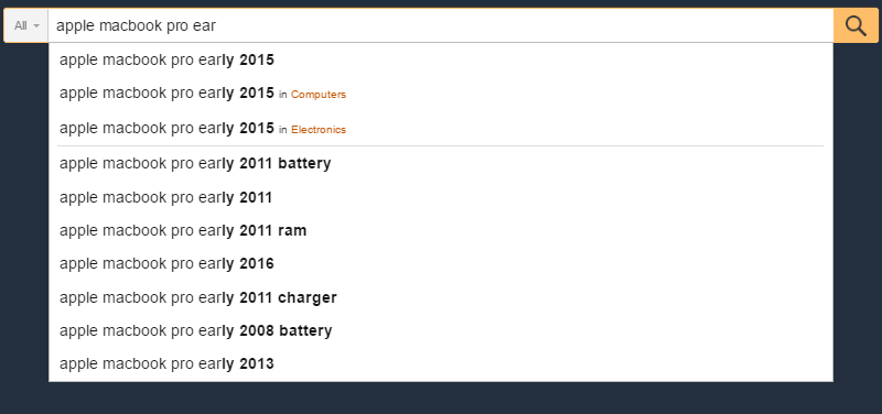
8. Use auto-suggestion mechanism
Auto-suggestions mechanism helps users to find a proper query by trying to predict it based on the entered characters. Auto-suggestion mechanism isn’t about speeding up the search process but rather about guiding the user and helping them in constructing their search query. Typical users are very poor at query formulation: if they don’t get good results on the first try, later search attempts rarely succeed. In fact, they often give up. When autocomplete suggestions work well they help the user articulate better search queries.
Google searches mastered this pattern, having implemented it since 2008. Because users tend to search the same things more than once, by remembering search history, Google saves time and creates a far more convenient experience.
Tips:
- Ensure that auto-suggestions are useful. Poorly designed auto-suggestions can confuse and distract users. So use a spelling auto-corrections, recognition of root words, and predictive text in order to improve the tool.
- You should provide auto-suggestions as quickly as possible, such as after third character is entered, to provide immediate value and reduce users data entry effort.
- Present less than 10 items (and without a scroll bar) so the information doesn’t become overwhelming.
- Allow for keyboard navigation for the list of suggestions. Once a user scrolls down past the last item, they should return to the top of the list. The Esc key should allow users to exit the list.
- Highlight differences between the inputted information and
suggested information (e.g., input text has a standard weight, while suggested terms have bold weight).
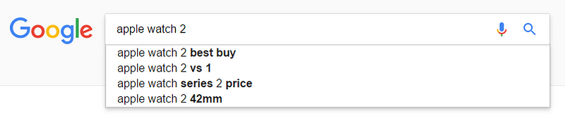
9. Make it clear what users can search for
It is a good idea to include a sample search query in the input field to suggest to users what the function can be used for. If the user can search for multiple criteria, use the input hint pattern to explain (i.e., IMDb in example below). HTML5 makes it easy to include text that as a placeholder inside the input field.

Tip: Limit your hint to just a few words, otherwise you actually increase the cognitive load.
Conclusion
Search is a fundamental activity and a critical element of building a content-heavy app or site. Even minor changes such as a proper size for the input field or indicating what information goes in search field can significantly increase search usability together with overall UX.
Thank you!
[Update] Read Best Practices for Search Results
Follow UX Planet: Twitter | Facebook
Source: https://uxplanet.org/design-a-perfect-search-box-b6baaf9599c
Written by
Editor-in-chief of UX Planet (https://uxplanet.org). http://babich.biz
UX Planet
UX Planet is a one-stop resource for everything related to user experience.