
You will certainly meet people in this world who say things like ‘I don’t care how this user manual looks as long as it is well-written and contains answers to my questions.’ It is great to know that some people are this practical and able to look past the visual side of things.
However, people are naturally attracted to things that look if not super-awesome then at least hitting the standard they have in their mind about something.
Let’s talk about ‘levels of spookiness’ of technical documentation and analyze a real user manual example.
These levels are nothing serious or scientific; let’s have some Halloween fun and hopefully learn something useful!
Here we go!
Elm Street
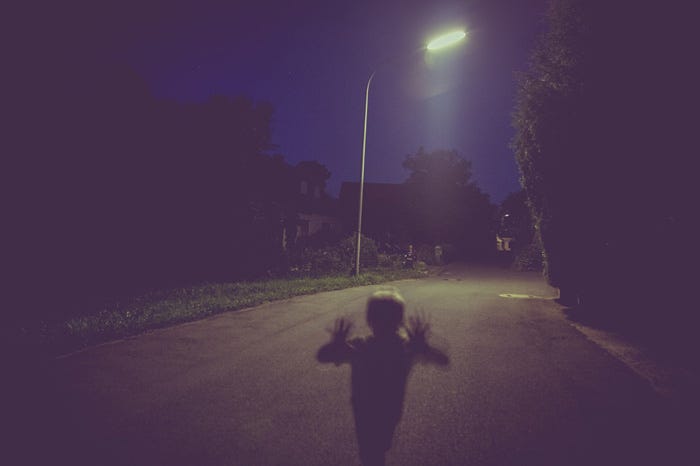
You can basically have a Halloween party in your user manual — all the decorations are already there. That’s how I would describe this best.
Technical documentation falling into this category is known for things like illegible fonts, screaming surreal colors and can cause dizziness.
You know this feeling when you open a page, and your first urge is to close it and run away!
Shrek’s Swamp
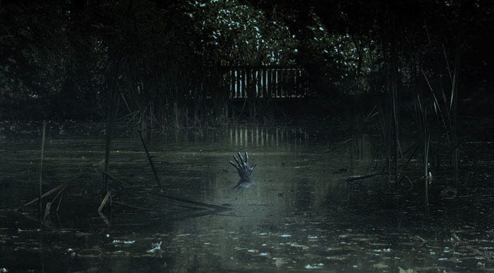
This scenario is especially common in user manuals that have been here for a while. You can definitely see that nothing has been done with them, not even a face-lift.
Somebody imported it into an online documentation portal a while ago, losing half of the styles during the process and just let it be. BTW, in ClickHelp, you wouldn’t have these issues in the first place as it handles importing projects from different formats very well.
Technical writers can feel at home and cozy in this swamp, but for a reader, this place looks outdated, rundown, and shabby.
‘Mediocre!’

In Mad Max: Fury Road, this exclamation was no compliment. But, in our reality, this might not be a bad option compared to the first two.
Such user manuals can’t really scare anyone, but they might bore the readers to death.
At first glance, they look just fine, nothing to nag about. But soon you might notice that the dream spell has started taking effect and you are drifting off to sleep.
Please remember that if you want people to read the docs, you need to make them appealing. Check your design options and, most importantly, make sure to have enough visual elements: videos, graphs, images, schemes, gifs, etc. Text walls are prohibited.
Spice it up!
Rivendell

Well, this is not scary at all! It is all neat and peaceful and pretty, there are no distractions and redundancy. What is it doing in this post?
To be honest with you, user manuals are not supposed to be scary, even on Halloween 🙂
In ClickHelp, we believe that technical documentation should look modern and professional. By modern we don’t just mean good-looking but rather reflecting modern trends of usability and supreme UX.
We would like to share with you a technical documentation example. It is a real online doc portal of one of our clients. You can find more of those in the Portal Gallery.
Let’s take a look at their home page first:
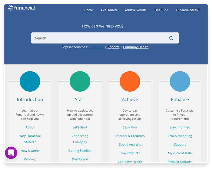
The colors go well together, and the color palette is soothing but business-like at the same time. This shows off the effort and professionalism right away. Not only is it a pleasure to look at, but also this page is informative and well-organized.
Let’s move on to the next screenshots:
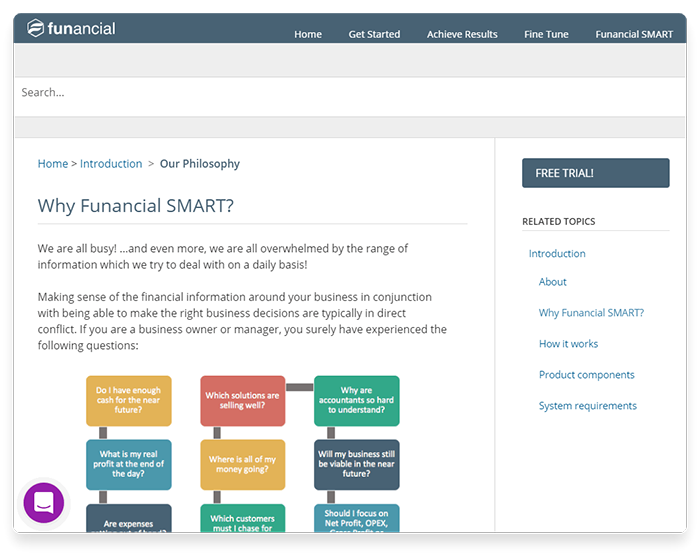
Here you are looking at a great example of using diagrams in user manuals. What a fine way to schematically explain stuff in a visually appealing manner!
Another thing to pay attention to is the font and its properties like color, size. Also, notice nice paragraph division and titles. This increases readability and text cohesion.
And, one more thing, warning/information boxes. I really love their approach shown on the screenshot below:
Nothing too distracting, but still these elements are very distinct. A smart way to do this, really.
All in all, this user manual leaves a good impression and looks like something I would read. It is clear and concise. Great job, funancial! Thanks for providing us with this excellent example.
Conclusion
In conclusion, I would like to advise the following — always be critical of what you are doing. When we look at something daily, we get used to it, to the idea that it is fine. Try searching around for new trends, new inspiration sources, and this will give you a fresh perspective to apply to your current work.
And, happy Halloween!
Good luck with your technical writing!
ClickHelp Team
Author, host and deliver documentation across platforms and devices
Source: https://medium.com/level-up-web/who-can-you-scare-with-your-user-manual-b8ba91b8e429
Written by

ClickHelp – Professional Online Technical Writing Tool. Check it out: https://clickhelp.com/online-documentation-tool/