
It’s more business-critical than ever to have a landing page that captures the attention of your visitors before they head for the dreaded ‘Back’ button. Thankfully, though, the design process of a great landing page can be much more informed and calculated than ever before — the trick is in figuring out what core elements are required to achieve that all-important cut-through.
Nobody likes to hang around. If you don’t give your site visitors what they want or, indeed, explain what you think they should want within a matter of seconds, they’ll be off to find a better alternative. Translation: you lose sales.
If it’s an all-too-familiar pain-point for you that people are doing more bouncing than converting, here’s where you discover what your landing page(s) could be missing and, of course, what you can do to put that right.
Here are the principles that should be at the core of any landing page, whether it’s for a plucky B2C startup going through a launch or an established B2B giant going through a revamp:
A straightforward value proposition
Put simply, if a user has to work hard to understand what it is you’re offering them, they’re not going to work hard to give you their time or money. The benefits of the features must be immediately clear and this can be really bolstered by great design.
If a user has to work hard to understand what it is you’re offering them, they’re not going to work hard to give you their time or money
Take Headspace, for example. The popular app’s landing page is not only visually striking, but it also makes it clear as day what it’s all about. It eases the visitor into the experience with tunnel vision — the header and subheader supplemented by two clear calls-to-action get the value proposition across in only 15 words. The impression of calmness and efficiency that this communicates is one of the reasons why it’s been downloaded over a million times.

A clean and simple UI
Most design services will shout about the importance of UI from the mountaintops, but not that many get it right at every level. If it is an app or some software you’re selling, the product itself might promise an incredible UI that surpasses all user expectations, but if the landing page ‘shop window’ for it creates a barrier between the user and the product because of a poorly designed UI, the journey will stutter and business will be lost.
Duolingo boasts a landing page that gets right to the crux of people’s desires to learn a new language in a way that is easy to navigate and understand. There’s virtually zero clutter — access to the product, all the languages it offers and all the devices and platforms it’s available on are immediately clear, so there’s no need to grapple with the site to find what you want. It makes the whole experience a pleasant and rewarding one and the same sentiment applies to the gamification of the app itself.

A consistent UX with other marketing activities
Consistency is key — you’ve heard that a million times, but it’s so true in all walks of digital life. Users not only expect a consistent experience within a programme or website, but they demand a consistent experience at every touchpoint, whether that’s via email, on social media or in-store.
For a site that built its name on seamlessness and interconnectivity, IFTTT offers up a great example of a landing page that’s aligned with its overall user experience. The style with which it communicates its core benefit of making life smarter is as obvious in its email marketing as it is in its landing page.

A logical structure with killer copy
Everything needs to work together when it comes to the perfect landing page. It’s not just about design, it’s not just about copy, it’s not just about a great offer. It really is about everything coming together into one cohesively structured page that shows the user the full picture.
It’s not just about design, it’s not just about copy, it’s not just about a great offer.
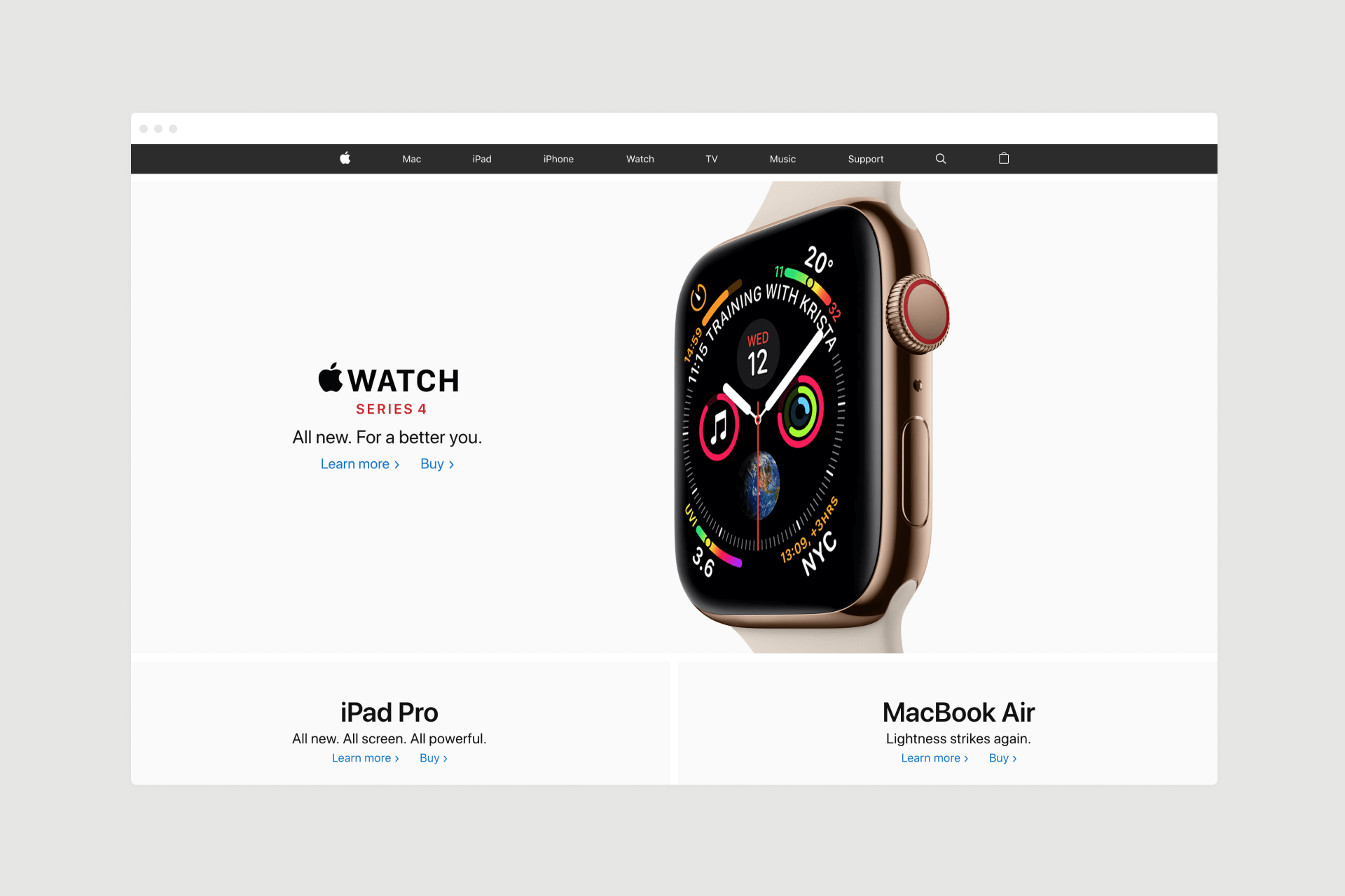
Apple has always done this extremely well when it comes to utilising copy to put the user first. It’s all about “you” and “your” needs and they position the products in such a way that makes them seem like an absolute necessity to fulfilling those needs.
A straight-to-the-point CTA
If a user’s attention span is on the short side, stirring them into action as soon as possible couldn’t be more important. It’s a fine balance in such a frantically competitive digital world, but competitors are continually entangled in games of one-upmanship when it comes to the likes of design, pricing structures and customer service.
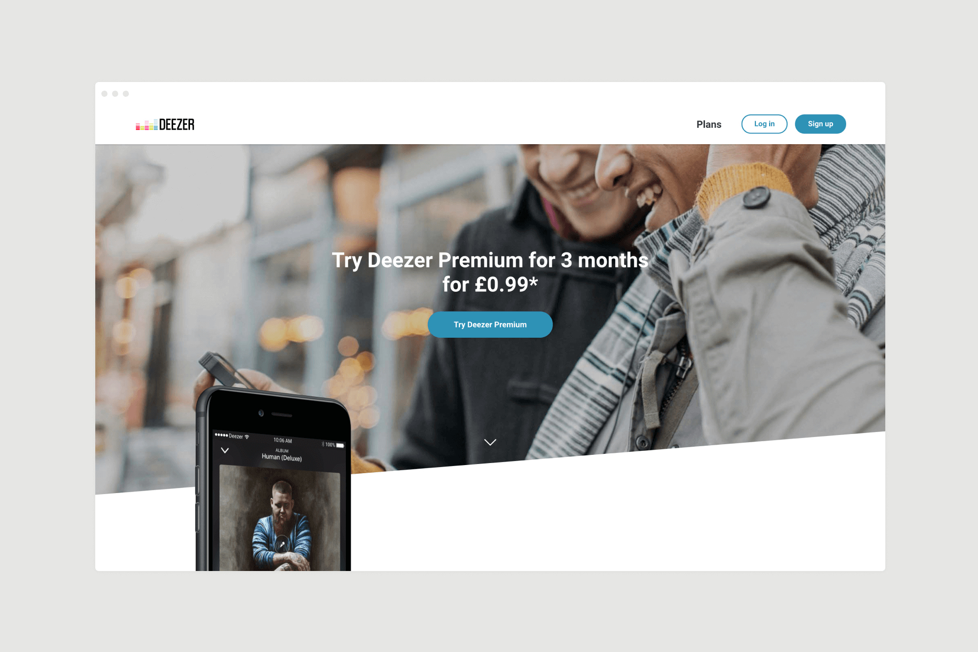
The music streaming industry sees one such battle play out between Spotify and Deezer. The former might be slightly older than the latter, but they’ve found themselves fighting it out in the same age of on-demand entertainment with essentially the same product for the lowest price and best UX. Consequently, the calls-to-action on both landing pages are financially motivated to get right to the one major gripe that most people have about music streaming: the price.
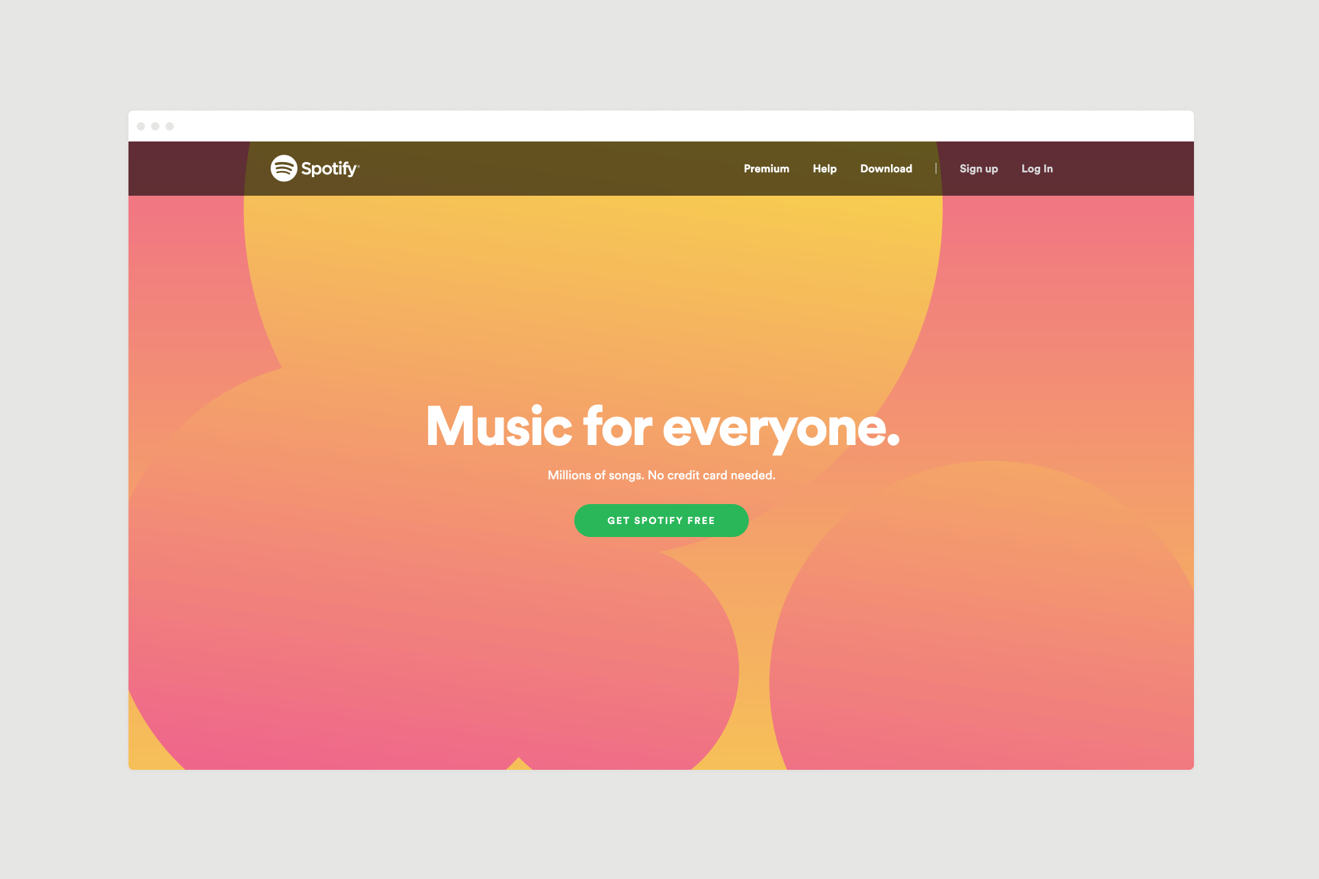
As demonstrated here and in many registration or sign-up buttons, imperative verbs give a real sense of urgency in CTAs: ‘Get Spotify Free’ and ‘Try Deezer Premium’, the latter of which is preceded by a mention of the price stir up a sense of ‘need’ as opposed to ‘want’.
Imperative verbs give a real sense of urgency in CTAs
A relatable amount of social proofing
Whether we like it or not, many of our decisions are made based on those that have already been made by others. Think of how crucial reviews are to the purchase cycle now; it’s no wonder sites like Trustpilot and Yelp are flying. A report by Mintel found that 70% of American shoppers actively sought out reviews before making purchases — and that was back in 2015.
Proof from others that something is actually worth your time and money is not just about opinions in testimonials and reviews either; usership numbers and sales figures can often do the trick.
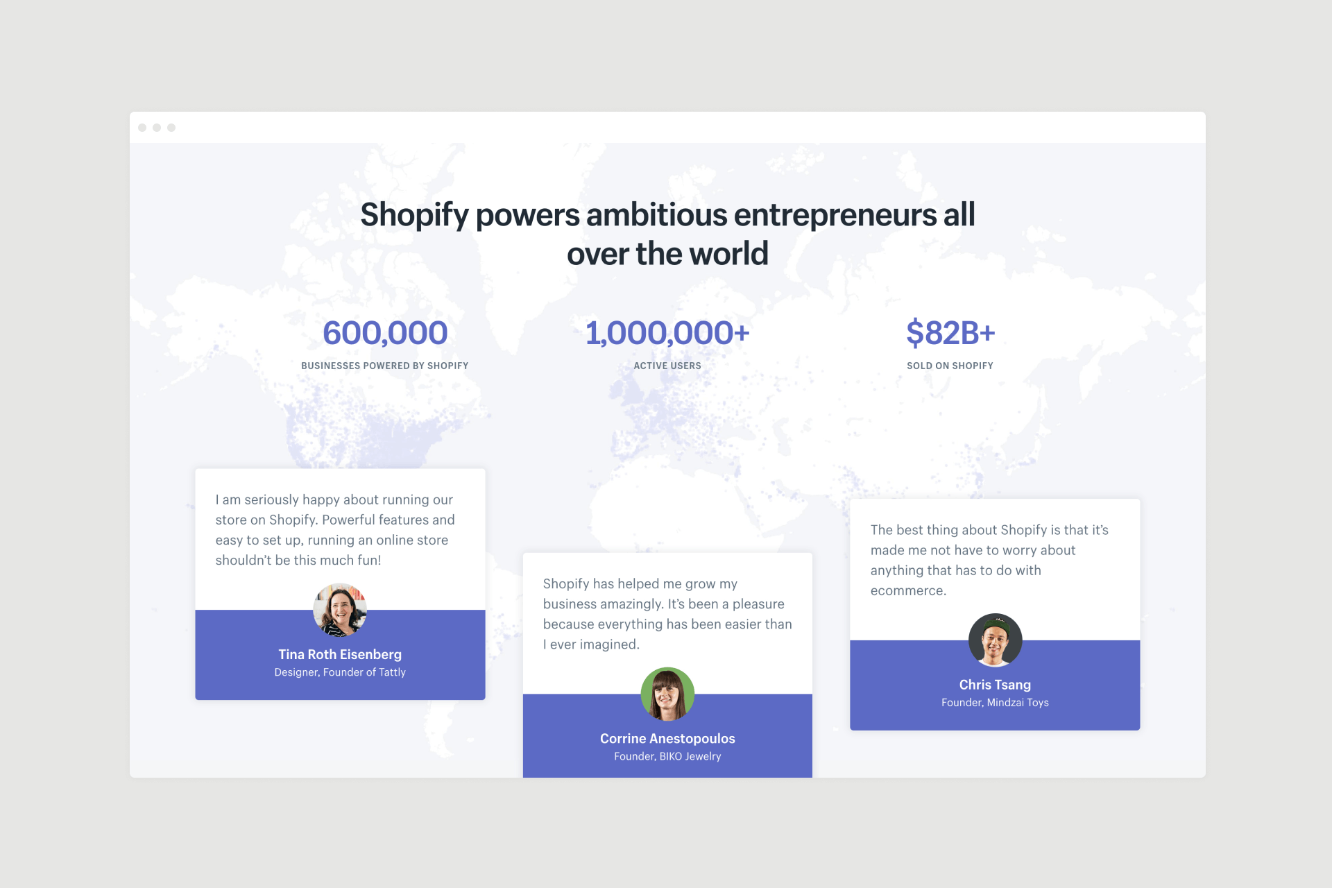
Shopify utilises these kinds of social proofing with impressively large numbers and positively glowing testimonials on its landing page. They might be below-the-fold, but they’re strategically placed low enough to add further encouragement to the type of scrolling user who might still have one or two niggling doubts about committing to the company at hand.
It’s become a modern-age-old trick that works time and time again, so it’s a critical part of any landing page worth its salt.
Different audience, different landing page
There might be a number of similarities between top landing pages these days, as we can see from the above, but the truth is that there is no set structure for the ideal design for “a landing page”. All of these examples depend on the likes of unique searching behaviours, purchasing cycles and device usage and so on, but the core principles here should be the foundation on which you build your direct responses to your audience requirements. Get that right and your landing page will do you right.
Are you in the process of designing a new landing page? Get in touch today to discuss how I can help you incorporate all the UI and UX design elements required to make it a successful one.
Thanks for taking the time to read this article. If you found it helpful, please let me know. ???
Need more advice? Request my FREE Cheatsheet which includes ’47 Actionable UX Hacks to Fix Your App’.
If you’d like to read more, check out my blog for regular updates.
This article was originally published atwww.simonmccade.com.
Source: https://medium.muz.li/what-makes-a-great-landing-page-73ddc4bf649c
Writter by


All the design inspiration you need. It’s like crack for designers. And good for you too! #design #ux #ui #inspiration #creativity #art #startup