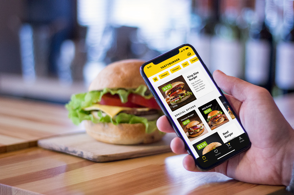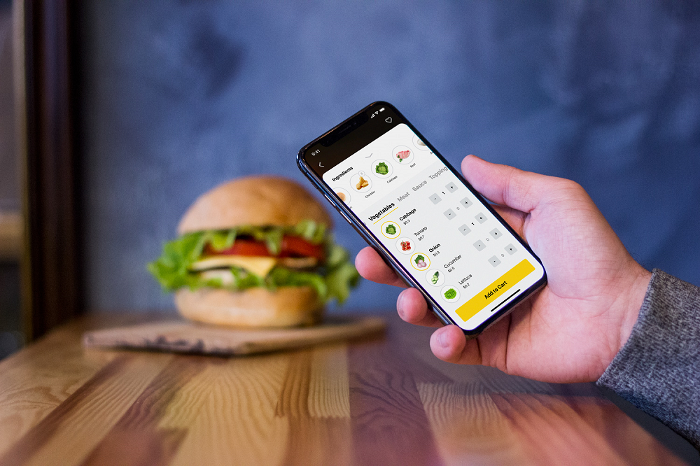
With more and more mobile apps around, that’s not easy for newcomers to reach and grow their audience. Competition is really hot: according to Statista, as of March 2017, there were 2.8 million available apps at Google Play Market and 2.2 million apps available in the Apple’s App Store, the two leading app stores in the world, and the numbers are steadily growing. So, not only should mobile apps offer high quality of their performance but also build up strong brands to stand out. Today we are discussing strategies and tips for mobile app branding.
What Is Mobile App Branding?
As usual, let’s start with terminology. In one of our previous articles, we have already defined branding as a set of marketing and psychological techniques and steps to promote a product, service, persona etc. setting a brand.
In its turn, brand is an image created with a set of distinguishing features and promoting awareness and recognizability of the product or service on the market, it’s what people think and know about it.
So, mobile app branding is how users will perceive the app interacting with it: its visual image, its communication and its reputation.
Questions to Consider
Building the brand for your app, first of all, you answer the questions traditional for building up any brand:
- Who is going to use your app and why are they going to use it?
- What is the USP of your app? What makes it unique compared to others?
- What is the look of your app? What is the main message it transfers with its visual symbols like logo, colors, illustrations, mascots, etc.?
- What feelings and emotions does your app wake in its users?
- What is the tone and voice of your app? Is it formal or informal? Does it communicate with a user as a friend, expert, mentor, or someone else?
- How will users get information about your app? What are the channels of communication between the app and the user?
The answers to these questions will allow for forming the general approach that influences all the sides of work on the app design, development, and promotion. Branding will have an impact on user experience logic and transition, colors and typography, graphics and animation, copy and style. It will define which channels and methods of promotion will set the shortcuts from app to a user.
Therefore, to make mobile branding effective, you have to answer these questions before design and development start. In this case, all the effort will be put in one complex direction and the brand image will be integral and consistent.
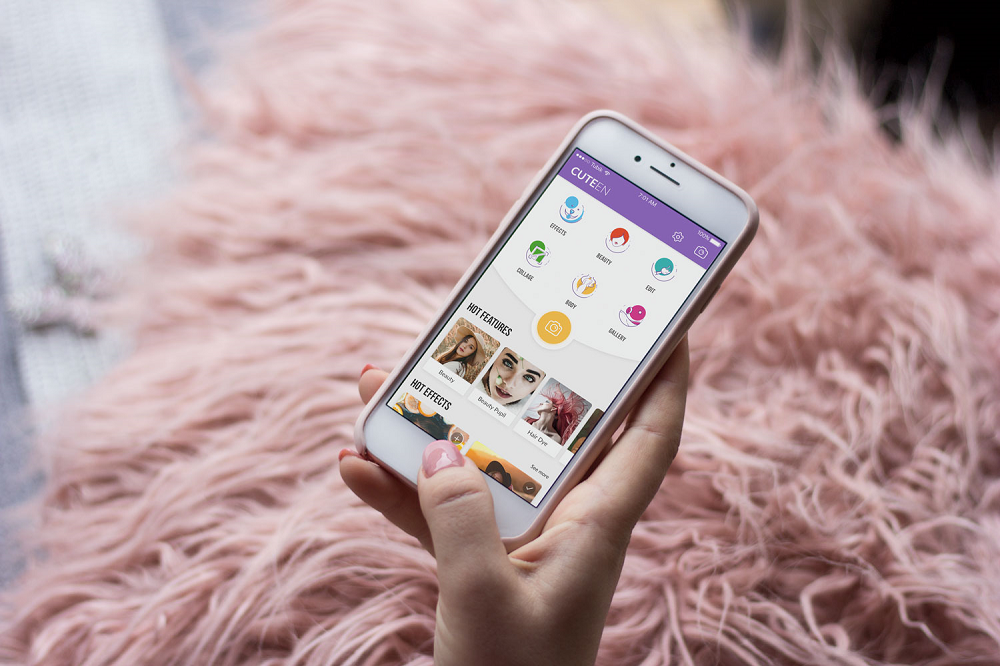
For example, here’s the Cuteen app: the mobile app brand is targeted at teenage girls which determined the solutions on naming, original graphics and interaction patterns.
Mobile App Branding Strategies
After you’ve defined who is the target audience of the app, what problems it solves and what message it sends to the world, it’s time to build a brand image step by step. Let’s check some strategies and features essential in this process. For sure, all of them should be based on user research and market exploration to find the original solutions.
Logo and App Icon
One of the core elements of branding is a logo which is a visual symbol representing the brand. There are different types of logos:
- Symbol: an image of a high symbolic potential associated with an app brand name, functionality or area of usage
- Logotype (Wordmark): artistic lettering featuring the full name of the brand
- Lettermark: the first letter of the brand name presented in an artistic manner
- Combination mark: two techniques used simultaneously — symbol/lettermark and wordmark
- Emblem: it inscribes the wordmark or lettermark presenting the name of the brand into the symbolic image.
Talking about mobile apps, the important thing to think about is the correlation of the logo with an app icon. App icon is an interactivebrand signs that present the application on different platforms supporting the original identity. In most cases, it features the logo of the app designed according to the requirements on this kind of icons. As an app icon is placed on a very limited amount of space, big wordmark or complex emblem logos can’t be used effectively. So, app icons tend to feature symbols or lettermarks.
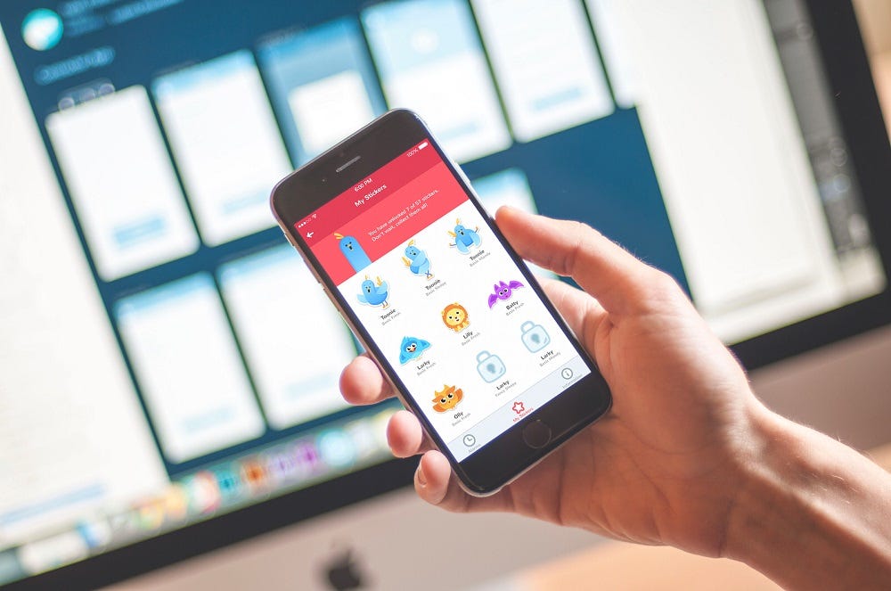
However, it also can apply something else, for example, a mascot or an abstract combination of corporate colors. Another approach may be used for the apps presenting well-known brands with already recognizable logos: in this case, designers will have to adapt the well-known logo image to the form of an app icon while inside the app they will use its full form, for example, on a splash screen. Here’s a splash screen for Toonie, featuring app mascot and a logo wordmark.

Keywords
One more good way to make the branding consistent is making a set of keywords for it. They can be divided into several groups according to their role.
Descriptor keywords will identify and describe your brand, so all the participants of the creative process will understand what image the app has to get and what message it has to send. These keywords define the core features users should catch immediately from the looks and interactions. For example, in this set you may define the app like “funny, entertaining, bright”, or “helpful, simple, minimalist”, or “business, luxury, exclusive” and so on, and so forth.
Brand keywords present the set of words people will use to find your app. It’s not only the original name but also different variants of its extension as well as typos. For example, in case of our Upper application the list will include Upper, Upper App, Upper to-do app, Upper mobile app, Uper, UPPER and so on. This list will be helpful for SEO issues and promotional campaigns if you plan any.
Brand-Plus keywords are the combinations of brand name with qualifying words or phrases. For example, for our Toonie Alarm app we have Toonie stickers, Toonie mascot, Toonie tutorial, Toonie special offer, Toonie for iOS, Toonie stickers for iMessenger, Toonie landing page and the like. They form another collection helpful for both SEO and content creation.
Copy: Name, Slogan, Style
For sure, these points would better be agreed upon before the actual creative process of design and development. The thing is that naming in terms of strong competition is another big challenge and it has a huge impact on all the following solutions about design, marketing and communication with users. Except for deciding on the name which you find reflecting the benefits of the brand and memorable, you will need to ensure about:
- availability of this name in AppStore and PlayMarket (if it’s not available, you’ll have to find the variants which may belong to your brand and brand-plus keywords or start from zero and find another name)
- a domain name for a website or landing page you will have for the app (in case, the app is an independent product rather than the supporter for an existing brand)
- presence of the app name on the Internet (there may be other non-app brands already using this name and hard to compete with).
Moreover, the name of the app will influence the general stylistic concept, choice of colors, ideas for a logo and mascots, design of app icons and many other things. So, if you make a decision at the start, you will save many hours of redesign later. Still, this path is just a recommendation, not a cure-all: there are many good examples when apps are renamed right in the process of creation or even after the launch successfully, but in this case, you should be ready for additional working hours and some effort on remaking other assets.
One more point in this section is slogan — a catchy brand tagline sending the message about core app benefits to the user. In branding for a mobile app, it may seem not crucial as sometimes there is no place within the app for much copy. However, try thinking beyond the app itself: you’ll definitely need a slogan for outer channels to promote the app. It may be used in social networks, promo videos, reviews, landing pages, emails etc.
And another thing to think about is UX-writing and copywriting style for the app. Copy sets the tone and voice of communication and sets the type of relations with a user. So, it’s vital to reach understanding how the app will talk to the users and keep this style across all the channels within and out of the app. Some minor changes are acceptable for various channels but the general communication should feel consistent from one point to the other.

Graphics
Developing a strong app brand, it’s vital to give it the pinch of originality even if it sells something very basic and widely-spread. Custom graphics play the premier violin here. They will make the app unique attracting users’ attention. Don’t forget that aesthetic satisfaction is one of the strongest factors of desirability.
In this aspect, consider using the following graphic content:
- logo (decribed above)
- mascots (symbolic memorable characters communicating to user on behalf of the app)
- custom illustrations (visual prompts on functions and processes, theme illustrations)
- branded interactive elements (loaders, splash screens, tutorials etc.)
- photos (not only inside the app but also hi-quality photos of the app for its promotion)
Product Video
Video content is more and more popular today, in the era of YouTube and Snapchat. Branding mobile app is not the exception. A product or explainer video is a short animated presentation of app features and advantages, informs about special steps of interactions and shows its problem-solving potential. A creative and catchy video is a good way of attracting customers’ attention and the proven method of informing them quickly and brightly. A video activates several channels of perception — audio, visual, sound — simultaneously and usually does it in a way of telling a story. For example, here’s an explainer video we made for OffCents mobile app.
Personalization and Onboarding
User onboarding is the set of techniques and interactions whose objective is to comfort user and give the first concise introduction to the product. There may be textual prompts, tooltips, tutorials — and all of them can carry the slight signs of branding in both copy and graphics. All these details shape the positive user experience and support brand loyalty with happy users.
Personalization is users’ ability to customize some features and interactions according to the individual users’ needs. Among the examples, recently we shared a case study on Recipe App which enables users to set personal goals and exclude the unwanted types of food or ingredients to customize their list of recipes.

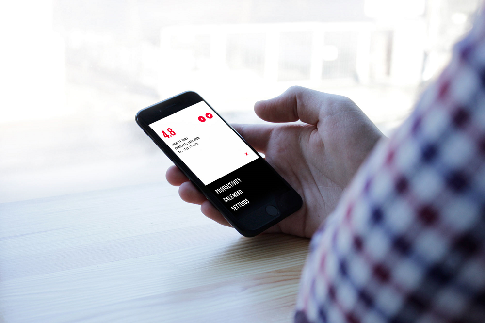
Another example is Upper App which enables users to choose among various skins to make the app looks correspond their preferences.

Gamification
Gamification applies game mechanics into the non-game environment, in particular, mobile applications. Challenges, badges, leaderboards, bonuses are effective methods of user motivation. Applying graphics in brand stylistics, they support brand awareness and make the app interface easily recognized. Even more, such virtual or even real rewards encourage users to share their success with friends both online and offline — this way, they become another channel distributing information about the app and witnessing positive user experience.
Help and Support
No man can make a good coat with bad cloth. Real branding is not only about attracting attention and making the incredible first impression. It’s about all the experience users will have. So, take care how they will the support they need at any step of interaction, especially in case of complex mobile products like social networks or e-commerce.
Landing Pages
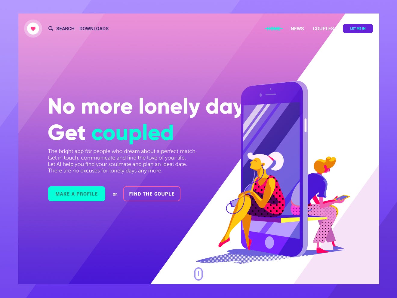
Landing page is a tool of great importance for building the mobile app branding and online presence. It plays the crucial role if the case is mobile-only and the app doesn’t correlate with a website. In general, it is a web page designed with a focus on specific relatively narrow goal and a quick way of accomplishing a particular action. So, for a mobile app, the goal will be app installation and the landing page will concisely cover its benefits and functions. What’s more, you can create multiple landing pages for one app based on various segments of the target audience with geographic, gender, psychographic, demographic and behavioral targeting. It is the effective way to reach users and give them a quick presentation of the app which will tell them more than just screenshots on the AppStore. Here’s the example of a landing page designed for a dating mobile service.
Social Networks
One more channel supporting branding strategy for a mobile app is social networks. Promotional campaigns, reviews and public pages for the apps should not be seen only as a direct sales channel from which users will directly install the app. Social networks are first of all the big channel of brand awareness and brand recognizability so don’t neglect their influence.
Brand Ambassadors and Opinion Leaders
This strategy for mobile app branding is also based on socializing. There’s still no better advertising than the recommendation from people whom you trust. Social networks with their huge and diverse audience form the growing trend of marketing with opinion leaders (individuals or businesses that are able to influence public opinion in their area) and brand ambassadors (an influential person hired to present the brand and build its positive image and strong awareness). Choosing this direction, remember two things:
– opinion leaders mostly care about their audience and reputation so they won’t promote what they don’t like or don’t find good for their audience, even rejecting profitable offers.
– opinion leaders and brand ambassadors will waste your money if the product is half-baked. You may get the big traffic from the campaign and attract many users but if they get something with numerous bugs or lorem ipsum here and there instead of real copy, it will have a bad influence on the brand image in general. Positive experience first. Presentation and promotion after it.
So, it’s easy to see that making mobile app branding deals both with app UI/UX and outer channels of reaching users. Neglecting one of the directions you risk failing another. Greatly designed and developed app will die unknown if target users don’t get the information about it. Amazing and well-performed marketing campaigns will waste your money if the app is trash. Only together they will build up a strong app with a loyal audience.
Useful Reading
6 Creative Stages of Branding Design: Step-by-Step Guide
UX Design for E-Commerce: Principles and Strategies
The Role of Branding in UI Design
Business-Oriented Design. Know Your Target
Short but Vital. Key Abbreviations in Design for Business
Business Terms in Design for E-Commerce. Sales Basics
Originally written for tubikstudio.com
Welcome to see the designs by Tubik Studio on Dribbble and Behance
WRITTEN BY
