Forget minimalism. Welcome to the era of whimsy and expression.
Once upon a time, we had products that were colorful, in shapes that were quirky, whimsical, and expressive. Interesting! And then, almost every tech product became white, silver, gray, black, flat, square, round, and minimalist. Boring.
But there are hints that this is changing. And one of the leaders of this change is, somewhat improbably, Google.
Anybody who’s been paying attention knows that Google has been pretty serious about hardware for a while, and at least as serious about doing quality design in hardware, software, and overall experiences. What fascinates me is the unexpectedly expressive direction the company has taken with its design language.
Google’s emerging design language (obviously still a work in progress) is reminiscent of the Italian branch of industrial design, which we haven’t seen much of in the last two or three decades. Instead, the German branch has dominated. It’s characterized by clean geometric shapes (cubes, cylinders), white and black glossy colors, and smooth unadorned surfaces. Think Bauhaus and — especially — Braun.
It’s a cliché at this point to draw parallels between Braun and Apple’s design languages. But nevertheless, aside from its own diversion into the more expressive realm of Italian-inspired design in the 2000s (original iMac, toilet-seat-shaped original iBook, etc.), Apple has hugely influenced other tech companies to follow the minimalist, German-flavored tradition.
This isn’t a knock against the Braun style — there are many beautiful products that have sprung from that well. It’s just that diversity is the spice of life, and tech products have become too much of a monoculture, stylistically. My former employer, frog design, helped set that minimalist course by creating Apple’s original “Snow White” design language back in the ’80s. So perhaps it’s only fitting that many ex-frogs have joined Google and have had a hand in its new design approach.
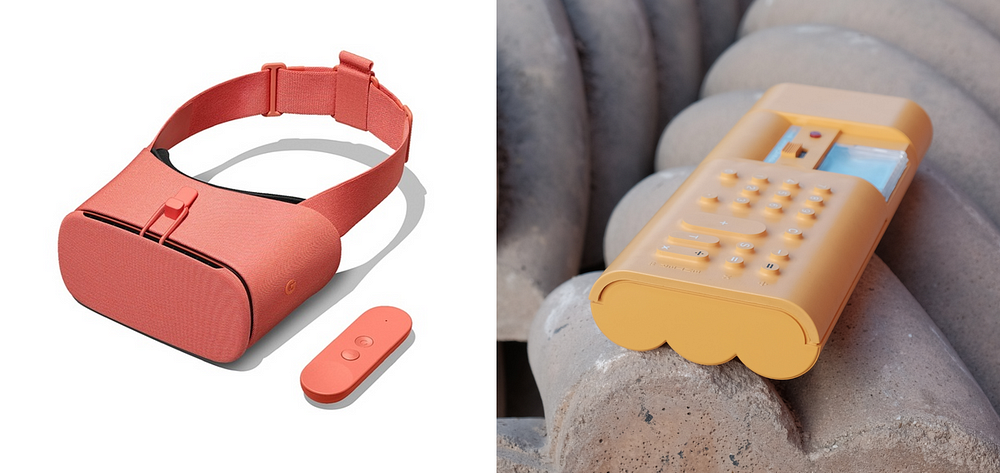
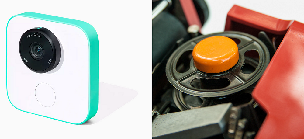
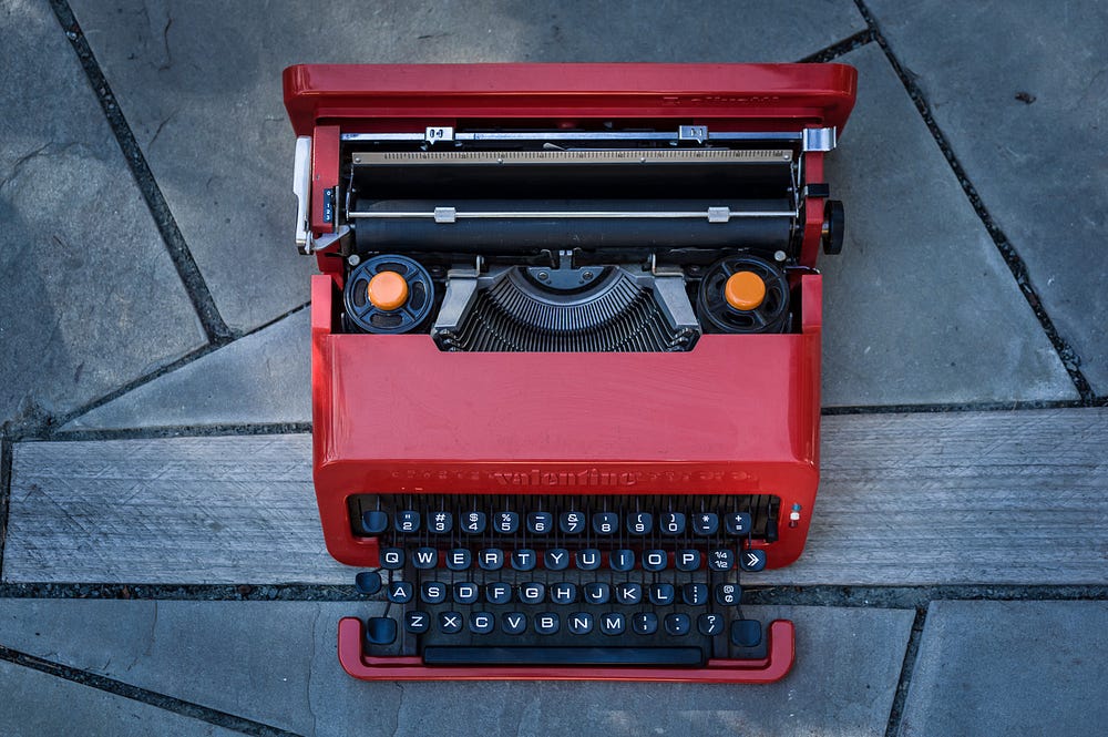
With Google’s launch of the Pixel 2 phone, wireless earbuds, VR headsets, Clips camera, and Home products, I was delighted to see touches of color and form that can clearly be traced back to the Italian branch of design, circa 1960s and ’70s. In particular, the pioneering company Olivetti — most well-known for its famous Valentine typewriter — but which had an incredible run of groundbreaking designs, including the world’s first programmable desktop computer (the Programma 101 of 1964).
Olivetti was founded in 1908. Starting in the 1960s, it really took on design as a strategic differentiator. (This extended beyond products to graphic design and architecture, even to the city of Ivrea itself where Olivetti was based.) It hired some of the best designers in the world, including Ettore Sottsass, Perry King, and Mario Bellini, among many others.
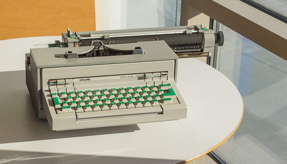
The delightful green key caps of the Praxis 48 typewriter, designed by Sottsass in 1964, are like a field of fresh grass for your fingers to play on.
Central to Olivetti’s philosophy — and also to the designers that it hired — was that technology needed to be humanistic, not domineering. Even in an office product, there should be touches of joy that enliven everyday tasks. This was especially important at that point in history, as people were questioning the rigidity of the traditional workplace (especially gender roles) in a context of social upheaval and transformation.
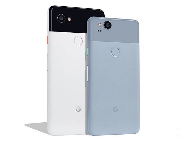
For example, the delightful green key caps of the Praxis 48 typewriter, designed by Sottsass in 1964, are like a field of fresh grass for your fingers to play on. Google’s wireless earphones and Pixel 2 phones also have small splashes of color that give them lively, even playful, personalities.
These details bring a welcome relief to the ponderously serious design we see from many other companies, Apple most notably, where there doesn’t seem to be much fun in the design process. It comes through in the resulting products.
(I like what Google is doing with the main surface colors too — subtle but sophisticated tones that offset the bright small touch points beautifully. In the case of the Pixel 2, color is the saving grace to what is otherwise a fairly prosaic overall design.)
Designer Sottsass once wrote about his Praxis 48:
The entire machine can be understood as a kind of inside joke: it aims to be a bit funny, joyous but also precious. It engenders a way of looking at mechanics as if you were looking at a toy rather than a real machine: it aims to be an object we are happy to look at, one we approach without fear and without thinking ‘I must get to work.’
It’s this sense of humor (which doesn’t tip over in to becoming a kitschy one-liner) that we rarely see in product design anymore, so it’s great to see Google picking up this mantle — especially given Google’s heavy engineering focus on design in the past, this makes it all the more unexpected.
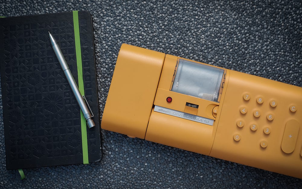
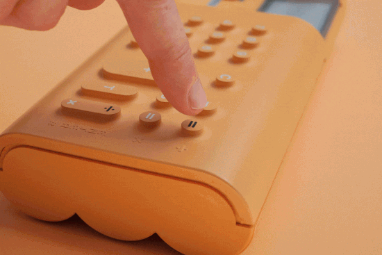
Likewise, the Divisumma 18 calculator, designed in 1973 by Mario Bellini, aimed to make accounting fun. In 1987, a curator for the Museum of Modern Art described the Divisumma somewhat sensuously:
“What is especially intriguing is the continuous, flexible, rubber-skin keyboard… Articulated pushbuttons, covered with the soft rubber skin, are like nipples. The emphasis is not on calculating and power, but on stimulating a sense of pleasure.”
The innovative rubber membrane and the “volcano” shape to the keys have been called “the most influential button design ever,” and combined with the eye-popping orange color, make this a really stunning piece, especially when seen and held in person.
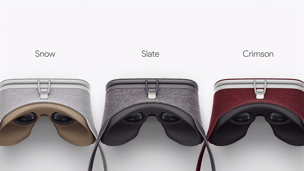
In this same vein, I was struck by the forms, the playful use of color, and the novel material choices on Google’s new Daydream View VR headset. It’s an even more intimate product in that it mounts to your head and creates a new world in front of your eyes. So it’s only appropriate that it takes on a feel of fashion and clothing, bringing a new soft material to a technological object and heathered colors that are a stark contrast to the edgy gaming aesthetic that dominates VR. It almost announces “This is VR for the rest of us.”
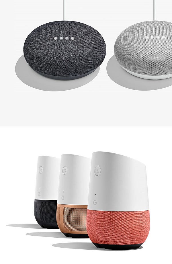
Google’s Home products, which debuted in 2016, began the motif of cloth-covered surfaces that the Daydream extends. The new Home update continues that motif, with bolder use of colors, and a new “fun-size” puck version. Early on there was some joking that Home looks like an air freshener, but it was clearly all part of the plan to make the product blend in to the home and make it less of a sore thumb sticking out.
I really hope this is the start of a longer trend of making the tech products that surround us unboring again. I hope other companies can embrace it as well. There’s much we can learn from the Italian path of design, lessons which are all the more important as technology becomes more intimate and pervasive with every passing week.
SOURCE: https://medium.com/s/story/google-and-the-resurgence-of-italian-design-e9234cf3d073
WRITTEN BY
 Adam Richardson
Founder of The Enigma Bureau / Innovation & UX strategy consulting / workshop leader / frog design alum / HBR contributor / www.enigmabureau.com