This hasn’t been an easy journey at all, its been filled with joy, laughter, pain, despair, resilience, complete admiration and being truly inspired.
To set the scene there are over 8 million students in Primary & Secondary education in the UK. The vast majority of those will use BBC Bitesize during their time in education.
Bitesize’s mission is to help every child in the UK to achieve their full potential — learning every day in their own way.
On the homepage we know nothing about our audience. Other than they are looking at the homepage.
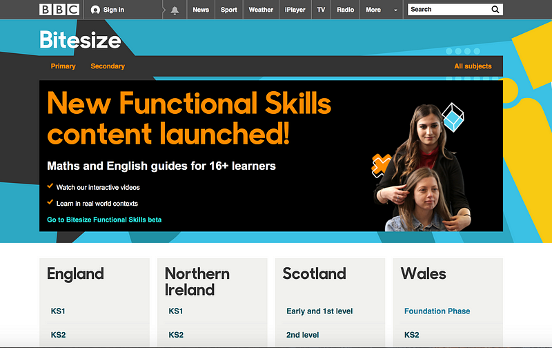
So… where do you start?
Bitesize has content for children from age 5 upwards. So this led us to the question “At what age can the students get to the content they need?”
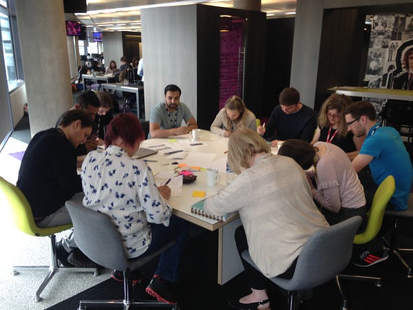
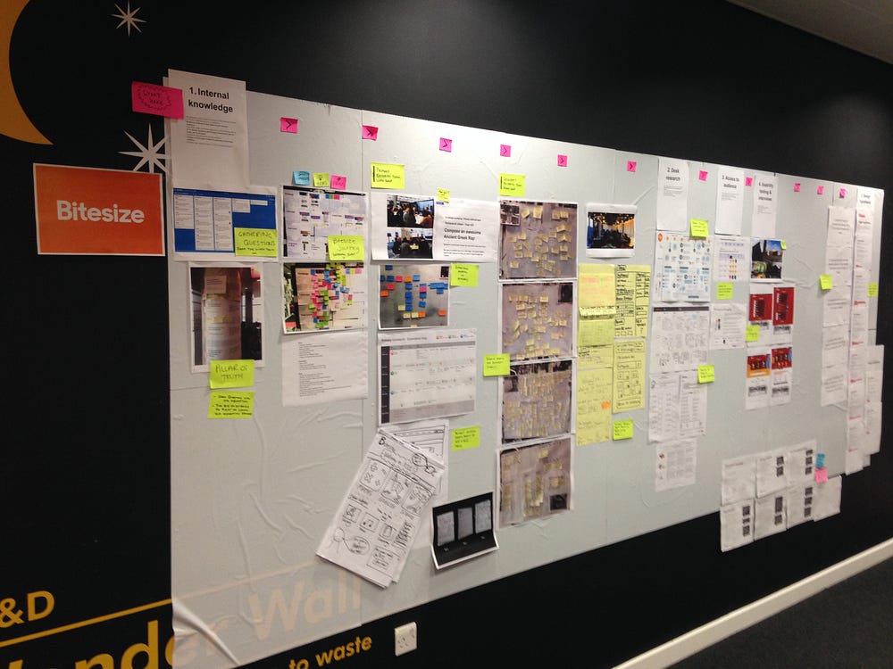
We ran an internal workshop with a good mix of people from Bitesize. One of the tasks was focused on students abilities.
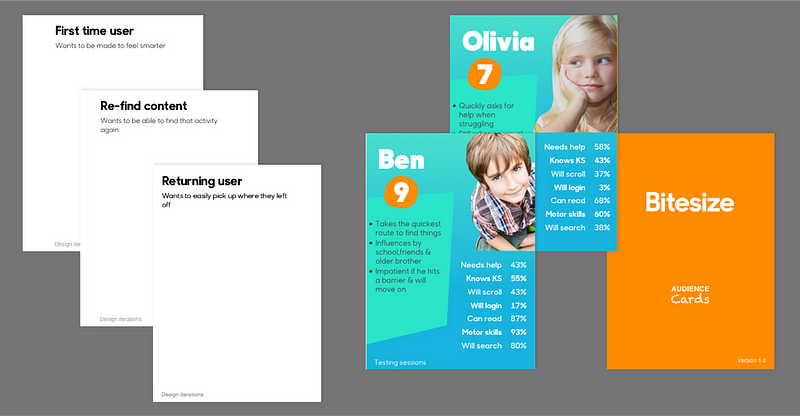
We printed out cards and asked participants in groups to rate the ability of students from age 5 to 16 on key abilities such as “requires help and direction, understands level of curriculum, knowledge of exam board, will scroll, will login, can read etc.. This created some heated discussion which is exactly what we need to learn more about our audience.
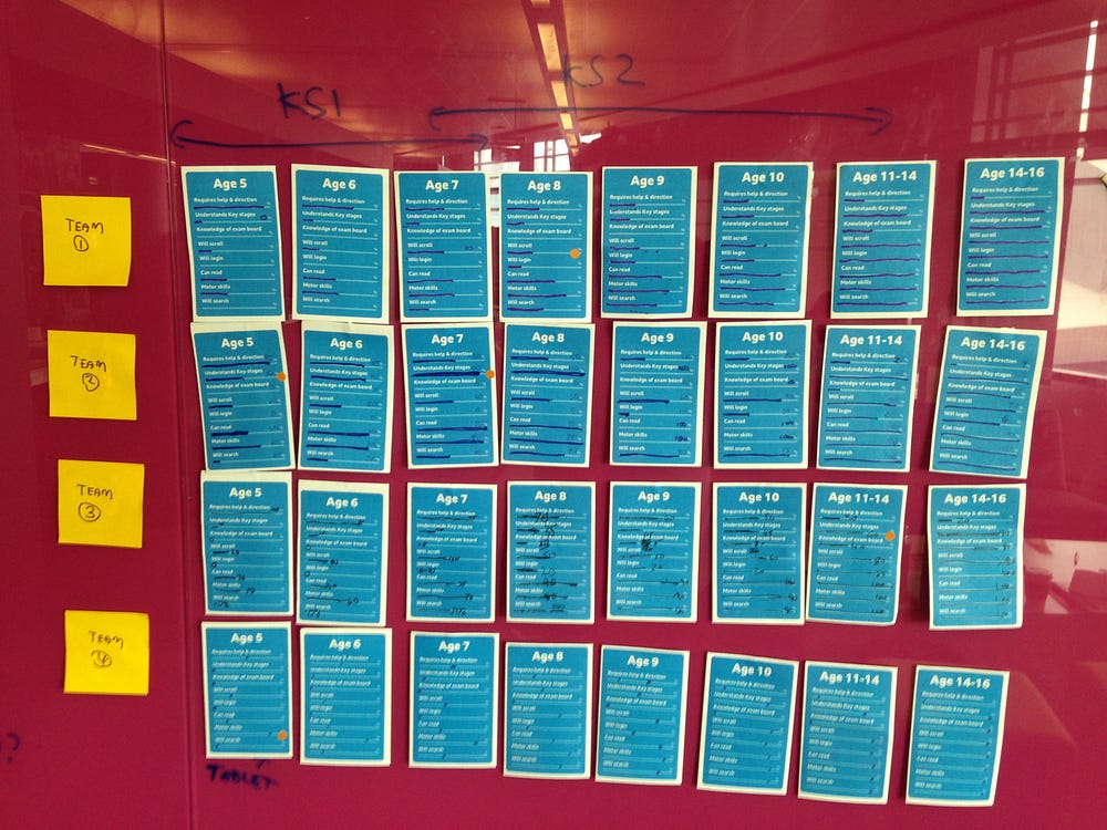
Within the same workshop we co-designed 2 prototypes that we could put in front of our audience to learn more.
Ace…only a few weeks in and we had base understanding of our audience and designs to put in front of them.
Getting to know our audience
We took an average scoring for the abilities and plotted it in a spreadsheet, we called it our “User ability matrix”
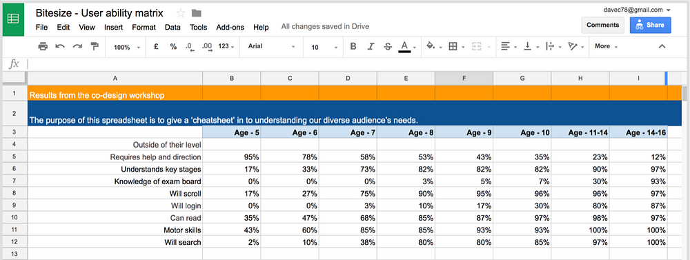
From our matrix we could see 58% of 7 year olds would need help finding the content they needed. So this seemed like a good place to start.
We prepared our discussion guide and with prototypes in hand, wandered into the lions den oblivious as to what was to come.
Our discussion guide had the usual warm up questions and getting to know a little bit about our participants. After 5 minutes of going through this, our 6&7 year olds had switched off. I guess it didn’t help us much with Hacker the Dog in the next room.
Lessons learnt test the thing you want to as quickly as you can.
Our two prototypes hadn’t tested well in fact the students could find content better on the current homepage. To us though this really didn’t matter, what mattered is we learnt about our audiences behaviour & understanding and we got a real insight into their world. We also had gained experience with testing with the students which is vastly different to adults.
We iterated and tested many times in the coming weeks everything was throw away, we’d change wording on prototypes in between tests if needed. In a way what we were testing was irrelevant. We were building a bond and empathy with real people rather than numbers or theories.
Keeping a record
We learnt a lot in a short period of time.
We wanted to record our knowledge in living and breathing documents.
Too often in big orgs can people be doing the same thing so hopefully we could smash that habit.
We already had our user ability matrix of which we were keeping up to date. Next up we created what we called “cheatsheets” for our Primary school and Secondary school audience.
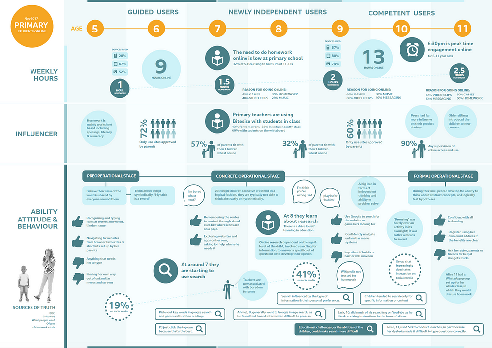
There is an abundance of research on school children we just wanted to capture key knowledge that could help us influence our designs.
From the age of 5 to 16 we looked at the homework they had to do and the time spent doing it, who helped them, common behaviours, cognitive development and attitude.
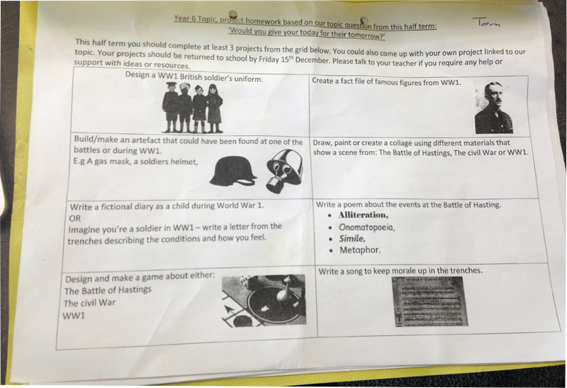
I’m not a massive fan of personas but we needed a way of talking about our audiences and abilities. Therefore we kept our groups descriptive.
For Primary school students we had:
- Guided users — 5 to 7 years old
- Newly independent users — 7 to 9 years old
- Competent users — 10 to 11 years old
And Secondary school students
- Inbetweeners — 11 to 13 years old
- Exam focused — 13 to 16+ years old
These descriptive titles tell you exactly were our users are in their journey.
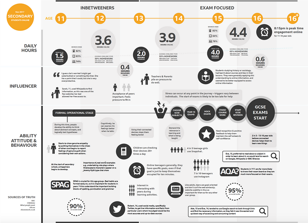
The cheatsheet tells you more about their behaviour to get to know them truly you do have to meet them 🙂
We’d aim to keep these updated with new learnings over time.
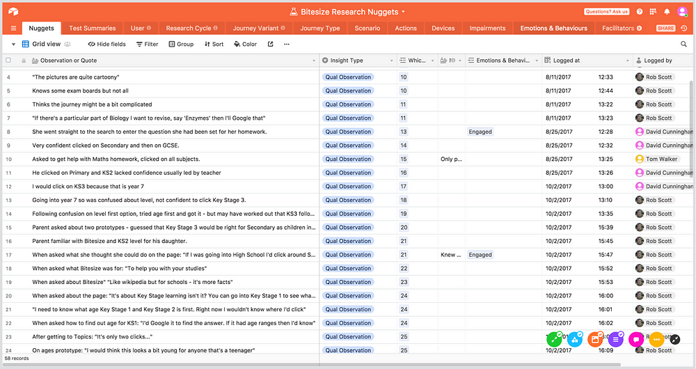
We also stored our usability testing in a database called Airtable to build up a picture over time of behaviours. We could track age, nation, school year so we could ensure we were testing broadly. We could then filter by say 7 year olds in Scotland and view our testing observations videos.
We created audience cards to facilitate discussion we’d ask people in meetings to represent a 7 year old or a 16 year old. The card contained key insights into the user based on our learnings. The mode of the user was also another card. So we could have a 7 year old returning user, or a 16 year old trying re-find content, or a 11 year old first time user. We’d always ask people to challenge our current understanding of our audience. We told them “We wanted to be wrong”
The curriculum across the UK and levels of study are complicated so to empower more people to be part of the conversation we created a simple spreadsheet with all the countries and levels. This sounds really basic but we’ve probably used it more than anything.
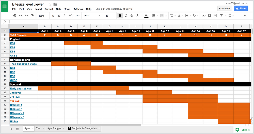
We could print out 4 sheets and people could feel empowered and challenge and bring their knowledge to the table.
User needs
Through all our testing and interviewing students, we were able to determine the following user needs.
- Students want key content prioritised.
- Students are task focussed and want to find content quickly.
- Younger primary students look for topics rather than subjects.
- Students want to find the correct content for their level of study.
- Students look for content via type (Video, images).
For the home page we created our first design hypothesis:
#1 We believe:
Meeting this user need:
Students want to find the correct content for their level of study
With these features:
Primary & secondary split on the Homepage.
Will create this business outcome:
Students will reach more content relevant to them as proposition will be instantly relevant to the them.
We think this because:
We have observed Primary students clicking on content for older students through search and within Bitesize.
We’ll know we’re right when we see this evidence:
An increased in students getting to content.
Having these needs and applying them to the hypothesis structure ensured we always had the need to outcome in there. The features had to be focussed on meeting the two. And the evidence would prove the hypothesis to be right or wrong.
The results
Overall the statistically relevant numbers were all hugely positive.
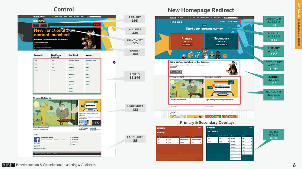
The major stat for us though was that 3% more students were getting to content.
Over the course of the year thats Millions of people. 3% may sound low to some, but due to the huge numbers of people visiting our sites at the beeb anything above 1% is deemed to be excellent.
Conclusion
Its a privilege to work for the BBC as a designer however with that is a huge responsibility to our audience to serve their needs.
We could of designed a page in a day and tested it. However this would have only ever shown if the user understands what they see and if they can interact with it.
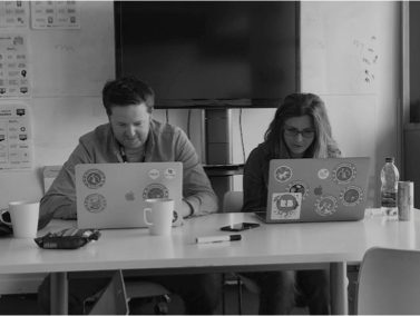
We took the opportunity to create systems of knowledge and insights that can be built upon and questioned and updated when needed.
We can now start with a need rather than an assumption. Qualitative research doesn’t give you a firm yes to go down a certain route. What is does give you is a best guess direction that can be proven or disproven over time with other sources of data.
Our best guess here through our research is a massive win for our audience. And we are proud of that. However learning is continuous and we won’t rest on our laurels.
We’re now in a position where we can run many experiments against our user needs which is very exciting.
Thanks for reading
Please do fire any questions, this post only really covers 20% of our journey.
SOURCE: https://uxdesign.cc/designing-a-homepage-for-8-million-students-of-all-ages-e299fff637d2
Dave Cunningham
Inclusive, user needs based designer @bbcuxdStill trying to figure it all out. Opinions my own.