How far can you ride scrolling gestures in a design? Pretty dang far.
I tested scrolling interactions in three different designs and found some do’s and don’t’s, pros and cons, and maybe a few rules about how to incorporate scrolling. I hope this helps you when it comes to building and prototyping your next design.
The Basics
As far as I can tell there is one over-arching rule when applying a scrolling interaction.
Rule #1
You can apply a scrolling interaction to an object on only one axis at a time.
Generally, that axis is either vertical or horizontal. Vertical scrolling is a mainstay of virtually every digital interaction you’ll come across and horizontal scrolling is a common way to show in-line content without sacrificing information space. When you apply a scrolling gesture to more than one axis, however, you break the boundaries. You give an object the space it needs to occupy any point in between its axes.
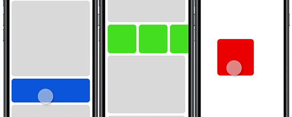
The example above (red square) shows an object with the ability to scroll both vertically and horizontally. It becomes a free-form object, more recognizable as a drag-and-drop interaction than as a scrolling interaction. I’m sure there are imaginative ways to use something like this as it is built, but it would likely not behave or be understood as a scrolling interaction.
CORRECTION
Turns out, the free-form object type of scrolling is a completely normal use case. Scrolling through a map on your phone is an example. It has different applications and isn’t discussed in this post. I only speak on incorporating and expanding upon the more traditional scrolling gestures. Up/Down. Left/Right.
Nested Scrolling
You might not be able to brake the single axis rule but you can definitely bend it. The most stable way to expand a scrolling interaction beyond a single axis is to incorporate nested scroll groups. Nesting scroll groups allow you to simultaneously apply vertical and horizontal scrolling gestures to a single object, or at least makes it seem like it.
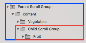
What nesting actually does is use scrolling interactions from two separate objects and applies them to one object. This means applying a scrolling group to one object then applying a separate scrolling group to an object that already contains (or is a parent of ) the first object. I included a piece of hierarchy from a design to show this. This structure allows the ‘fruits’ group to scroll separately from and simultaneously with the ‘vegetables’ group because the fruits group is receiving gestures from two scrolling interactions.
Essentially, nested scrolling uses transformations from two sources to bypass rule #1. It makes a perfectly fine work-around until those two sources are somehow made to conflict. In the example above, the ‘fruits’ group scrolls vertically, while the parent ‘fruit-vegetable’ group scrolls horizontally. This is done out of necessity. If both groups scrolled in the same direction, say vertically, then the two interactions would conflict. The system will not be able separate one scroll gesture from the other and the design will certainly break. One interaction blocks the other, barring it from being used. This brings me to the second rule I’ve learned about scrolling interactions.
Rule #2
You cannot apply or imply two scrolling interactions of the same axis onto the same object.
Even nested scrolling won’t save this one. If objects are in the same space then when it comes to the actual scrolling gesture, there can be only one interaction associated with a vertical gesture and one interaction associated with a horizontal gesture. I’d like to hope this is a software shortcoming on my end, but I don’t think it is.
Compound Scrolling
Fear not, there are still ways to stretch those scrolling bones. Compound scrolling (a name I just made up) is one such way. Instead of focusing on the actual scrolling interaction, compound scrolling allows you to proliferate that interaction outward to the rest of the design.
The gist of it involves animating off the scroll position of a scroll interaction. You use the progress of a scroll group to determine the content in other parts of a design. In the bottom example (left), a nested scroll group allows you to scroll through different shoes as well as scroll through descriptions for each shoe. What is new is the shoe icons at the bottom. They are not in the scroll group but they seem to scroll alongside of it, despite being very different in size and shape. What’s actually happening is a manual animation piggybacking off of a scroll interaction. I animated the shoe icons to be in specific positions at specific points of the scroll position. The result is one gesture controlling several different pieces of the design. It sounds time-consuming but I promise you it wasn’t.
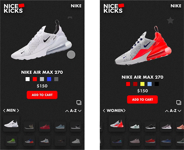
It’s not all good, however. Check out the other example (right). The same dynamic is happening but in reverse. The shoe icons are in a nested scroll group while the shoes/descriptions aren’t. You can tell that the interaction is not as smooth as the left example and it requires bigger gestures for the animation to activate. I can tell you that this particular interaction broke often. What happens is the scroll interaction does not trigger the manual animation. Let’s say the trigger for a shoe to appear is a scroll position from 0px–66px. If I somehow scroll from 5px-66px, then the manual animation doesn’t trigger and I have a broken prototype. There was a lot of trial and error before I came to the third rule of scrolling interactions.
Rule #3
Don’t do tooooo much.
Active Manipulation
By this point, I think I strayed too far from the original purpose of scrolling. What makes scrolling different from swiping and sliding is active manipulation. A swipe begins and ends. A scroll is always active. The previous designs make large use of paginated scrolling which removes this active quality. This next design, I tried to highlight it.
I redesigned (sort of) the medium mobile experience to include a scroll drawer with everything a medium’er might need. You can scroll open the drawer then scroll it closed, preserving the information space. More than that, the scroll drawer is quite big, and because scrolling is an active interaction you only need to scroll as far as the content you want requires it. The highest priority content is revealed first.

I do like this design, but I will admit, it is kind of wonky and that’s because you may have noticed I’ve broken my own rule #2 with it. The vertical scroll to open the drawer is on top of a vertical scroll for the main content. Sometimes when I scroll, the gesture breaks the boundaries of content, causing the drawer to spontaneously open. It does work though and it wasn’t an accident. I really had to think outside the box to get this design to respond to two separate vertical gestures. The fact that it does work at all despite a “rule” that claims it can’t means there is room to grow, room to wiggle, room to change and break the rules. So…
Rule #2 amended
You cannot apply two scrolling interactions in the same direction in the same axis onto one object. 😀
I hope it comes across that I don’t take these rules too seriously. They’re just things that I’ve noticed about scrolling interactions. Hopefully, we can get rid of them entirely.
Peace.
SOURCE:https://uxdesign.cc/scrolling-interactions-techniques-d6dafbfa4716
Written by
Jose Virgil Almeda
Interaction designer + user experience