This article is about a simple question with a surprisingly complex answer.
The Question
It’s Monday afternoon and the air is starting to feel stuffy in our meeting room. We are standing in front of 20 marketing professionals, all of them representatives of individual countries of an international non profit organisation. We just finished presenting our new UX approach for their global website relaunch.
“What are you going to do about the scrolling problem?”
This question got us by surprise.
“The ‘scrolling problem’?” — We asked
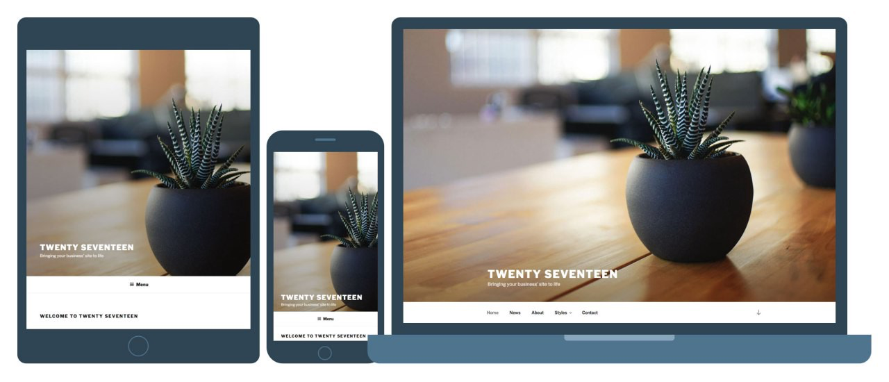
After some discussion the ‘scrolling problem’ our customer was referring to turned out to be the length of their current mobile site. The need to scroll more on mobile than on desktop was seen as a flaw that needed to be fixed.
“Our mobile site is just getting way to long”

So — Do we need to ‘fix’ scrolling?
Scrolling doesn’t need to be fixed
Seeing scrolling as a problem goes hand in hand with the much discussed ‘above the fold’ argument, the urge to place everything important in the initially visible area of a page. There are many interesting articles and UX studies about the topic, I’m going to link just two of them below. In a nutshell most of them prove that user engagement peaks exactly on or right below the fold, making the ‘above the fold’ argument invalid.
http://blog.chartbeat.com/2013/08/12/scroll-behavior-across-the-web/
In my opinion this user behaviour comes down to two reasons:
Users are impatient. They don’t wait until a page is fully loaded to scroll and discover the content.
Users have learned to scroll. In a mobile-first world scrolling has become the number one interaction with digital content. Never-ending newsfeeds have taught this interaction to users over and over again.
As a result, many pages and blogs (unknowingly) embrace this behaviour. Most of them, including the most popular WordPress themes around, feature a prominent media header at the top of the page. We call it ‘mood-setter’. It has no specific function attached to it but helps do prepare the user for the content that follows below, where engagement happens.
So, users scroll. A lot. Does this mean there is no scrolling problem?
Not exactly.
Bad responsive design needs to be fixed
Our customer has a point: When users want to skip a section (on their current page) that they are not interested in, they have to scroll through all of it’s content. As a result the organisation lost potential customers on the way.
But the real problem isn’t scrolling, it’s lazy UX design: using the same old desktop design patterns and adapting them for mobile.
There are hundreds of possible solutions to this problem, most of them feature a mobile-first approach and the idea of progressive enhancement. But just like many desktop navigation solutions don’t work on mobile, many mobile navigations don’t work great on desktop either. Take tab-bars for example: They are considered to be one of the most effective types of navigation for mobile applications. But still, they are quite uncommon on responsive websites. There is a lot of space available on desktop pages — why not use it to show content from different areas of your service instead of hiding it behind a navigation link? On the desktop it’s all about teasing different areas of your page to generate interest. On mobile it’s more about making a lot of content easy to navigate on a small screen.
Responsive Design is always about compromises, it’s about finding adaptive navigation solutions, that work on all devices and all sizes. But our current desktop and mobile navigation patterns just seem to be incompatible.
So how can we fix our customers responsive design?
Bidirectional Scrolling
The Objective
Our task was to display a huge variety of content from different categories. There were 3 main conditions:
- Don’t create two different user experiences for desktop and mobile
- Don’t hide content behind menus (don’t make a user click to often before he/she sees relevant content. But don’t overload your page with content either)
- Don’t make users scroll too much in order to see relevant content
It all comes down to a basic marketing-based user journey:
- Attention: Show the user everything you offer
- Interest: Generate interest in one specific offer
- Desire: Make the user say “I want to know more”
- Action: Make the user click
The Solution
Out of all the ideas we considered, there was one solution that caught our attention. It’s the one we presented in that meeting room when we were asked about the ‘scrolling problem’. There is no standardised naming for the solution we proposed, some people might simply say ‘horizontal scrolling’, others might call it a slider, we called it ‘bidirectional scrolling’.
bidirectional: Moving in two directions (usually opposite) — Wiktionary
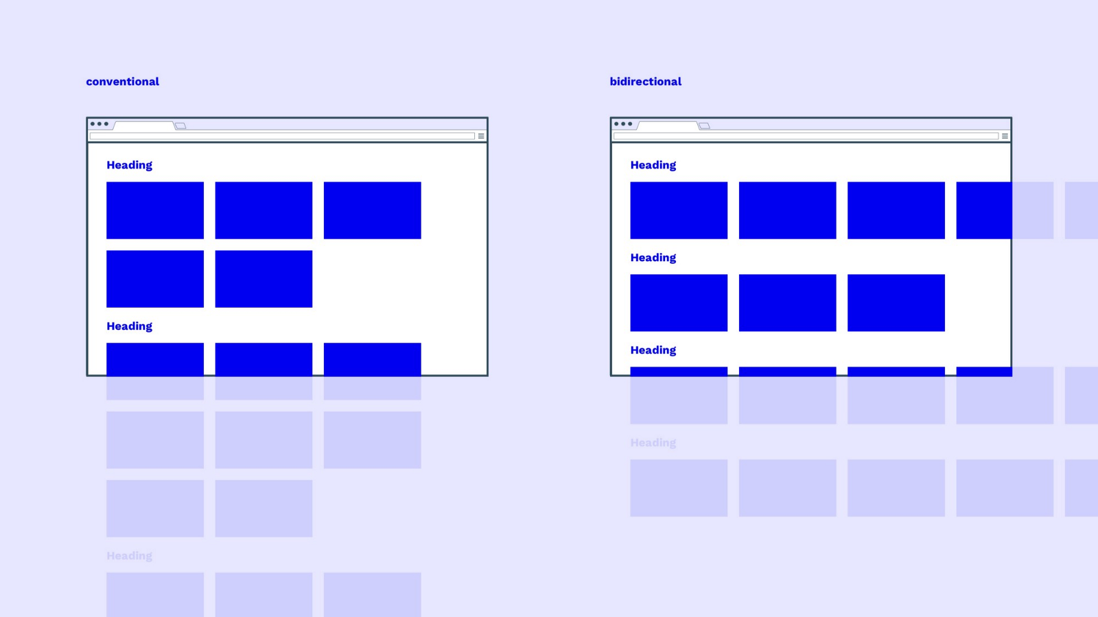
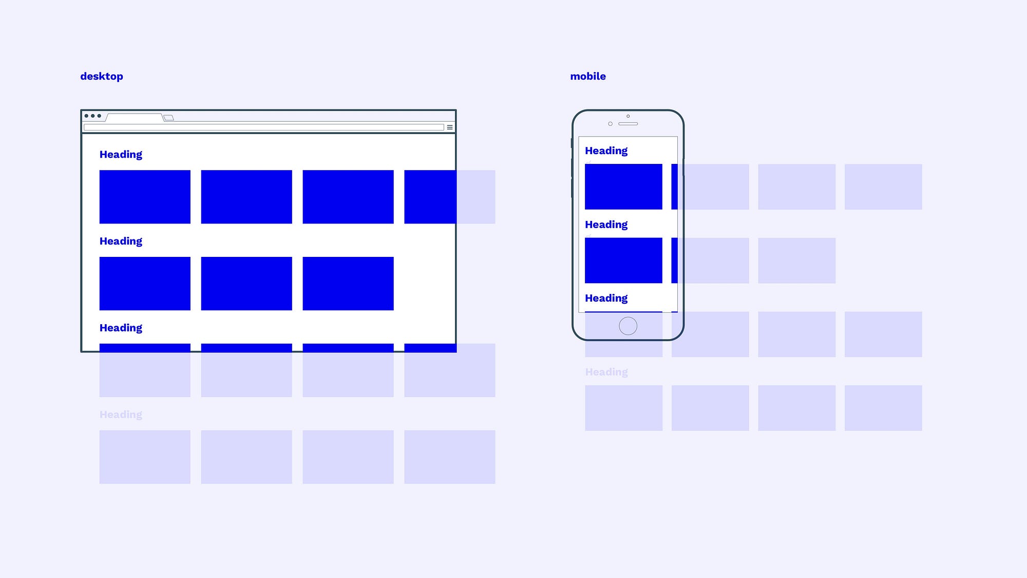
A bidirectional scrolling website is — just like the name implies — a page that scrolls in two directions. It’s important to distinct between primary and secondary scroll direction.
The primary direction of scrolling should be vertical in most cases. This means the entire page will move on the vertical axis when a user scrolls.
Many researches have shown that horizontal scrolling hurts the user experience and has lower engagement than vertical scrolling. But this doesn’t mean that you have to abandon horizontal scrolling completely.
The secondary direction of scrolling for a bidirectionally scrolling website is horizontal. This direction is used by individual sections of the page, not the entire page. Each section can be scrolled individually.
Why?
This scrolling system allowed us to tease a lot of content from different sections without creating the need to scroll, without hiding things behind a menu and without visually cluttering the interface by showing too much content. And most importantly: it works on desktop and mobile.
This way it’s easy for users to jump from section to section by scrolling vertically. Yet they still see what to expect inside each section by scrolling through it’s content-teasers horizontally. Teasing relevant content this way without forcing users to first choose a navigation point is important to generate interest. Users are used to seeing a variety of (personalised) content, e.g. when they open a social network. Facebook doesn’t ask you whether you want to see events, news or pictures. It just shows you a little bit of everything and gives you the option to view more content of each type. When designing an interface that is supposed to encourage users to discover your website it’s important to remove hurdles. Skip complex navigations, minimise clicks whenever possible and focus on the content that users might be interested in.
How?
There are many great articles on how to integrate horizontal scrolling into interfaces. Here are just two of them:
Examples of bidirectional scrolling
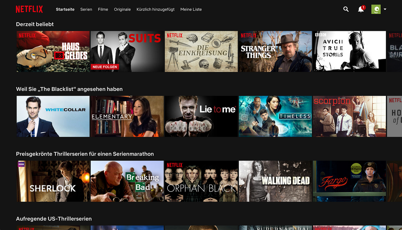
Bidirectional scrolling isn’t a new idea. Interfaces like this have been around for quite some time, almost exclusively for media-libraries like Netflix or Amazon Video.
With apple embracing bidirectional scrolling in their new apps like App Store, Music and Podcasts, more and more app developers started picking up the idea lately.
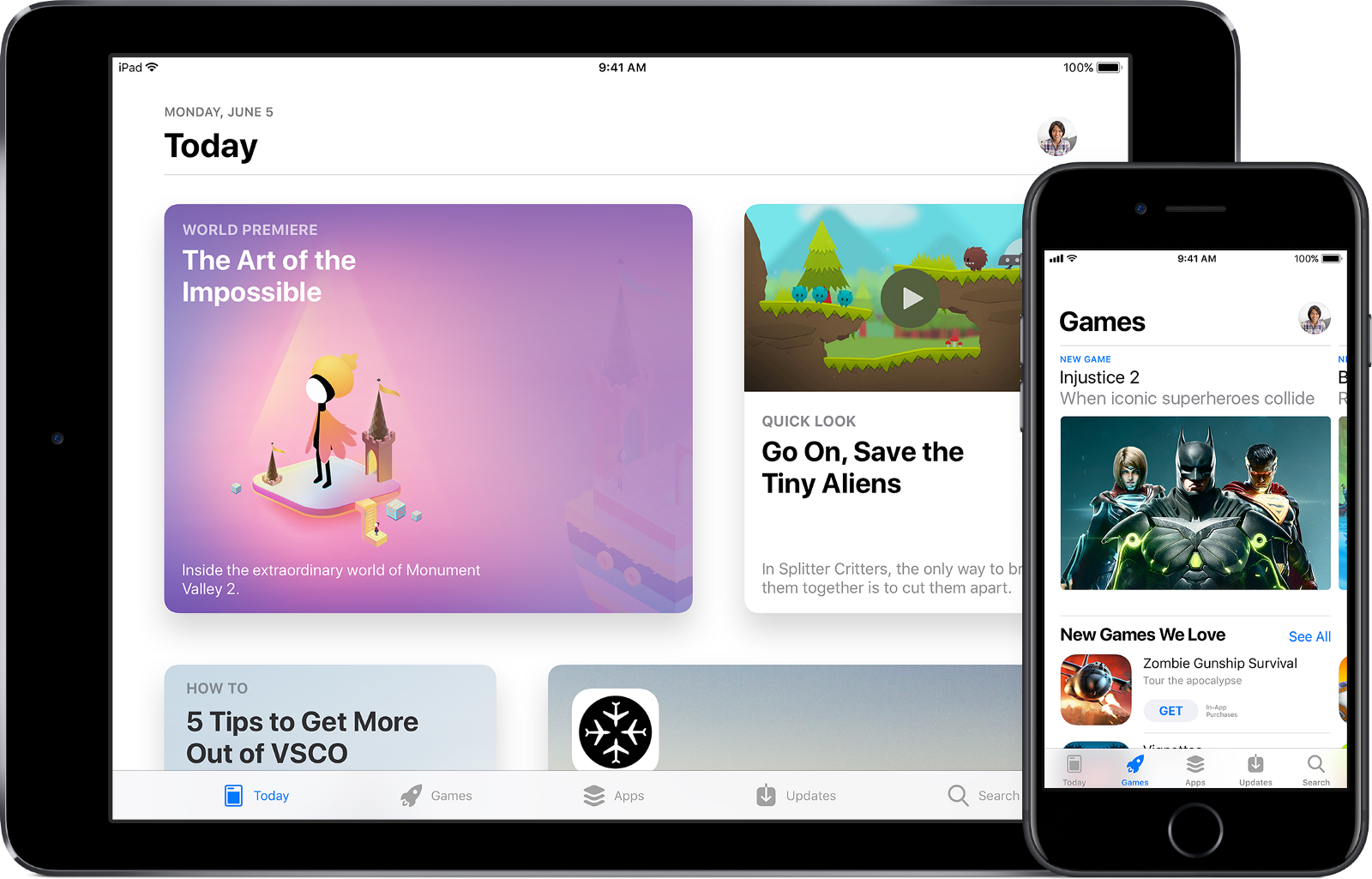
The idea now starts to make the jump from native apps to web-interfaces. Also it is no longer limited to media-heavy interfaces. We are starting to see this UX pattern on news-websites, social networks, booking sites and many other digital services.
Do you know a great example of bidirectional navigation patterns?
Let me know!
SOURCE; https://uxplanet.org/bidirectional-scrolling-is-here-to-save-responsive-design-be1afe53206d
Written by
Fabian Sebastian
Designer and Design Thinker, currently working as Creative Director at adunique in Hamburg. www.fabiansebastian.com