
by Bradley Nice, Content Manager at ClickHelp.com — software documentation tool
The end of the year draws near, so i guess it’s time to reflect on its highlights.
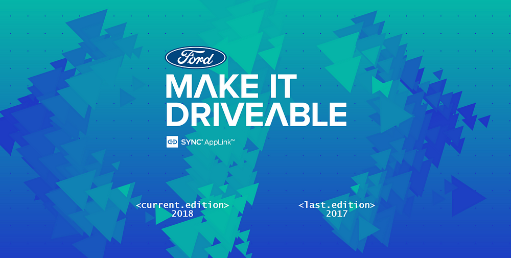
Large Headings and Bold Typography
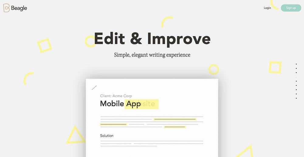
Typography and imagery have always been the two pillars of web design that draw your your attention and make the first impression, creating website’s personality and setting its tone.
And headings were always used to highlight the most important parts of website and make it more readable, making a distinction between different parts. And the mobile devices’ increasing screen resolutions untied designers’ hands.
Mobile-oriented designs
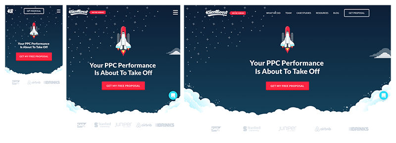
As I mentioned earlier, mobile devices are getting better at displaying web pages due to increasing screen resolutions and sharpness. And, not surprisingly, mobiles have officially surpassed desktop in internet usage, so it’s not a surprise that more and more people make designs with mobiles first in mind, and only then — desktop.
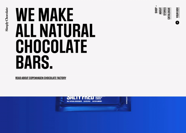
Minimalism
This one has been going on for some time already and is not unique to this year, but still — more and more web designers tend to create simplistic designs with only the bare minimum of information and graphics. It’s true — people don’t want cluttered pages with tons of interactive elements, they want what they came for, and simplistic designs aim to help them reaching their goals.
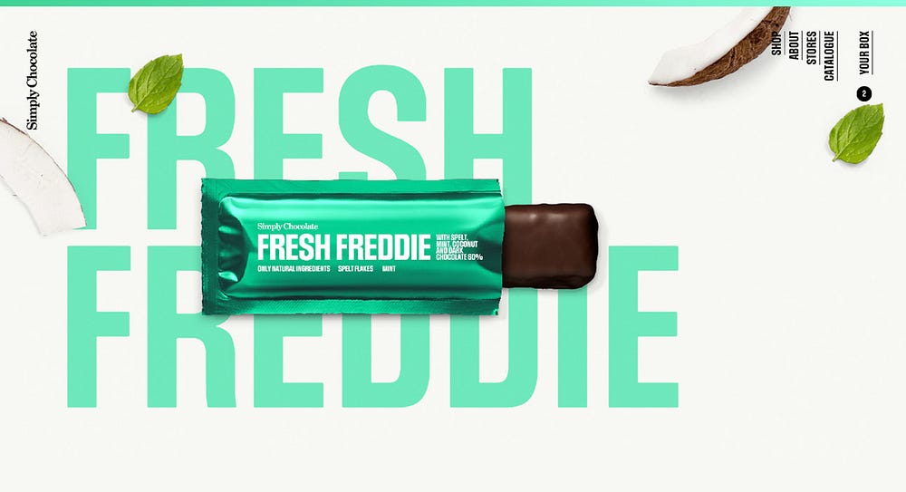
Bright and vibrant colors
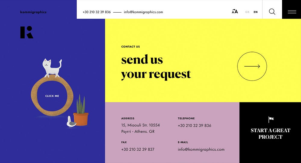
And don’t forget to throw in a contrasting combinations in the mix as well. While in the previous years many brands were keeping to web-safe colors, this year is a new page for web. Designers are not afraid to experiment, using wild colors that will draw attention for sure.
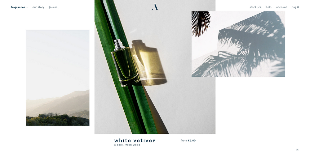
Custom illustrations

Finally, we are starting to see less and less stock photos and videos on websites! And instead brands bring us custom illustrations, often stylized and tailored to brand’s tone.
Gradients
Yes, it is another color-related trend, but I didn’t want to include it into the “bright and vibrant colors” section for a couple of simple reasons — not always gradients are of vivid colors, and anyway that is a whole independent trend. Over the previous years flat design was a dominant style, but gradients made their comeback in 2018.
Animation
Be it a micro animation of the menu items popping up when you hover over them or the whole page animated (like in the example above), but the fact is that animations are slowly taking over. They allow to better convey your message to visitors and attract attention. And technology advances pretty fast, allowing more and more websites incorporate animations with the minimum impact on performance.
Asymmetrical and broken layout
This one is going strong in 2018, after being introduced somewhere around 2017. You can’t argue — it has certain appeal and uniqueness to it, when nothing is symmetrical and seems out of place, but still perfectly fitted onto the page. Although broken grid layouts may not suit sites with a lot of content, especially lots of text, but still it’s an interesting trend.
If you know any other noticeable trends that I may have missed — be sure to let me know in comment section below!
I wonder what 2019 will bring us…
Have a nice day!
Bradley Nice,
Content Manager at ClickHelp.com — best online documentation tool for SaaS vendors
SOURCE: https://medium.com/level-up-web/2018-a-year-in-review-ui-trends-in-web-design-59da415b4092

Bradley Nice
Content Manager at https://medium.com/level-up-web ?. I write about web design, web development and technical writing. Follow me on Twitter and Facebook