More often than not, especially by those who are just starting their UI/UX design career, the use of uppercase is overlooked.
Of course, OVERUSING caps is almost as bad as not using it at all. You have to be smart about it, just like with everything else. Let’s take a look at a live example.
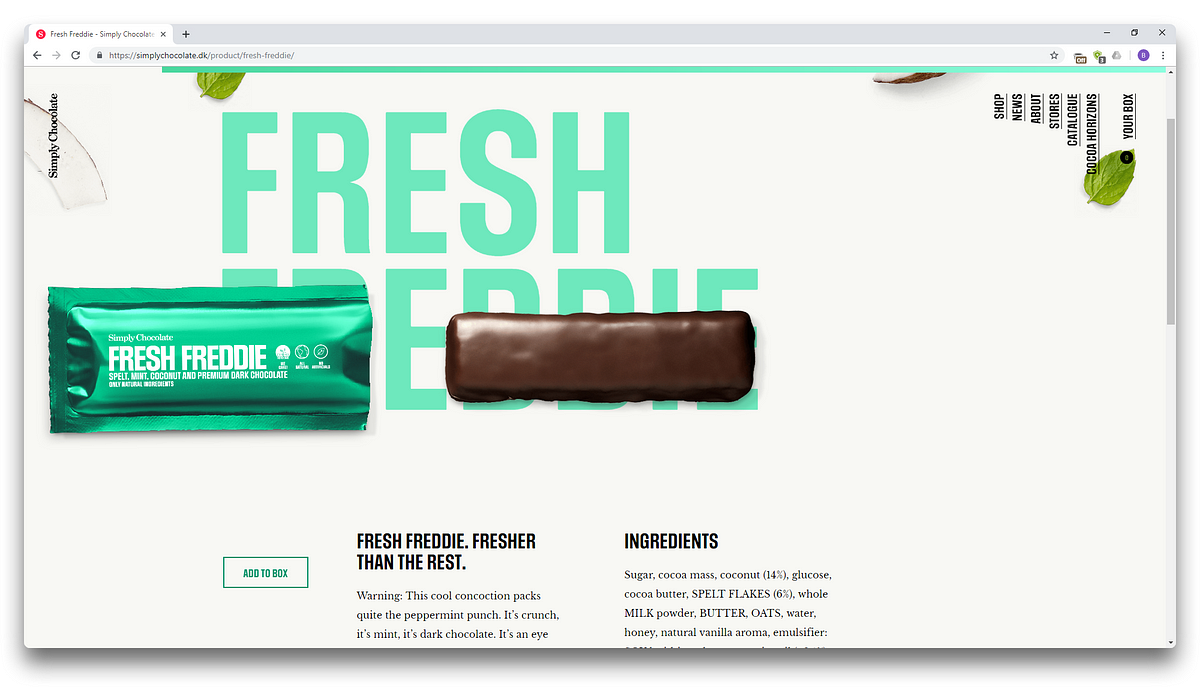
As you might notice, pretty much everything that isn’t a body text is in uppercase. The menu, the titles, and button text as well.
And that’s perfectly okay because they are careful with their all caps. Menu items are separated from one another by an underline, and the titles are all quite short.
And that is lesson #1, kids — don’t use your uppercase where there will be a lot of text. It will only make it harder to read and perceive. Let’s switch ’em up, shall we?
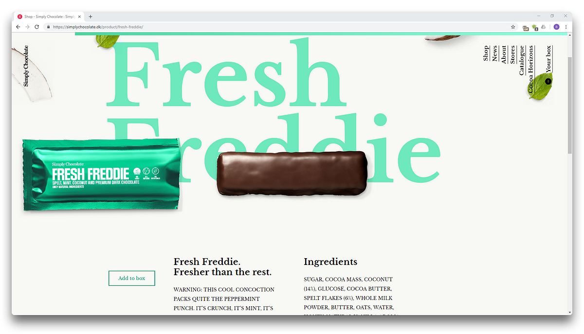
First, let’s look at the menu. I intentionally ditched not only the uppercase but the font-family as well, because, in theirs, lowercase and uppercase look almost the same. See what happened? The text immediately got harder to read.
And that’s another tip — uppercase text can be read vertically with almost no effort.
Then the big heading in the background — it becomes less visible and is almost lost amongst other elements. The only thing saving it is its size and contrasting color.
The next stop — text headings. Now it almost looks like a regular text. And that’s yet another tip — uppercase draws attention to smaller pieces of text. And this effect here is practically lost. Almost, because the font is still bold and of larger size than the body text.
And look at that terrible all-caps body text. It almost physically hurts my brain trying to read it.
And though typography can seem subjective, it obeys lots of rules. One of them is alignment. Each font treats it differently, but what I wanted to talk about is the difference between sentence case and uppercase. Look at this text:
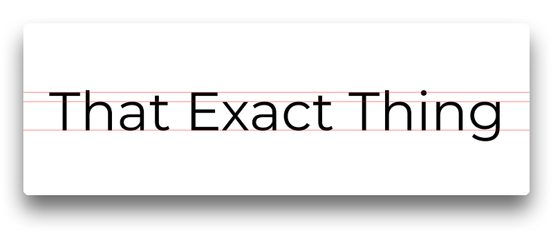
It’s almost perfectly aligned along the baseline, aligned well enough along the x-height line, but the cap height alignment? In this example, the h breaks it (so would f, b, and others). It may be hardly noticeable, but it’s essential for our breakdown. Now look at the same font, same text, but in uppercase:
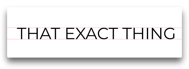
Now everything is perfectly aligned along both axes. And thus it creates a sense of tidiness, neatness. It’s clean. It’s simple.
Basically, there are a lot of elements on the page, where page can be uppercased:
- Navigational items
- Titles (obviously)
- Subtitles
- Button labels
- Form controls
Don’t be afraid to experiment with uppercase. If you feel that uppercasing your text makes it too dense — just increase the letter spacing, and keep on experimenting!
Have a nice day!
Bradley Nice,
Content Manager at ClickHelp.com — best online documentation tool for SaaS vendors
Bradley Nice
Content Manager at https://medium.com/level-up-web ?. I write about web design, web development and technical writing. Follow me on Twitter and Facebook
Level Up!
Stories for technical writers, web developers and web designers. It’s time to level up your skills!