“Should I use Infinite scrolling or Pagination for my content?” Some designers still not sure which method to choose for their project. Each method has their strengths and weaknesses and in this article we’ll overview the two methods and decide which one we should use for our projects.
Infinite Scrolling
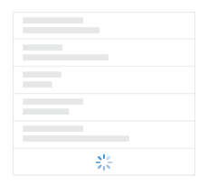
Infinite scrolling is a technique that allowing users to scroll through a massive chunk of content with no finishing-line in sight. This technique simply keeps refreshing a page when you scroll down it. Tempting as it may sound, the technique isn’t a one-size-fits-all solution for every site or app.
Pros #1: User Engagement and Content Discovery
When you use scrolling as your prime method of exploring the data, it maymake the user to stay longer on your web page, and so increase engagement. With the popularity of social media, massive amounts of data are being consumed; infinite scrolling offers an efficient way to browse that ocean of information, without having to wait for pages to preload.
Infinite scrolling is almost a must-have feature for discovery interfaces. When the user does not search for something specific so they need to see a large amount of items to find the one thing they like.
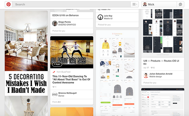
You may measure the benefits of infinite scrolling with the example of a Facebook news feed. By unspoken agreement, users are aware that they won’t get to see everything on the feed, because the content is updated too frequently. With infinite scrolling, Facebook is doing it’s best to expose as much information as possible to the users and they are scanning and consuming this flow of information.

Pros #2: Scrolling is Better Than Clicking
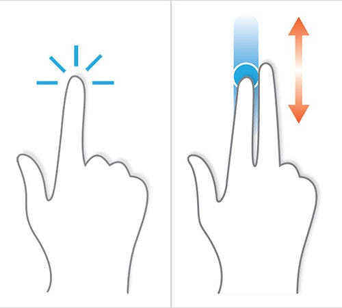
Users have better experiences with scrolling than clicking/tapping. The mouse wheels or touchscreens make scrolling faster and easier than clicking. For a continuous and lengthy content, like a tutorial, scrolling provides even better usability than slicing up the text to several separate screens or pages.
Pros #3: Scrolling is Good For Mobile Devices
The smaller the screen, the longer the scroll. The popularization of mobile browsing is another significant supporter of long scrolling. The gesture controls of mobile devices make scrolling intuitive and easy to use. As a result, the users enjoy a truly responsive experience, whatever device they’re using.
Cons #1: Page Performance and Device Resources
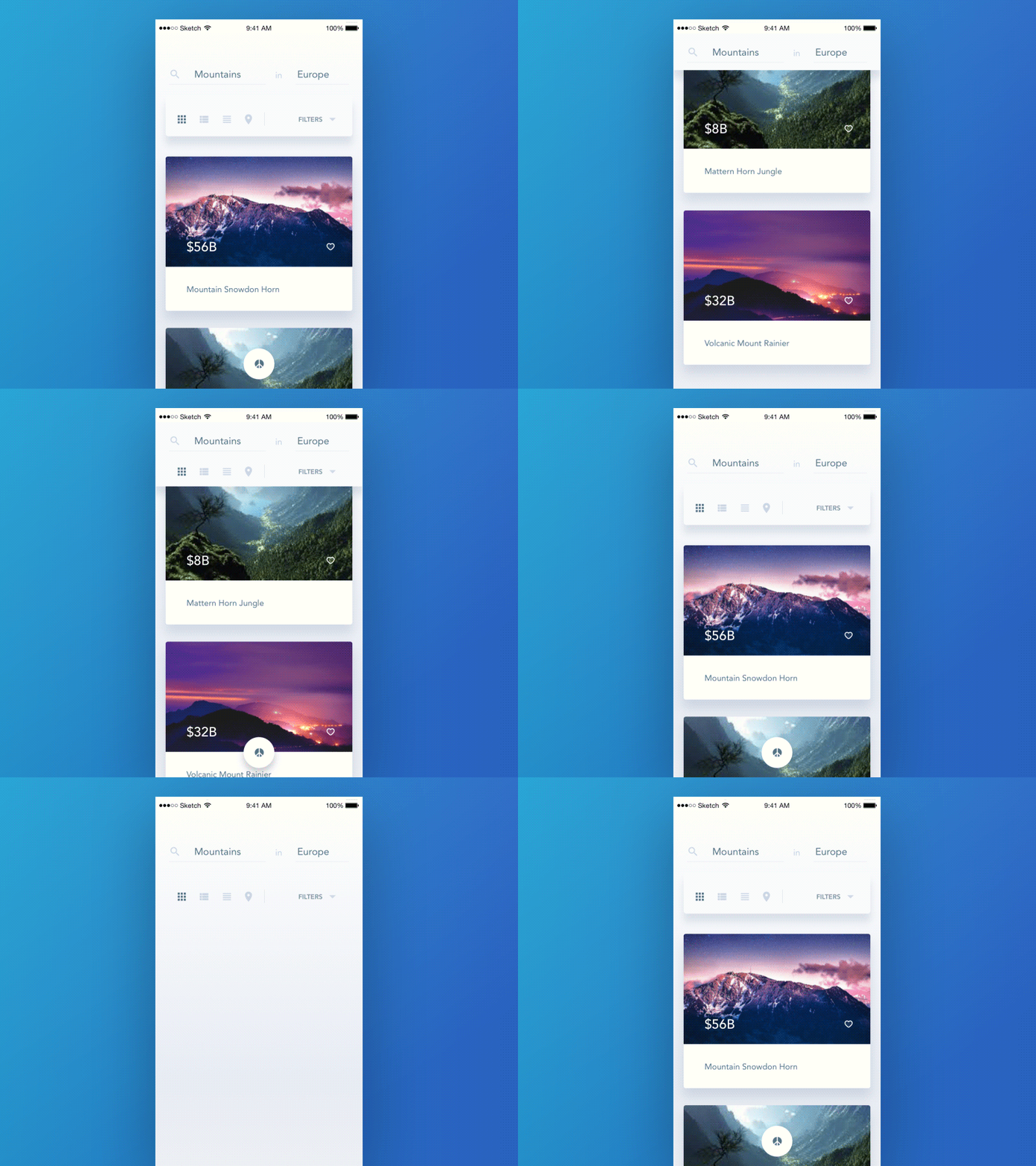
Page-loading speed is everything for good user experience. Multiple researches have shown that slow load times result in people leaving your site or delete your app which result in low conversion rates. And that’s bad news for those who use an infinite-scrolling. The more users scroll down a page, more content has to load on the same page. As a result, the page performance will increasingly slow down.
Another problem is limited resources of the user’s device. On many infinite scrolling sites, especially those with many images, devices with limited resources such as an iPad can start slowing down because of the sheer number of assets it has loaded.
Cons #2: Item Search and Location
Another issue with infinite scrolling is that when users get to a certain point in the stream, they can’t bookmark their location and come back to it later. If they leave the site, they’ll lose all their progress and will have to scroll down again to get back to the same spot. This inability to determine the scrolling position of the user not only causes annoyance or confusion to the users but also hurts the overall user experience, as a result.
In 2012 Etsy had spent time implementing an infinite scroll interface and found that the new interface just didn’t perform as well as a pagination. Although the amount of purchases stayed roughly the same, user engagement has gone down — now people weren’t using the search so much.

As Dmitry Fadeyev points out: “People will want to go back to the list of search results to check out the items they’ve just seen, comparing them to what else they’ve discovered somewhere else down the list. Not only does the infinite scroll break this dynamic, it also makes it difficult to move up and down the list, especially when you return to the page at another time and find yourself back at the top, being forced to scroll down the list once again and wait for the results to load. In this way the infinite scroll interface is actually slower than the paginated one.”
Cons #3: Irrelevant Scroll Bar
Another annoying thing is that scroll bars don’t reflect the actual amount of data available. You’ll scroll down happily assuming you are close to the bottom, which by itself tempts you to scroll that little bit more, only to find that the results have just doubled by the time you get there. From an accessibility point of view it’s quite bad to break the use of scrollbars for your users.

Cons #4: Lack of a Footer
Footers exist for a reason: they contain content that the user sometimes needs — if users can’t find something or they want additional information, they often go there. But because the feed scrolls infinitely, more data gets loaded as soon as user reach the bottom, pushing the footer out of view every time.

Sites that implement infinite scrolling should either make the footer accessible by making it sticky or relocate the links to a top or side bar.

Another solution is to load content on demand using a Load More button. New content won’t automatically load until the user clicks the More button. This way users can get to your footer easily without having to chase it down.

Pagination
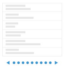
Pagination is a user interface pattern that divides content into separate pages. If you scroll to the bottom of a page and see the row of numbers — that row of numbers is a site’s or app’s pagination.
Pros #1: Good Conversion
Pagination is good when the user is searching for something in particular within the list of results, not just scanning and consuming the flow of information.
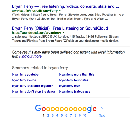
You may measure the benefits of pagination with the example of Google Search. Looking for the best search result could take a second or an hour, depending on your research. But when you decide to stop searching in Google’s current format, you know the exact number of search results. You can make an decision about where to stop or how many results to peruse.
Pros #2: Sense of Control
Infinite scrolling is like an endless game — no matter how far you scroll, you feel like you’ll never get to the end. When the users know the number of results available they are able to make a more informed decision, rather than be left to scour an infinitely scrolling list. According to the David Kieras research Psychology in Human-Computer Interaction: “Reaching an end point provides a sense of control”. The research also clarifies that when users have limited but still relevant results, they are able to determine easily if what they’re seeking is actually there or not.
Also when users see total number of results (of course when a total amount of data isn’t infinite) they will be able to estimate how much time it’ll take to find what they’re actually looking for.
Pros #3: Item Location
Having a paginated interface lets the user keep a mental location of the item. They may not necessarily know the exact page number of page, but they will remember roughly what it was, and the paginated links will let them get there easier.

Pagination is good for ecomerce sites and apps. When users shop online, they want to be able to come back to the place they left off and continue their shopping.

Cons: Extra Actions
To get to the next page in a pagination, the user has to find the link target (e.g. “Next”), hover the mouse over it, click it and wait for the new page to load.

The main problem here is that most sites show users very limited content with a single page. By making your pages longer without compromising loading speed, users will get more content per page and won’t have to click or tap the pagination button as much.
When To Use Infinite Scrolling/Pagination?
There are only a few instances where infinite scrolling is effective. It’s best suited for sites and apps that are streams of user-generated content (Twitter, Facebook, Pinterest, Instagram). Pagination, on the other hand, is well-suited for goal-oriented sites and apps.
Google experience is a good illustration for this point. Google Images uses infinite scroll because users are able to scan and process images much more quickly than text. Reading a search result takes much longer. This is the reason why their Google Search results still use the more traditional pagination technique.
Conclusion
Designers should weigh the pros and cons of infinite scrolling and pagination before select the one. The choice depends on the context of your design and how that content is delivered. In general, an infinite scroll works well for something like Twitter where users consuming an endless stream of data generated in real time without looking for anything in particular, while pagination interface is good for search results pages where people are looking for a specific item and where the location of all the items the user has viewed matter.
Thank you!
Source: https://uxplanet.org/ux-infinite-scrolling-vs-pagination-1030d29376f1
Editor-in-chief of UX Planet (https://uxplanet.org). http://babich.biz
UX Planet
UX Planet is a one-stop resource for everything related to user experience.