Infinite scrolling, sometimes called endless scrolling, is a technique that allowing users to scroll through a massive chunk of content with no finishing-line in sight. This technique simply keeps refreshing a page when you scroll down it.
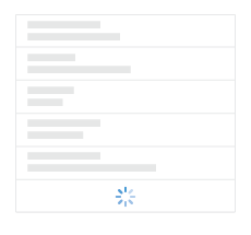
The technique allow user to scroll the list of items without any interruption oradditional interaction — items simply appear as the user scrolls down the page. It’s notably used in the news feed page on Facebook; the images search results page of Google and the Twitter timeline. Tempting as it may sound, the technique isn’t a one-size-fits-all solution for every site or app.
Five Rules For Good Infinite Scroll
Making good infinite scroll isn’t impossible task. In order to complete it you should remember and follow these guidelines.
1. Keep The Navigation Bar Visible
When you use infinite scrolling it’s best to keep the navigation bar persistentlyvisible, so that navigating to different areas of the site or app is fast and easy for users. If navigation bar is out of reach, users will have to scroll all the way back when they’re far down the list.

Mobile devices only: Because a mobile screen is much smaller, navigation bar can take up a relatively largely portion of the screen. If the screen is a scrolling feed, the navigation bar can be hidden when people scrolling for new content and revealed if they start pulling down trying to get back to the top.
2. Use a “Load More” Button If You Have A Footer
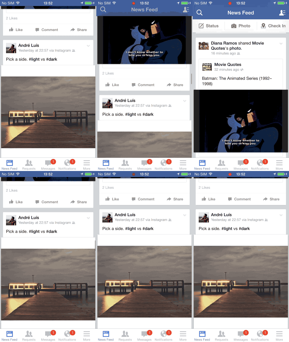
Infinite scrolling impedes the user’s access to the page footer. And actually this is one of the major design challenges of infinite scrolling: because items continually load as the user approaches the bottom of the list, the user will see the footer for a second or two until the next set of results is loaded and pushed the footer out of view. This prevents the user from reaching the footer.
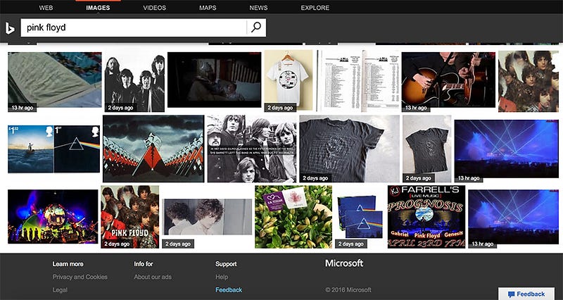
Take Bing Images, for instance. The footer contains links like “Learn More” and “Help,” but user aren’t going to be able to actually click on any of these links until the page stops infinite-scrolling, which takes a while.
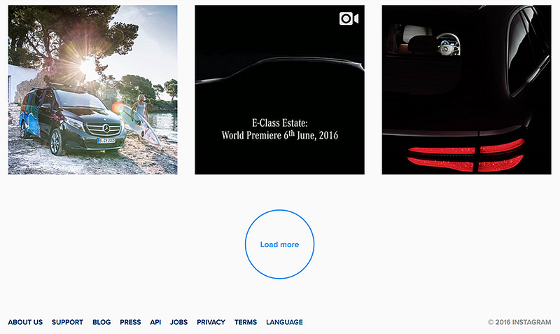
If your site or app has a footer and it’s important to you (or more importantly, to your users), you should use the “Load more” approach. New content won’t automatically load until the user clicks the “Load More” button. This makes for a very simple interface and probably the smallest cognitive load possible for on-demand loading of additional items.
Instagram uses “Load more” button in order to provide an easy access to the footer and doesn’t force the user to click “Load more” button again and again.
3. Back Button Bring Users Back To Their Previous Spot
Sometimes infinite scroll implementation introduces a major usability flaw: the scroll position isn’t recorded as a ‘state’. If users follows the link from the list, and then clicks the Back button, they expect to return to the same point on the original page. But the user’s position in the list of results is not maintained and this means using the browser’s back button will generally reset the scroll position to the top of the page. It’s not surprise that users get frustated quite fast by not having a proper “back to list” functionality.

Don’t make your users lose their place in the list of items just because they used the Back button. It’s critical that after a user has visited a particular item page from the list, they are taken back to the same spot on that list upon clicking the browser’s back button.
Flickr matching the browser’s back-button behavior to the user’s expectation. The app remember the user’s scroll position, so when the user press Back button he returns to the original position.

4. Add the Possibility To Bookmark Particular Items
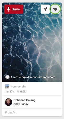
One of the most often cons of infinite scroll is that it’s impossible to bookmark things as they appeared. A simple bookmark (or “save for later”) of favorite results for future reference is a very powerful tool for your users. Users do a bookmarking if the site or app offers it. Pinterest, for instance, uses a bookmarking tool that helps users save creative ideas.
5. Provide a Visual Feedback When Loading New Content
When new content is loading, users need a clear sign that the site is doing this. Keep them informed by using a progress indicator to show that new content is loading and will soon appear on the page.
Since loading new content is a fast action (it shouldn’t take longer that 2–10 seconds) you can use looped animation to offers feedback that the system is working.
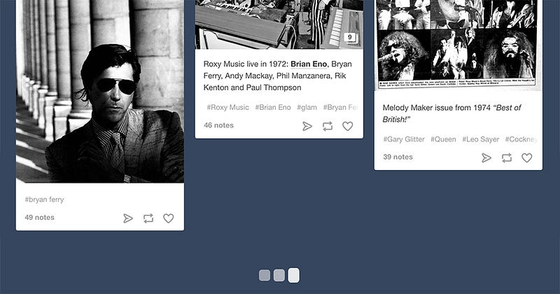
It can also be helpful to add additional clarity for the user by including text that explains why the user is waiting (e.g. “Loading comments…”).

Conclusion
When infinite scrolling is implemented well, it can make for an incredibly smooth and seamless experience. Hopefully you’ve received some clues as to what makes good infinite scrollling and this will help you to establish perfect user experience.
Thank you!
Follow UX Planet: Twitter | Facebook
Source: https://uxplanet.org/infinite-scrolling-best-practices-c7f24c9af1d
Written by
Editor-in-chief of UX Planet (https://uxplanet.org). http://babich.biz
UX Planet
UX Planet is a one-stop resource for everything related to user experience.