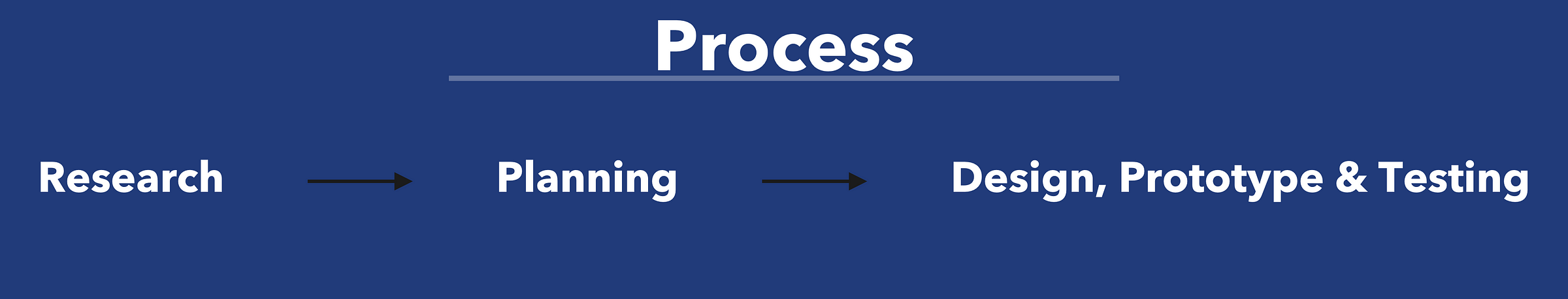
Task
- To re-brand or refine the visual identity of the brand.
- Re-design key pages of the UI/UX of the current Bloomsbury Beginnings website (helping visitors quickly understand the value of the course thus encouraging them to sign up to the programme).
- Creation of a new members area for users with key start-up resources e.g Lean canvas. This is to extended their Bloomsbury Beginnings activity from face-to-face events to a scalable online resource where they build a longer term relationship with the brand.
Tools Used: Sketch, Illustrator, Photoshop, InVision, Principle, Keynote
Target Devices: iOS devices
Timeline: < 3Weeks
The Client

Bloomsbury Beginnings (situated at Calthorpe Project in central London) was founded by Ann and it helps entrepreneurs with sustainable/social businesses or enterprise ideas, charities to develop and grow at the first step of their business journey by introducing and applying business support resources and services. The entrepreneurs receive these services and support from experts within the field for a period of time e.g 3 months. At the end of the course, they would have a business plan, a great network and a product or service for their customers.
My Role: Analysed the research and designed the user interface. Worked with a team of UX researchers to get user data.

Challenge
- Despite the current website, majority of the members (both past and present) still contact Ann directly for more information before making informed decisions about the course etc.
- Having a “member’s area’ or creating a way both past and present members can add value to each other.
- With most of the teaching currently done on paper, it is difficult keeping all the work intact, thus the new web app would aim to digitalise this business tools and resources.
UX Research & Findings
Context Inquiry & Interviews
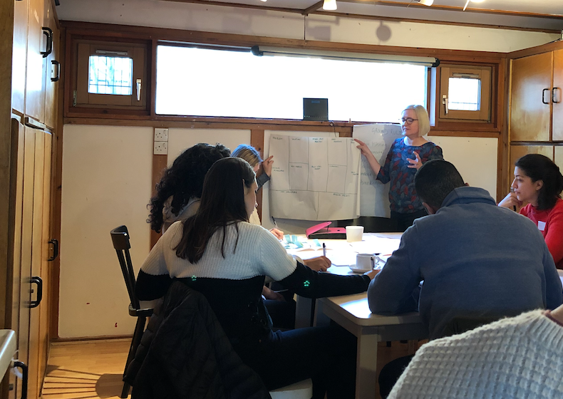
The client provided us a chance to visit during one of her start-up course sessions. At the end, we had the opportunity to directly speak with the current students, in which we interviewed 7.
Take aways:
- Start-up material such as lean canvas easily got lost in paper format (Here we thought perhaps a digitised version that can be edited could be a solution).
- Content on website was unclear.
- A lot of the students are not the most tech savvy.
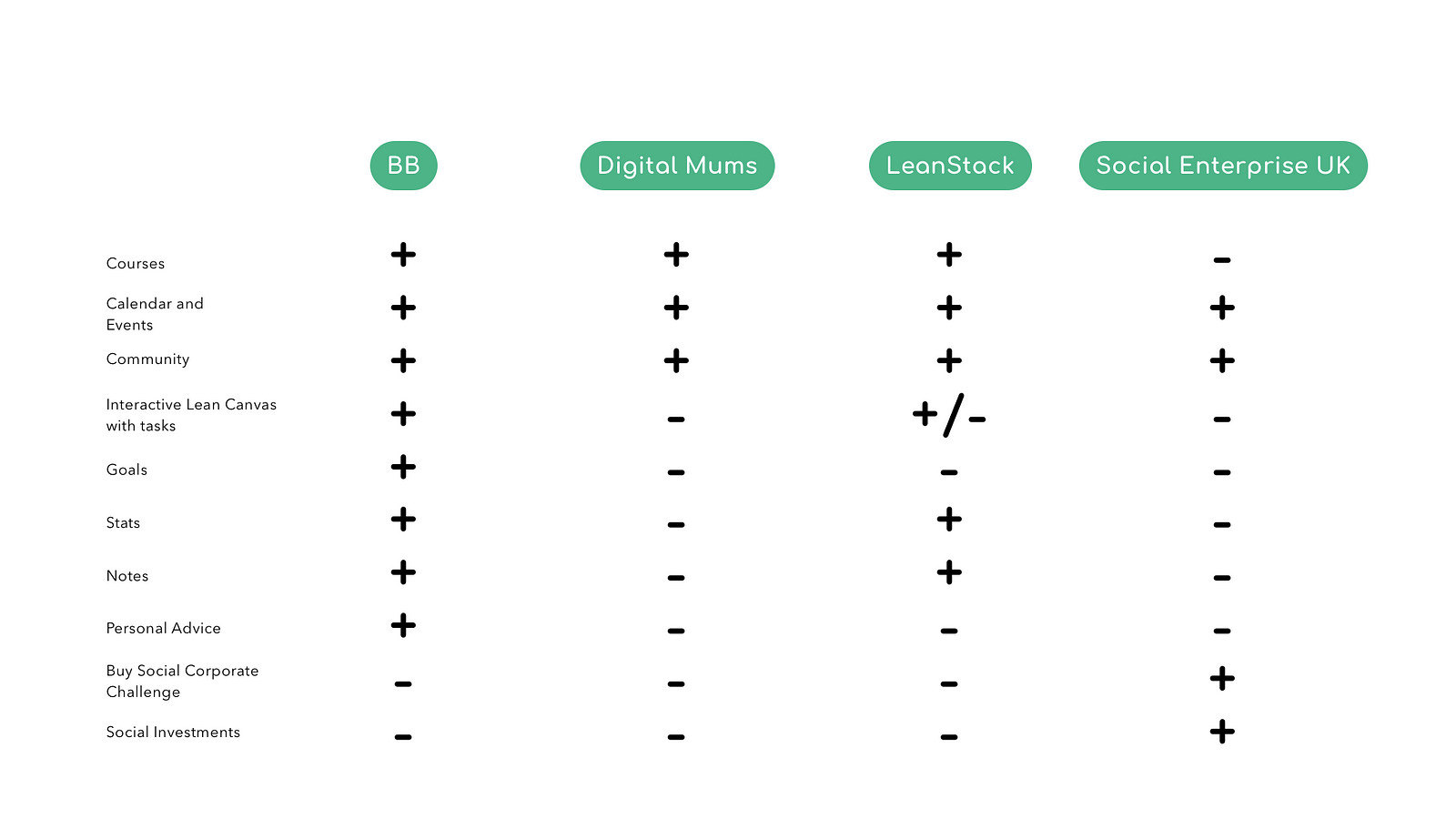
Competitor analysis
we analysed the competition — similar companies that aim to help inexperienced entrepreneurs with their business ideas and goals.
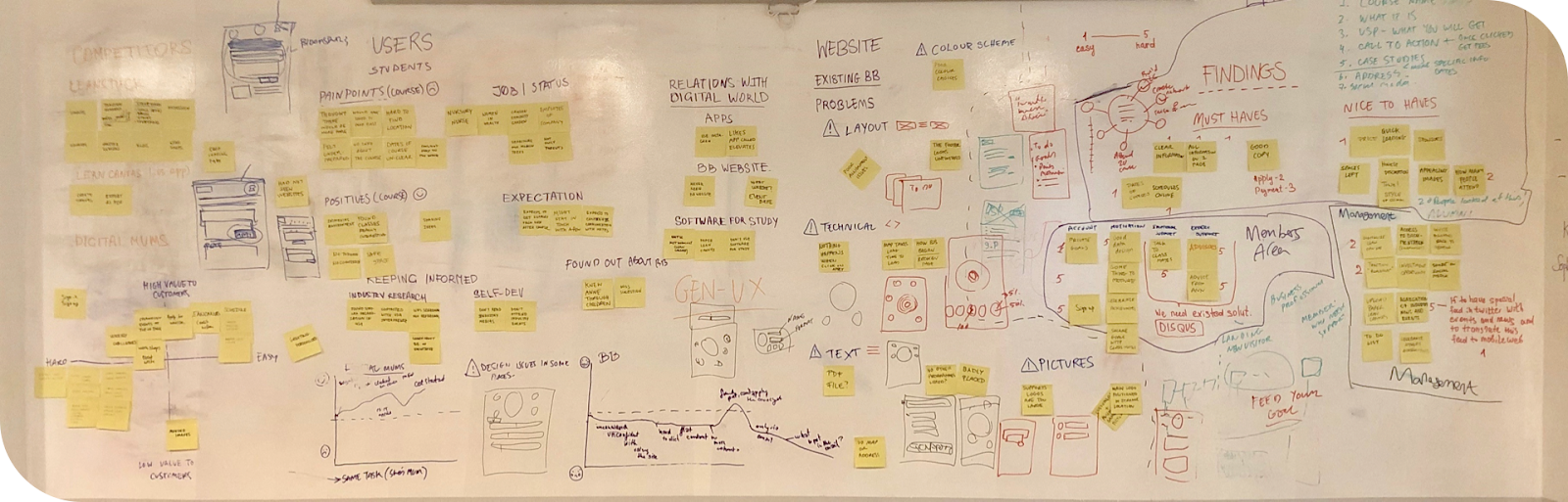
Affinity Diagram
We used this technique to further breakdown the information gathered from the interviews and refined them into common themes such as user problems, needs, goals, emotions and pain points.
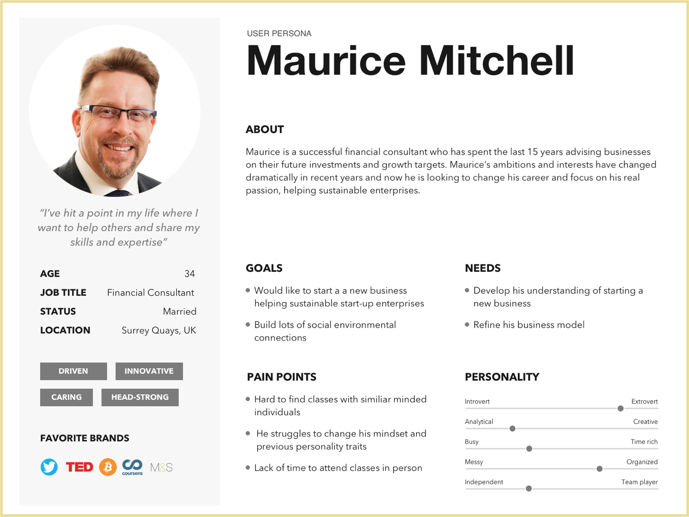
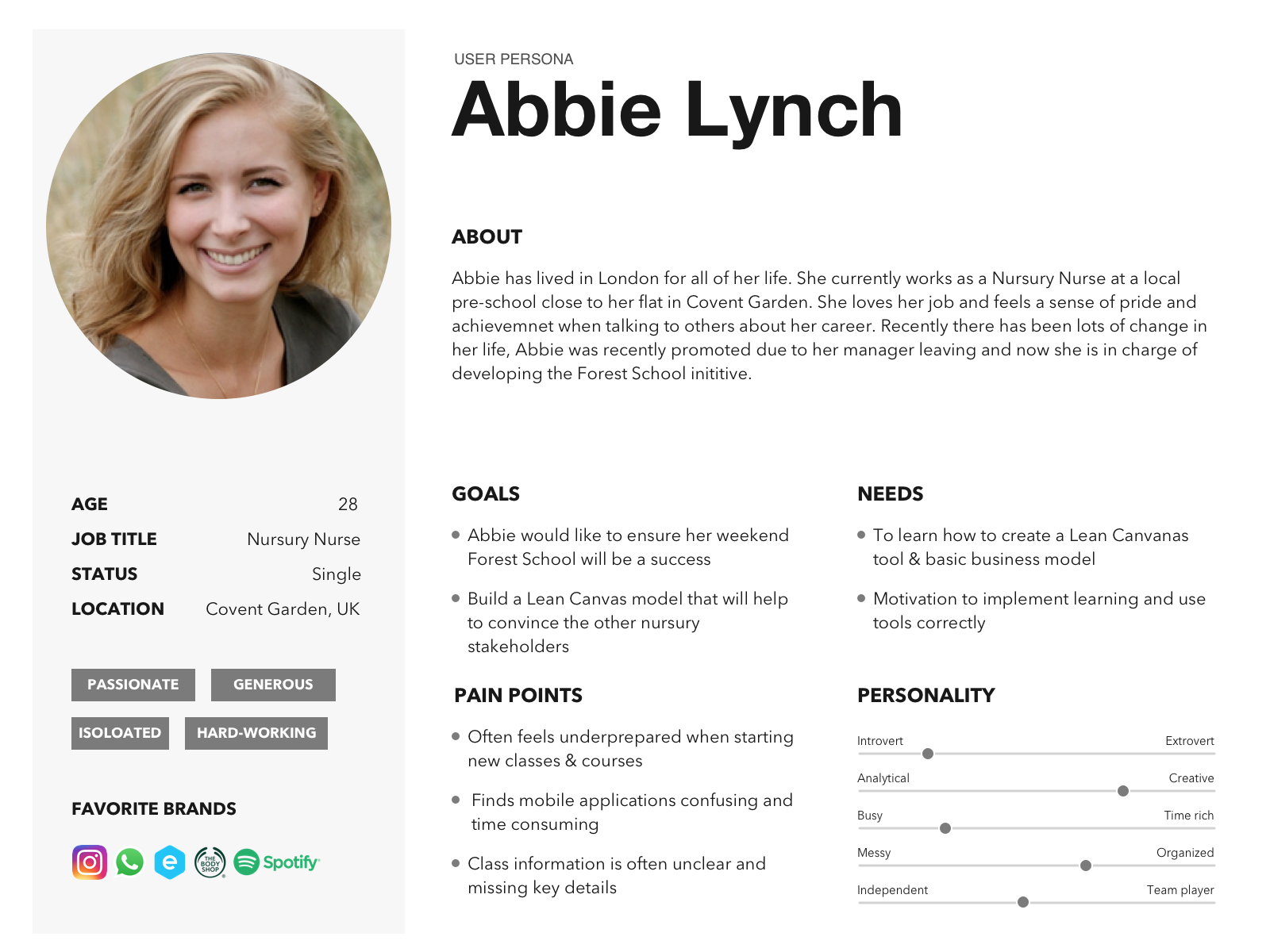
User Persona
We created two personas, each one distinguish between male and female characteristics. Both users are highly time constrained as they are likely to have a job that pays the bills (outside their business idea) and in some cases kids.

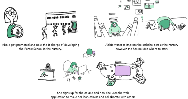
Storyboard
Storyboard is used here to visualise the user journey to further build context and empathise with them. This is because sometimes as a designer, it might be hard to empathise with a user that is not you and this is where a storyboard can help.
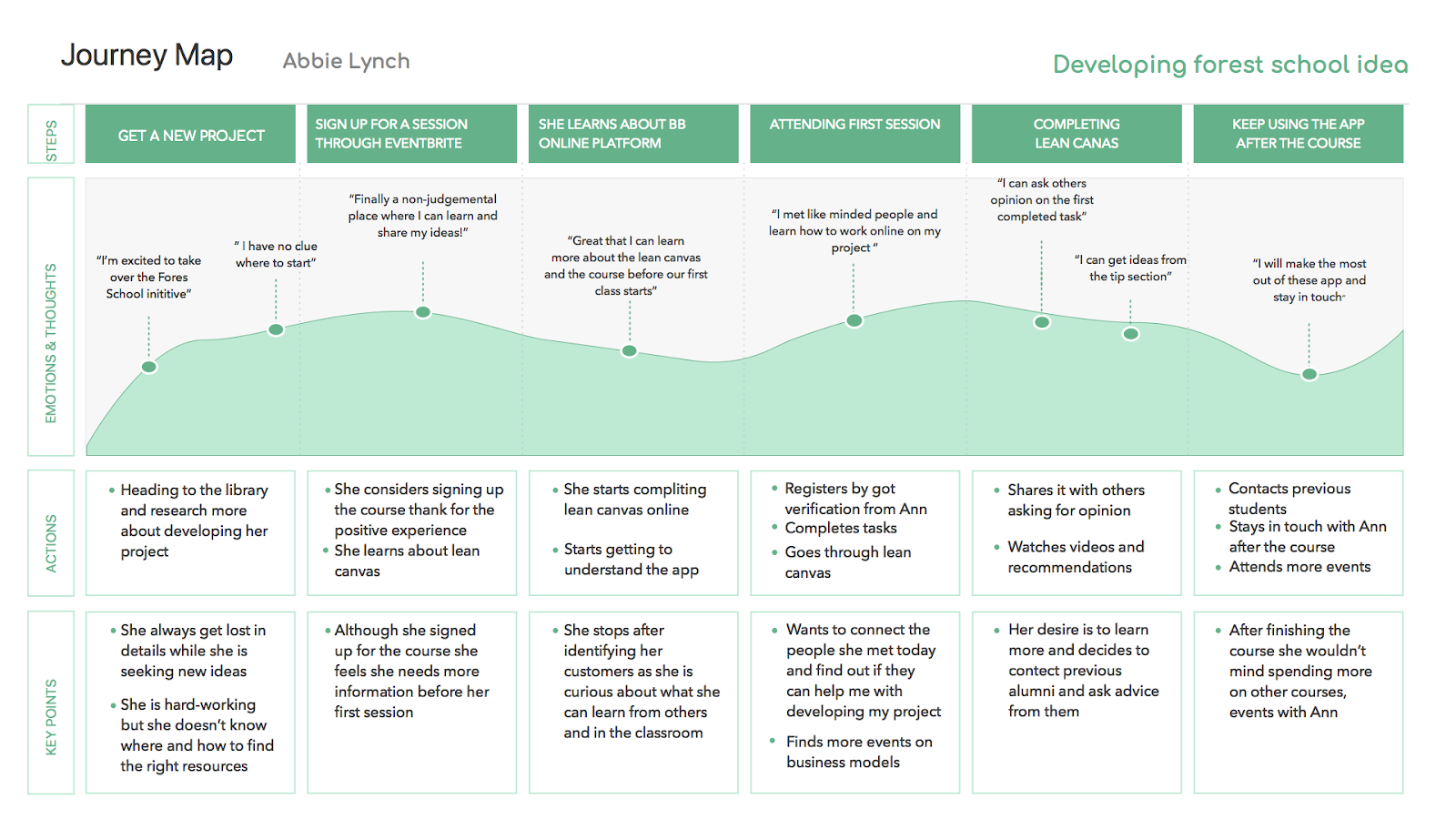
Journey Map
A journey map is used to analyse the user’s pain points, frustrations and satisfactions they might experience before and after starting a course at Bloomsbury Beginnings and how the web app might improve their journey.
MVP Feature Listing
For the purpose of this project, only important features were prioritised.
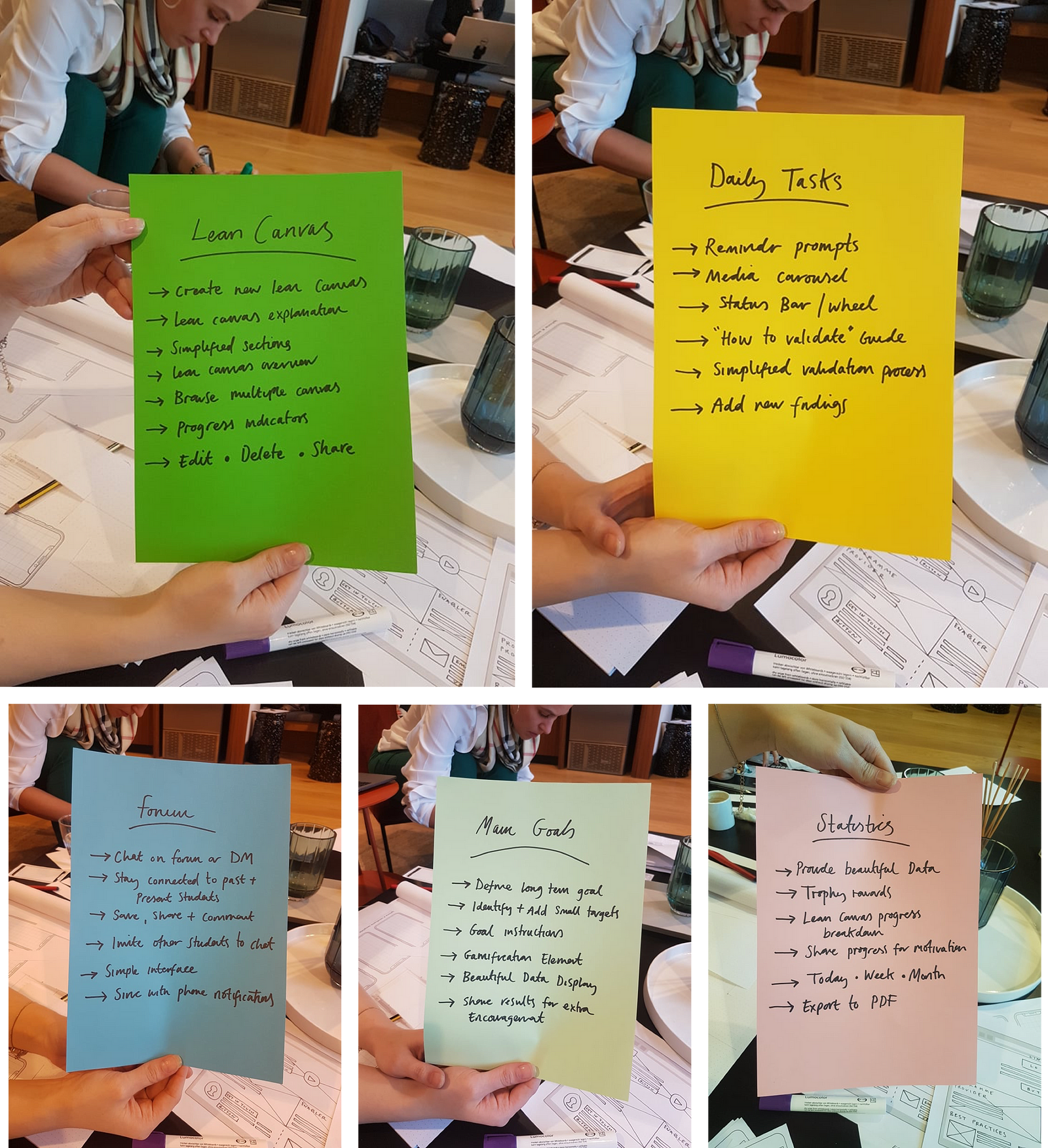
These features include:
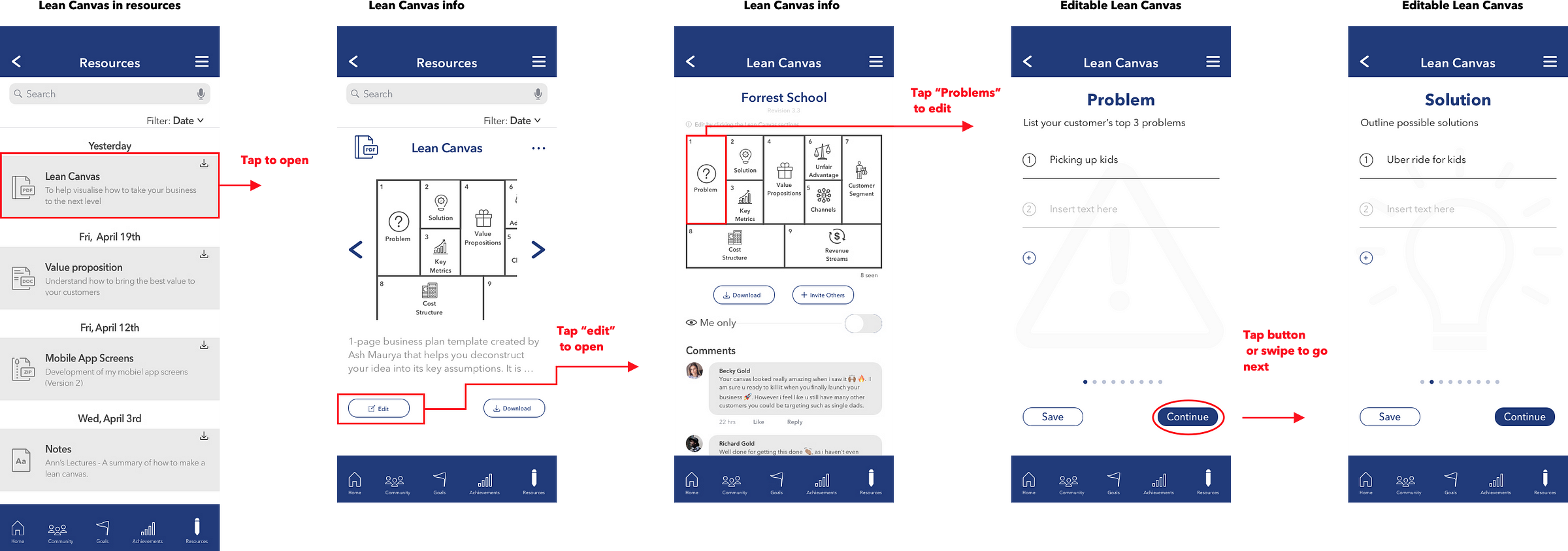
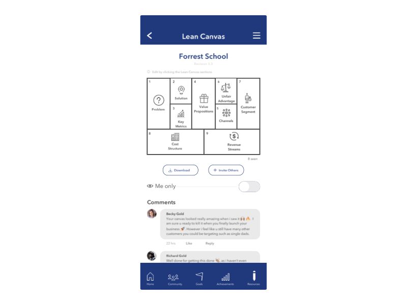
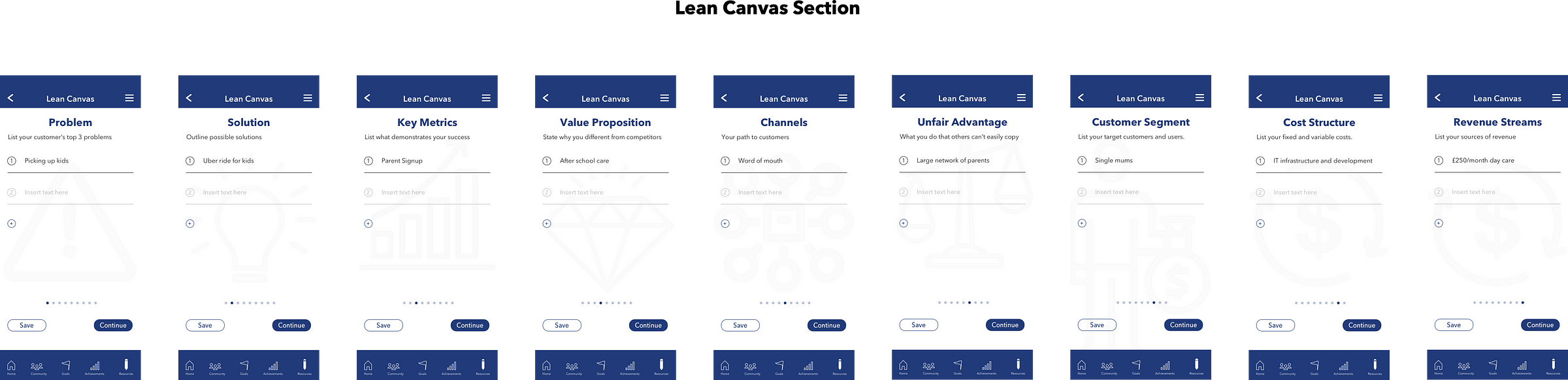
- Lean Canvas: The user is able to create and edit digital lean canvases on their mobile phones with the ability to see the overview after creation.
- Daily Tasks(Dashboard): This feature ensures the users are on top of their tasks/to-do list by prompting them e.g to verify their original assumptions. This prevents the user from slacking off.
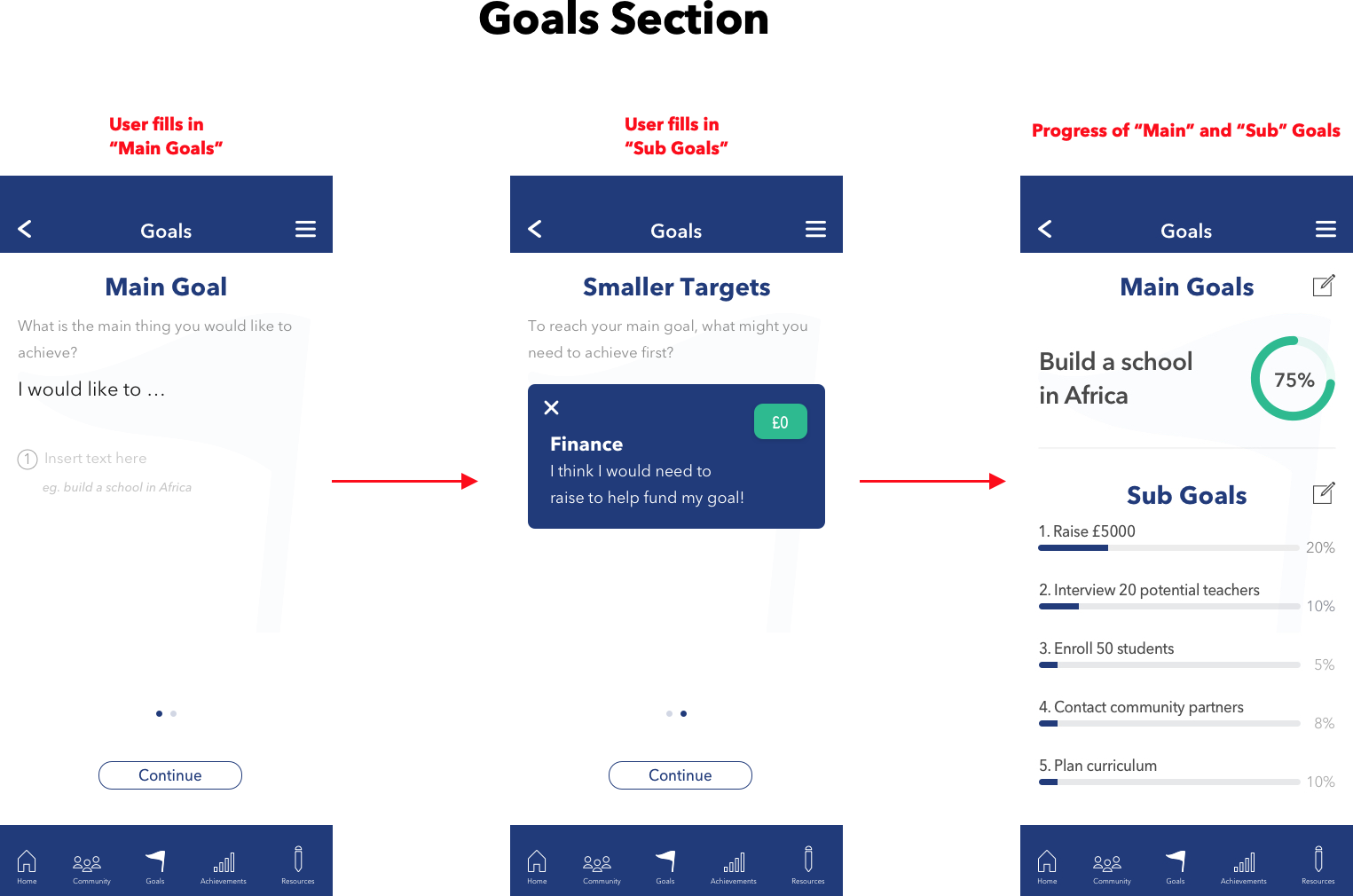
- Goals: The user is able to identify what their long term goals and also breaking them down into smaller section.
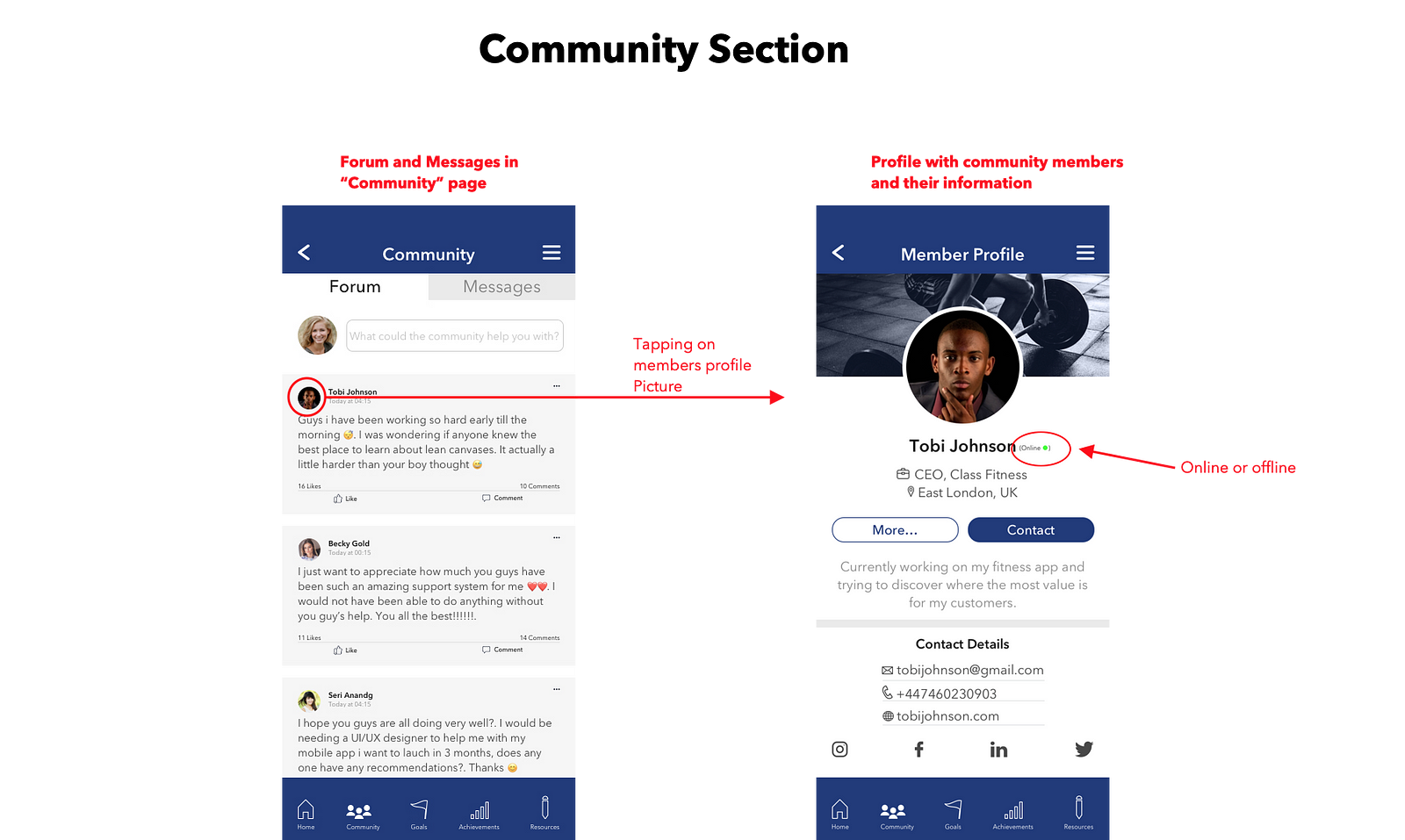
- Forum(Community): The forum section would allow past and present students to support, communicate, share ideas and keep connected during and after the course.
- Statistics(Achievement): This feature display the user’s overall progress
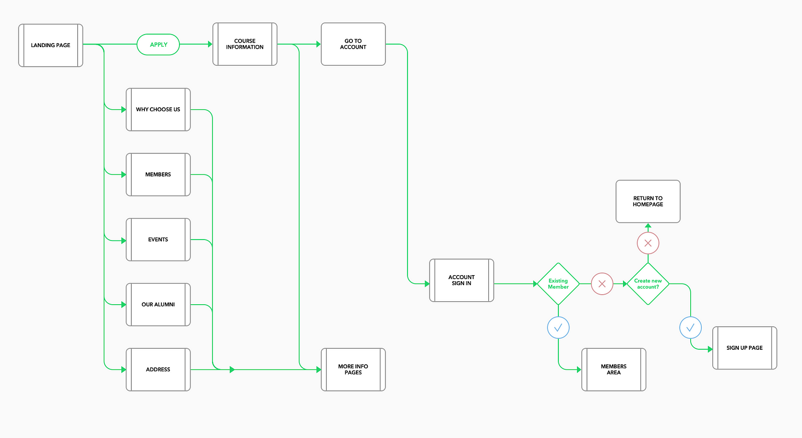
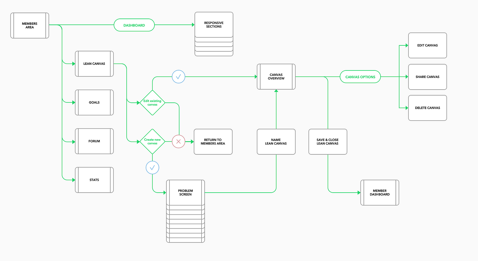
User Flow
The mobile web app is split into 2 sections which are the “landing page” and “members area”. This is the information architecture which summarises the user flow within these sections.
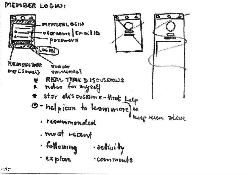
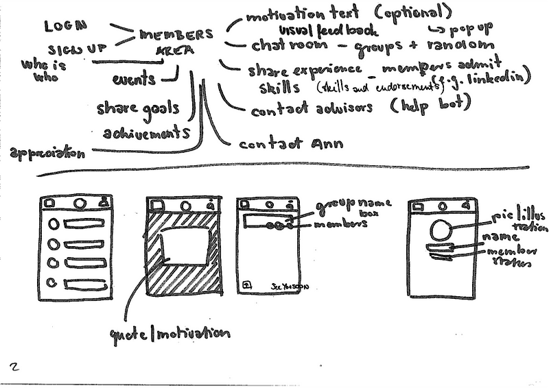
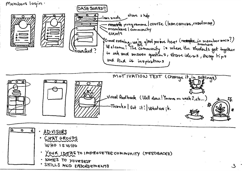
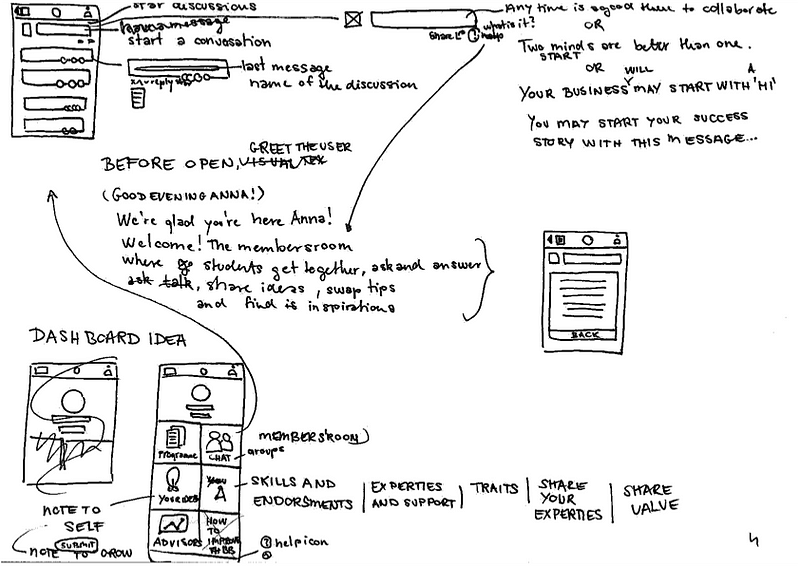
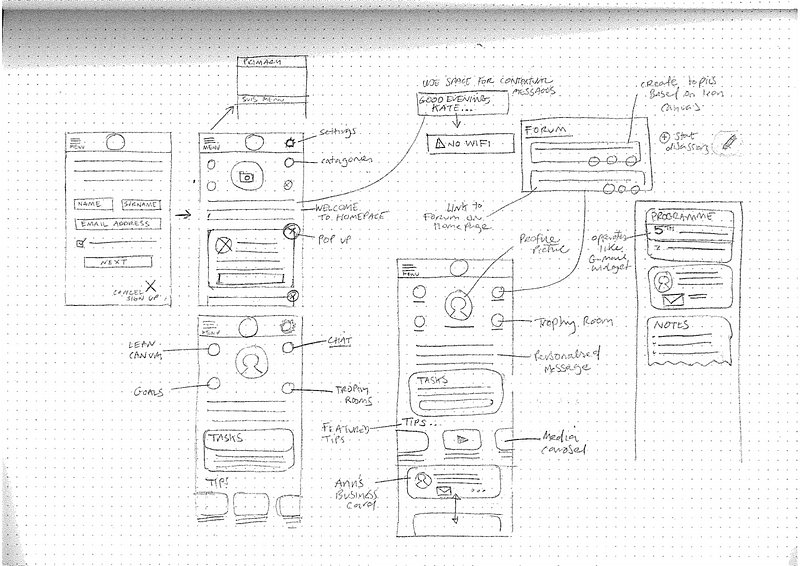
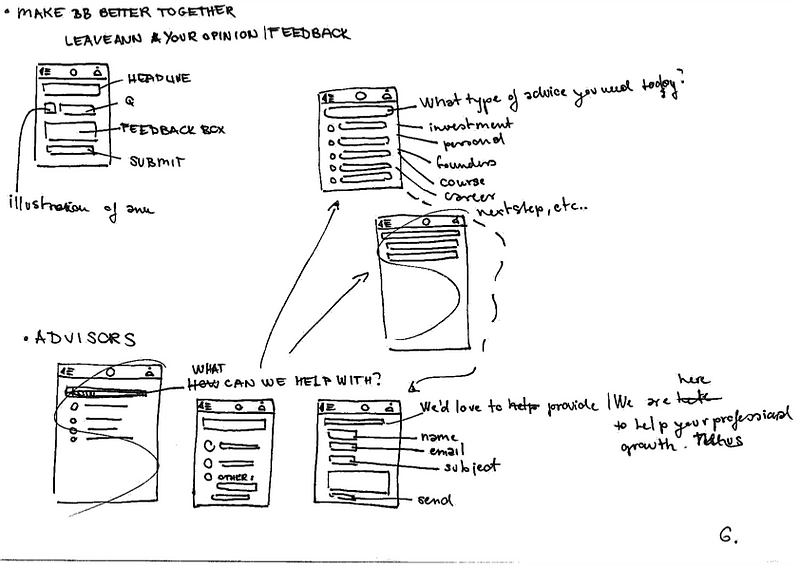
Low Fidelity — Sketches
Early in the design process, low fidelity sketches were quickly produced (shown in the figure below). It made us grounded in the functionality of the mobile web app. The pages within the 2 main sections (landing page and members area) were effectively and quickly designed.
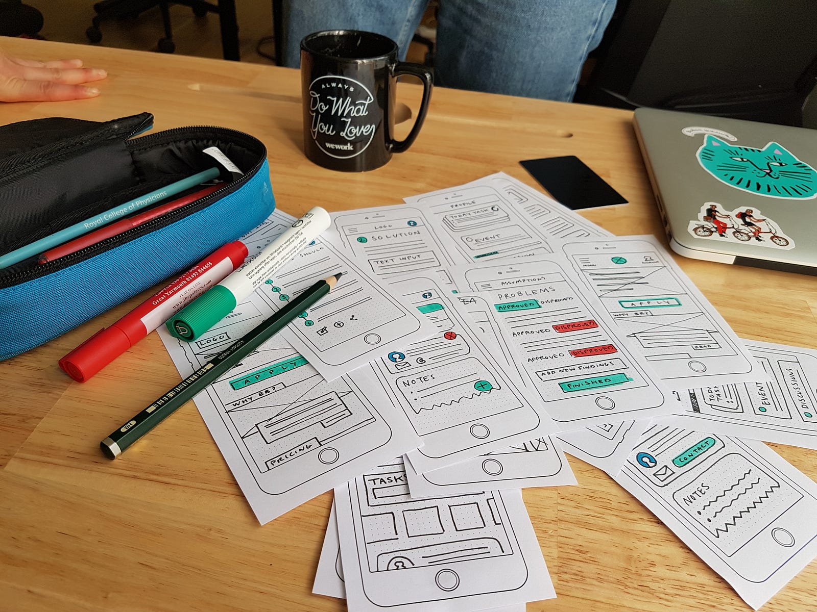
Paper testing
Before going digital, we quickly tested some assumptions.
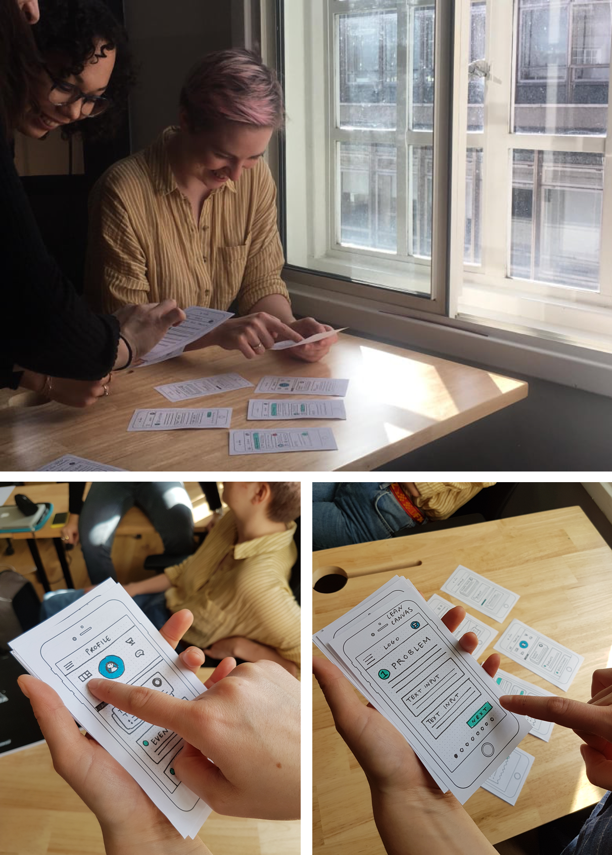
After paper testing, areas for improvement were highlighted which include:
- Users not fully grasping some of the ‘buzzwords’ associated with the programmes such as “lean canvas”, “Pivoting”.
- Further explanation where required to support users in completing required actions.
- Some users were exhausted by the number of screens.

Mid Fidelity Wireframes (Testing)
At this stage it was important to test our prototype with users to get feedback. A mid-fidelity prototype was used for testing because we wanted to get feedback on functionality, interaction and usability.
Test iterations findings
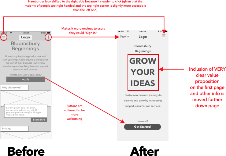
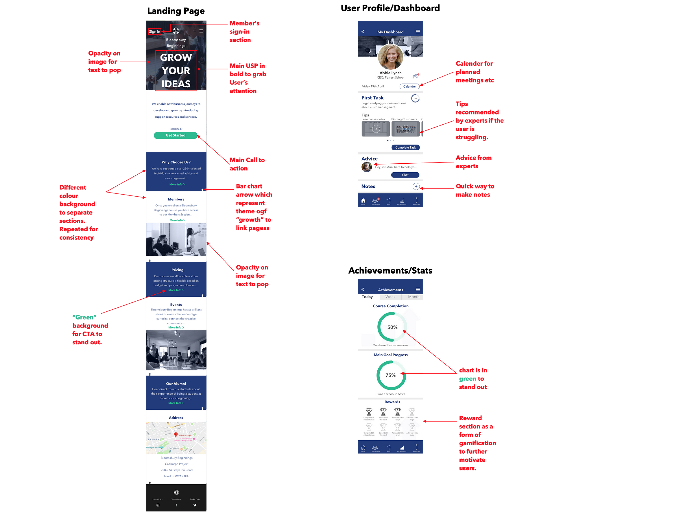
- Landing page website: The figure below shows the changes made to the landing page after testing. In summary, the hamburger menu was made more accessible and shift to the right side, as in the whole web app , it would be used more than the hamburger menu. The value proposition stood out and became extremely clear for users to grasp the Bloomsbury Beginning’s Value proposition.
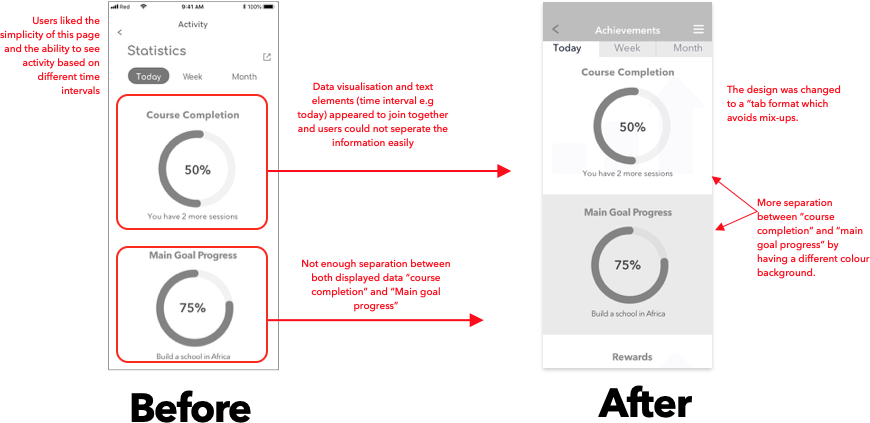
- Achievement/Stats Section: Here a tab design is used to split the time intervals at the top (e.g “today”). Also for better separation the “course completion” and “main goal progress” section had different colour backgrounds.
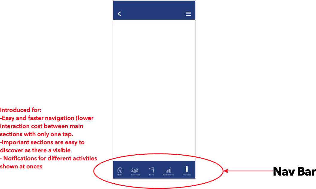
- Nav Bar Introduction: Users struggled to navigate within the major sections of the members area. A bottom nav bar was therefore introduced to aid easier and faster navigations between these major sections.
UI Design Inception
One of the first steps in UI design is to understand the “why” and core values of the brand in order to create a mood and feel which are translated to visual elements. The first meeting with Ann (the client and founder) helped to deeply understand the purpose and mission of the business. She shared her business values and the reasons why Bloomsbury Beginnings existed using words such as “Sustainability” and “Community”.
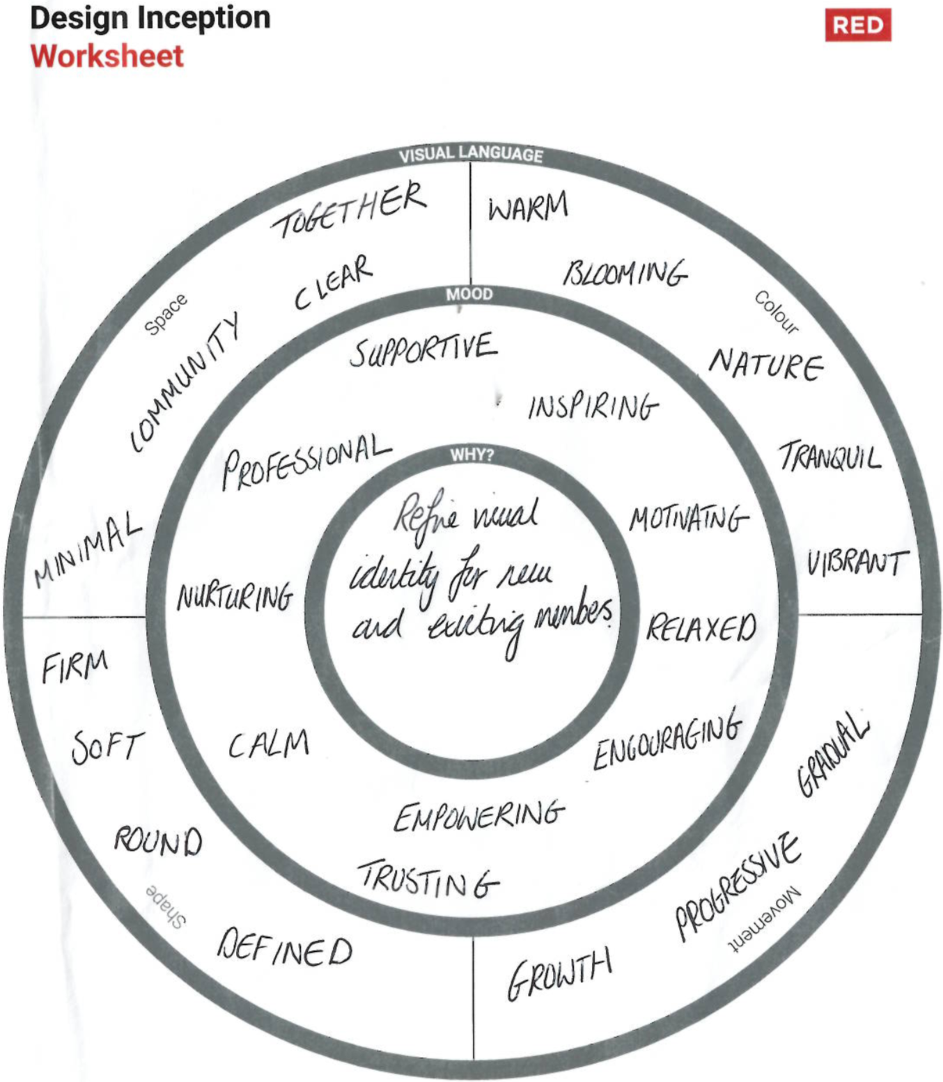
The design inception sheet above shows the mood (or tone of voice) and visual language I wanted to create for Bloomsbury Beginning.
Mood: For users on the website and the new members area, the mood to be evoked is one that is professional, nurturing, supportive, motivating and encouraging.
Visual Language: The shapes are soft and round, making the visuals more welcoming and receptive. Any movements would show gradual progression and growth. The colours used would be of nature, cool and blooming to go with the brand name (Bloomsbury Beginnings). Elements in space would be allowed to breathe thus having a minimalistic and clear UI.
Mood board
The mood board here helped to visually translate the feelings/ emotions/ mood and direction to be created taken for the website. Two directions were taken with this, mood board 2 was illustration illustration driven which is presently trendy on a lot of start-up websites. It gave a whimsical and friendly feel , however for our target audience, it could come across as a bit casual and immature to the target audience especially if not executed thoroughly.
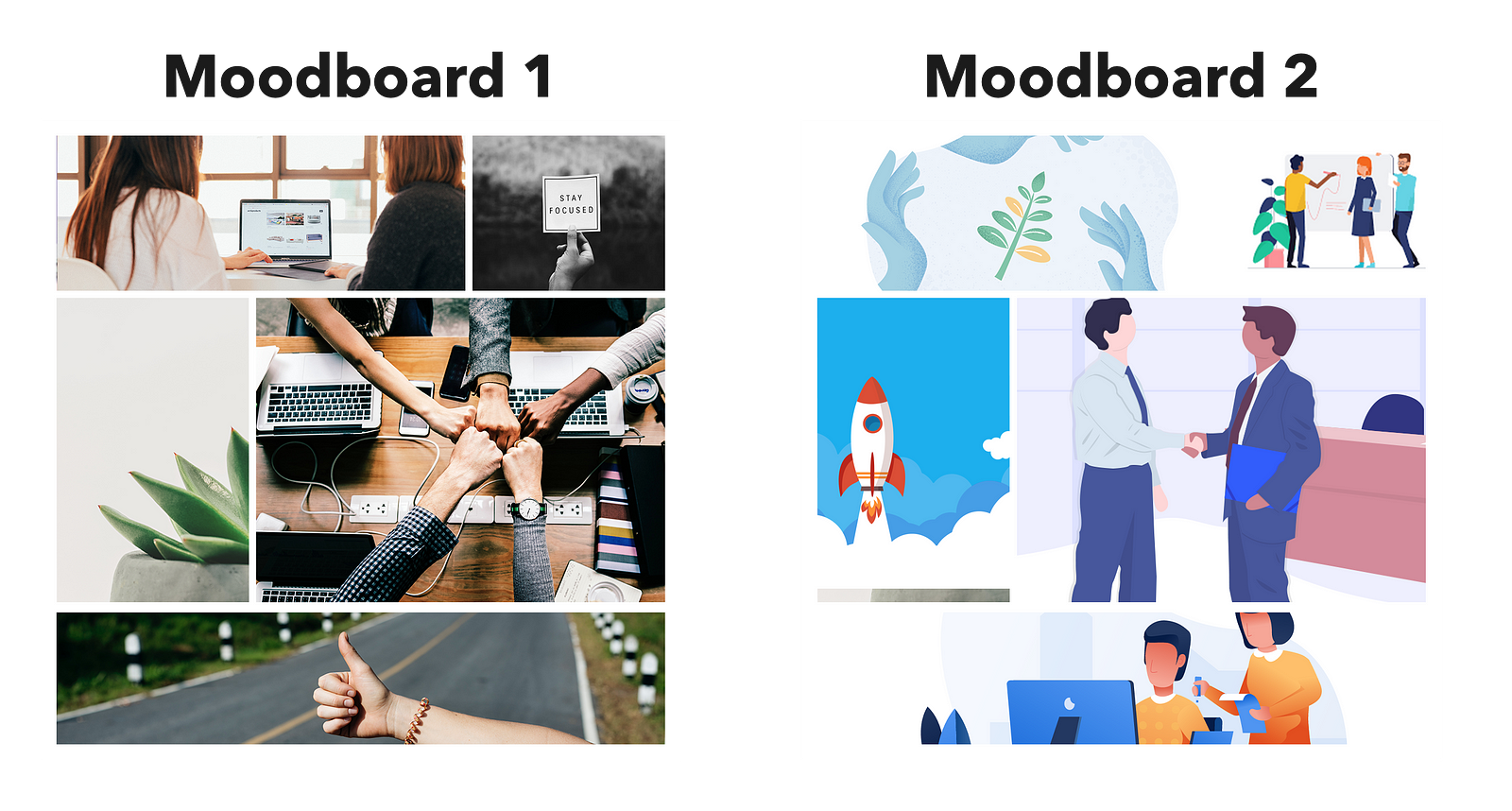
Mood board 1 predominantly involves images of teamwork, growth and support was the direction chosen. The direction was chosen because the client (Ann) felt this best conveyed her vision and mission, plus this audience would connect better with; which I totally agreed with.
Style Tile
The style tile here helps translate the visual identity of the website and brand through the depiction of elements such as buttons, colours, imagery and typography.
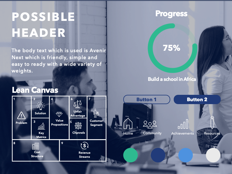
Colours: The colour palette is ensured to appeal to both female and male gender. In terms of colour psychology, green is associated with growth and development which is one of the key terms of this project. Blue is general is known to represent trust, security and dependability which is what we want the user to associate with Bloomsbury. White refers to simplicity, new beginnings and fresh ideas. The colour palette blends in together well to give a modern feel
Icons: Icons chosen were “outlined” which carries less visual weight than “filled”. Thus making the interface appear less clunky.
Buttons: Buttons used have rounded edges which are welcoming and friendly as oppose to sharp edges. Outlined (or ghost) buttons are used for secondary call-to-actions whilst Filled in buttons are used for primary call-to-action.
Typography: Avenir Next is the font used for both headers and body text to keep consistency. It is friendly, simple and comes in a wide variety of font weights making it versatile.
New Logo Design
The client the creative freedom to explore logo designs to further develop the branding. The main theme I was going for was for it to be fresh, modern, responsive for mobile to communicate the brand message and connect with the target audience .
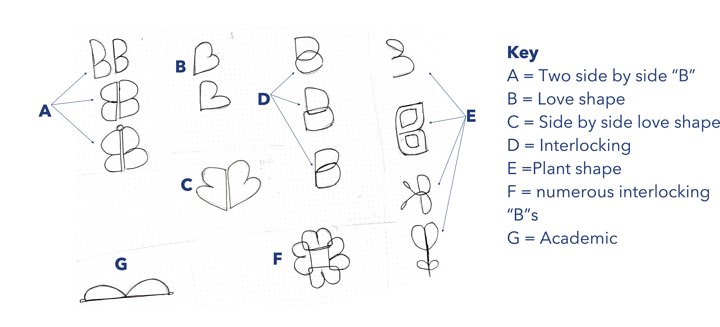
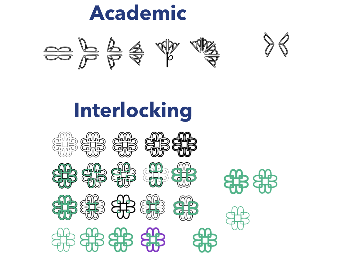
From the logo sketches below, Idea A shows the combination of two “B”s from the company name into wings which represents flying high and growth. Idea B is making a love symbol in the shape of letter “B” to give the feeling of being supported and looked after. Idea C is a combination of idea A and B. Idea Dand F explored interlocking elements to represent community and togetherness. Idea E was making the letter “B” out of plant shapes which represents them “growing their ideas”. Idea G, shows the letter “B” flipped to look like a book showcasing a learning environment.
Two designs which i felt would connect with the target audience and represent the brand the most where then digitised and further explored as shown below.
Below shows the final chosen logo which works well in different colours therefore making it versatile and flexible.
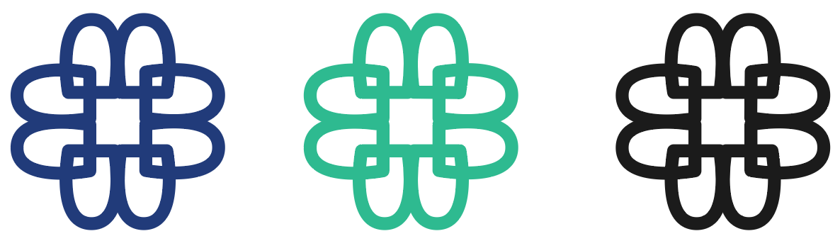
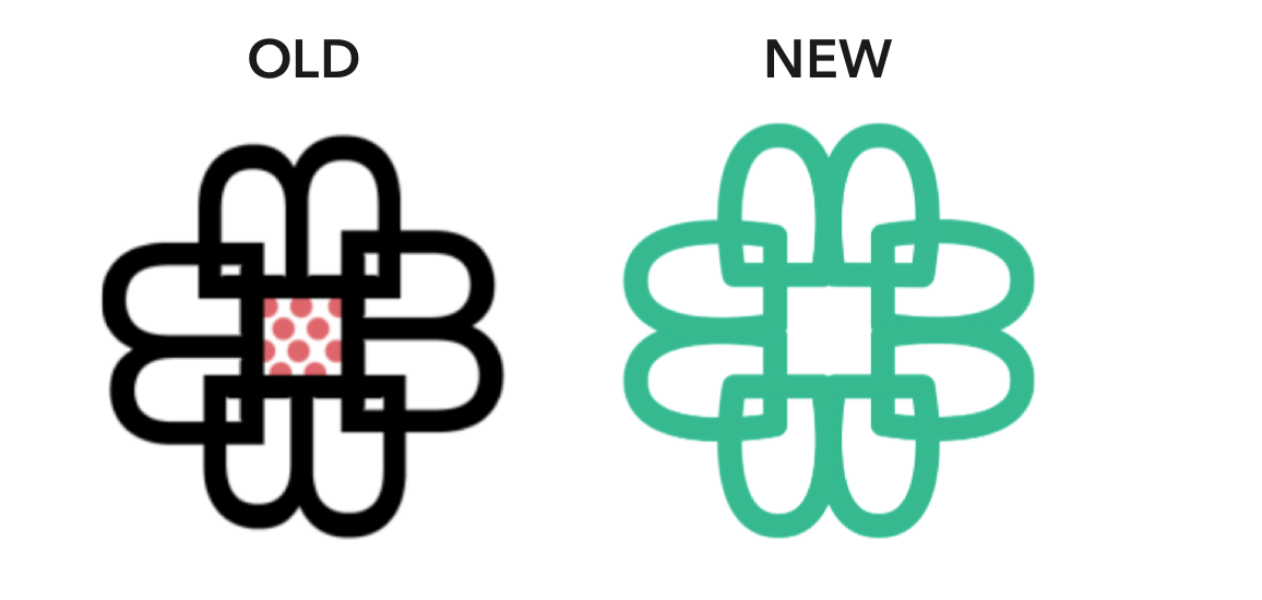
As shown below the new and old logo are placed side-by-side. The edges of the “B”’s are softer therefore welcoming. The honey comb at the centre is removed as such detail could be lost when logo is shrunk and used in tight areas such as a mobile app logo. In general, the new logo is not drastically different from the old one so current members can their still associate very well with the branding.
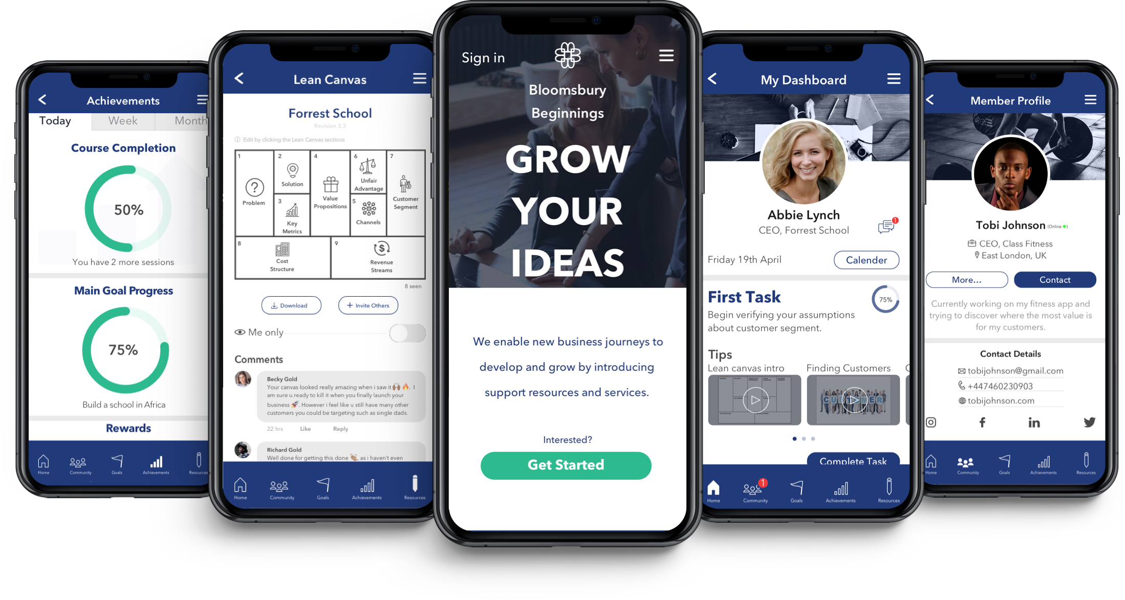
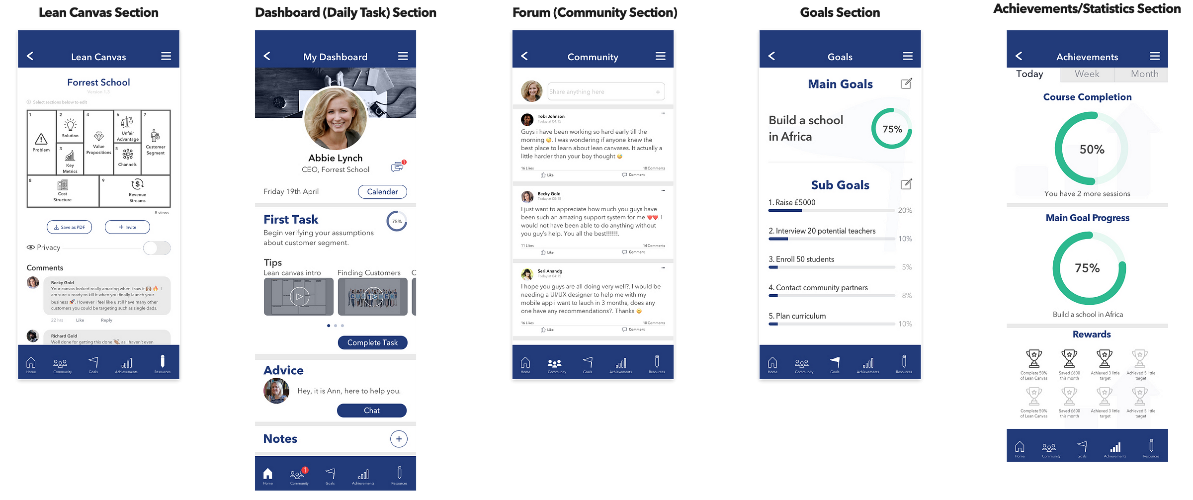
High Fidelity Prototypes
The wireframes were then converted into high fidelity prototypes. Below shows the high fidelity screens of the major sections.
Design Decisions
High fidelity user flow
Prototype
Video Demonstration
Overall, I am happy with the results delivered at the end of the project as I feel we brought the client vision for their company to life. In this project i really understood the value of involving the client in the project at the right times (we got the client feedback at the mood board and style tile stages). This ensures that as a designer you got their vision for their product/brand right.
Before you go
? 50 Clap if you enjoyed this article.
? Click follow Ibz to get updates of my recent articles
My other top recommended articles for you:
UI/UX Design — Future of Electric Scooters
UI/UX and branding case study — Tourism Campaign for Africa’s most populous city (Lagos)
? Read this story later in Journal.
?? Wake up every Sunday morning to the week’s most noteworthy stories in Tech waiting in your inbox. Read the Noteworthy in Tech newsletter.
Source: https://blog.usejournal.com/case-study-mobile-web-app-bcf4e943811a
Writte by
Ibukun (Ibz) Adegola
UI/UX Designer in London
Noteworthy – The Journal Blog
The Official Journal Blog