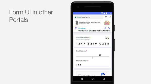
The case of deploying “inefficient” UX to make a better product

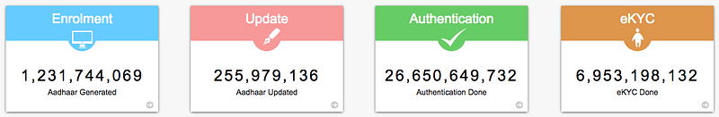
Aadhaar project by Indian Government operates on a massive scale. Unique Identification Authority of India (UIDAI), which handles this project, under the Ministry of Electronics and Information Technology (MeitY) has issued more than 120 crore Aadhaar numbers to the residents of India till date. For context, Aadhaar number in India is somewhat similar to the Social Security Number in the US. One account which can link to everything else — bank accounts, subsidies, mobile SIMs, academic records and the list goes on. Just to get your head around the mammoth task undertaken by the Indian government, below are a few mind-boggling stats.
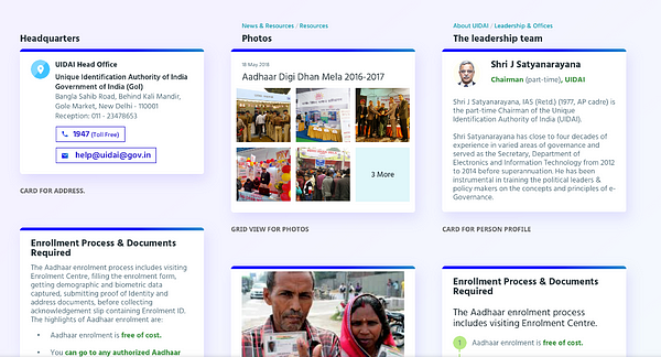
With the Digital India push of the government and increasing penetration of internet and smartphones, UIDAI realized that their website needed to be responsive, and render itself well on mobile devices.
When we met UIDAI, that was our brief. We at Monsoonfish, handled everything about user experience and design, while our friends at Tekdi Technologies took care of development.
Getting to the root
We took a step back, and tried to get to the root of the website’s functionality. The process we followed for this was –
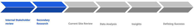
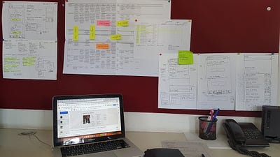
We ran discovery workshops — interviewed internal teams at UIDAI, the end-users and did secondary research on how similar websites around the world were working out. Our entire team took to the user research, interviewing everyone from rickshaw-wallahs to cigarette sellers, to vendors and internet-savvy users on why and how they use the Aadhaar website. We reviewed the information architecture, perceived values of information and the flows, languages, accessibility and responsiveness of the website. We also analysed all the available data, including traffic, most accessed pages, CRM data as well as social media streams and support requests.
So, what did we find?
This intensive exercise led us to some key insights, and formed the basis of the project. Aadhaar of Aadhaar, if you will.
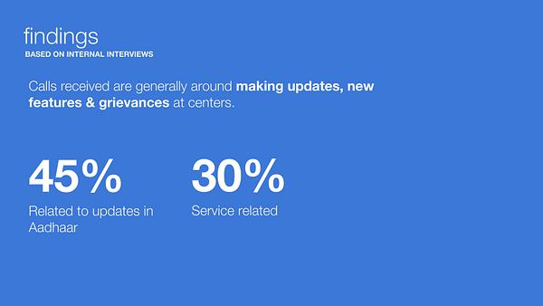
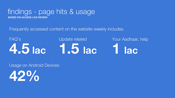
- Maximum share of users came to access FAQs and Aadhaar update related information. Most of the support calls to the CRM team were around updates and Aadhaar related services as well
This insight was key, since many services under these sections opened in different portals — redirecting the users to a completely different site, with a different look and feel
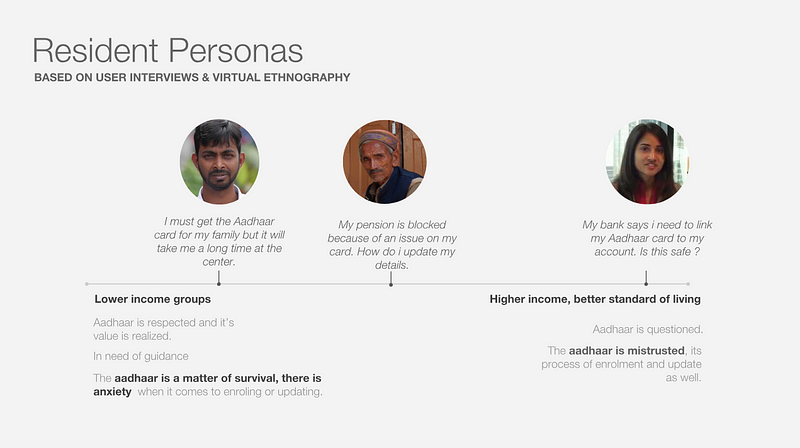
- Aadhaar had already managed a vast adoption across the nation, the next bunch of users were residents looking to make updates, or young parents, wanting to create cards for their children
- Across the income scale, on the lower side the Aadhaar represented utility value. These residents feared making updates, and there was a general sense of misinformation. On the higher side, residents questioned Aadhaar, its use and security around it
- The website was mostly accessed on Android devices
Another key insight which influenced our visual design approach and even the type of font we chose
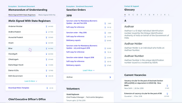
- Relevant user information was hidden deep in the website
- Duplication of content — same thing was said in different words
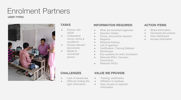
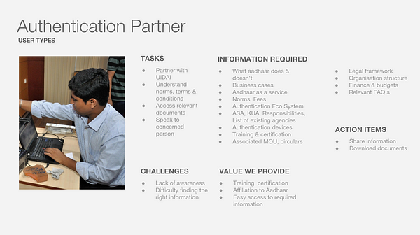
We also bucketed the stakeholders, i.e. the audience profiles of visitors: Residents with Aadhaar — bulk of our audience; Residents without Aadhaar; Authentication Partners; Enrolment Partners; Govt. Employees; UIDAI Internally
What would success look like?
We realized that this was not simply a rendering issue. The major share of audience — Residents with Aadhaar and Residents without Aadhaar, needed to be catered to in a much more seamless manner.
Aadhaar website is not a daily use product — it is a utility. People come to the website to get their query resolved/work done and leave the website. We needed to treat every user as a first-time user, and every use-case as the first use-case.
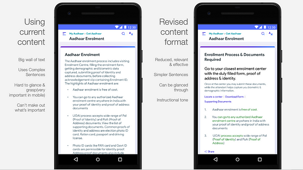
This led us to the most important consideration for the route that we would take for this design. Efficiency, in the traditional sense is to get user from A to B as fast as possible. The audience of Aadhar that we prioritized, were residents who came to create or update their Aadhar cards. The current website had all links and information in bulk, and finding your particular query was like looking for a needle in a haystack. This led to users being frustrated and leaving the website, which not only put an additional toll on the tertiary infrastructure like Aadhar support centres, but hampered reputation of the Aadhaar system. So while the existing design was ‘efficient’ literally, (all links in one page, so technically just two steps to get the users to info they needed) it did not make much sense for the website.
We prioritized only two sets of information — Aadhar services and updates. Since bulk of the users came for this, it made sense to show right information at the right time — to the right users. Updates and other services formed the backbone of most activity done on the website — and was the cornerstone of our information architecture. We changed the definition of efficiency for this project, in a bid to make it more relevant and useful for our desired sets of audience.
To make the process for residents smoother, we kept two goals in our mind:
Residents got access to the right information at the right time: Bulk of our users were on their mobiles looking for Aadhaar update related information. This, today, required them to look deep in the website. If this could be brought up front and made easily accessible users would see value.
Residents got access to the information in the right context: Most of our users accessed the site from their mobile devices, if the site rendered well of their device of use, they would get access to the information they needed.
For this, we needed to resolve the challenges of deep-buried information, lack of contextual FAQs, too many sub-portals and duplication that confused users. We needed to channel the information dump into an information flow.
This ambitious project of Aadhaar operated at a huge scale as we have already seen, so we had to make a few important considerations all along:
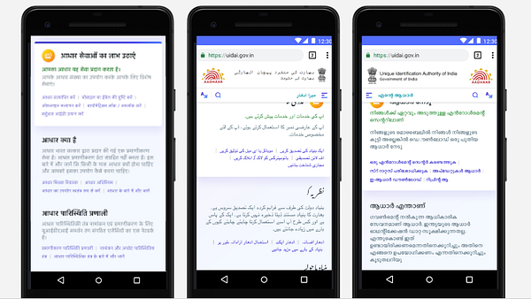
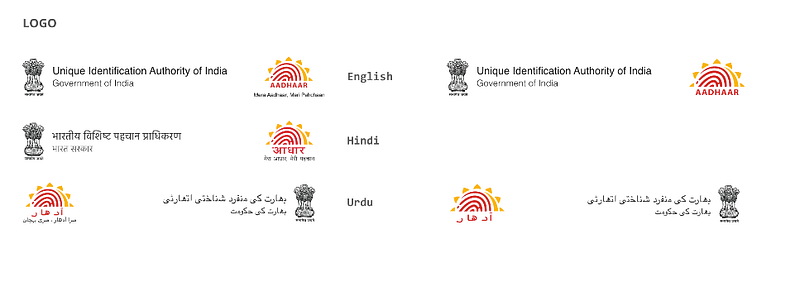
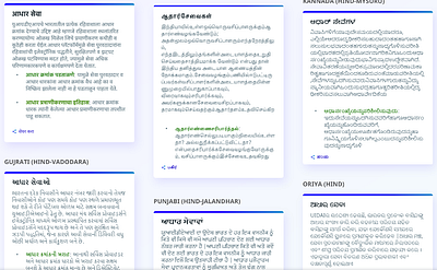
- Language support: Aadhaar website rendered in English and 12 other Indian languages. The redesign would have to work well not just on all devices, but also in all languages. (Eg. Arabic is written and read from right to left!)
- Accessibility: This was one of the most important factors. Since Aadhaar was for anyone and everyone, we needed to especially take care of the website tiding over the hurdles to ability. From alt text to colour contrasts — we needed to make sure the website was accessible to all.
By now, the project had ballooned from its original brief. A complete design overhaul, a formidable design system, redesigned information architecture. What had not changed, however, was the timeline! We had three months to design and develop the website, and an additional month of testing.
The Path to Success: Pillars of design
Translating the above prose into simple objectives, we started off with the following in mind:
1. Reduce time taken to access key information
2. Ensure existing information is brought up at the right time
3. Ensure smooth performance across all devices and for everyone
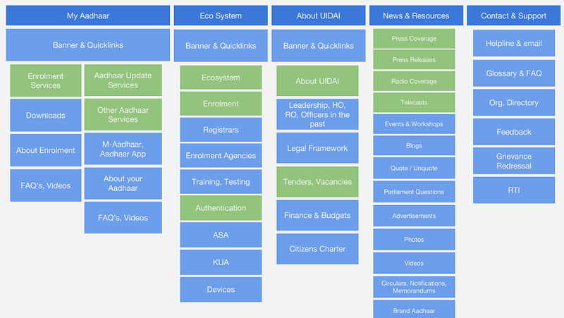
Information Architecture
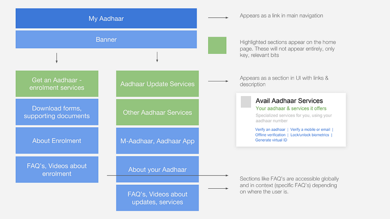
The first step was in getting the information in right order. Aadhaar website had everything the user wanted — our job was to make it readily available without having to hunt for it. We restructured the information keeping in mind mainly residents and then internal audience.
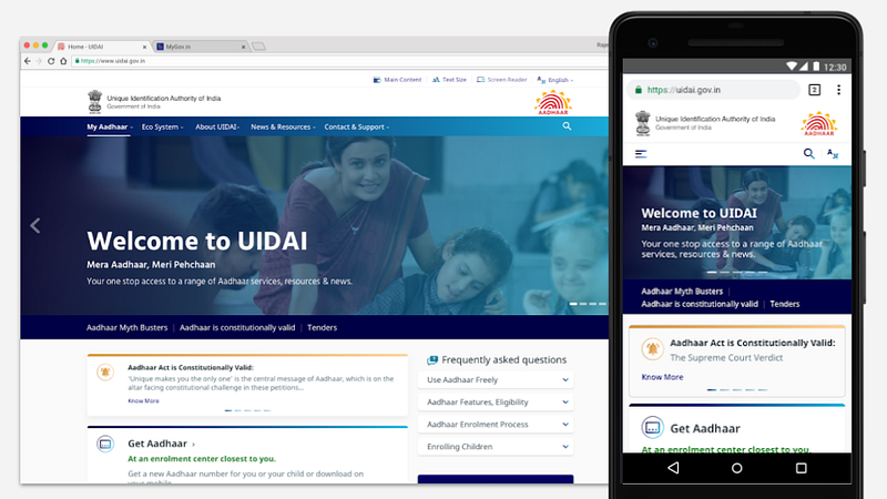
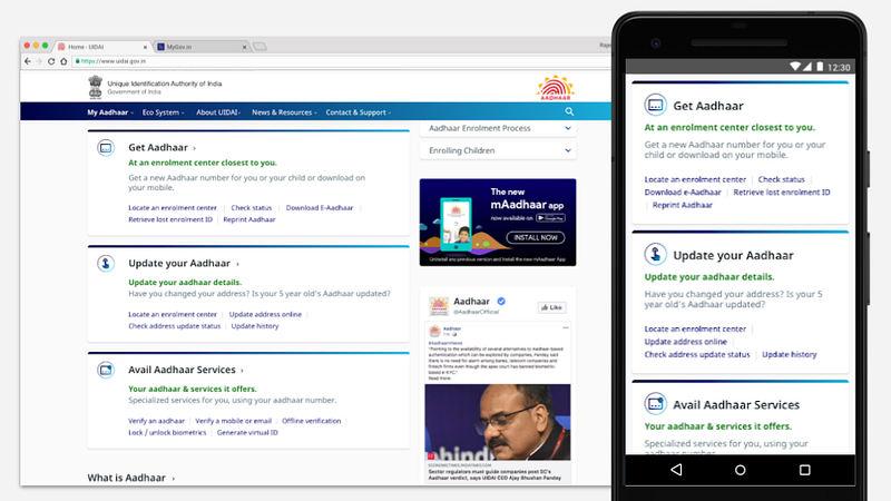
How this unfolded in the structure was by bringing updates and services related information upfront, followed by partner information & then media, news and downloads. The most important information from each section built the home page.
UX Strategy
Taking care of our objectives and considerations, we devised the following UX strategy:
- A unified Aadhaar portal — though these existed as varied portals, we wished to unify them in user’s eyes, giving them access to one, unified Aadhaar website
- Accessible — Since our audience was so vast we took accessibility as the highest priority
- Content relevance — Based on user journeys, the site was restructured to show only the most relevant, and timely information
- Device relevance — designed to suit any screen size, anywhere
- Localised — Available and ready to any Indian, in her language of choice
Wireframes were iterated on and reviewed, while we worked in parallel on style options for the website. We put up low fidelity mockups for different workflows on how the experience will look and feel on a mobile device.
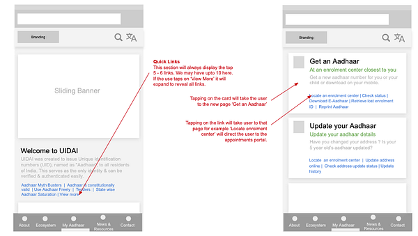
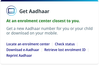
We also designed additional pages for the website. Rather than having simple links, we created link cards — which could give the users a preview of where they are headed.
To make sure that we were making an accessible design, we went through these steps:
- Extensive review of GIGW manual
- Checks in UX wireframes for size of information chunks
- Sentence lengths, and content simplification
- Maintaining basic contrast ratio in design
- Use of understandable iconography
- A custom set of guidelines for design and QA just for accessibility
- Use of automated testing for design and developed versions
Visual Design
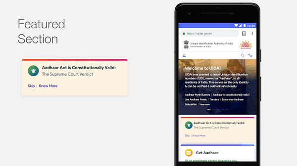
The next step for us was to design the website. As the government’s flagship project, and Aadhaar being something that holds unique value and unlocks doors to different opportunities, the site needed to feel trustworthy and ooze authority. A user who lands on UIDAI.gov.in should rest assured that the website will have what he needs. We developed 3 design solutions, all communicating this. Collaborating with stakeholders, we finalized the below design.
- The visual style had good balance of approachability and authority
- The flows met our objectives for UX: Information flow, Responsiveness, Accessibility
- The visual style was compliant with GIGW and government web guidelines
- It aligned with the kind of interfaces resident users were used to seeing from an experience and visual perspective
- Holistically aligned all UIDAI web and portal interfaces
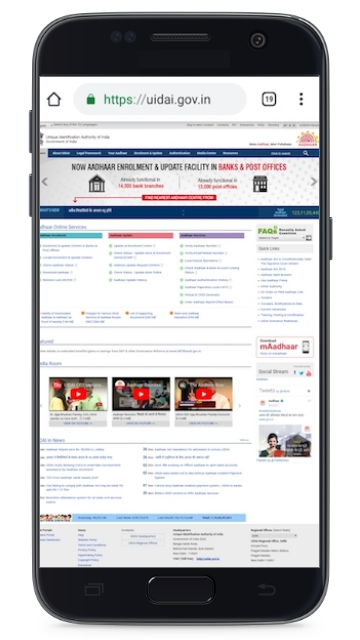
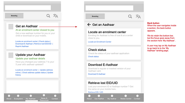
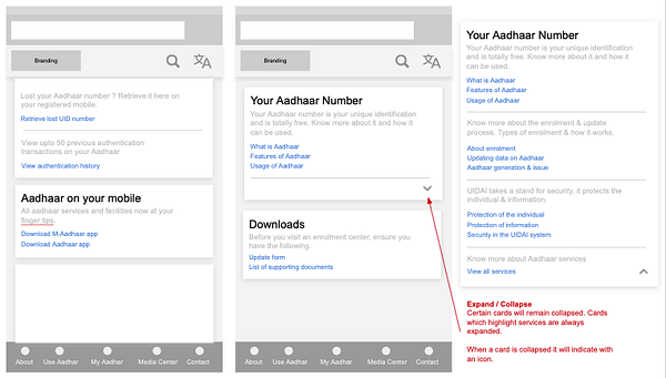
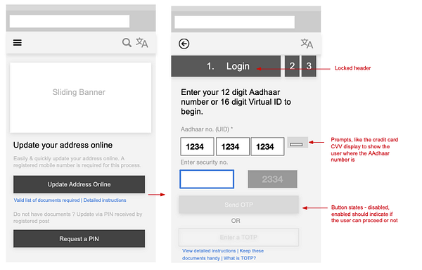
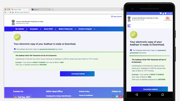
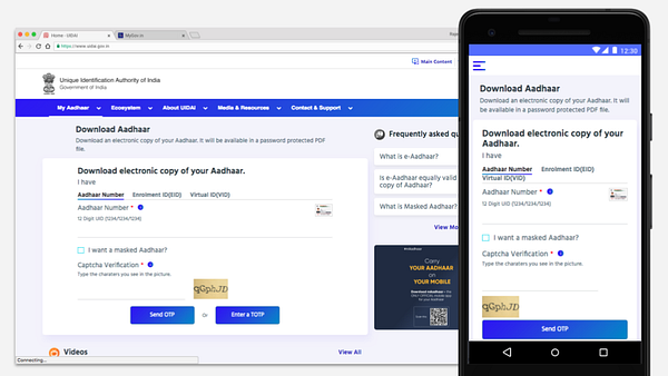
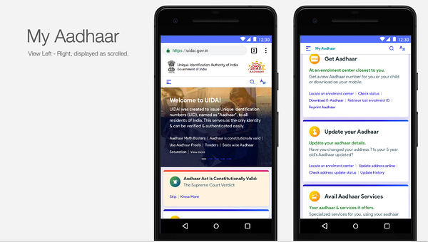
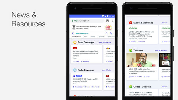
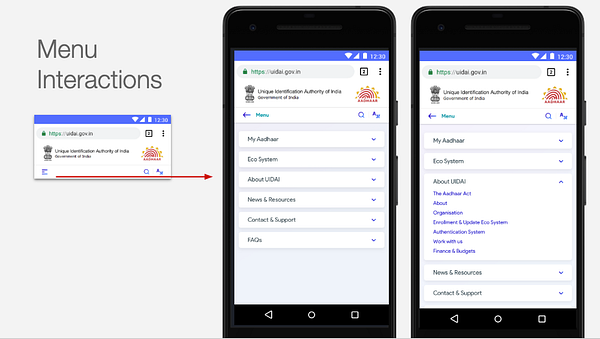
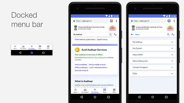
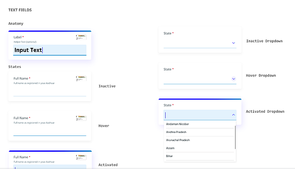
Here are some screenshots of how the design detailed out on mobile interfaces.
Handover and Building the interface
Development and design teams worked collaboratively in building the interface. Every page was designed and then developed. A key aspect in the process was choosing the right font. Since a large part of the website information was in text format, it was important that this displayed well and clearly irrespective of the language. The key criterion here was performance. We needed a typeface that rendered well, and had been extensively tested in similar scenarios.
Our choice was Noto Sans.
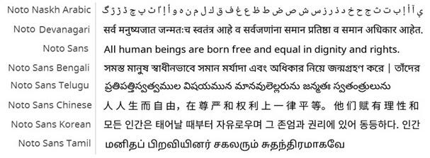
Noto is a Google font, previously used by Google across all its products and with support for all Indian languages. Being an open-source font, it was all the more easier for us to deploy on the website. Additionally, bulk of the traffic to the website came from Android devices, making Noto a font that people were already familiar with.
- Noto was developed and tested to perform in all scenarios
- It was built to render well on mobile devices
- Provided us with a range of weights and glyphs to support different information types on the website
- It was a single light-weight option as compared to using a set of fonts in development
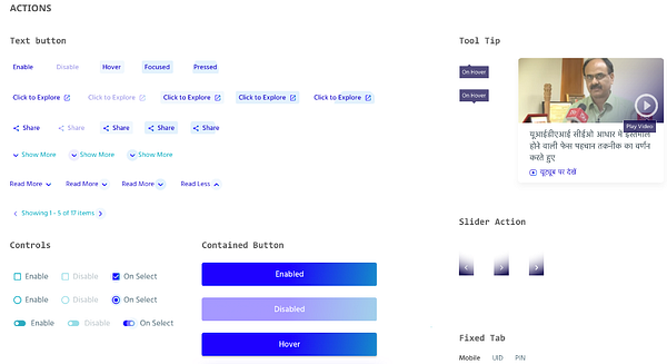
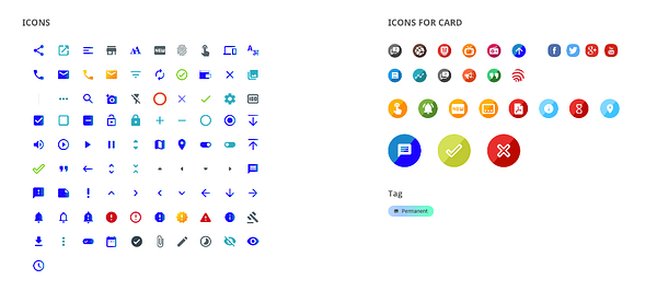
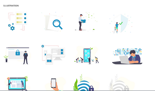
Building a Design System, Style Guide & UI Framework
Designing for Aadhaar was not a one-off exercise. Whatever we defined for the website would need to get implemented on any Aadhaar or UIDAI interface. Moreover this had to be easy to build. Our approach was to build a modular design system.
- No back and forth between the design and development team
- Speed in design. Any page, new or old could be built by simply picking up and dropping blocks from the design system
- The stakeholder team could focus on content reviews, while design quality was automated
- Accessibility was handled at a design system level, all components were GIGW compliant and more. This saved us immense time in QA. All design cleared the automated tests easily
- Scalability of design. Any development team could now design an Aadhaar interface without breaking it’s style
- One singular point of reference for all teams
- Vastly documented style document
- Base for HTML and CSS version of the style guide which was later shared with the development teams at UIDAI, and allowed them to efficiently build Aadhaar interfaces
Take a look below at how the design system and components were detailed out. We also converted this to an easy to use style guide & UI framework of sorts built on top of Bootstrap.
In conclusion
Being one of the flagship government initiatives, it was critical for us to get speedy and iterative approvals at every stage of the process. In the four months of design and development of the website, we collaborated with the dev teams, key internal stakeholders at UIDAI and ensured that the work does not stop for lack of approvals. It is satisfying when clients appreciate the solutions you provide, especially when they go outside of the brief.
It was a great learning curve for our team, where we learnt how to have a sharp focus on accessibility and the challenges present in designing for multiple languages. A deep collaboration between design and dev teams ensured the work progressed smoothly and hiccups were resolved before they became hurdles.
It was rewarding to be part of solving the needs of more than a billion Indians who come to the Aadhaar website every month.
You can follow us on Twitter/ Instagram / Facebook / LinkedIn
This article was first published on Monsoonfish.com
Source: https://medium.com/swlh/redesigning-the-aadhaar-website-ux-case-study-fb0586ea11a2
Written by
Monsoonfish
We combine data driven insights and design thinking to generate innovative ideas and turn them into amazing products that are used by millions.
The Startup
Medium’s largest active publication, followed by +473K people. Follow to join our community.