There are a lot of different terms in the UI/UX design field. If you’re just starting out, it’s easy to get overwhelmed by the amount. But the truth is, everything is pretty simple. Experienced designers know that they are different entities, and each of them is a tool for solving different problems. But if you dig deeper, and ask what’s special about each of them, you’ll get as many answers as there are designers. Some designers acknowledge only black and white prototypes, interactive mockups and drawing sketches by hand. While others can use colors in prototypes, make static mockups and use an editor for sketches.
So let’s see what’s the prevailing opinion on each of them and what exactly are prototypes, mockups, sketches and wireframes.
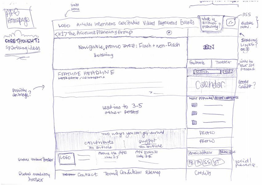
Sketch
Most of the times, it’s a freehand sketch made with a pencil or pen, on a blackboard or napkin. It’s very cheap and fast and often done during brainstorming sessions.
Its main goal is to illustrate the idea. To convey it quickly to everyone else. As with most visual things, it’s easier to make a quick sketch than to explain the idea with words. In the sketch, you can outline some details of the UI. But don’t get carried away and fill in the little details — that should come later.
In most cases, it’s better to go directly to wireframe or prototype, without showing your sketch to a customer — some of them may not understand your idea correctly and this will only cause confusion and spoil the creative process.

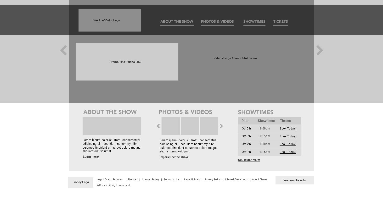
Wireframe
It’s a detailed black and white layout of the website page. You plan the layout of elements (images, buttons, text) at this stage. You can compare wireframe with a building blueprint — it will guide people during the construction (in our case — during the website/app development), but you cannot live in it. A wireframe does not perform any real website functions. You should describe interaction results, features, animations and the like in the comments.
So, the wireframe is used to determine where things will be placed. Also, it, along with the comments can be used to compile a task for designers.

Prototype
It’s an interactive version of the wireframe. Also black and white. But it can do much, much more than its predecessor. If I was to take the previous example about the building — a prototype is a model made of cardboard and sticks. It looks ugly, but it works. If you click somewhere, something else will happen, like on a real website.
It’s mostly used to conduct usability testing.

Mockup
Basically, a mockup is a beautiful version of the wireframe. Colors start to appear, images are chosen, typography is in place.
A mockup is used to reflect the style and mood of the project. To think over the visual stuff and discuss them with the customer.

All that I’ve talked about today is not a must-have steps in the design process. On the contrary- it’s best to take 1–2 of them and keep it at that. Which ones to pick? Well, it depends on you and the customer. Sometimes, you may show the customer your sketches, if you’re sure they’ll understand the idea.
Have a nice day!
Bradley Nice,
Content Manager at ClickHelp.com — best online documentation tool for SaaS vendors
Written by

