
One of my most recent projects involved working on-site with a new client in Bristol, namely, the providers of pre-ordering technology for the hospitality industry, Preoday. Here’s a case study of how we reimagined app-based cross-selling through the power of design:
Preoday provides a technology that allows hospitality businesses to cut out the middle man and appeal directly to their target consumers. It already facilitates such a user flow in the food and drink sector via its relationship with a leading ticket sales and distribution company, but the identification of a new target market endeavoured to take the technology to the next level.
Thanks to its relationship with the ticket-selling giant, Preoday pinpointed an opportunity to partner with large car park providers to provide customers with the option to buy a parking space at the same time as their event ticket via the ticket-selling app or independently via a new app that focuses solely on parking.
We needed seamless integration and visual attractiveness to ensure that the user experience remained as high as it could possibly be — in ticket-selling app’s case, if customers don’t notice that they’re using Preoday’s technology whilst booking tickets, the user experience is a successful one.
One of the challenges, though, was to ensure that the new functionality was adaptable for future clients and not just tied to a ticket-selling app. This meant first understanding how current parking suppliers market to their own audiences.
There were multiple car park competitors that formed the basis of my research into the app design.
There was an overwhelming abundance of barriers preventing users from doing what they wanted to do — and quickly. There were too many steps in the processes; some asked for sign-up or vehicle details too early on, whilst others failed to clearly explain why it was necessary that the user shared their location or activated notifications.
It should be a simple matter of booking parking as quickly and smoothly as possible, so we carried this mantra into the design process for the added functionality in Preoday’s technology.
Understanding user behaviours
One of my first ports of call was to work out when and where users come to consider parking in the buying funnel for tickets. For this, I sketched out low-fidelity wireframes of every stage of the new user journey so we could clearly visualise the thought process.
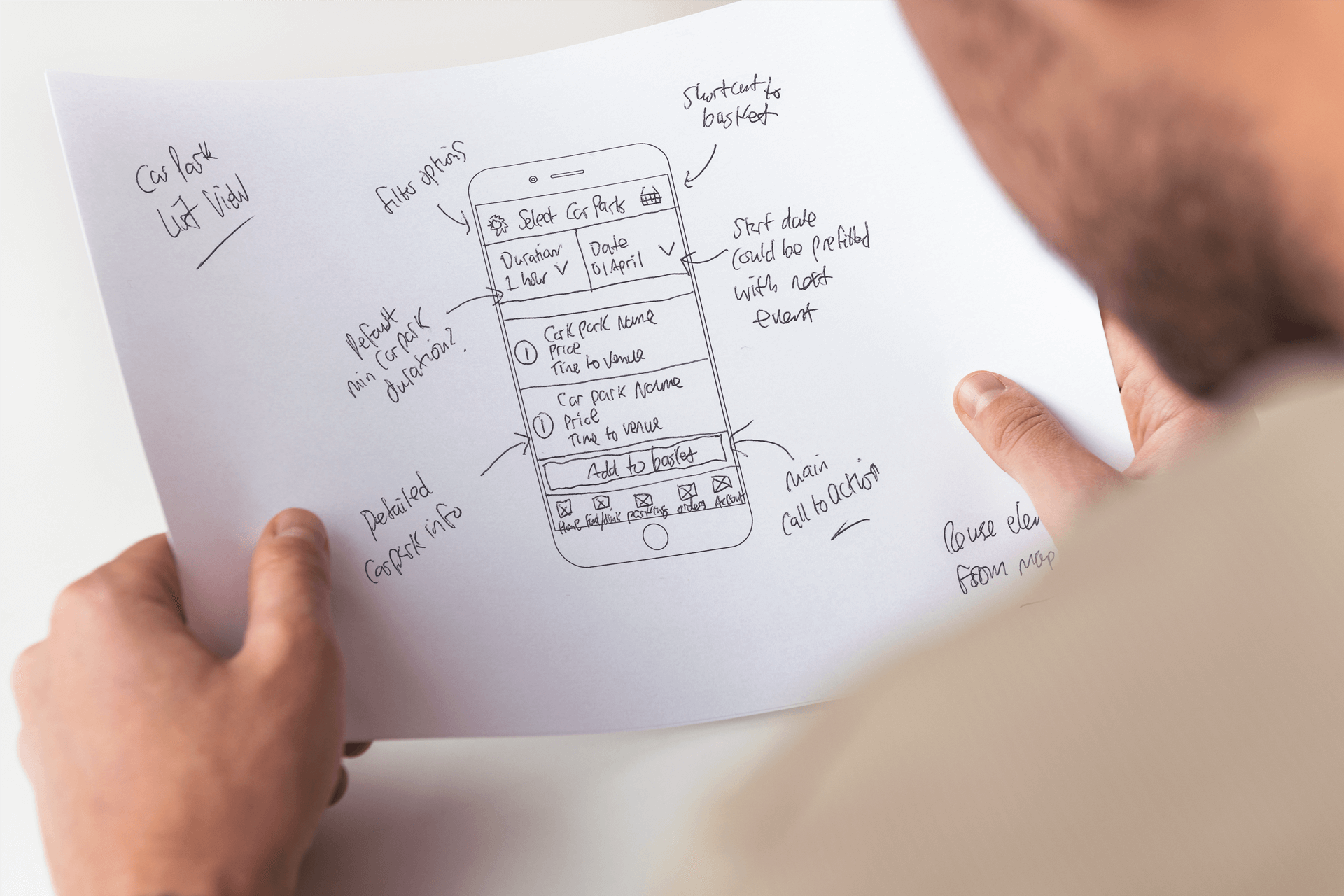
Users are in the ticket-selling app funnel with the express intention of purchasing a ticket, so parking is the kind of add-on that’s akin to food and drink — it’s an afterthought — but that doesn’t mean that it can’t be signposted and cross-promoted in conjunction with that add-on.
To minimise production time and avoid unnecessary changes to coding, I redesigned the user flow with a concentration on the purchase-end of the funnel and turned these low-fidelity wireframes into high-fidelity working prototypes. These included variable screens and clearly presented options for Preoday, so we could work together to find the best solution for their partners’ customers.
The sales tool needed to be slick in design, but also clear in functionality for the user, so the end of the funnel for ticket-buying users had to be easily digestible and straight to the point.
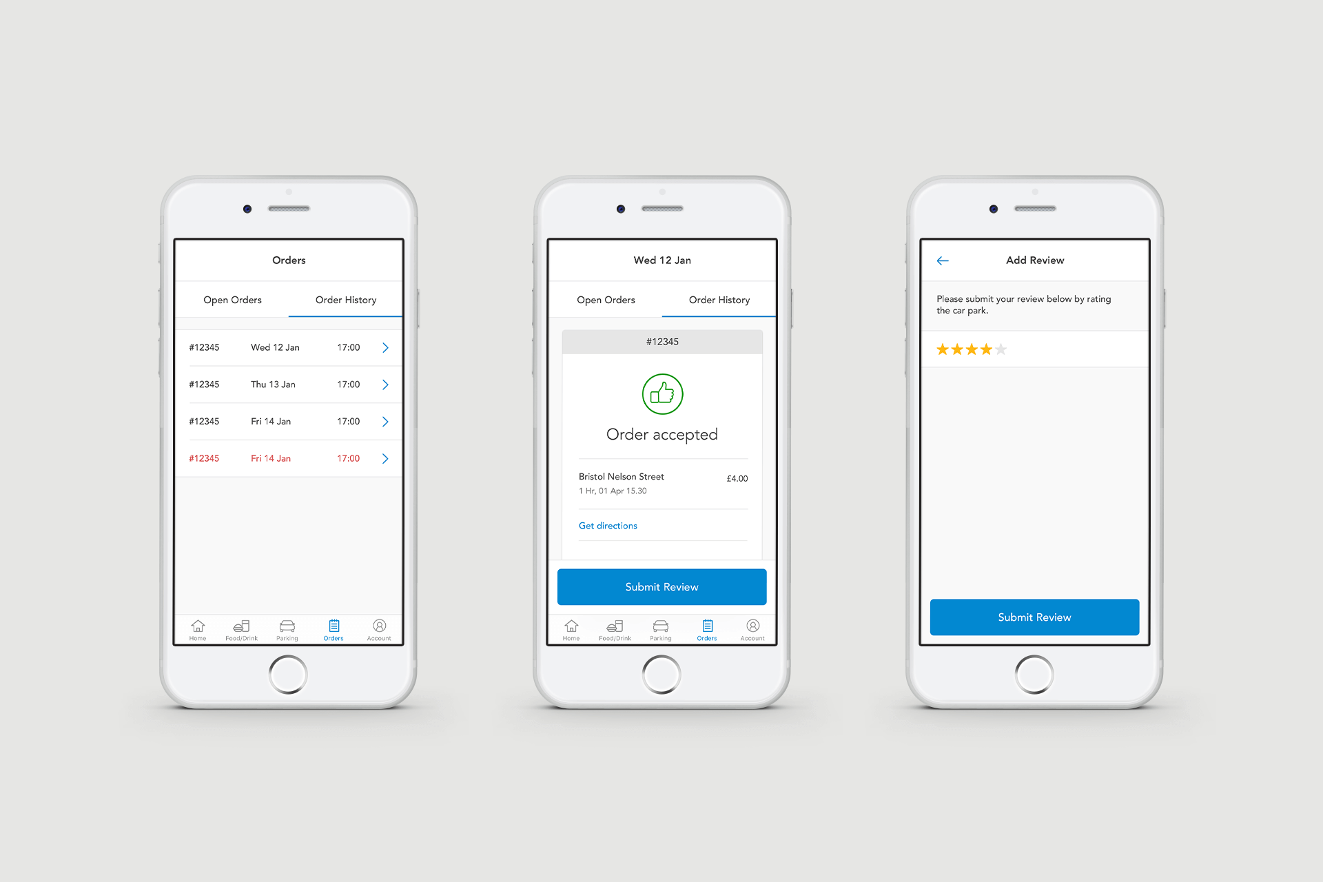
This is where I cut back a lot of the unnecessary steps found in competitors’ apps and focused on including as much of what the users really need on single screens, such as maps, pricing and start and end dates for parking.
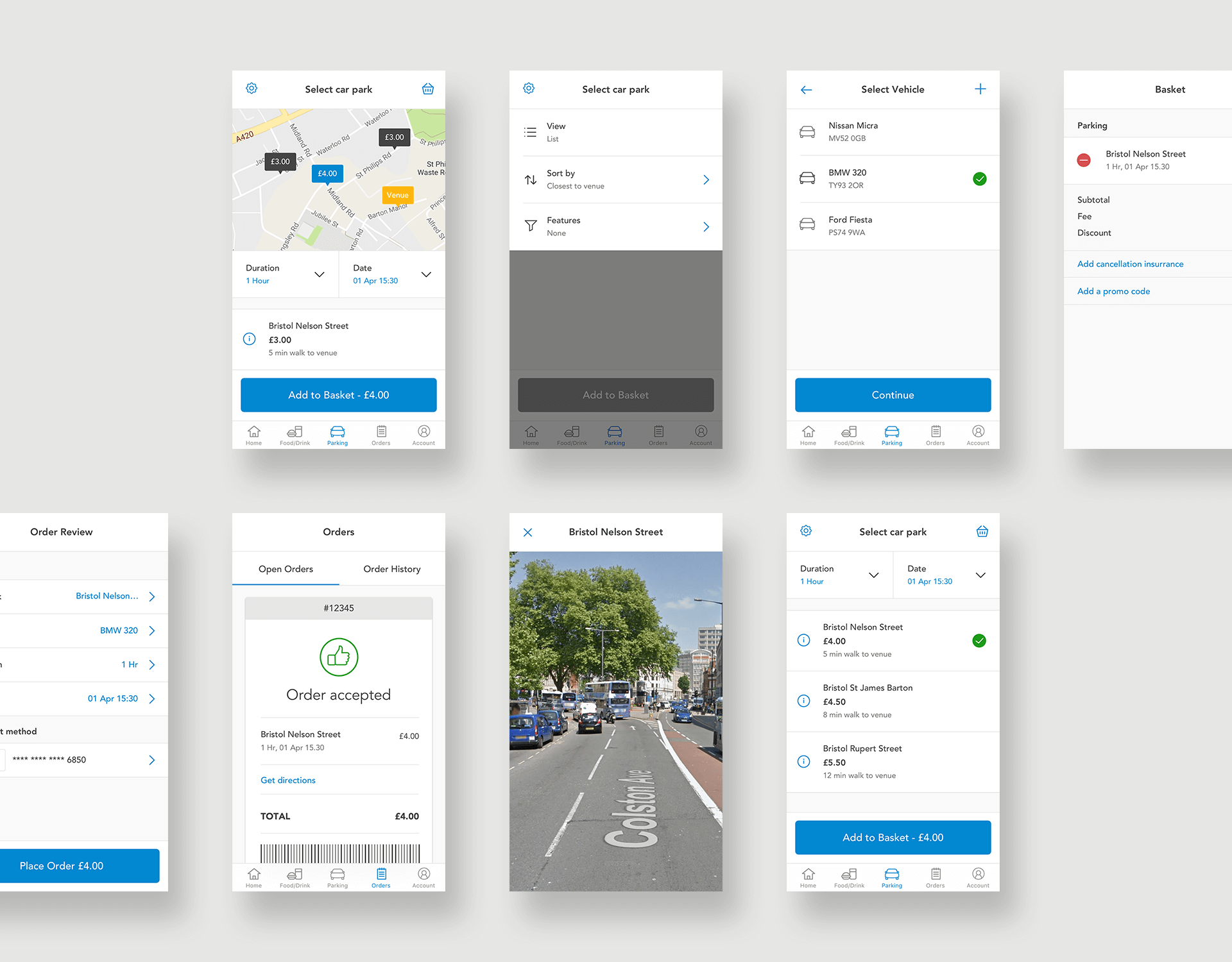
What we ended up with was a feature of the technology that made it easy for customers to understand what they were getting via the ticket-selling app, for instance, and for future clients to understand what they could add to their own user experience for added value (and revenue, since Preoday does not charge commission on orders).
The simplification of the user process and consistency of the design means that this approach can be applied to a variety of industries — the visuals can simply be adapted according to the branding of Preoday’s partners and there’ll be no need for sweeping changes to the code behind existing customer-facing apps.
This way, Preoday gets what it needs, Preoday’s customers get what they need and Preoday’s customers’ customers get what they want at every stage of the user journey.
If you’d like to find out more about this project, please feel free to contact me today.
Client testimonial
“I was really impressed with Simon’s professionalism, dedication to the project and speed of execution. He communicated clearly and had great ideas whilst working effectively within the constraints of the brief. The quality of his work exceeded my high expectations.”
Simon Evans, Product Manager at Preoday.
Thanks for taking the time to read this article. If you found it helpful, please let me know. ???
Need additional advice? Request my FREE Cheatsheet which includes ’47 Actionable UX Hacks to Fix Your App’.
If you’d like to read more, check out my blog for regular updates.
This article was originally published atwww.simonmccade.com.
SOURCE: https://medium.muz.li/design-case-study-preoday-12056d07f433

WRITTEN BY
Simon McCade