There was a whole lot of ? this year
It’s been nearly 10 years since Mapbox was founded in 2010. Since then, we’ve continued to invest in what can be done with our tools. But what makes that truly exciting is how it’s reflected back in the growth of the community of builders, and how they are using location tools to understand and explore.
That progression was on full, glorious display in 2019. This year, we saw more amazing #builtwithmapbox projects shared than ever. In a motorcycle? An electric concept car? An app to track all your deliveries? School projects? A driver-safety AR navigation app? A wine label-reading, AR sommelier? Offline data collection for humanitarian relief? Every U.S. building’s fire risk? All of it! It’s inspiring to see, so we wanted to shout out a few of our favorites. Have others? Share them on twitter with #mapping2019.
Jonni Walker’s turtle viz
This year Tableau introduced vector maps powered by Mapbox, so there were a lot of amazing map dashboards from the #datafam. But Tableau’s Jonni Walker was in a class by himself, firing off a map design and data viz opus, including this stunning visualization of threats to Sea Turtles in the Greek Oceans.

USA Today’s reverse mortgage foreclosure map
A few months after the release of this attention-grabbing report revealing racial disparities in predatory lending practices, Congress announced investigations and actions to protect senior citizens, citing the report directly during congressional hearings.


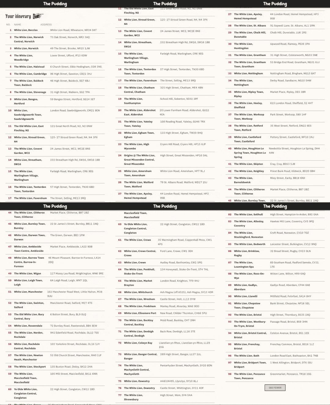
The Pudding’s Ye Olde Mad-Lib Pub Crawl route generator
If you didn’t know you needed to go on a 339 pub, 8,398 kilometer journey to every “Red Lion” pub in the UK, now you know — and you know the shortest route. When you finish, start on the “Blue Anchor,” “Green Dragon,” or “Black Dog.” In one of the most imaginative uses of the platform this year, Matt Daniels used the Optimization API to order pub stops of the same name, the Directions API to route between them, and GL JS to place the routes on a vintage map that will still look great with a bit of lager spilled on it.

Patriot Act’s visualization of Amazon deforestation
There were a lot of big stories this year, and no one covered them on a bigger screen than Hassan Minhaj — an Emmy-award winning backdrop he describes as “if Michael Bay directed a PowerPoint presentation.” His episode on Brazil and the Amazon visualized Global Forest Watch data showing the importance of indigenous land rights for forest protection. Somehow, with jokes!

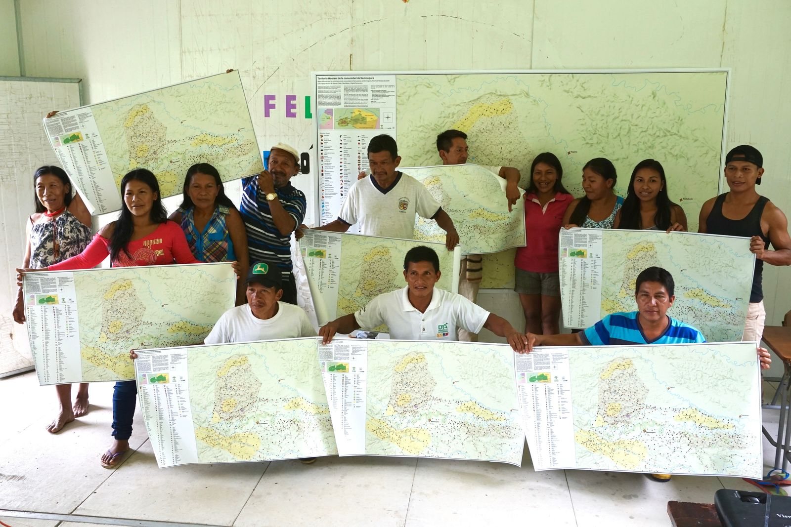
Waorani territory maps
Empowered with offline mapping technology, Ecuador’s Waorani people created maps of their traditional lands which became evidence in a successful legal battle against the Ecuadorian governments’ attempts to drill for oil in the rainforest. As Waorani leader Alex Lucitante said, “el mapa es poder.”
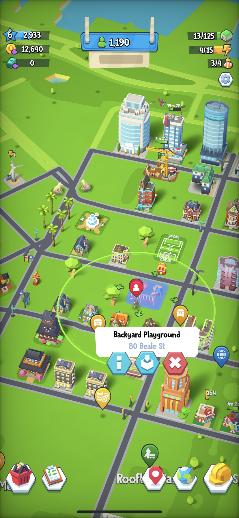
GoCity’s world map you can build on
GoCity by Shipyard Games lets you build the city of your dreams on the real street network wherever you are, with gorgeous, smooth graphics and interaction with local POIs based on location. In the downtown San Francisco I’m building, the Mapbox office is a playground, there a Soccer Field across the street (in a nod to our active foosballers,) dense, walkable housing nearby‚ (because there are no NIMBYS to stop me,) and Market St. is lined with Palm Trees, a fountain and obviously, dog statues.

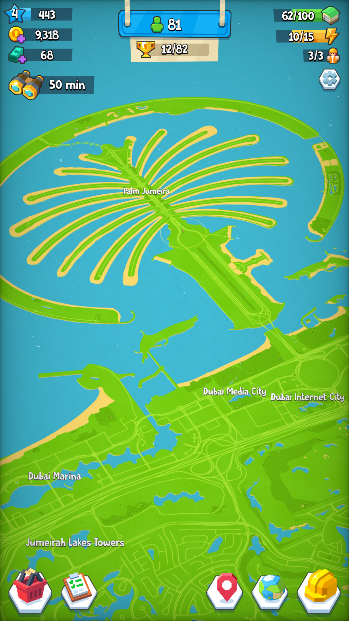
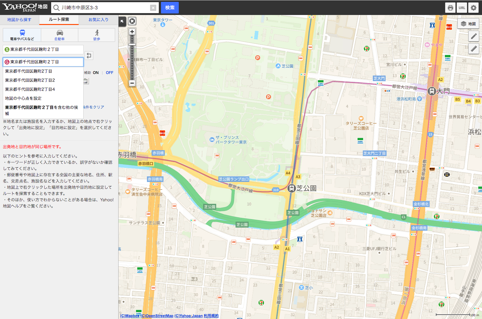
Yahoo! JAPAN’s new web and mobile maps
Yahoo! JAPAN is the most visited digital destination in Japan, and this year their team launched gorgeous new custom maps across their web portal, navigation and weather applications, bringing best-in-class products and experiences, with the precision of Zenrin data, to their millions of users.

Mineral map style
Madison Draper, one of our map designers, created many beautiful, quirky, intricate, strange, and fantastical map styles this year. The Mineral style stands out because of what’s not there, focusing on the connection between people and across landscapes. (This style is also a great ad for your account’s 100 free high resolutions Studio map prints a month.)

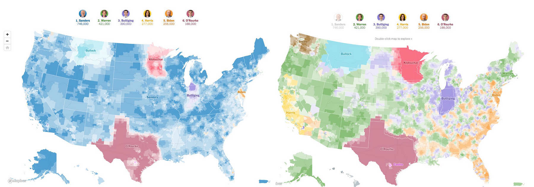
New York Times’ election contribution map
The data-driven story told by visualizing all 2,278,000 individual donations to Democratic primary candidates was a refreshing counter to endless sound-bites and polling updates. If the geographic patterns of support weren’t compelling enough, the map geeks went wild for the Times’ use of an Albers projection for a more spatially accurate visualization.

Room sized map of Chicago architecture
On the list of quintessential Chicago activities, the Architecture Tour on the Chicago River is up there with staring into the center of The Bean, and drinking an Old Style at Wrigley. So we loved seeing the Chicago Architecture Center’s room-sized floor map that lets people explore the city from above.
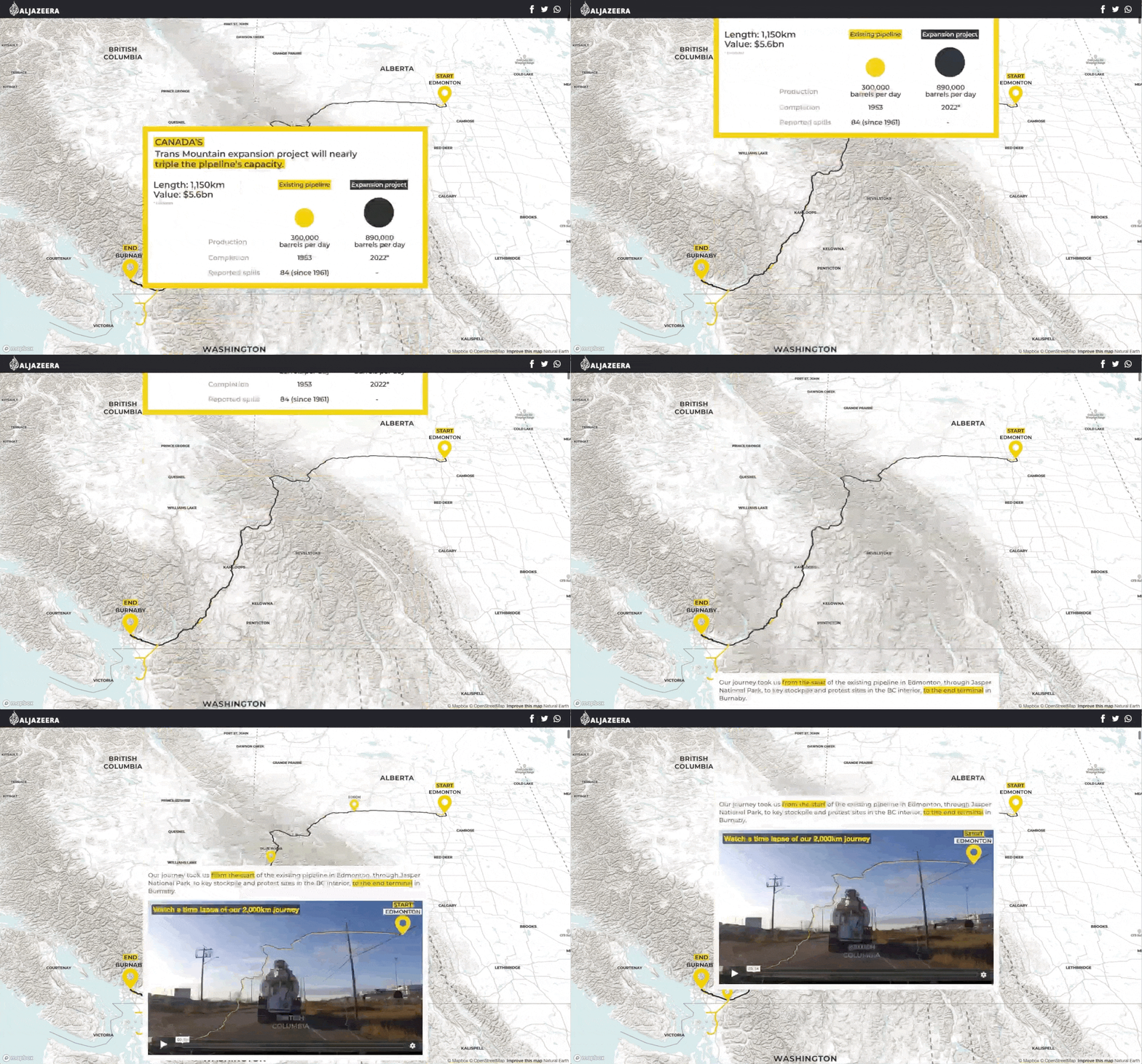
Al Jazeera’s interactive pipeline route storytelling
In “Nations Divided: Mapping Canada’s Pipeline Battle” the AJ team traveled the length of the proposed Trans Mountain tar sands pipeline expansion, from Edmonton, Alberta, to Vancouver, BC. Using the Storytelling Template, the interactive report combines reporting with imagery, video, personal accounts, and maps, for an in-depth look at a contentious issue that provides a concreate sense of the people and places effect.
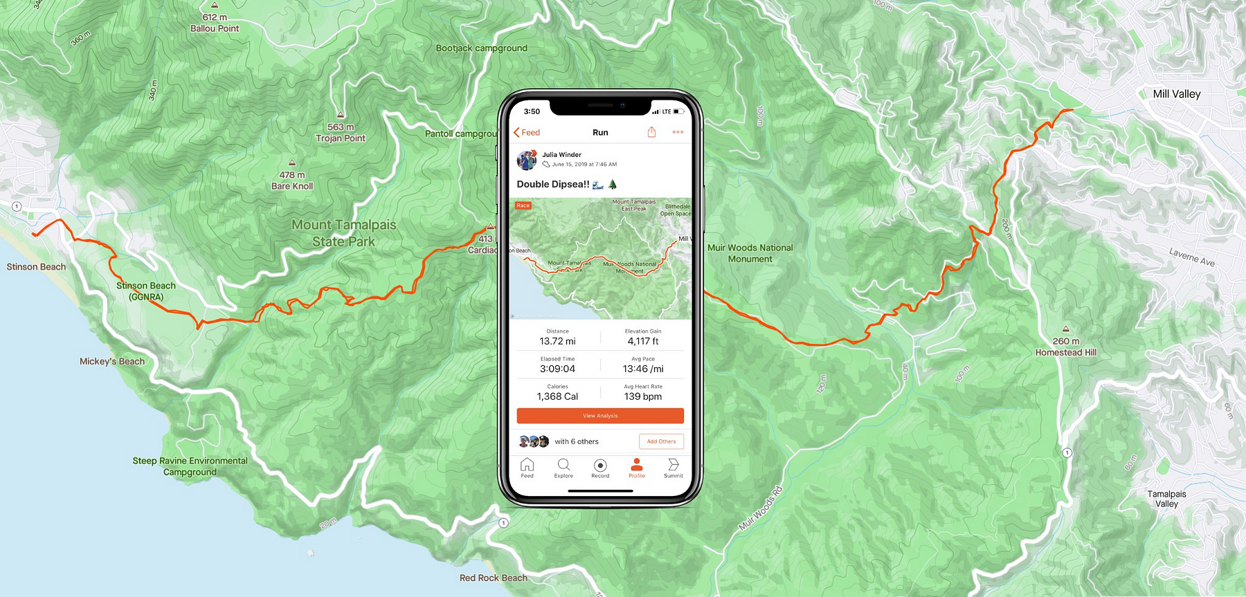
Strava’s new feed maps
With the launch of a gorgeous new redesigned map style for the static maps in their feed, the Strava team was able to capture and reflect the full effort of the physical activities we share — showing in high relief the climbs, descents, and terrain that pushes us and pushes others.
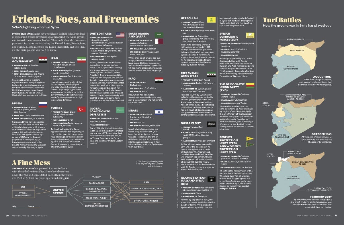
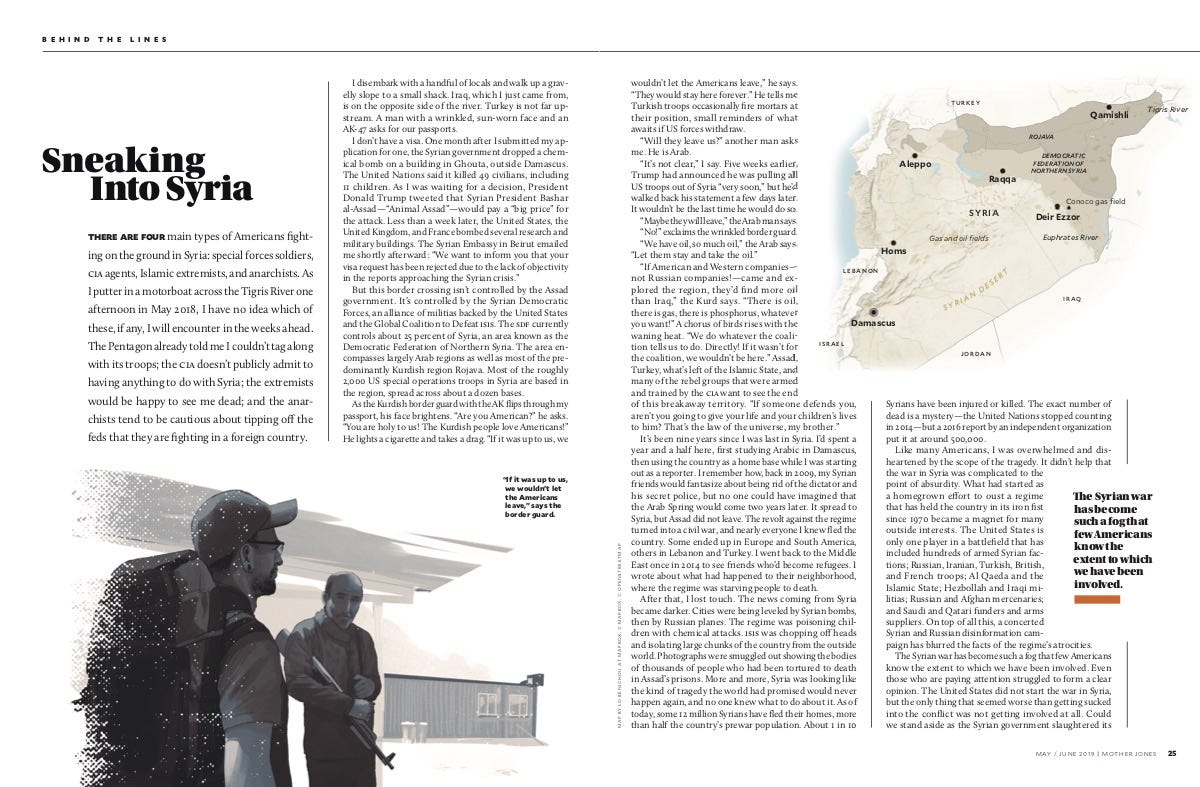
Mother Jones Syria maps
To shed light on America’s role in Syria’s tragic and complex civil war, Mother Jones reporter Shane Bauer traveled behind the lines, complimenting his reporting with original maps created in Mapbox Studio that illustrate the territories and more than a dozen governments and factions involved.
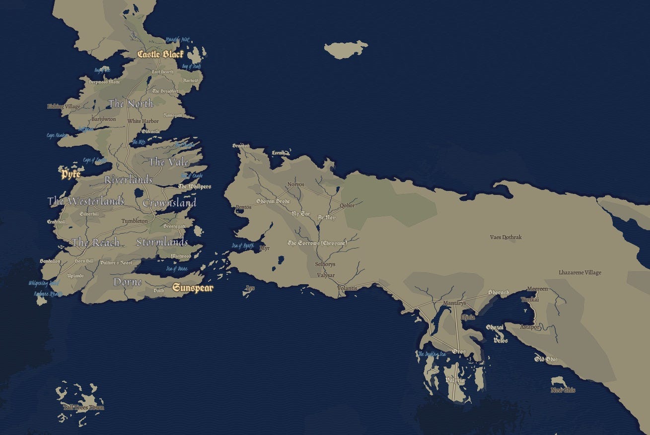
Build-your-own Game of Thrones-inspired map
A brighter day may be in store for the Seven Kingdoms as (spoiler alert) we bid adieu to Jon and Dyneris peacefully assuming their co-leadership of the Iron throne. But for the rest of us, Winter Has Come, and with no more GOT, it’s going to be a long one. Fear not, you can re-visit Westeros and Essos any time you want, with, by far, the most popular designer map style we made this year.
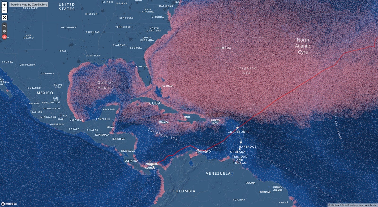
eXXpedition’s voyage map
This map charts the planetary scope of ocean plastic pollution. And it also charts the journey — including ocean currents, wind speed, ocean depth and the route — of 300 women who are sailing around the world over two years as part of the eXXpedition to raise awareness and find solutions.
Ancestry’s sub-region origin maps
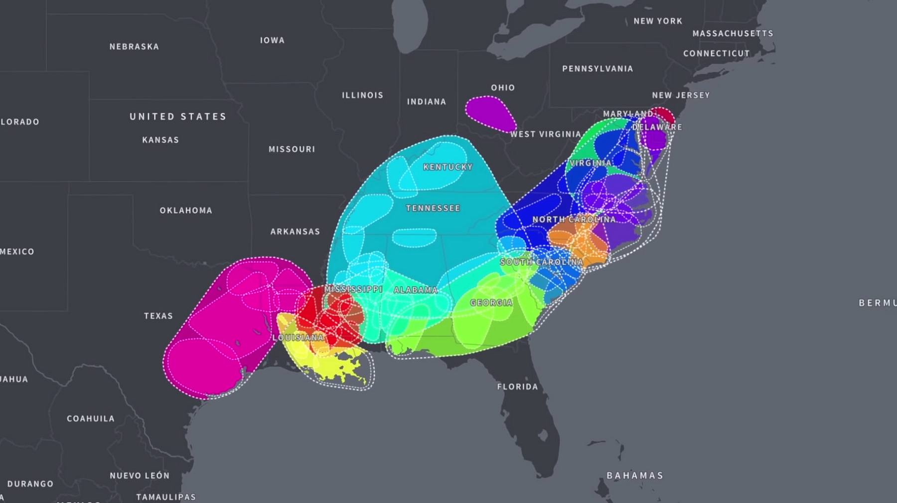
How do you map ethnic origins that in many cases pre-date modern existing political boundaries? Ancestry used 20 billion DNA and family tree records to create a tapestry of custom regions and subregions, so that people can understand not just what countries they come from, but see the deeper level of the where in their origin story.
Snap’s Egg Hunt map
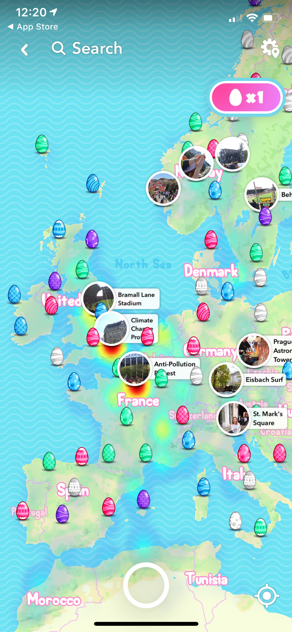
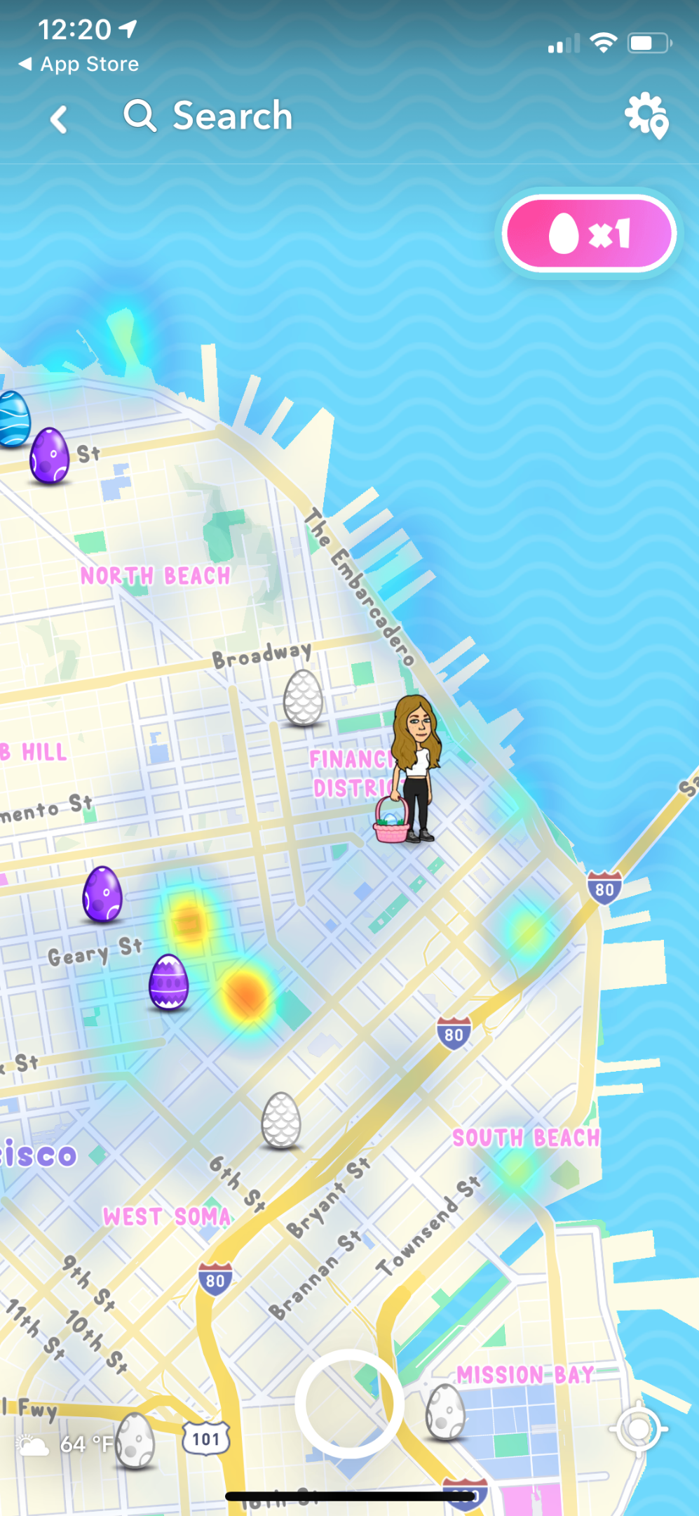
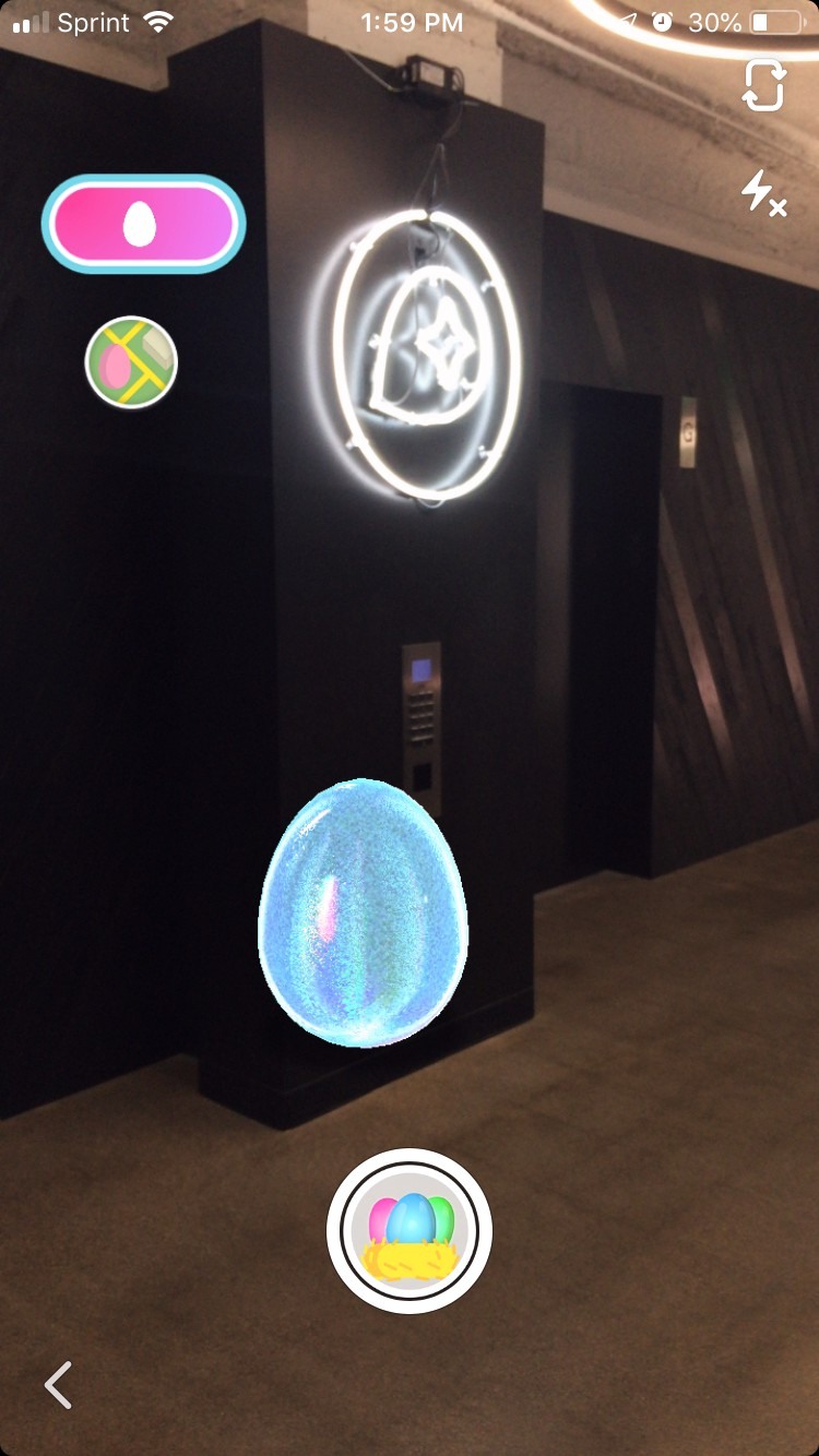
In 2019 Snap rolled out festive holiday maps and provided a real-time view on global events. But hiding tens of millions of eggs around the world, visualized on the map and captured in AR, made for a uniquely fun holiday map.
Washington Post maps 70 billion opioid pills
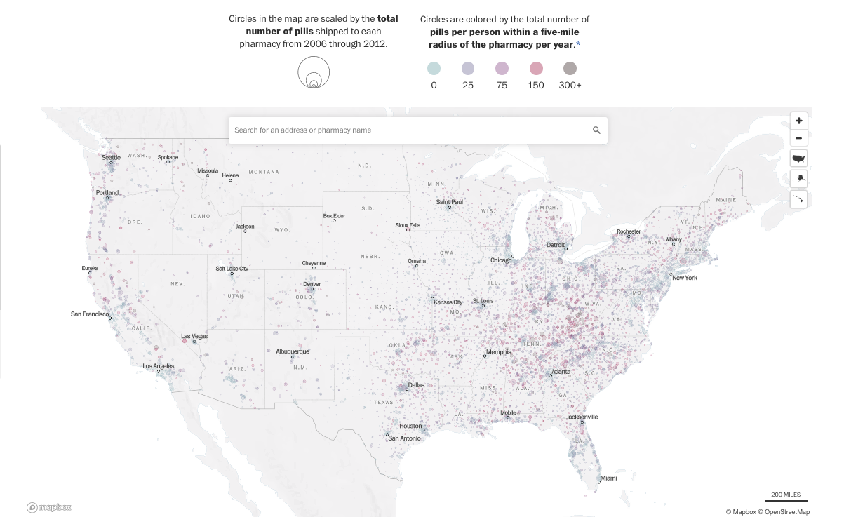
One of our favorite examples from the last year of how visualizing spatial relationships of data can show a new perspective on a story was the Washington Post’s map of 70 billion pain pills by pharmacy location. While the DEA dataset was incredibly large, the Post’s visualization brought immediate context on the opioid epidemic from the aggregate, regional, and individual pharmacy level.
Netherlands building age map by Parallel
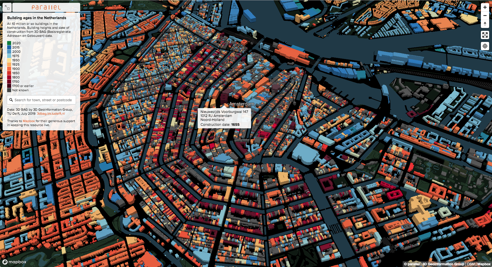
Even as maps are faster, can handle more data, and make just about anything seem possible — we can still be awed by them. Parallel’s 3D map of all 10 million buildings in the Netherlands, visualized by their age, captivated us and a few other people, too.
Bonus: The map you make
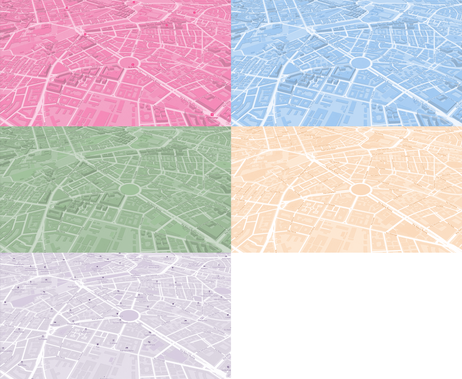
It’s not too late to make 2019 the year you design that amazing map or upgrade the map in your application, website or platform. With the redesign of Mapbox Studio with style components, it’s quicker, easier and more foolproof to design great looking map canvasses for every use. Try it out and share what you build with #builtwithmapbox.
Written by
