by Bradley Nice, Content Manager at ClickHelp.com — software documentation tool
Making mistakes in your UI is easier than you think. There are quite a lot of pitfalls on your way of delivering smooth user experience, and I want to talk about some of them today. Without further ado, let’s get right to it.
Phone Number Form Fields
Phone number field is a beast. In my other article, I mentioned a post on Imgur that presents you the best UI/UX practices from hell, mostly concerning phone number input. But there are less obvious ways to ruin user experience.
Everything is permitted
The most common misbelief is that allowing users to enter whichever format they like is the key. But it’s not entirely true.
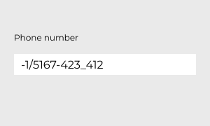
Check out an example above. Is this filled out correctly? No? But hey, you decided to let users run wild, so someone clearly did. How will your database handle this input? And if you throw in a validation there, it will further confuse users. Do they need a country code? Do they need to put dashes or spaces between number groups? Users will most likely abandon filling out the form, rather than spend time guessing which format you meant there.
Let me show you the way
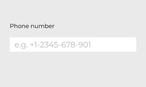
Some developers think that by showing the user an example how the field should be filled out they will avoid confusion, but in reality, most users just ignore the example and fill out fields the way they like. This, again, causes validation errors and leads to form abandonment.
We are the many
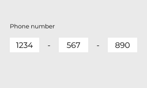
Other designers split input forms. But adapting form to just one country isn’t user-friendly at all. The example above will mostly suit some users, but others may be left aside because they have different formatting and number lengths in their countries. This approach is also difficult to fill out from mobile phones.
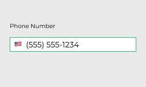
What to do: use auto-formatting instead. Suggest that users need not worry about their input, because your system will work it out, putting brackets and dashes.
Birthday forms
Birthday forms are another form type that causes a lot of confusion and still doesn’t have a strict guideline about its appearance.
What’s first?
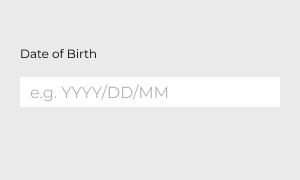
Ever found yourself wondering, what exactly and in which order should you input in such a field? There are many MM/DD/YYYY forms, but just as many DD/MM/YYYY. And yes, just yesterday I’ve stumbled upon one of the rarer species, the one I put in the example. Who does that?! This kind of input makes your users think and confused about what to enter first, and should they enter leading zero (like, 09/01/2001) or ignore it?
And again we return to the fact that users ignore examples, so they either end up with mixed up month and day, or failed validation.
Too much unnecessariness
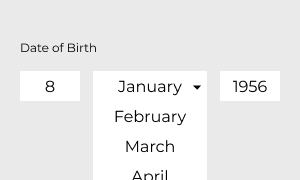
Scrolling through that many options can be difficult and tiresome. It’s good enough if such form supports keyboard input for quicker selection, but still — there are 31 day options, 12 month options, and 128 (!) year options. By the time you finish scrolling, you’ll be at least a couple of years older and you’ll have to do this one more time…
Why even…
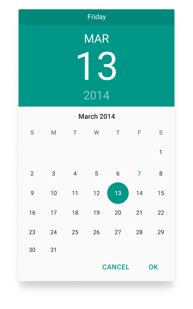
Ah, yes. Calendar views. On one hand, they can be more user-friendly than other examples, but still, they are quite complex and not all users understand what they have to click in order to get their date of birth. On some screen, sizes these calendars can be quite small and difficult to navigate.
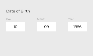
What to do: Put clear and easy to understand form. Separate fields from one another (yes, this works here, unlike in phone numbers) and label them accordingly, so users won’t have to guess.
Email confirmation
I’m pretty solid on that email confirmation field must be gone. Try and remember how many times have you’ve actually typed something in this field instead of just copy-pasting from email field? This form is archaic and isn’t very user-friendly, and, as I’ve mentioned, doesn’t protect us from mistakes.
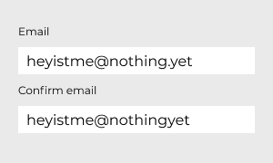
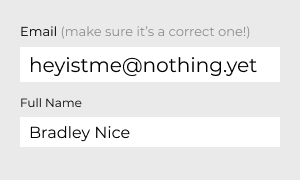
What to do: my advice is — avoid using email confirmation field. Instead, put your email field first, increase its size and font size for clearer reading and kindly remind a user to pay attention to what they write (“make sure it’s a correct one!”).
Miscellaneous Text Field Practices
Separate Name and Last Name fields
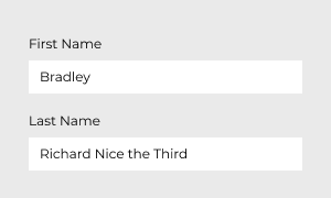
Yes, it’s not as bad as other ones, but still, think about it — some people might not have the last name, or they don’t want to disclose it. Or they have a middle or other types of names that your form doesn’t support. Not a lot of cultural inclusivity, huh?
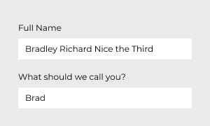
What to do: make a single “Full Name” field. It will allow users to input whatever they feel right. Yes, it may be harder for you to search for specific users, because your database most likely won’t parse for first or last names separately, so you can address users later. But you always have email, which is 100% unique, unlike first and last names. You can also add a second field, something like “what should we call you?” — that’s gonna be a whole lot more personal.
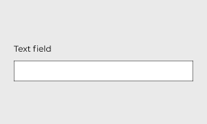
Too bleak
Look at the example above. Would you tell that’s an editable text field? I’d personally think that’s an image or just an inactive field. Well, there’s not much here to talk about — just don’t make input fields that blend with the background.
What to do: don’t ever blend active elements with background or other surrounding elements. Make it stand out. Add a border (0.5px in the examples) and accentuate your fields with the help of colors.
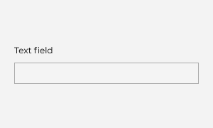
Too modest
For some reason, designers sometimes are afraid to emphasize input fields, like they are almost ashamed to ask users for input. Thus it can be both inconvenient (the text is too small) and bleak (is this really necessary?).
What to do: See the example below. Compare the two fields. The first one is has a height of 30px and font size of 12px. The second one is 50px in height and has 16px text inside. Don’t be afraid to make these elements bigger!
Select menus EVERYWHERE!
Select menus are a popular type of menus, but are they good? Sure, in some cases they are perfect. But I’ve already touched this subject and you already know that in birth date input they must not be used at all. But what are our choices?
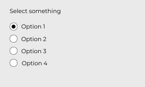
Less than 5 options
What to do: If you have less than 5 options, just replace select menu with radio buttons. This way users will see their options spread before their eyes and they will have to make fewer clicks to choose whatever they need.
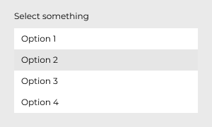
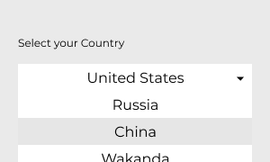
Over 15 options
Yes, this is a plain ‘birthday input’ case. If you have a lot of options — just provide users with a text input field, if possible, instead of making them scroll through numerous options.
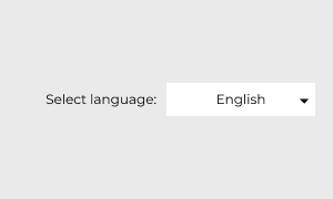
Unnecessary default
Why would you make “Alabama” in “Choose your State” input a default? If a user misses this field, he will have wrong info in their profile, and validator won’t even notice this, because de facto field is filled out.
What to do: never provide a default value for dropdowns/select menus, unless they can be applied to a majority of users. In the example below default is English, because it’s an international language and can be applied to most of the users.
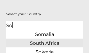
Known User Input
Another bad practice is making a select menu out of known user input. Why would user scroll through numerous options, if there are simpler ways?
What to do: autocomplete is the answer. Let users enter what they want, and help them by providing filtered options they can choose, based on their input.
Have a nice day!
Bradley Nice,
Content Manager at ClickHelp.com — best online documentation tool for SaaS vendors
Bradley Nice
Content Manager at https://medium.com/level-up-web
?. I write about web design, web development and technical writing. Follow me on Twitter and Facebook
Level Up!
Stories for technical writers, web developers and web designers. It’s time to level up your skills!