Refactoring changes the interface directly, and redesign changes it by changing an internal logic. Refactoring uses heuristics, and redesign — empirical methods. Refactoring is scalable through the transfer of methods and rules, and redesign through the transfer of experience.
Martin Fowler in the book “Refactoring” defined:
Refactoring is a disciplined technique for restructuring an existing body of code, altering its internal structure without changing its external behavior.
With regard to the UX and interfaces — everything is external. So the main question is the definition of synonym “external code behavior”, which will correspond to a change in the interface structure.
Considering that “external code behavior” is the result of code execution, the result of working with the interface will be the achievement of the user’s goals. An analog of the “internal structure of the code” is the interface itself and the logic of interaction with it (UX) laid by the designer.
Paraphrasing of Martin Fowler, “UX refactoring is a process of changing an interface in which the user’s goals do not change, but the interface itself and the logic of working with it (UX) changes.” Let us now consider the question more formally.
Terms and Definitions
Don Norman said: “User experience” encompasses all aspects of the end-user’s interaction with the company, its services, and its products.
The interface is a necessary part, but still only a part of the system (site, in a particular case) to provide these aspects of interaction. User experience is a more comprehensive concept. From this perspective, let’s continue the discussion.
Any interface can be considered from the point of view that the user wants to achieve his goals, to perform the “main action in the interface.” And for this, at each step, it is necessary to understand what kind of result he will receive by doing this or that action. And the clearer this result at each stage, the less effort interface requires to achieve goals.
The main action in the interface — is the last action, before the user reaches the goal.
We also take into account that when designing an interface, a designer implement his own set of goals, more general than the user’s goals.
Efficiency is the ability to avoid wasting materials, energy, efforts, money, and time in doing something or in producing a desired result.
In general, the number of clicks and the time spent working with the interface are consequences of the effectiveness of the interface. The user does not have enough information to decide where to click and what will happen after that.
If you look more closely, you see the time to work with the interface also depends on the number of clicks. The user does not understand what needs to be done, commits redundant actions, mistakes, then corrects them until he reaches success.
Let’s define the following terms:
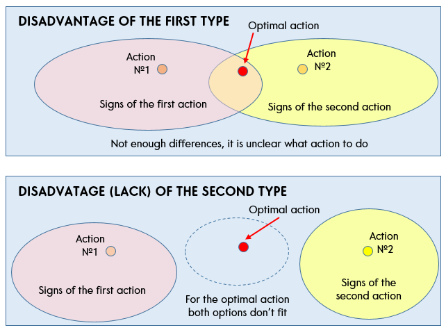
The “Disadvantage” of the interface are those situations where the user does not have enough information to decide what to do.
A more general statement: if a user has several options and he does not have enough information to understand which of them is more optimal, then this is a disadvantage of the first type. Options for action carry signs of optimal action, but these signs are not enough to separate the more appropriate from the less suitable.
The opposite situation when the user has few options. Options for action either do not have at all or have insufficient signs of the user’s goal. It is not clear which of them is somehow suitable for achieving the goal. In this case, it is required to supplement the interface with signs of the user’s goal. This is a disadvantage of the second type (or lack, will be more correctly).
In more detail about the concept of signs and properties is described in the article of the same name “Signs and Properties”.
We must strive to ensure that at each stage there is only one, the optimal option to take a step forward. Do not force the user to think about a specific action, or whether it should be done at all (or can it be easier to leave this incomprehensible site?).
Joel Spolsky, in the book “Guide to UI Design for Programmers” is right, saying that:
“Every time you ask a user to make a choice, you make him make a decision. This is not always bad. But definitely bad, if the choice does not relate to the problem that the person solves. It is better to make a choice for the user everywhere except his main task.”
If the difference between the proposed options is not completely clear, the user will either begin to think (to waste time) and study the information on the screen or press buttons at random, trying to advance to the goal (and here come clicks!).
Disadvantages relate to the structure of the interface and are determined unambiguously, unlike defects. Defects also appear as a result of marking the user’s path and assigning one or another effect (the appearance of an error, in particular) to defects.
An interface “Defect” is a dead-end path that does not lead the user to his goal.

In particular, locked buttons are dead-end indicators that indicate defects. Error messages that the user receives in the interface are defects. Deadlock, where he got doing something wrong, as conceived by the designers of the interface.
Moreover, the goals that the designer intended creating the site, but which are not needed by the user, do not fall under his goal — they are also defects. They lead the user away from the optimal path. For example, a subscription to the news on the website of the online store, when the user comes for the purchase.
As a rule, disadvantages of the second type entail defects. The action variant does not contain signs of the user’s goal (disadvantage) but contains signs of another goal, originally intended by the designer. And is an error in this case (defect). What corresponds to the definition of Don Norman — the designer designs a map of user goals by creating an interface and laying in it the resulting user experience (UX).
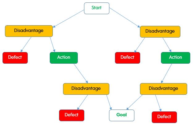
The user’s path is a decision tree, where at each stage the user must understand what needs to be done in order to achieve his goal. Yes, it is very similar to the CJM (Customer Journey Map) with its barriers.
The ideal interface will be called the refactored interface. All defects and shortcomings eliminated.
In an ideal interface, the sequence of actions will tend to the chain, bringing the user closer to the goal with each step.
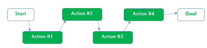
In fact, you have no obscure choices — only the optimal ones are left at each step. You also have no mistakes and options for actions that lead to any goals other than yours. The interface becomes so simple and clear that you move on it as quickly as possible, without thinking.
Using the terms above, we can more formally define UX refactoring:
“UX refactoring” is the elimination of defects and disadvantages in the interface, without changing the rest of the logic and user’s goals.
Not creating a form from scratch, which would require reworking a site or application, but a UX change aimed at improving its efficiency, in which the rest of the logic behind the interface remains the same.
Examples
Let’s take concrete examples to analyze where there are disadvantages, and where defects.
Example 1. Subscribe form

The placeholder in the input field tells the user what exactly he should enter. This is an email with the @ symbols and dot in it. In case of absence of the placeholder — an inexperienced user will think about what and how to enter. This is a disadvantage of information that can lead to a defect — an error message that the address is entered incorrectly.
The text label above the field prompts what you should enter. Not login, phone or something else, but email. It also indirectly removes the disadvantage of an interface.
The disadvantage in the picture is the active “Sign” button. If the user clicks on it without entering the address, he will receive a defect — an error message. At least, it should be made inactive. Ideally, remove it, so that even an inactive button will not be an indicator of a dead-end action and does not confuse the user.

If you look closely how the user enters the address, then you can make hints that the input character is expected @, and then a dot.
An example of refactoring of defects and disadvantages of this form is given in the article “UX refactoring on subscribe form”
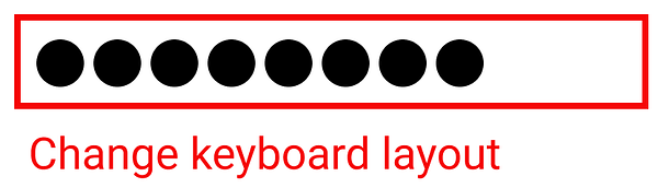
Similarly, if the user types in the wrong layout, you can also prompt him in the input process. This will eliminate the defect with the wrong address entered in the wrong layout.
And if you refactoring not a separate form, but the entire site, once entered email on the site (during registration, in the form of a callback, upon delivery, upon subscription) should automatically be substituted in all places of the site where the user’s email is supposed to be entered. Once introduced — use everywhere.
Example 2. Save window in Word
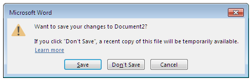
What prevents, for example, saving a file in Word automatically? When closing, there will be a choice between two buttons — “Do not save” / “Cancel”. Moreover, it has already been saved somewhere, since it will be “temporarily available”. The “Save” button is needed only to set the correct path to the folder where the file will be stored.
The button “Cancel” actually means the action “Continue editing”. How “Cancel” is different from “Not Save” is not obvious from the message. This is a disadvantage of the first type.
Good and bad
A good interface is an invisible interface. Not always. The minimalistic interface is good because it eliminates defects and disadvantages, removing them like garbage. Plus, if the designer makes himself to think, then effective solutions appear, pushing the user to the desired action or generally doing it for the user. This also minimizes disadvantages. The main risk with minimizing the interface is to delete what was needed. Signs of user’s goal. And then, instead of the optimal action, the user will receive a lack of information and a disadvantage of the second type.
What should we strive for when refactoring? At least, there are several signs of the interface being ideal or close to it:
- A user just cannot make a mistake. The interface simply will not give him that opportunity. Will not lead this way. It will keep the user in the correct borders. Hints, micro-interactions, a set of system states — everything will tend to direct the user in the right direction.
- the interface cuts off all dead-end branches in the user’s work path. If the branch of work is not necessary to achieve the goal — it should not be at all.
The ideal interface does not contain any defects and disadvantages at all.
To eliminate defects and disadvantages in the interface, you need to show the user what happens in the event of a particular action. Where will he find himself, in what state? What the system will do, what will change. To do this, you need to pull the signs of the goal (from the next or further steps) to the stage of the current step. More details about this concept are described in the article “Signs and properties”.
Measurable results
Using all of the above, you can now clearly determine which interface is worse or better. Moreover, in two ways.
The first is by the number of clicks. The fewer actions, the more efficient the interface. Compare the number of clicks needed to achieve a goal before and after refactoring.
The second — by indirect signs, the consequences of the number of actions. Defects and disadvantages. One with fewer defects and disadvantages is better.
Refactoring vs Redesign
Let’s compare what the usual redesign of interfaces differs from UX refactoring.
Figuratively speaking:
Source interface: 1 + 1 + 1 + 1 + 1 = 5, we are looking at how to improve.
Redesign: 5 * 1 = 5, cardinally optimized addition
Refactoring: x * 3 = 5, where 3 — restrictions (that we do not touch the user’s goals, API and etc.), and X — the most effective changes under these restrictions.
Now the redesign in the industry is any improvement. In this article, we say that if we restrict ourselves solely to the interface, then we can find the most optimal improvements with the help of refactoring.
In development, the defect is eliminated during testing, but in the redesign, defects, as defined in the article, for some reason are often not considered as defects and leave the user to deal with them. This is the first.
Second, in refactoring, defects are defined by the designer. What he considers to be a defect in the source interface is marked up. The initial interface is used as a base and refactoring takes place relative to it. In a sense, freedom of action is limited to an already implemented system. And redesign in this respect is freer to choose actions, it redefines the entire interface (the current one often is not used as a base).
If a redesign is to find a solution in which several defects are “closed” at once, then refactoring is in small steps, close all current defects sequentially and ensure that no new ones occur.
Here a question arises: what does a “good” design decision mean (obtained by redesign)?
- Redesign involves changing the internal logic that affects the interface. Refactoring without changing the internal logic, changes only the interaction with the interface.
- The redesign uses empirical methods: observation, survey, statistics, experience, experiment, empathy, and so on. The basis of refactoring is heuristic methods that allow you to combine, isolate and find the difference between interfaces and operates with clearly formal features: numbers, quantity, was-has become. It is based on logic and a sequence of actions leading to the desired result.
- For the high-quality redesign, one designer must maximally pass the experience to another. For the high-quality refactoring, it suffices to pass the methods and definitions. It is more scalable.
Special thanks to Wova Roodnyy for ideas and consultations.
SOURCE: https://uxplanet.org/ux-refactoring-64c6aeec31ea
Written by
Kirill Kuzmin
Less + More. Ideas, business-models, UX Refactoring
UX Planet
UX Planet is a one-stop resource for everything related to user experience.