A toolkit for when copy becomes design.

Writing is no easy thing. It’s something product designers do all the time — buttons, navigation, empty states, etc — but rarely with the same rigor or delight that we reserve for visuals and interaction patterns. When you come across the rare style guide for in-product copy, most focus on the finer details of writing: which abbreviations to use, how to type out dates, how to compose error messages and so on. This post is about the bigger picture that we often miss. It’s about the intersection between style and usability where copy becomes a facet of product design.
Copy as design
Every product has a voice. As you read text, you “speak” the words to yourself and hear them like a spoken conversation. This voice is a tangible aspect of the product, just like its colors or animation. It should be designed.
Many factors contribute to your perception of voice: typography, what you ate for breakfast, and the words themselves. In design, we often have the greatest control over the words.
Make it easy
Some words are hard to read, or take a while to subvocalize (←like this one). Use them wisely. It’s not just five-dollar words to look out for, even “congratulations” takes a while to say.
The shape of some words makes them recognizable — think “Follow,” “Save,” or “Cancel.” These words are well suited for functional UI because you can tell what they say faster than you can read them. These words should usually stand by themselves. “Follow” can be understood instantly, but “Follow Username” can’t.
When in doubt, say it to yourself out loud. If it’s a mouthful, look for something that isn’t.
Keep it short
Users aren’t there to enjoy your copy. Don’t waste their time.
Keep it active
Active language is easy to follow. Avoid passive voice and phrasing that undermines the user’s agency.
Do: You liked this post.
Don’t: This post was liked by you.
Keep it clear
Say the most important thing first.
Each piece of text should have a purpose, so pick words that convey it.
Do: Be clear.
Don’t: There are innumerable ways to engage with our audience, of which we recommend first and foremost language that is as clear as the waters of Lake Como in the spring and not overly laden with descriptions, cliches, comparisons, or meandering lists, which have a way of obscuring the real point that you want to communicate because sadly, saying more often communicates far, far less.
Keep it appropriate
Each interaction with a user is a social situation. Be tuned in to how they might be feeling, and what they want to do.
Bad news and error messaging: keep the language polite but direct.
“That password doesn’t match. Give it another try.”
Good news and confirmations: informal and enthusiastic.
“The results are in: you’re the top player this week!”
Awkward situations: be direct, but not too serious. Consider a light touch of referential humor, playful rhymes, or self-aware formality. Keep it subtle.
“Pardon the interruption.”
Empty states: this is a good place to be clever, but don’t try too hard.
“Nothing to see just yet”
Remember that your user is reading quietly in their own personal space, so use your library voice. Reserve exclamation points for tweet-able moments.

Keep it consistent
Assume that readers are distracted and forgetful. Give them consistent cues to direct their attention without making them guess what you mean. Consistency makes your language easier to understand, and each use of a phrase will reinforce the last.
If you want readers to upgrade, always say “upgrade.” Don’t be clever. Saying “join the elite Sing Karaoke VIP members club” in a button feels evocative in the moment, but doesn’t help readers connect the dots with their previous experiences.
Maintain perspective
Write as if you are having a conversation with the reader. This typically means assuming the perspective of a kind and attentive friend. Your reader doesn’t know everything, and you’re there to inform them and provide options.
This also means that you shouldn’t suddenly switch perspective, especially within a session. For example, imagine that you’re creating an account for Netflix and the flow of button copy goes like this: create your account→sign in→continue with Facebook→log in→continue as [your name] →got it.
Notice something a little odd there? “Got it” abruptly shifts to the reader’s perspective. As a rule of thumb you should address the reader in the second person. Only use the first person when a user assumes personal responsibility for an action. For example, when agreeing to the terms of service or deleting an account. Be mindful of context, and stay in character.
Convey character
Much of what makes a product relatable and memorable comes down to its personality. There should be a way that your product speaks. It’s on your team to cultivate this over time, and it often helps to keep an actual person as a reference point.
For example, I think that Evernote should speak like Tommy Lee Jones. First, he embodies its core brand attributes (full disclosure, I’m making this up): dependable, intelligent, and straightforward. Second, he gives us a lot more to work with. Aspects of his voice that we can use as inspiration include:
- Casual yet professional demeanor. Calm and confident in any situation.
- Dry sense of humor. Always pithy.
- I can’t imagine him making small talk. Can you?
- Sooner or later he will call you “boss,” and it will make your day.
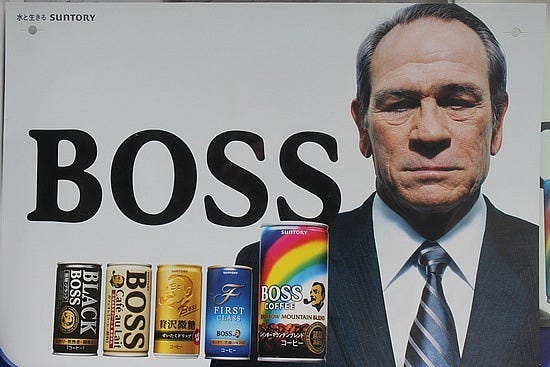
This also helps us identify what Evernote’s voice is not:
- Zany
- Bubbly
- Affectionate
What does this look like? As I interpret it, a header like “You have encountered your limit of 12 new files this month. Upgrade for unlimited access to our suite of tools” could be adapted to something like “Nice work, boss. You could use an upgrade.” Put this in a bold slab serif, and suddenly Evernote speaks in a very distinct voice.
Typography
Use typography to convey voice. Font size, weight and opacity are easy ways to make any given typeface speak loudly or softly. Consider the unique qualities of a typeface and what they communicate— the contrast of their strokes, the shape of their spurs, the angle of their crossbars — how they contribute to the voice’s timbre. For example, Medium juggles a few typefacesto distinguish between the voices of the platform and its content.
Noe represents the Voice of Medium in its purest form. It appears when the distinction between Medium’s voice and user content matters most. It can feel aloof when left to its own devices, so we write in a light tone and pair it with playful illustrations. It never appears in small sizes or light opacities.
SOURCE: https://uxdesign.cc/how-to-write-products-a269c775bfa5