If you have read about Flutter even for 5 mins, you must have stumbled upon Widgets. And the most popular fact “In Flutter, almost everything is a widget”.
Yes, everything. ?
I define Widgets as the components or blocks that define the user interface. The AppBar is a widget, the text on it is a widget, the style you apply to the text is a widget, even the alignment of the text could be called as a widget. In Flutter, anything that is a view or contributes to a property of the view is a widget.
I can go on and on about widgets, but to simplify, here is a recommended listof widgets you must know to build an application in Flutter. For quick reference, see below.
Focusing on Rows and Columns
In Flutter, you can break almost 90% of the layout designs into Rows and Columns. Occasionally, you will have to use other widgets like Stack, Grid etc, but from the base level, you will be requiring rows and columns in some UI block or the other.
So Rows and Columns are…
When there are elements placed side by side, or horizontally left/right of another element, you need Rows.
When there are elements placed one after another, or vertically top/bottom to another element, you need Columns.
Pretty basic, right? ?
For the purpose of this article, you should also know the following:
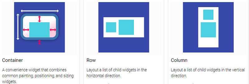
Containers : If you are coming from a web development background, or have any basic knowledge of HTML, containers will sound quite familiar to divs.
Stacks: If there are views overlapping other views, use Stacks.
Let’s build some UI
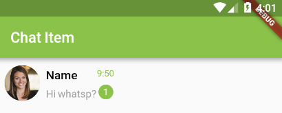
Time to dive into the code and build a couple of pretty popular layout components and see how Rows and Columns fit in here. For the first design, we will be replicating the WhatsApp Chats Screen list item. Something similar to the below image.
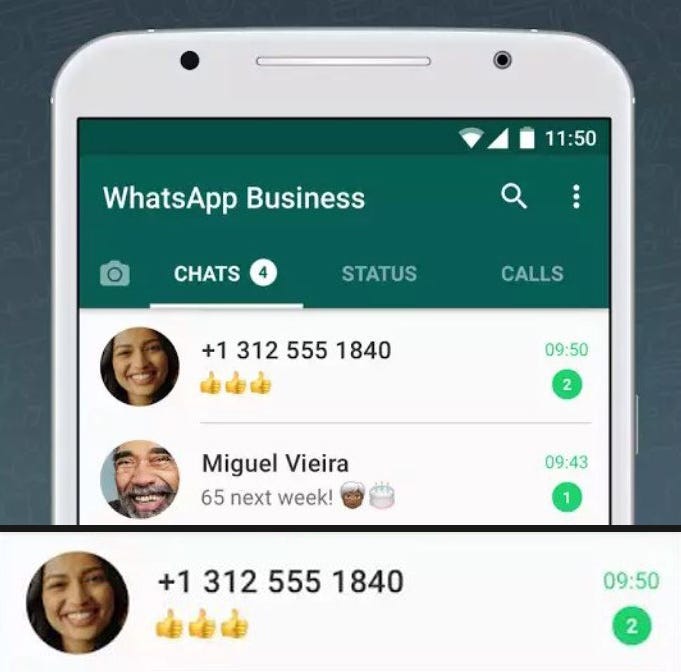
Layout Breakdown #1
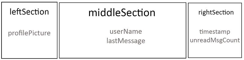
So how many elements or views do we see? Profile picture. User name. User’s latest message. Time of the last message. And number of unread messages.
Lets wrap all of this inside a container, and have three children sections : leftSection, middleSection, and rightSection, one after another horizontally.
leftSection will contain the profile picture.
middleSection will have lastMessage below userName.
rightSection will have unreadMessageCount below timeStamp.
Okay. Was that hard?
Maybe in the beginning, but once you get the hang of rows and columns, you can naturally breakdown layouts in your head.
Time to code
Unlike most other beginner level tutorials, I will always try to break down my code into different classes and widgets. It makes the code super readable.
main.dart
void main() => runApp(new MyApp());

class MyApp extends StatelessWidget {
  // This widget is the root of your application.
  @override
  Widget build(BuildContext context) {
    return MaterialApp(
      home: new ChatItemScreen(), //calling chat_screen_item.dart
    );
  }
}
Beginner’s tip: Don’t forget to import the classes you will be using. So for example, main.dart will import chat_screen_item.dart which has our ChatItemScreenclass.
chat_item_screen.dart
class ChatItemScreen extends StatelessWidget{
  @override
  Widget build(BuildContext context) {
    return new Scaffold(
      appBar: new AppBar(
        title: new Text("Chat Item"),
        backgroundColor: Colors.lightGreen,
      ),
      body: new ChatItem(), //calling chat_item.dart
    );
  }
}
That was just to get you started, so that you don’t stumble upon your basic starting steps. Now we move on to the main code. Our ChatItem class will return a Container widget which has a Row child. This Row child will have three new children leftSection, middleSection and rightSection widgets which we will be constructing soon.
chat_item.dart
class ChatItem extends StatelessWidget{

  final leftSection = new Container();
  final middleSection = new Container();
  final rightSection = new Container();

  @override
  Widget build(BuildContext context) {
    return new Scaffold(
    body: new Container(
      child: new Row(
        children: <Widget>[
          leftSection,
          middleSection,
          rightSection
        ],
      ),
    ),
  );

  }

}
Left Section
In the left section, we need a CircleAvatar, and we have a nice little widget for that as well.
final leftSection = new Container(
  child: new CircleAvatar(
    backgroundImage: new NetworkImage(url),
    backgroundColor: Colors.lightGreen,
    radius: 24.0,
  ),
);
Middle Section
Now inside middleSection Container, we create a column of two text widgets that will hold the userName and lastMessage content.
final middleSection = new Container(
  child: new Column(
    children: <Widget>[
      new Text("Name"),
      new Text("Hi whatsup?"),
    ],
  ),
);
It does the work of placing widgets one after another but looks really ugly. Time to add some beautification.
final middleSection = new Expanded(
  child: new Container(
    padding: new EdgeInsets.only(left: 8.0),
    child: new Column(
      crossAxisAlignment: CrossAxisAlignment.start,
      mainAxisAlignment: MainAxisAlignment.spaceAround,
      children: <Widget>[
        new Text("Name",
          style: new TextStyle(
              color: Colors.black,
              fontWeight: FontWeight.w600,
              fontSize: 16.0,
          ),),
        new Text("Hi whatsp?", style:
          new TextStyle(color: Colors.grey),),
      ],
    ),
  ),
);
- Expanded : Since this section wants all the free space available, we wrap the entire container in this Expanded widget. Without this, the layout will look like this —
- Padding : More room to breathe, woah.
- TextStyle : Gives styling to the text, like colors, fontSize, etc. So much like CSS, damn.
- Now I can explain crossAxisAlignment and mainAxisAlignment, but I can’t explain it better than this video. So I would suggest you to learn from the best. (Check from 2:00 to 7:30 to just get a quick reference to the topic we are at)
Right Section
We are almost done. Just need to build another column of two widgets. This time, the children widgets will be a Textwidget for timestamp and another tiny CircleAvatar for the count.
final rightSection = new Container(
  child: new Column(
    mainAxisAlignment: MainAxisAlignment.spaceAround,
    children: <Widget>[
      new Text("9:50",
          style: new TextStyle(
            color: Colors.lightGreen,
          fontSize: 12.0),),
      new CircleAvatar(
        backgroundColor: Colors.lightGreen,
        radius: 10.0,
        child: new Text("2",
        style: new TextStyle(color: Colors.white,
        fontSize: 12.0),),
      )
    ],
  ),
);
Now run this beautiful thing. And it’s ready.
Shall we breakdown another layout just to make sure you’re getting the hang of it?
Layout Breakdown #2
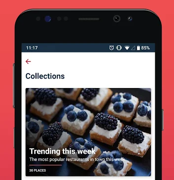
So we have this simple card layout that has a column of a few text widgets overlapping a background image. Hmm.. did you say overlapping? So does that mean we use Stacks here?
YES, you are getting it.
So instead of left, middle or right section, let’s break down this layout into backgroundImage, and onTopContent.
@override
Widget build(BuildContext context) {

  return new Container(
    padding: new EdgeInsets.all(8.0),
    height: 250.0,
    child: new Stack(
      children: <Widget>[
        backgroundImage,
        onTopContent
      ],
    ),
  );
}
Background Image
Now background image will just have a Containerwith a background image and a color filter to darken the background.
final backgroundImage = new Container(
    decoration: new BoxDecoration(
      image: new DecorationImage(
        colorFilter: new ColorFilter.mode(
            Colors.black.withOpacity(0.6),
            BlendMode.luminosity),
        image: new NetworkImage(url),
        fit: BoxFit.cover,
      ),
    ),
);
On Top Content
What do you think? Rows or columns?
You got it. Coluuuumns.
final onTopContent = new Container(
  height: 80.0,
  child: new Column(mainAxisSize: MainAxisSize.max,
    mainAxisAlignment: MainAxisAlignment.spaceEvenly,
    crossAxisAlignment: CrossAxisAlignment.start,
    children: <Widget>[
      new Text("Trending this week",
      style: bigHeaderTextStyle),
      new Text("The most popular restaurants in town this week",
        style: descTextStyle),
      new Container(
        height: 2.0,
        width: 150.0,
        color: Colors.redAccent,
      ),
      new Text("30 PLACES",
        style: footerTextStyle),
      //new Container()
    ],
  ),
);
Now don’t be surprised by the styles I have used. These are not Flutter defaults, I know you have errors. All the styles for zomato card are defined here.
You can even find the entire GitHub repository for these layouts here.
In the future, I will explore more complex layouts that you can break to the root level. Ofcourse, you will be needing more widgets for more complex layouts, but Rows and Columns will always have a role in it somewhere so it’s important you get this in your head.
Read my other articles on Flutter
Flutter is fresh, and I’m currently discovering it myself. If you find something wrong with my code or approach, do mention it in the comments, I would love to improve.
If you learnt even a thing or two, clap your hands ? as many times as you can to show your support!
Hello World, I am Pooja Bhaumik. A creative developer and a logical designer. You can find me on Linkedin or stalk me on GitHub or follow me on Twitter? If that’s too social for you, just drop a mail to pbhaumik26@gmail.com if you wish to talk tech with me.
Source: https://medium.com/flutter-community/breaking-layouts-in-rows-and-columns-in-flutter-8ea1ce4c1316
Writte by
Poojã Bhaumik
Mobile Developer | Android ❤ Flutter | Udacity Nanodegree Graduate | Final Year CS Undergrad
Flutter Community
Articles and Stories from the Flutter Community