Designers love making responsive UIs but implementing them in real life is not that easy. As a Flutter developer you should’t say NO to your designers. so let’s make them happy again.
TDLR :
- In responsive UI we don’t use hard-coded values for dimension and positions.
- Use
MediaQueryto get the real time size of the window. - Use
FlexibleandExpandedwidgets to get a flexible UI that works with percentage rather than hard coded values. - Use
LayoutBuilderto get theConstraintBoxof the parent widget. - You can get the orientation of the device using
MediaQueryorOrientationBuilder.
What are the components of responsive design?
In responsive design apps we have three major things to consider : size,orientation and device type and whenever each one of them changes, the app UI changes.
For example if you have a list of images in one column in portrait mode it should become two columns in landscape mode to show as much as possible to the user in one page and in this little example the UI depends on the orientation of the device in the next part we will discuss each component with examples.
What’s the problem ?
The main issue here is the hard-coded values for dimension and positions of your UI widgets. So to solve the problem just don’t use them, right ? Yes but that’s just to solve one part of the problem because in responsive UI you don’t just scale Widgets, sometimes you re-position them and other times you change them according to the available space. In this article i will give you some tips how to do that.
INFO: The unit of measurement in flutter is logical pixels.
1. Different screen sizes
Flutter support both android and IOS devices and both of them come in a wide variety of sizes it’s impossible to make a layout for each one of them but it’s possible and very easy to make your one layout scale to fit all of them and in Flutter we have a set of Widgets that help in this situation. let’s talk about some of them :
The MediaQuery is an InhertedWidget that gives you information about the current media(AKA the windows that content your application) such as the size,orientation and Pixel Ration of the device.
So for example if you have a drawer menu and you want to show it only if the media width is less then 600 and if it’s greater then that you will show a normal menu in the left .
NOTE : 600 is just an example for an android tablet screen but if you want to know more about the right numbers you should read this for android and this for IOS
Widget build(BuildContext context) {

    media = MediaQuery.of(context).size;

    Scaffold(
        appBar: AppBar(),
        drawer: media.width < 600
            ? Drawer(
          child: Menu(),
        )
            :
    ,
        body: Row(
          children: <Widget>[
            media.width > 600 ? Flexible(flex: 1, child: Menu()) : Container(),
            Flexible(
              flex: 3,
              child: Center(
                  child: Text(
                    "Size ${media.width} * ${media.height}",
                    style: Theme.of(context).textTheme.title,
                  )),
            ),
          ],
        ),
      );
    }
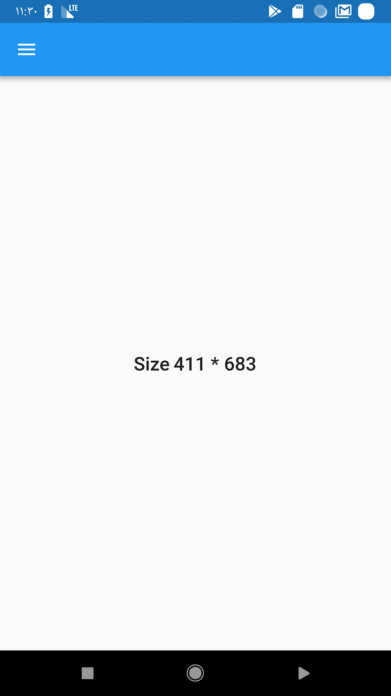
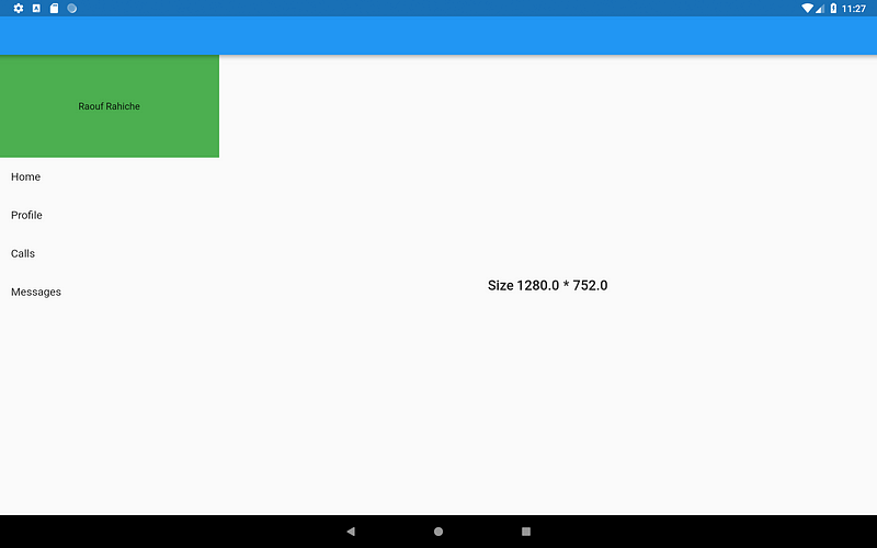
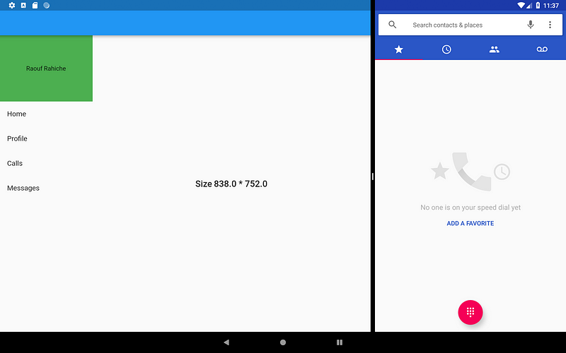
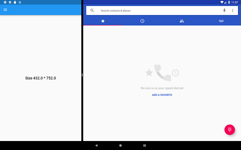
This example is very simple we have a Scaffold that contains a Row with two children a Text in center and a menu in the left that will be shown only if the condition is true . the interesting the 2 line where i declared the media
Now if you run this app in tablet and medium android device you will get different UIs :
As of now Android and IOS has real time window change for example we have Multi-Window Support and in this mode the size of the app can be modified by the user and using MediaQuery you can still get the exact size , let’s run the previous app in Multi-Window mode and as you can see it works as expected .
In the previous example we didn’t just use the MediaQuery to get this flexible design we used other widgets like Flexible which follow the FlexBox layout system let talk about this a little bit more.
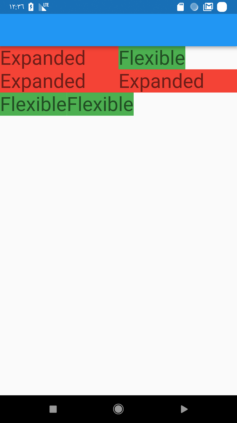
Flexible and Expanded are two widgets that you can use inside a Row, Column, or Flex to give their children the flexibility to expand to fill the available space and the main deference between them can be shown in this example :
Scaffold(
      appBar: AppBar(),
      body: Column(
        children: <Widget>[
          Row(
            children: <Widget>[
              buildExpanded(),
              buildFlexible(),
            ],
          ),
          Row(
            children: <Widget>[
              buildExpanded(),
              buildExpanded(),
            ],
          ),
          Row(
            children: <Widget>[
              buildFlexible(),
              buildFlexible(),
            ],
          ),
        ],
      ),
    );
buildFlexible and buildExpanded are just two function they return the right widget.
For example :
Widget buildFlexible() {

    Flexible(
        child: Container(
          color: Colors.green,
          child: Text(
            "Flexible",
            style: Theme.of(context).textTheme.display1,
          ),
        ),
      );
    }
NOTE: If you don’t provide a flex value the default value is 1
So the difference is that the Expanded widget require the child to fill the available space while Flexible does not. and now you can use them to distribute space between multiple items
The MediaQuery widget will give you the global size available for your application meanwhile you can think of LayoutBuilder as a local MediaQuerybut more focus on the size constraints so it will provide you with the parent widget’s constraints to read them and decide what to display according to them
NOTE: in flutter everything is a widget even the app so you can achieve the same thing we did in the first example by using the
LayoutBuilderjust by warping yourScaffoldinside aLayoutBuilderand use themaxWidthvalue in the condition.
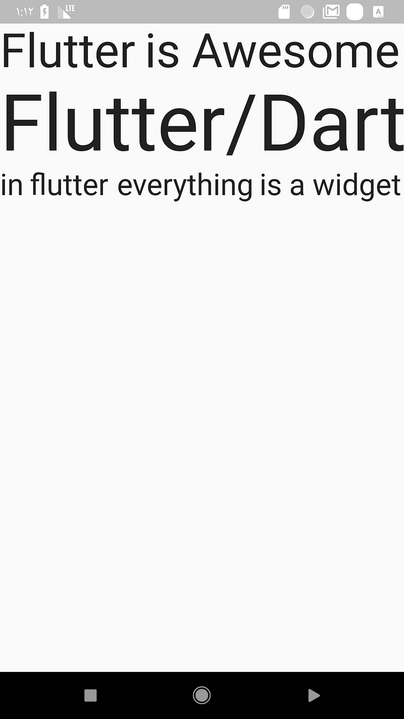
This widget is a must if you want your fixed size widgets to scale and position them self to fit the available space. Take a loot at this example where i have three Text widget’s, With the help of FittedBox they will scale them self to fit the screen width always in both orientations .
2. The Orientation
The orientation change is another type if run time size change just like what we saw in the multi-window example above but in this time it’s more specific for phone users because most of the time people change from portrait to landscape mode to get more data in the view-port .
- access the device orientation
using MediaQuery:
Widget build(BuildContext context) {

    media = MediaQuery.of(context);

    Scaffold(
        appBar: AppBar(),
        body: Center(
          child: Text(media.orientation.toString()),
        ),
      );
    }
using OrientationBuilder :
OrientationBuilder(
    builder: (BuildContext context, Orientation orientation) {

    Center(
              child: Text(orientation.toString()),
            );
          },
         ),
NOTE: both of the ways use the same logic which is if the width > height then it’s portrait otherwise it’s landscape but the
OrientationBuilderuses the parentBoxConstraintsso unless you provide an explicitmaxWidththat’s greater then themaxHeightyou will get the right orientation .
Now let me show you a simple example where this come handy . let’s say you have a login page that look like this :
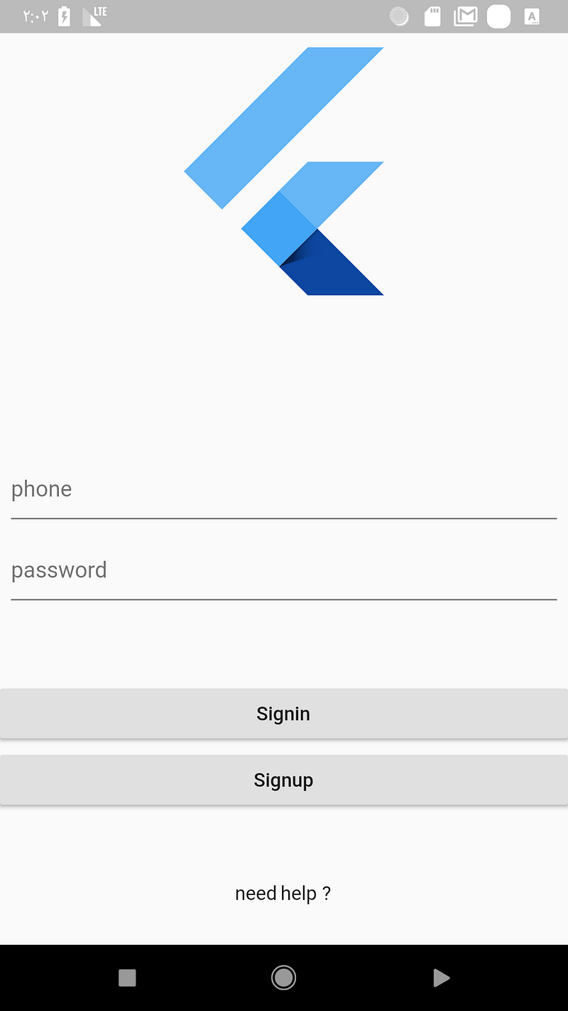
Now if you change it landscape it will look like this :
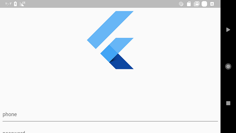
This is not something you should show to the user , in the login page the user expect to see the input field to write the login information. Let’s fix this using the OrientationBuilder.
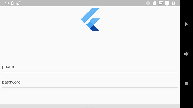
OrientationBuilder(
      builder: (BuildContext context, Orientation orientation) {

    ListView(
          children: <Widget>[
            FlutterLogo(
              size: orientation == Orientation.portrait ? 200.0 : 100.0,
            ),
           //other widgets
          ],
        );
      },
    ),
The fix is simple if the orientation is portrait then the size is 200.0 otherwise it’s 100.0 so now it will look a little bit better.
Okay that’s it for orientation but if you want to see how to deal with orientation in a crazy way take a look at this implementation by Simon Lightfoot :

Should i care about Desktop support ?
As some of you now google is working on a new OS called fuchsia which will be available for desktop and mobile as well and flutter is going to be the official development tool for it.
So the apps you create now for android IOS will work on fuchsia as well. The question here is : should i care about desktop support(in term of responsive UI)? My answer is No for the moment because in fuchsia the app can work in two modes the desktop and mobile mode and even if you run your app in desktop mode it will look good if you follow the above advises.
Conclusion
That’s it for me i hope you enjoyed this article if you did feel free to clap and share with others if you did’t please let me know in the comment’s what i am missing. And for the final advice i would say :
in responsive design don’t think about specific device because you will just get in trouble
all the examples shown on this article can be found on this repo
Follow me and the flutter community on twitter for more articles .
SOURCE: https://medium.com/flutter-community/build-responsive-uis-in-flutter-fd450bd59158
Written by
Flutter Community
Articles and Stories from the Flutter Community